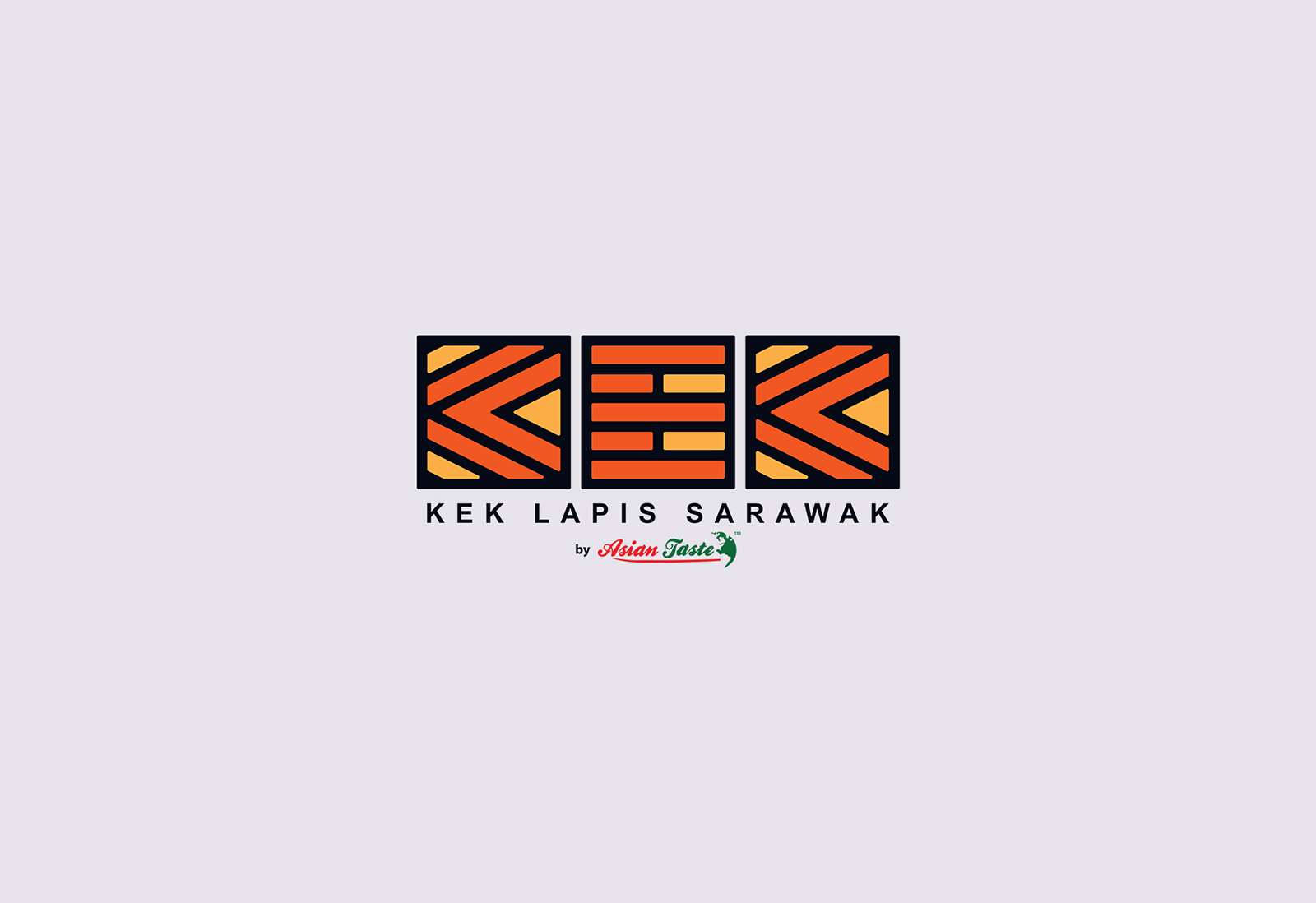
Sarawak Layer Cake is known for the uniqueness of its stack of layers. An amazing art to begin with.
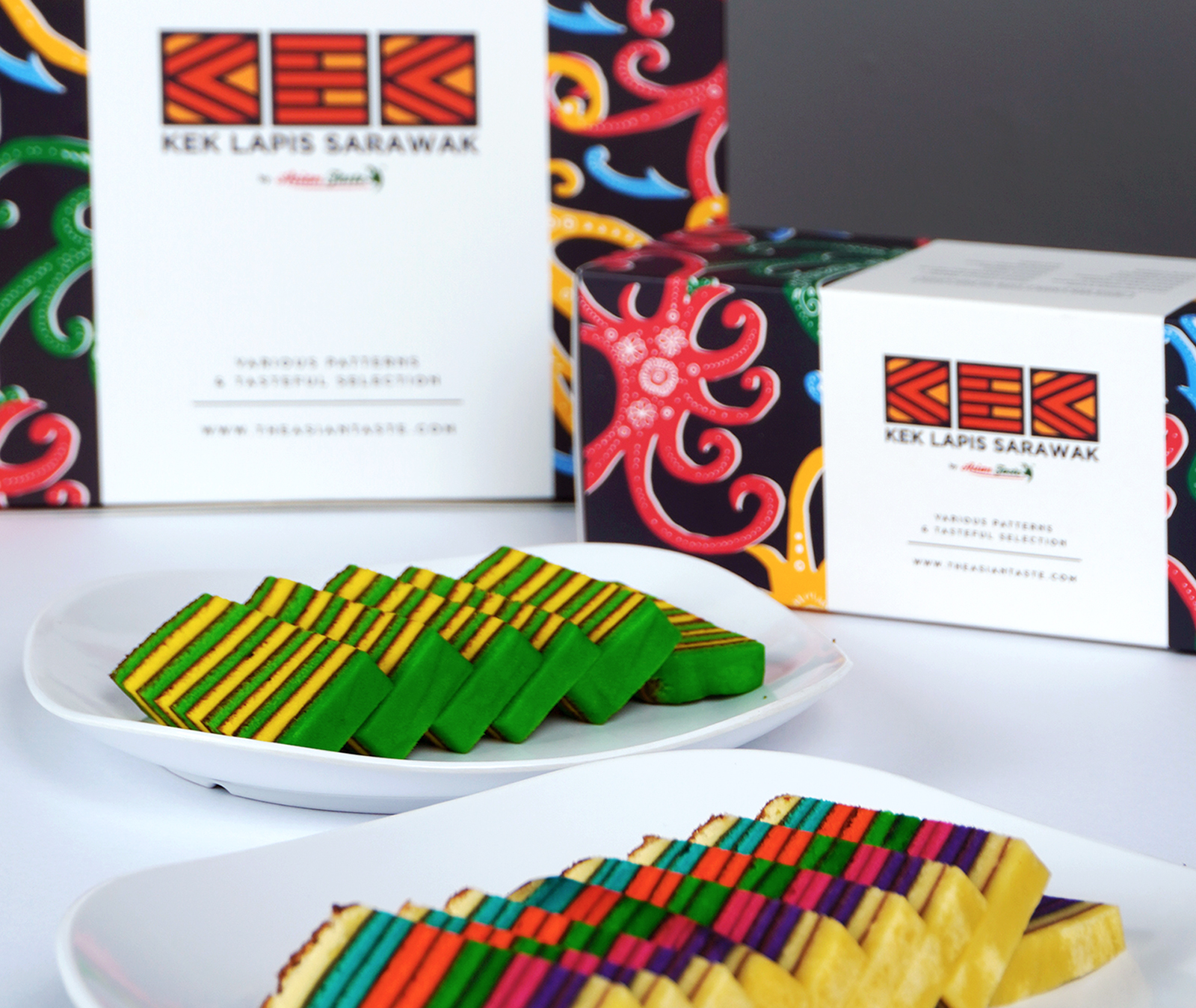
When talking about central part of the art, the logo hints everything. It is fabricated to picture the exclusive pattern of Sarawak Layer Cake itself where the alphabets symbolise layers of the cake, forming capital K, E and K. That being said, even if you don’t know what is Sarawak Layer Cake, you can straight up imagine it just by looking at the logo.
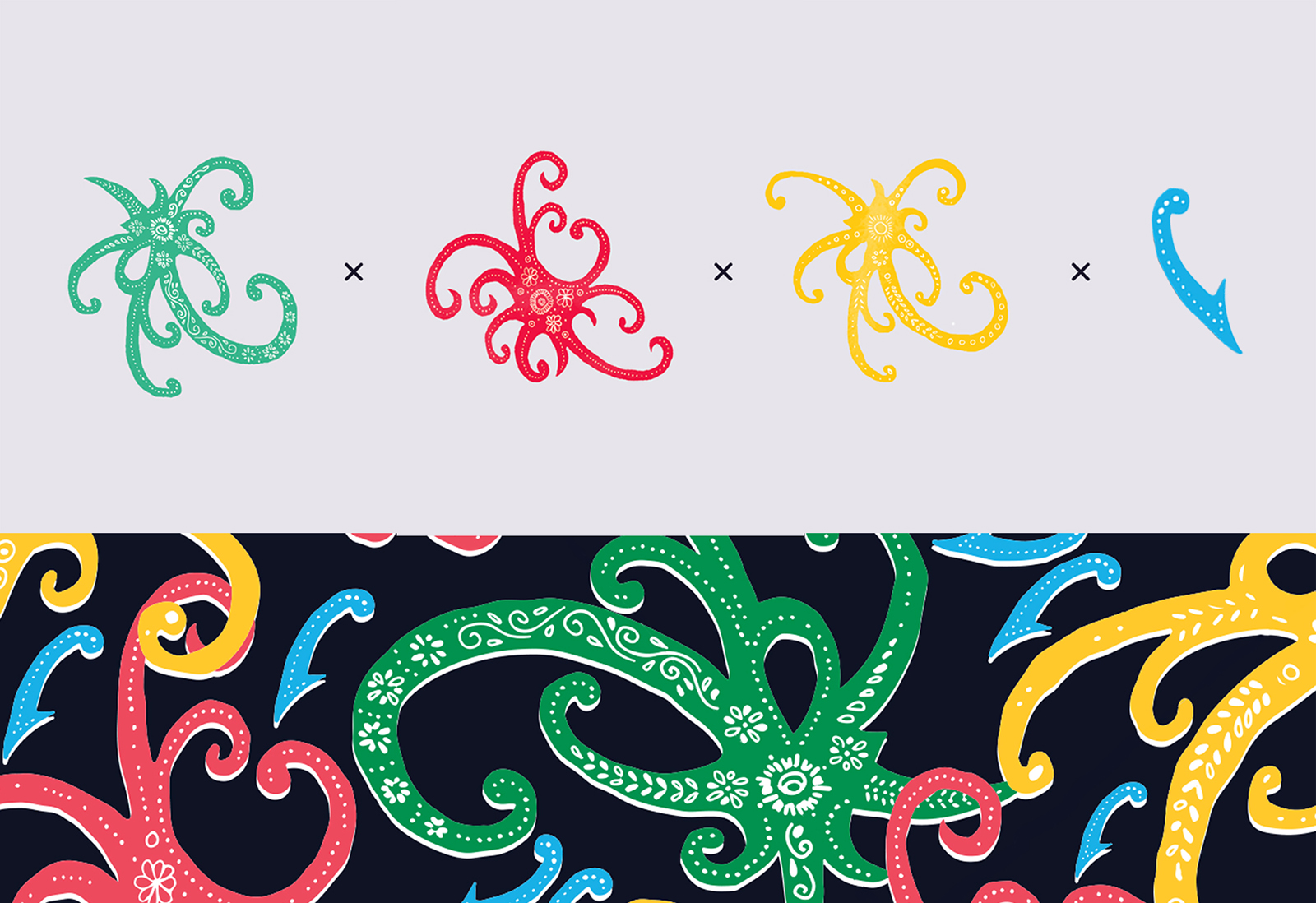
The creation of the graphic element is inspired by the most popular Sarawak Batik. The motif is infused as a symbol of Sarawak Layer Cake origination as it is crafted to resemble the local heritage and culture of “Land of the Hornbills”.
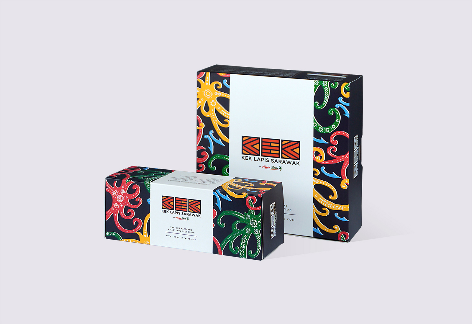
Now’s the time for the colour. We believe it plays an important role of everything; hence the combination red, green, blue, yellow is chosen to ensure fun, friendly feelings and instantly memorable packaging design.
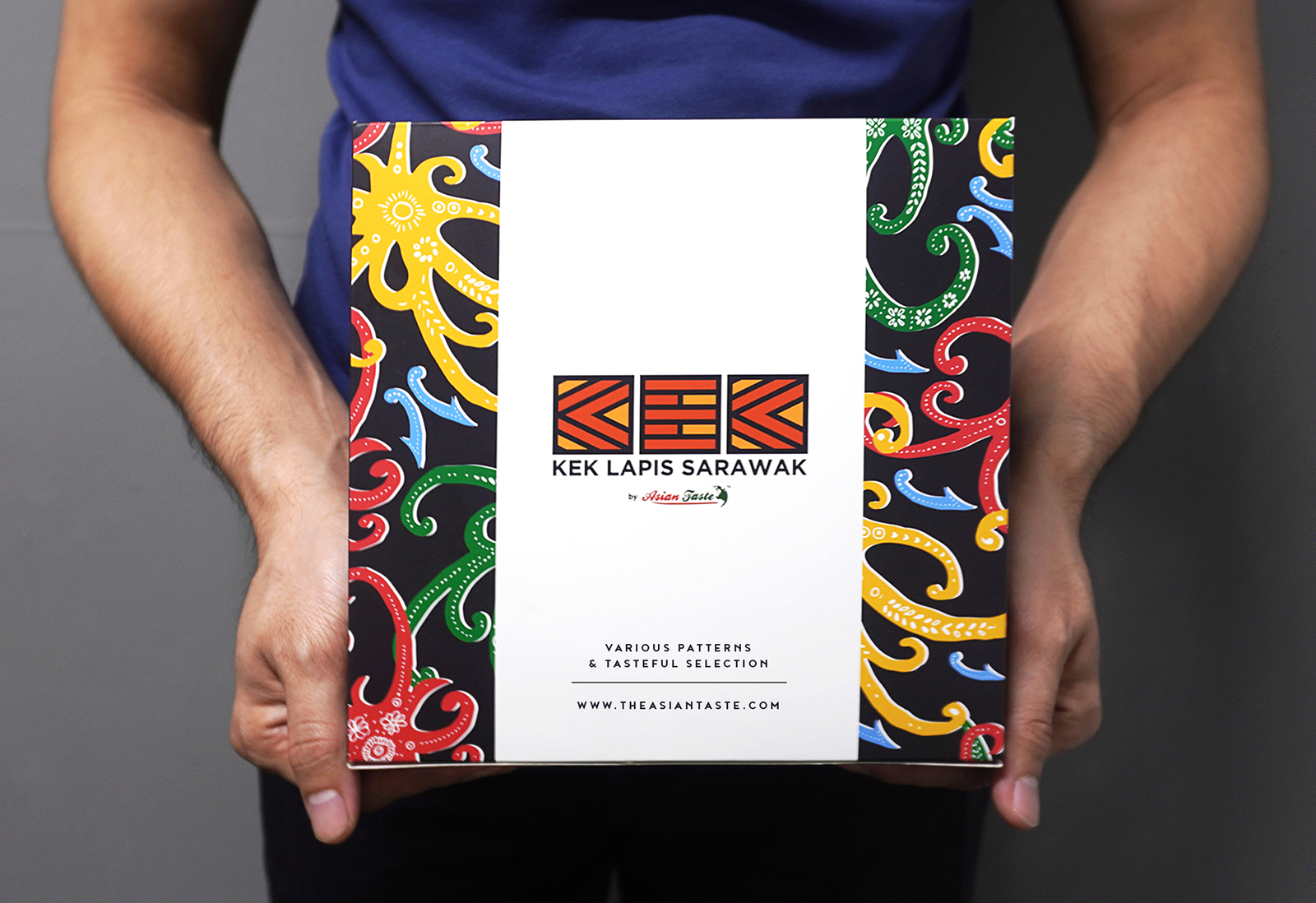
Point being, this packaging drives people to feel encouraged to buy the product because of the risen of the vibrant and colourful colour.
The art of Sarawak heritage is all depicted on this packaging. Custom pattern that is not seen on many Sarawak Layer Cake packaging designs make it stand out from other competitors.
CREDIT
- Agency/Creative: Zulfadhli Azlin
- Article Title: Kek Lapis Sarawak by Asian Taste
- Organisation/Entity: In-house, Published Commercial Design
- Project Type: Packaging
- Agency/Creative Country: Malaysia
- Market Region: Asia
- Project Deliverables: Brand Identity, Brand Strategy, Graphic Design, Illustration, Packaging Design, Rebranding
- Format: Box
- Substrate: Plastic


