


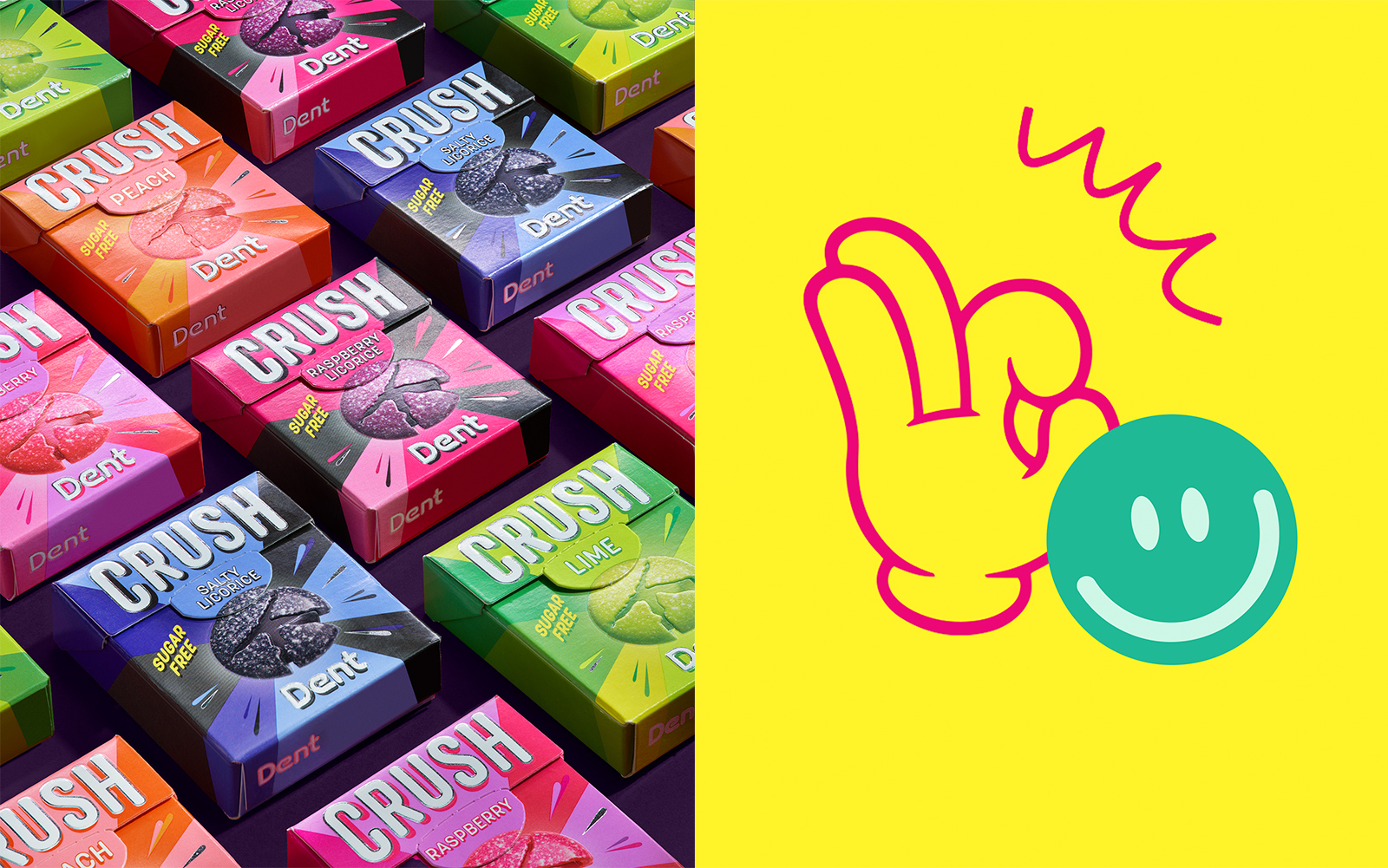
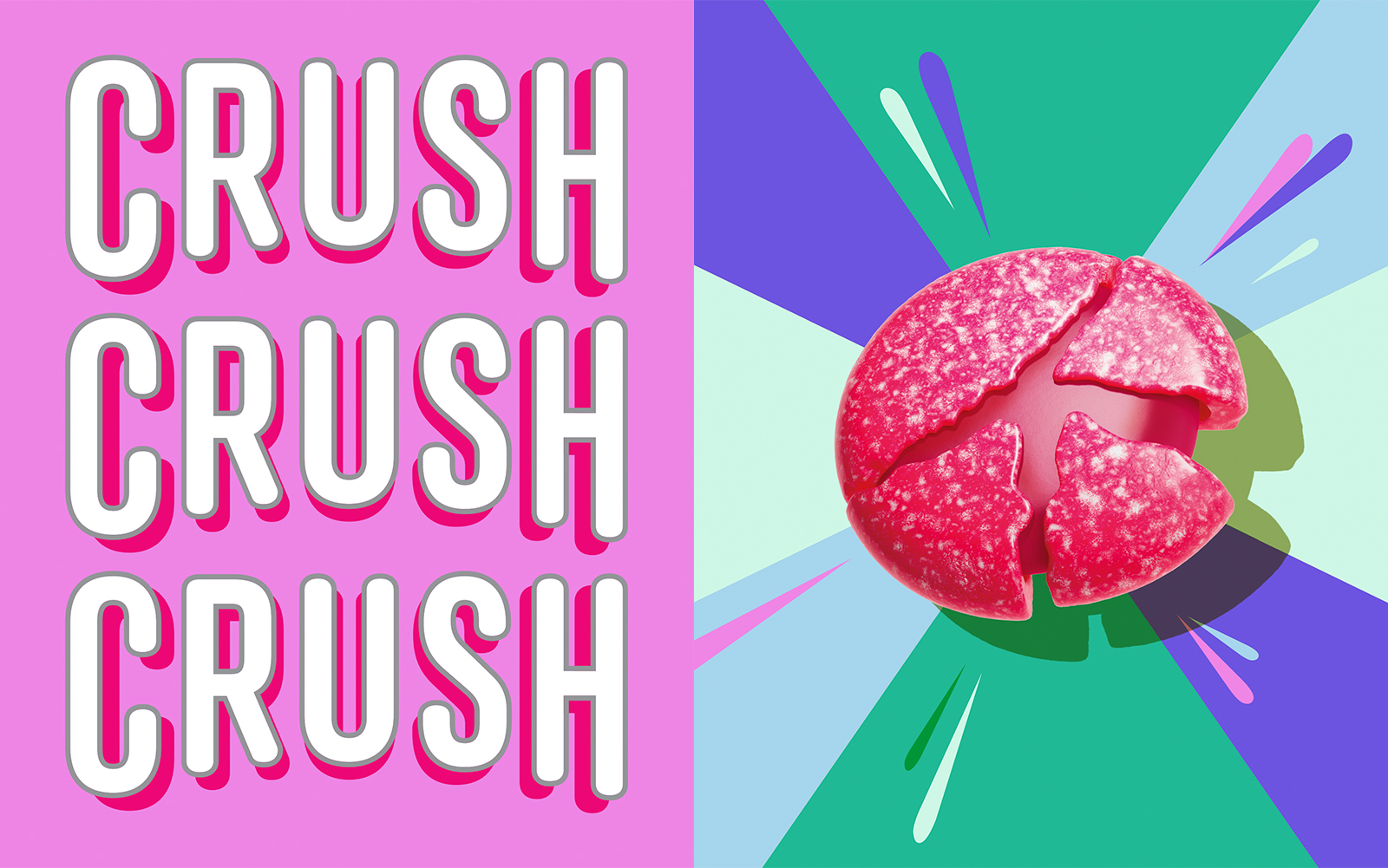
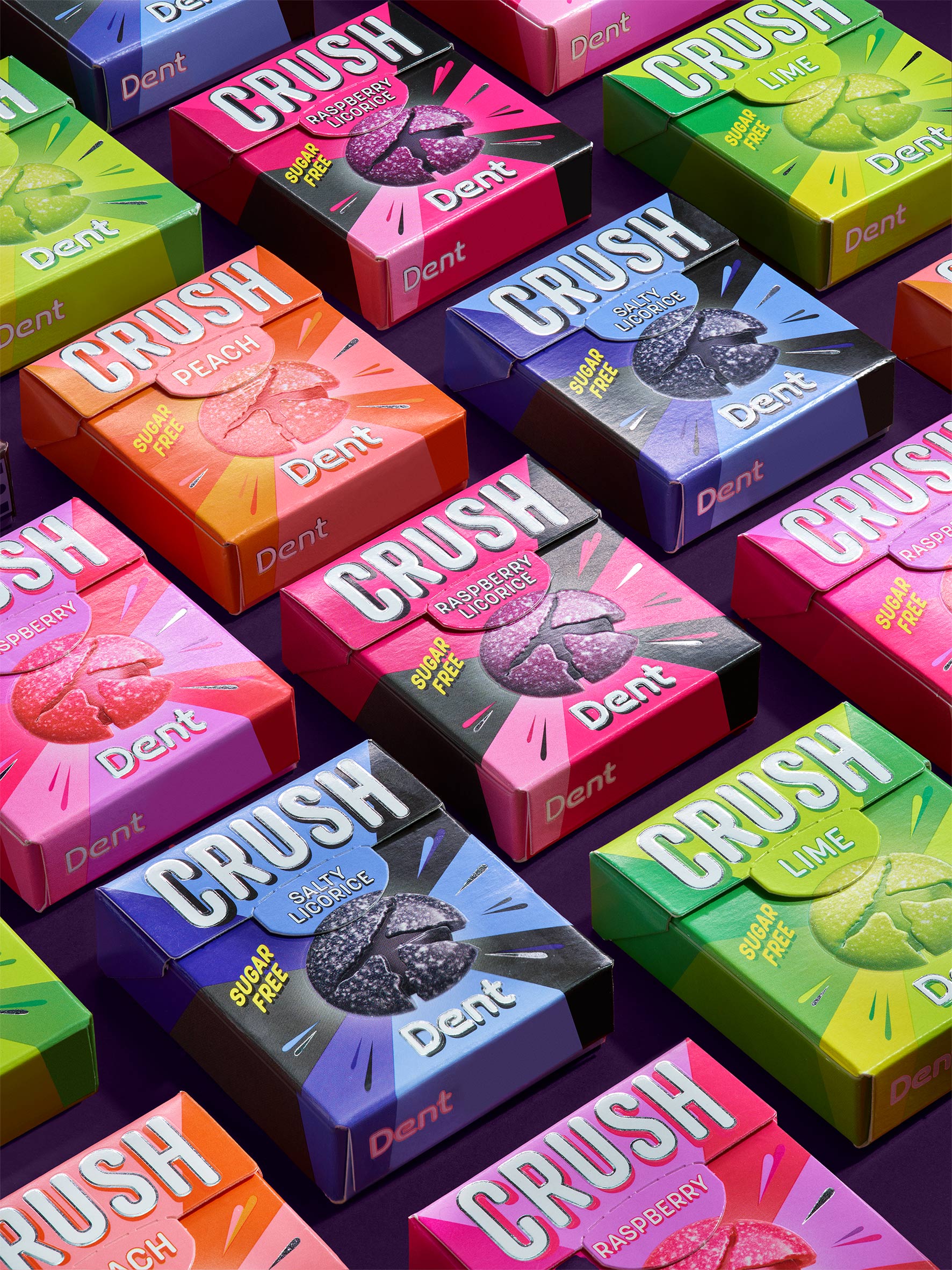
Meet our new CRUSH! By capturing the essence of the name Crush, we’ve crafted a kaleidoscope and explosion of colors, perfectly reflecting the diverse taste experience — sugar-free fun!
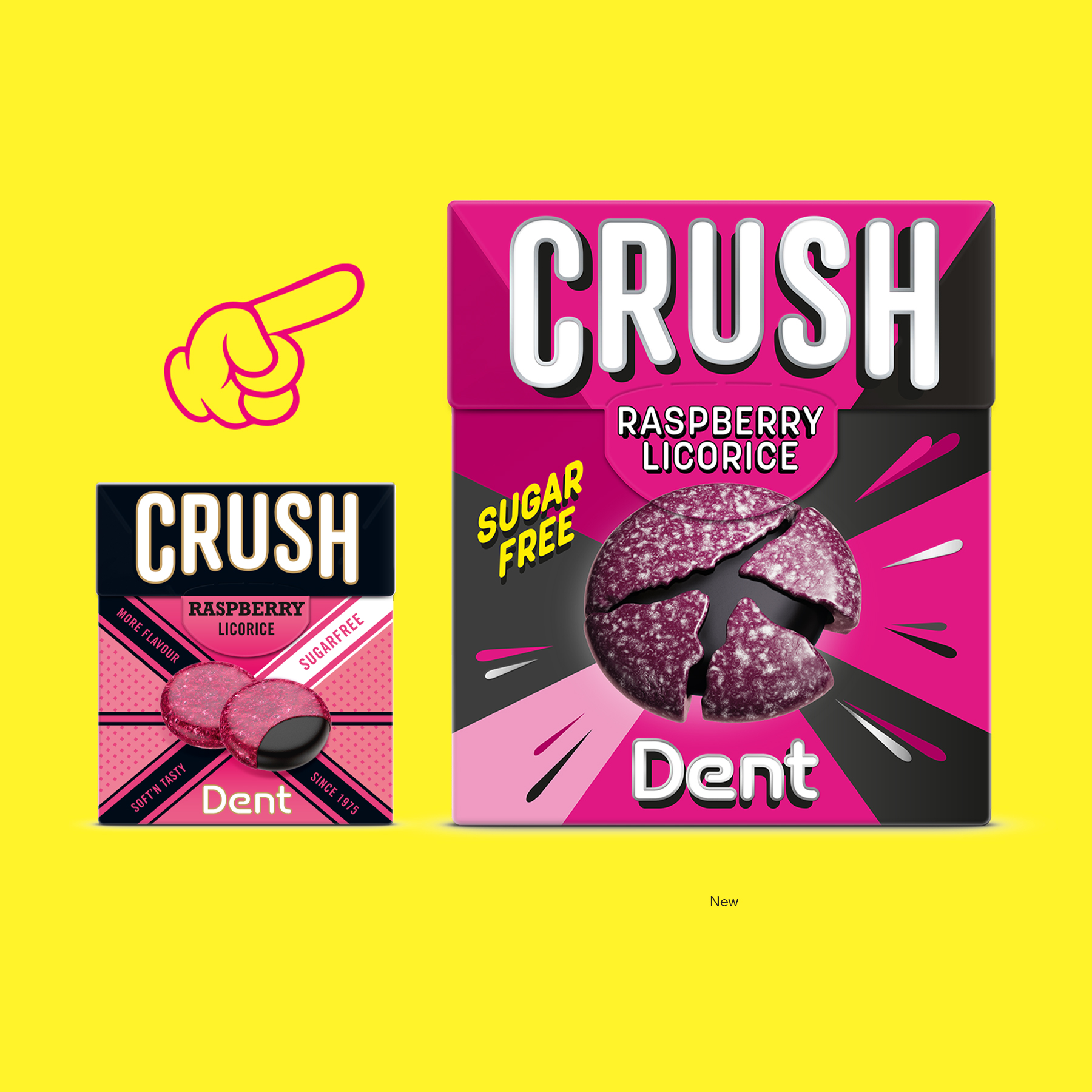
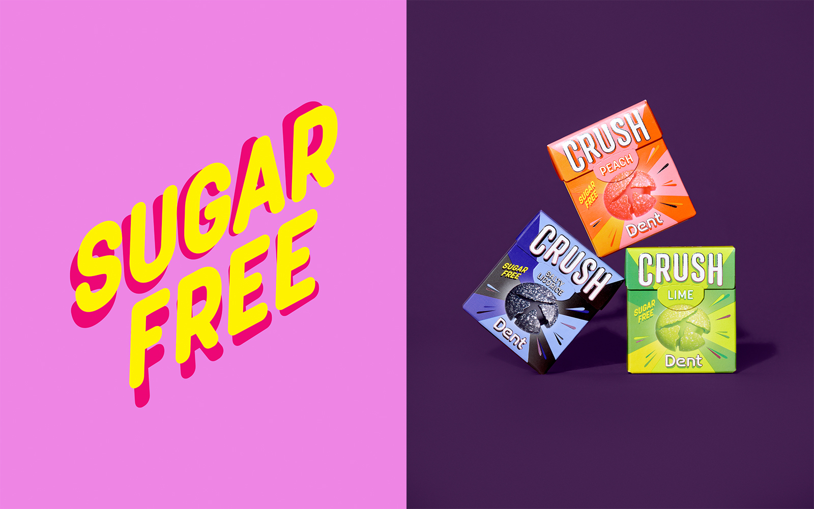
Our new makeover for the packaging design for Dent Crush lozenges is a vibrant celebration of flavor and excitement. Inspired by the lively and dynamic nature of the Crush brand, we’ve infused the packaging with an array of bold and eye-catching colors. Each hue represents a different flavor sensation, from zesty citrus to salty liccorice and everything in between. But it’s not just about the colors; it’s about the experience. The design features playful graphics and energetic patterns that evoke a sense of joy and anticipation. Whether you’re reaching for a lozenge to freshen your breath or satisfy a sweet craving, the packaging sets the stage for a delightful taste adventure.
In addition to its visual appeal, the new packaging is also practical and user-friendly. We’ve incorporated easy-to-read design with clear product information, making it simple for consumers to identify their favorite flavors and understand the benefits of choosing sugar-free. Thanks to our design strategy, the launch of our new packaging for Dent Crush lozenges has not only caught the eye but also given sales a significant boost.
So, whether you’re a longtime fan of Dent Crush or discovering our lozenges for the first time, we invite you to experience the thrill of our new packaging design. Get ready to crush your cravings and savor the sweetness of sugar-free fun like never before!
CREDIT
- Agency/Creative: Keep Oslo
- Article Title: Keep Oslo Sparks Flavor Excitement with a Vivid Identity for Dent Crush Lozenges
- Organisation/Entity: Agency
- Project Type: Packaging
- Project Status: Published
- Agency/Creative Country: Norway
- Agency/Creative City: Keep Oslo
- Market Region: Europe
- Project Deliverables: Brand Design, Brand Strategy, Branding, Design, Graphic Design, Packaging Design
- Format: Box
- Industry: Food/Beverage
- Keywords: Sugar free lozenges
-
Credits:
Senior Designer: Ina Bråthen
Senior Designer: Alexandra Kloster
Senior production Manager: Reidar Oksavik


