


The Task
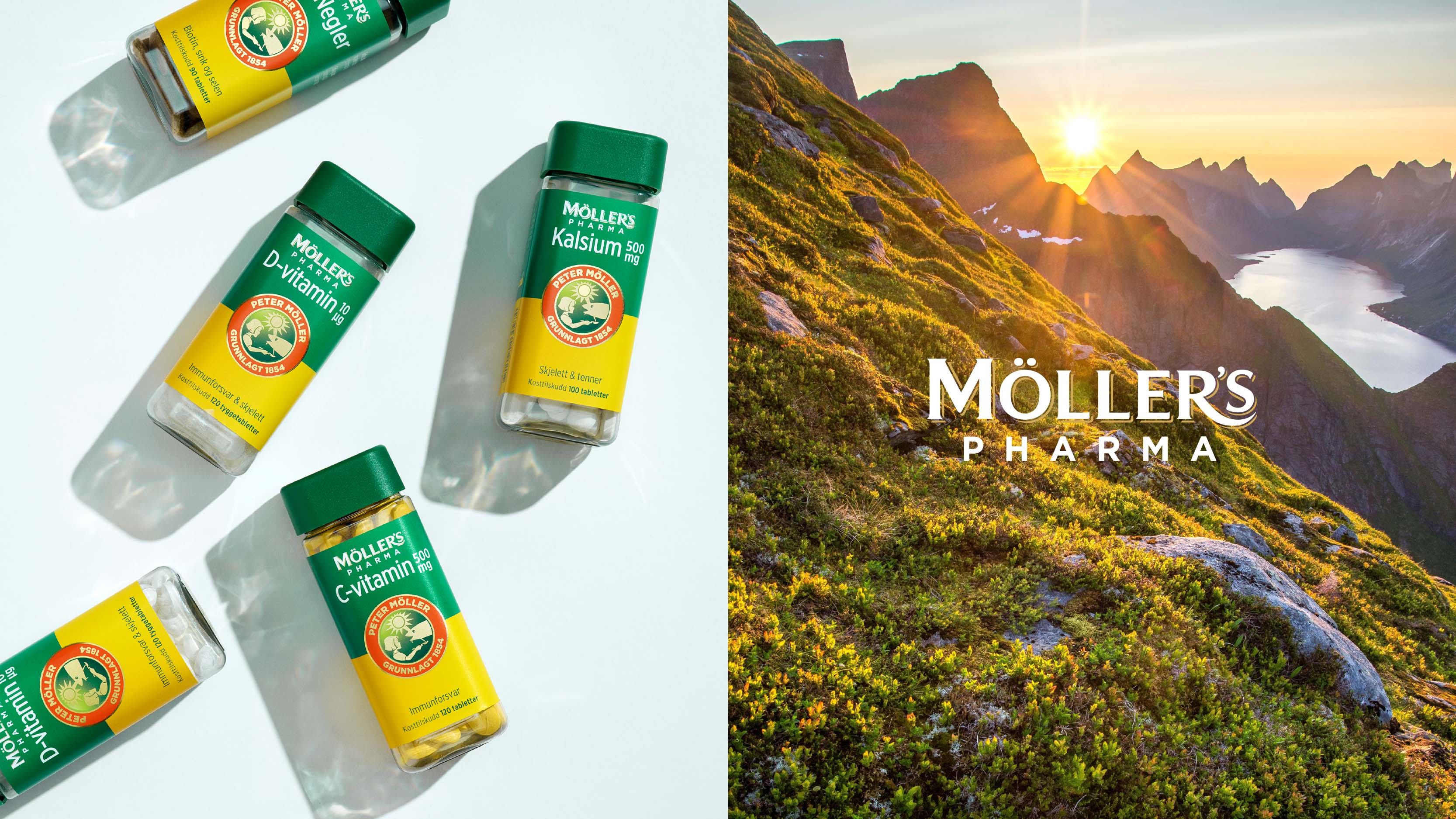
The Möller’s redesign had several key objectives. Firstly, unifying the brand across its portfolio, improving shelf impact and navigation. Secondly, strengthening Möller’s distinctive assets preserving the brand heritage. Lastly giving it a fresh look to appeal to younger audiences.
The Challenge
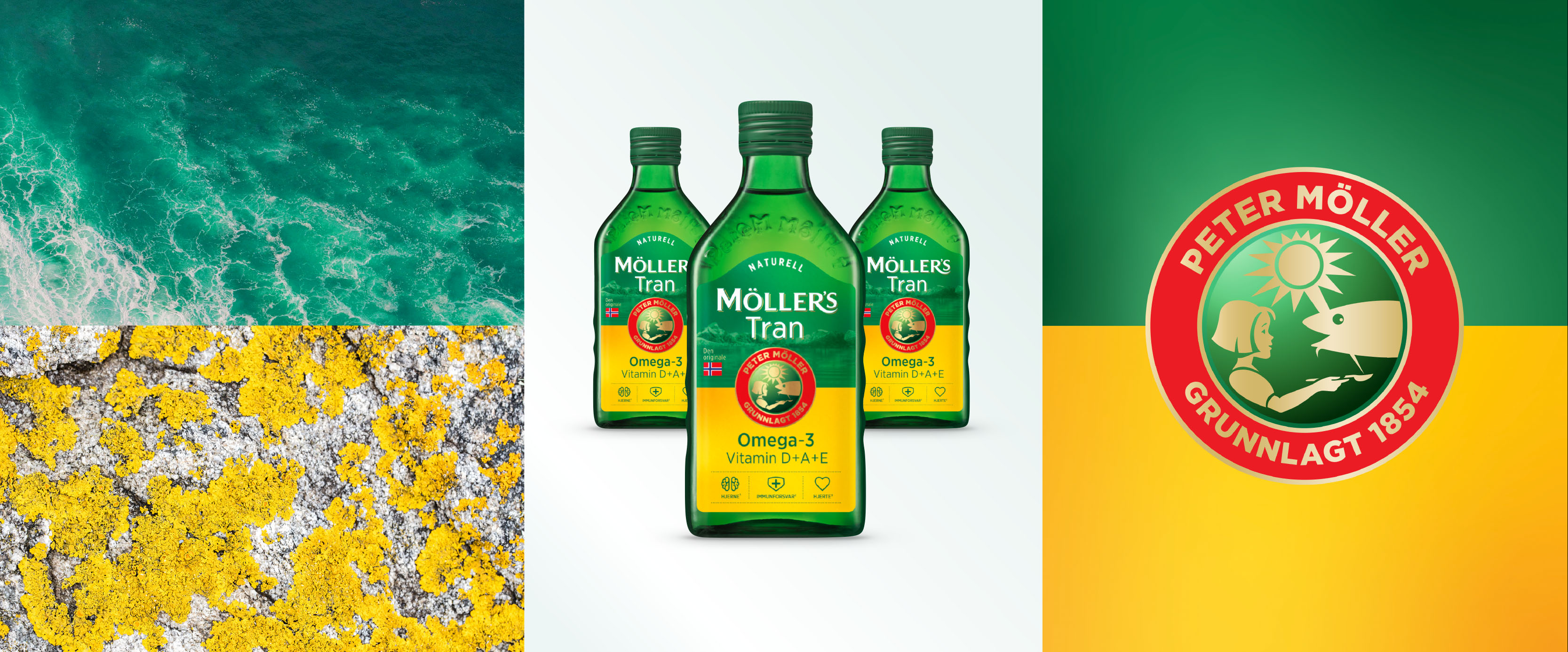
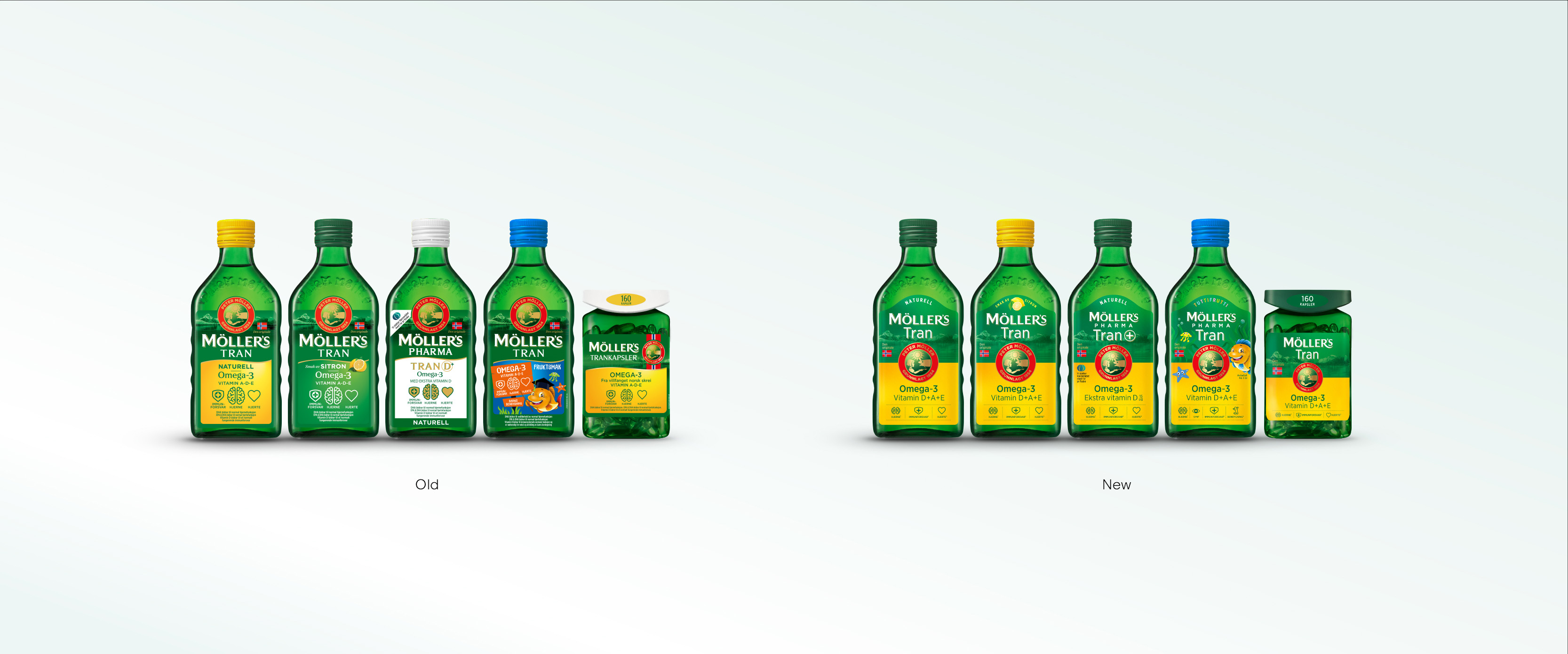
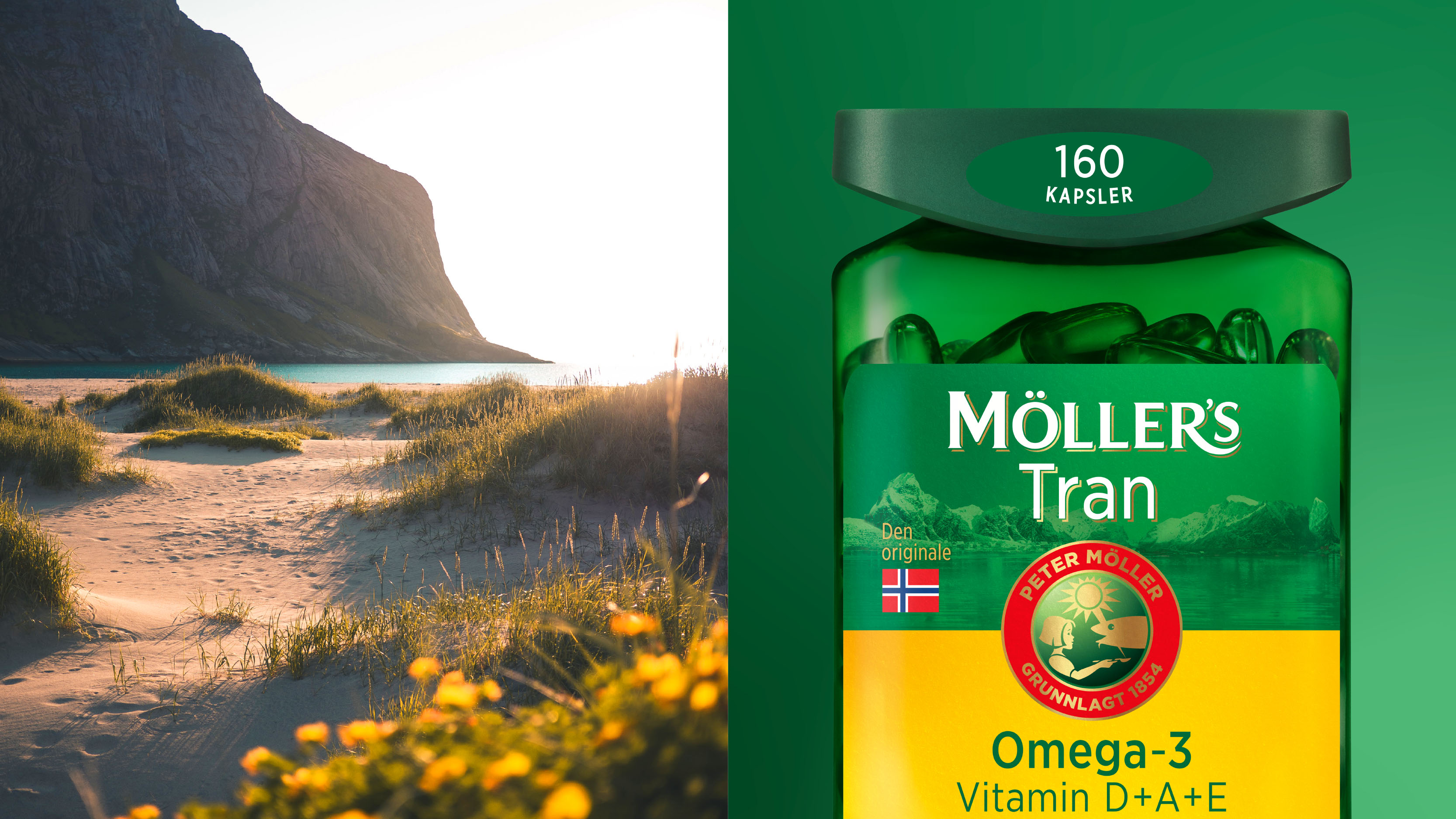
The portfolio lacked consistency and appeared fragmented. Historically, the iconic cod liver oil was defined by the logo, emblem, and green/yellow palette. Re-establishing ownership of the green and yellow was key to standing out in a competitive market. Separately, the colours are generic. Yet in this specific combination, they become distinct.
The Solution
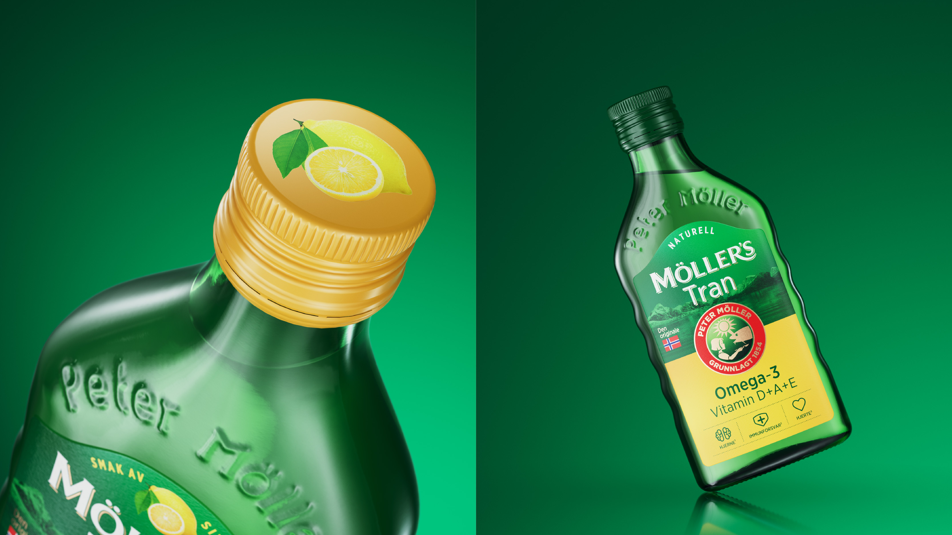
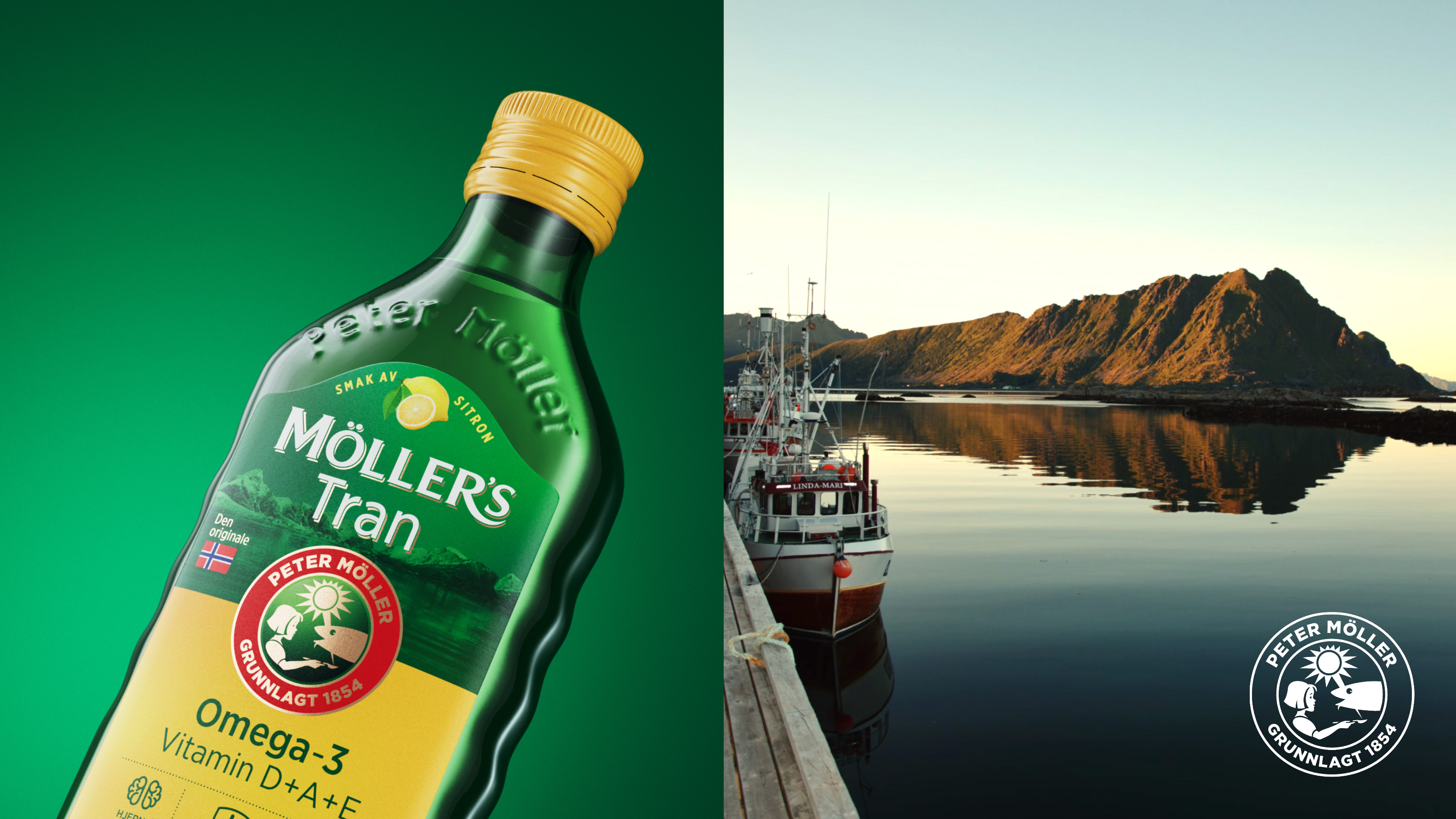
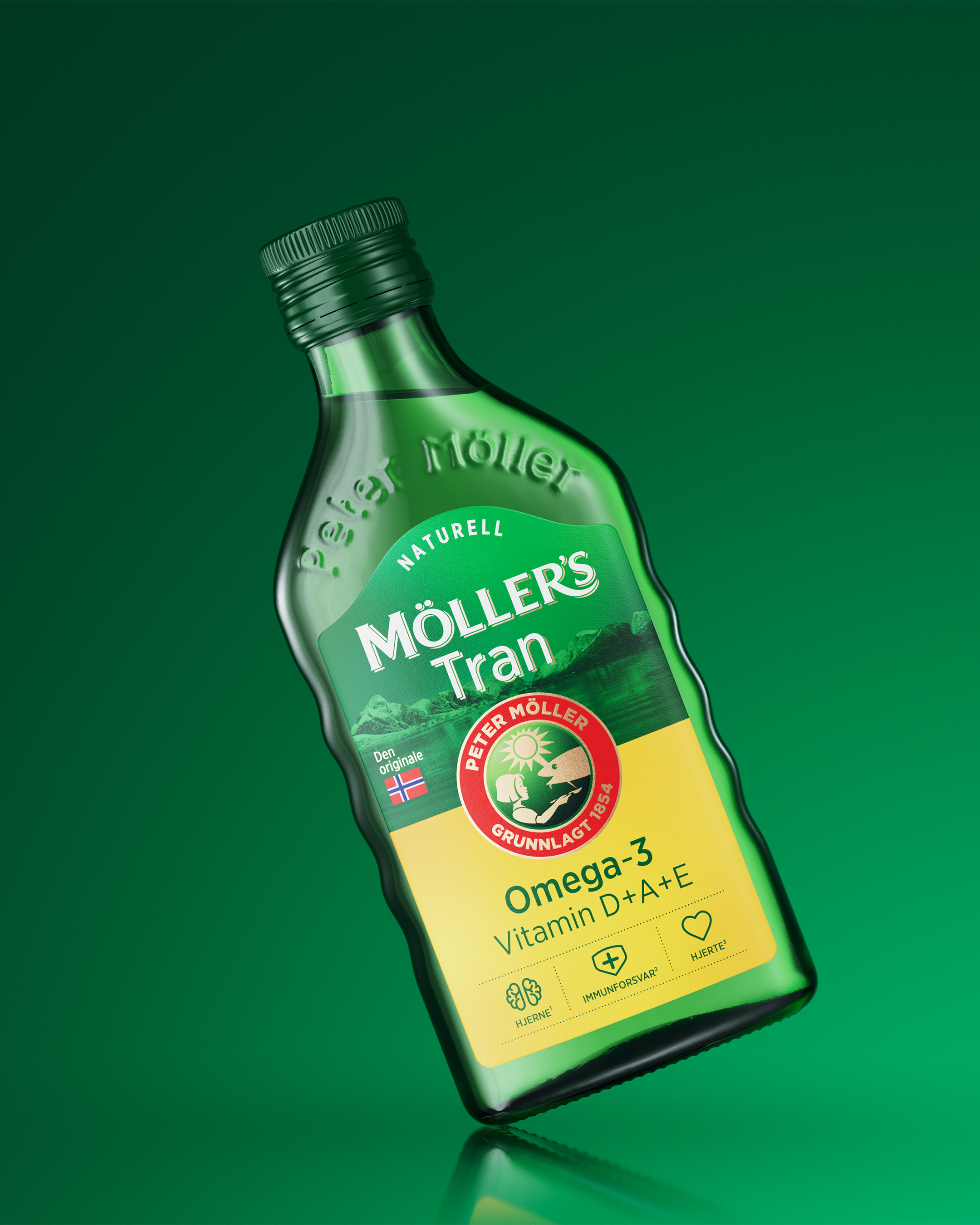
Inspired by Norway’s pristine landscapes, featuring an arctic colour palette the new Möller’s identity pays tribute to the brand’s heritage, dating back 170-year history. The emblem plays centre part while the horizon of the nordic sea creates a strong graphic backdrop. The emblem, a symbol of trust and quality, plays centre part creating a bull’s eye, while the horizon of the nordic sea creates a strong graphic backdrop.
The new design reenforces the brands most distinctive assets in a sophisticated, modern way, unifying the portfolio across various products and packaging formats. Simplified texts/symbols improve on-pack navigation, ensuring a clear focal point on store shelves.
Describe Project in One Sentence:
To unify Möller’s brand. multinational cod liver oil strengthen its heritage, and appeal to younger audiences with improved shelf
CREDIT
- Agency/Creative: Keep Oslo
- Article Title: Keep Oslo Merges Tradition and Innovation in Möller’s New Identity
- Organisation/Entity: Agency
- Project Type: Packaging
- Project Status: Published
- Agency/Creative Country: Norway
- Agency/Creative City: Keep Oslo
- Market Region: Europe
- Project Deliverables: Art Direction, Brand Design, Brand Guidelines, Brand Identity, Brand Redesign, Branding, Design, Graphic Design, Packaging Design, Packaging Guidelines
- Format: Bottle, Box, Sleeve
- Industry: Health Care
- Keywords: Packaging redesign
-
Credits:
Senior Designer: Ina Bråthen
Senior Designer: Alexandra Kloster
Senior production manager: Reidar Oksavik


