


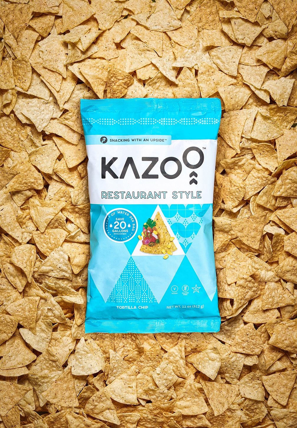
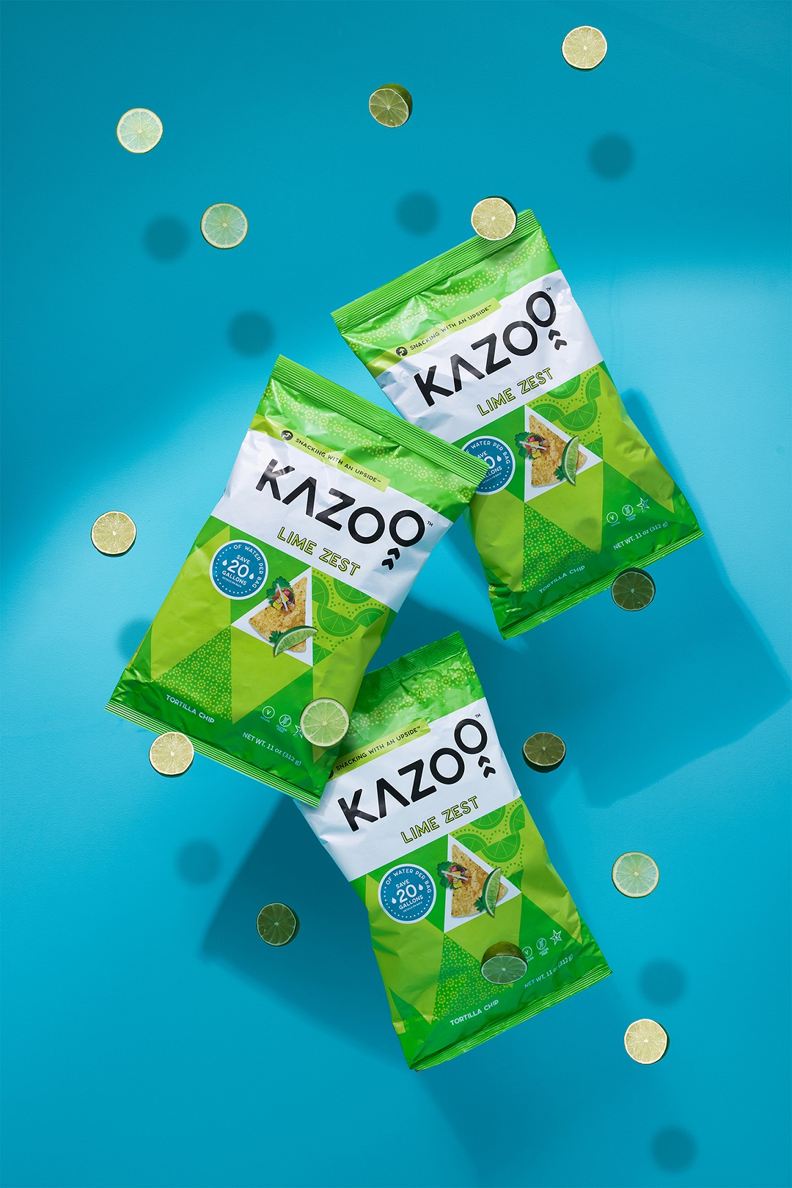
Developed by an eco-conscious lawyer, Kazoo was born out of an authentic desire to see a snacking option on shelves that was both healthy and sustainable. This innovative idea mashed up snacking, nutrition, and waste reduction into one remarkable patent pending corn tortilla chip. Using 40% upcycled corn, Kazoo has managed to outperform the competition with a staggering savings of 20 gallons of water per bag. Now that’s worth celebrating.
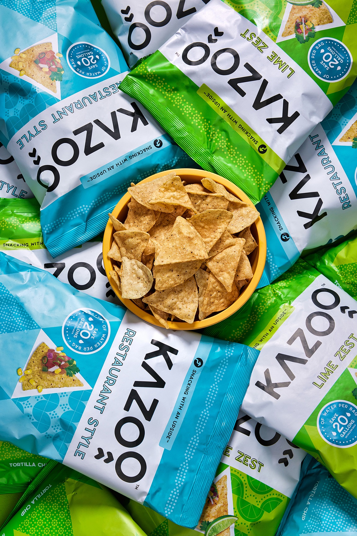
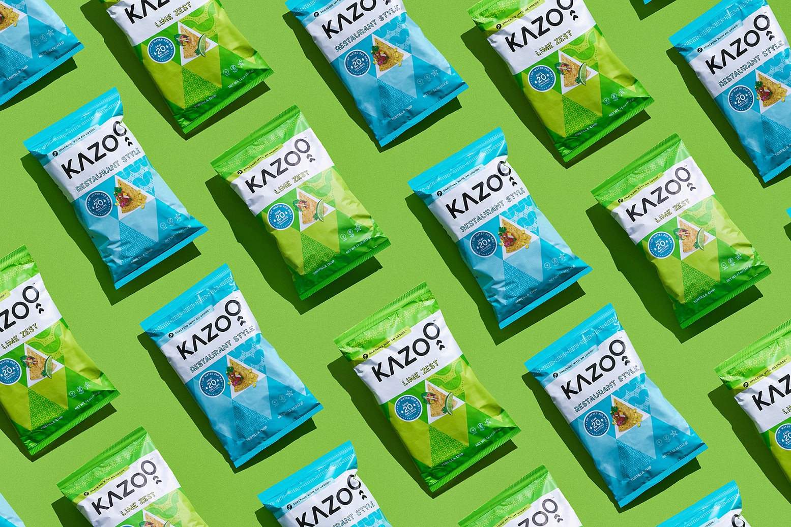
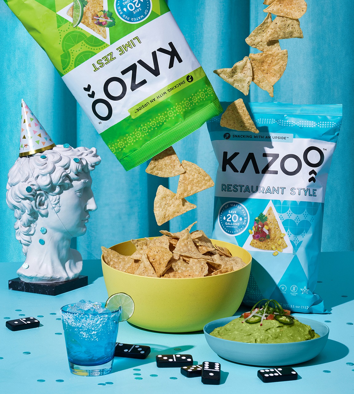
From name development to package design, the Kazoo brand needed to embody the pure excitement surrounding this innovative product. The word ‘kazoo’ was pulled from the classic musical instrument most known for its use during parties, and for its signature ‘buzzing’ sound (which we thought was quite fitting, given the buzz this new product is making). The design nods to the cultural roots of the tortilla, in a fresh modern way by drawing on the distinct use of the triangle in both Mayan and Aztec cultures. The twist? A traditional snack with a major upside. The design communicates a modern, playful reimagining of traditional geometric designs using custom patterns that draw on each flavour combined with bright, joyful colours that feel like a celebration. Using a bold contrast of black and white against the colourful patterns, the wordmark was designed to tell the idea of the ‘upside’ of ‘upcycling’ while adding a playful bounce to the already fun letters in the name.
This design reached to embody the heart of Kazoo, and why it was made, by expressing the pure joy and celebration of this innovative product, its sustainable achievements and Kazoo’s passion and determination to find the ultimate corn chip.
CREDIT
- Agency/Creative: Crew Food & Beverage Marketing Partners
- Article Title: Kazoo The Traditional Snack with a Major Upside
- Organisation/Entity: Agency
- Project Type: Identity
- Project Status: Published
- Agency/Creative Country: Canada
- Agency/Creative City: Surrey
- Market Region: North America
- Project Deliverables: Brand Identity, Brand Naming, Packaging Design, Product Naming
- Industry: Food/Beverage
- Keywords: Food, Beverage, Pretzels, Packaging, Package Design, Sustainability, Snack, Chip
-
Credits:
Associate Creative Director: Rachel Latkolik
Chief Creative Officer:: Gerald Schoenhoff
Writer: Ian Bray
Account Manager: Nate Douglas
Photography: Merzetti Studios, Nick Merzetti


