Turning interior design outside in.
Overview
Tendril Magazine breathes life into interiors by seamlessly blending nature and design. Catering to both plant aficionados and interior decor enthusiasts alike, Tendril explores the symbiosis between greenery and living spaces. The magazine features expert advice on plant care, innovative design ideas, and captivating stories that showcase how nature can weave its way into every corner of any space.
Positioning
The market for publications about homes is predominantly occupied by interior and exterior design and gardening magazines. This creates a unique space for Tendril Magazine, which positions itself as a periodical focused on using plants and organic materials as decor and a means of expression. Tendril offers plant and design lovers alike a place to discover endless new ideas, bridging the gap between the worlds of greenery and interior design.
Solution
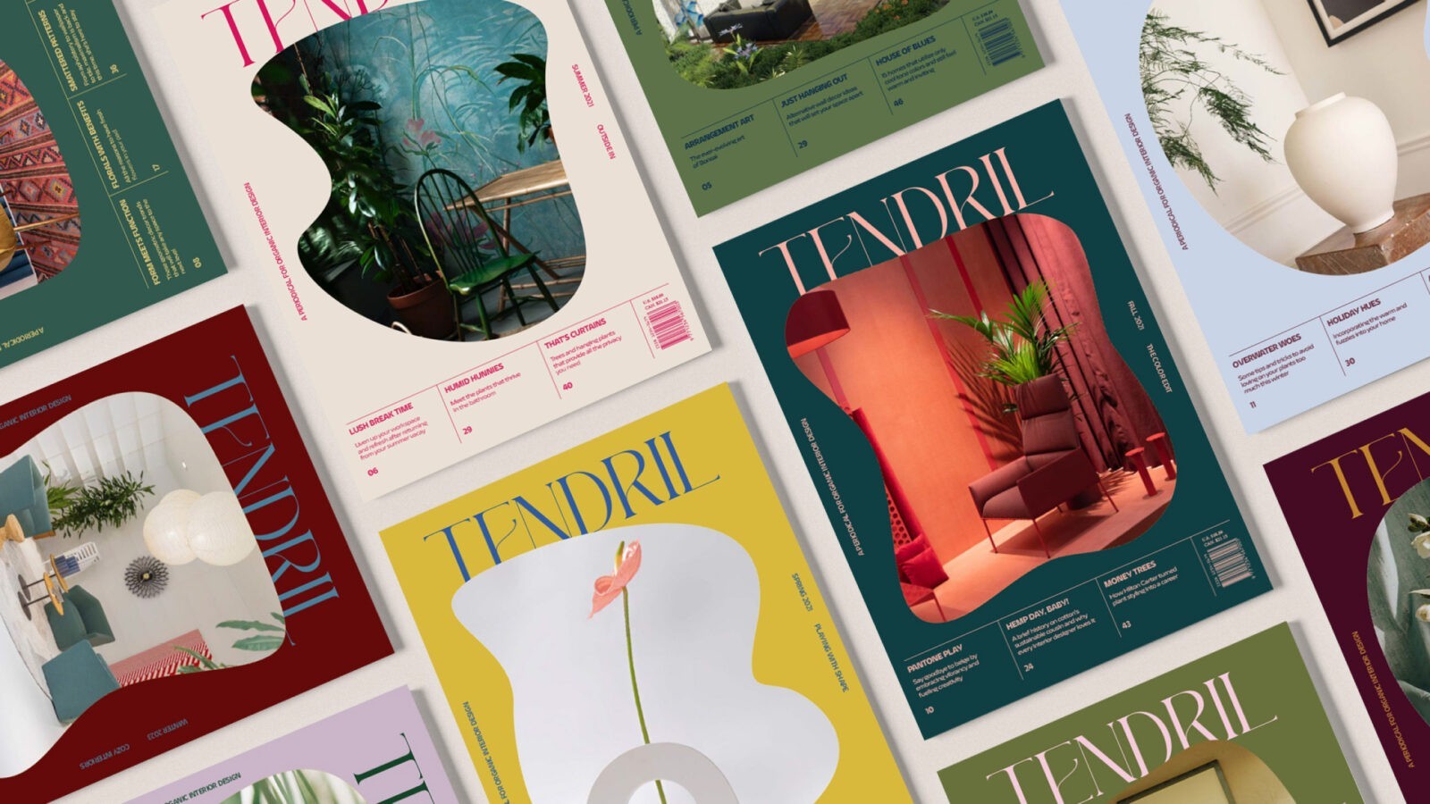
The design and branding of Tendril Magazine were carefully crafted to reflect its unique focus on the intersection of nature and interior decor. The Tendril logo is a key element of the brand, modified from a high-contrast font to convey an elegant presence while incorporating curvy details that mimic the organic forms of plants. This logo sets the tone for the magazine’s sophisticated yet approachable aesthetic.
Magazine covers are designed to be visually striking, featuring interior spaces masked into organic shapes. The color palette of each cover is carefully coordinated with the cover image, creating a harmonious and inviting look. A gridded footer element is also incorporated into the cover design, providing a flexible space to house various feature stories and other essential cover elements, ensuring that each issue maintains a cohesive and organized appearance.
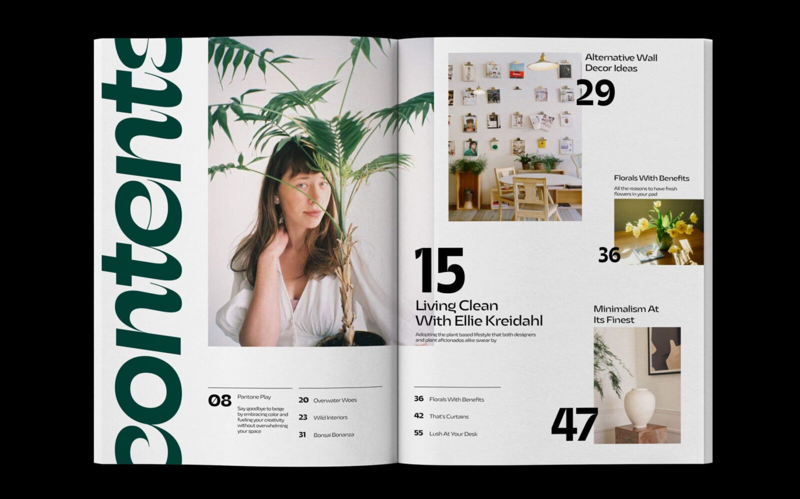
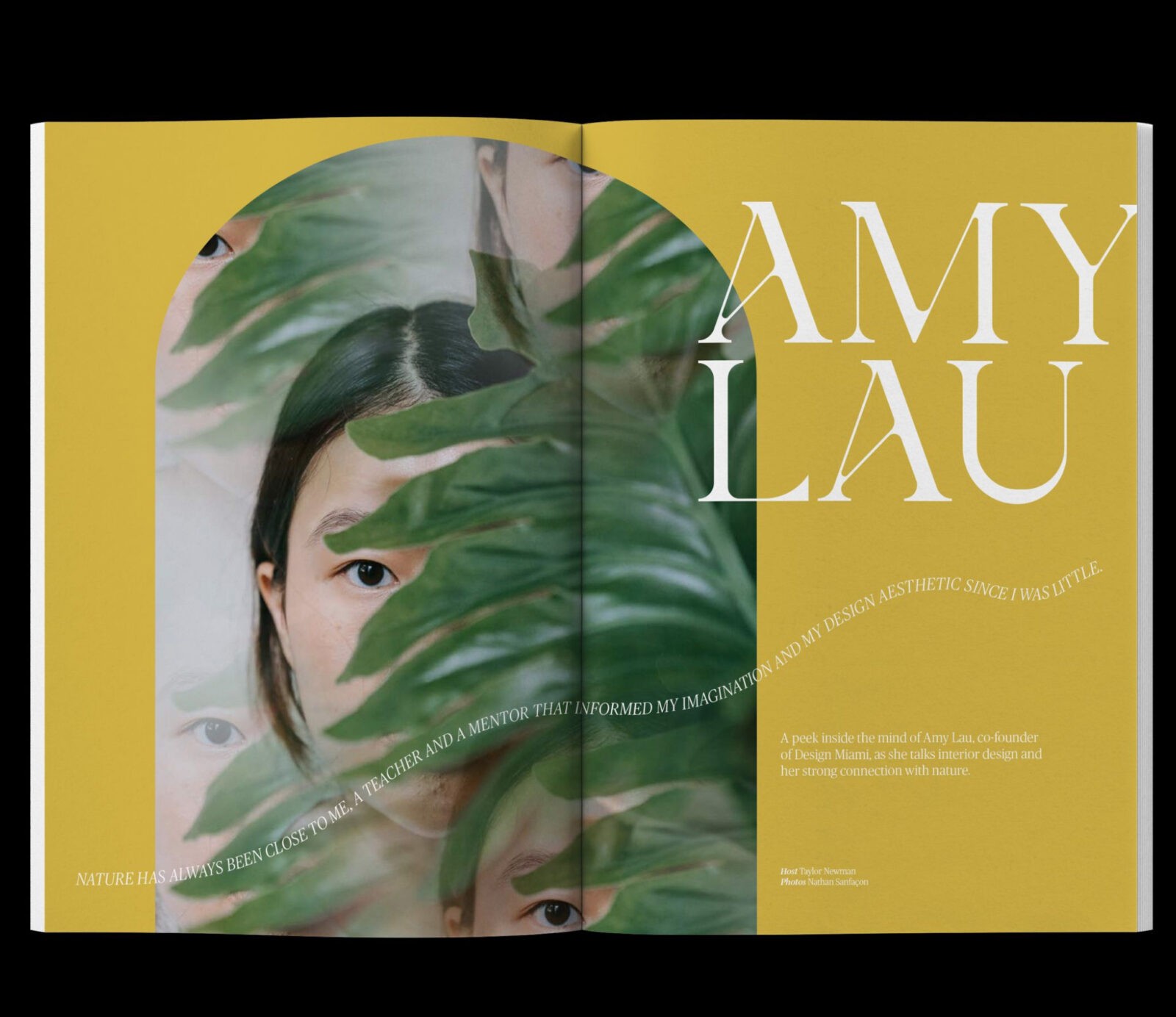
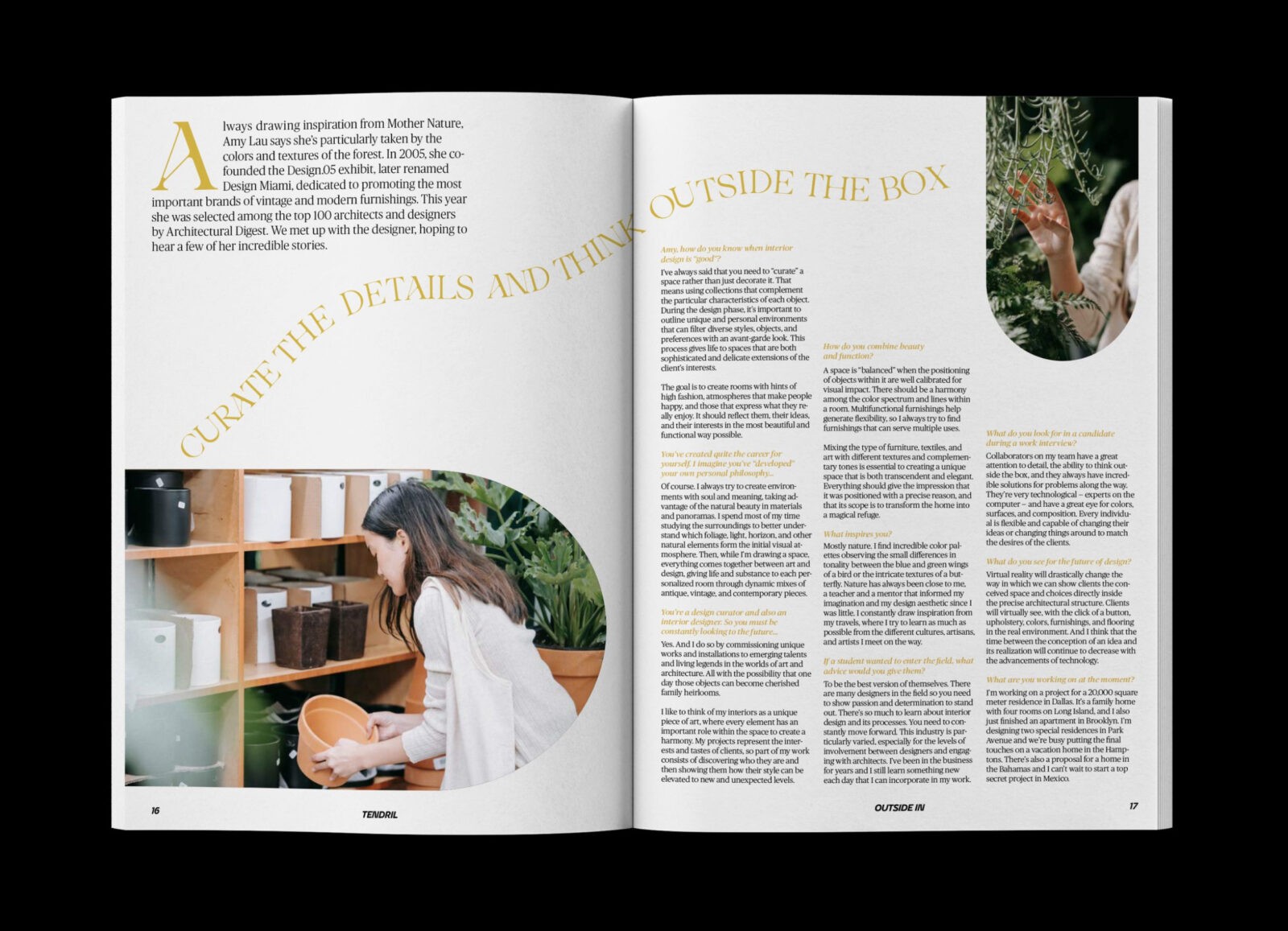
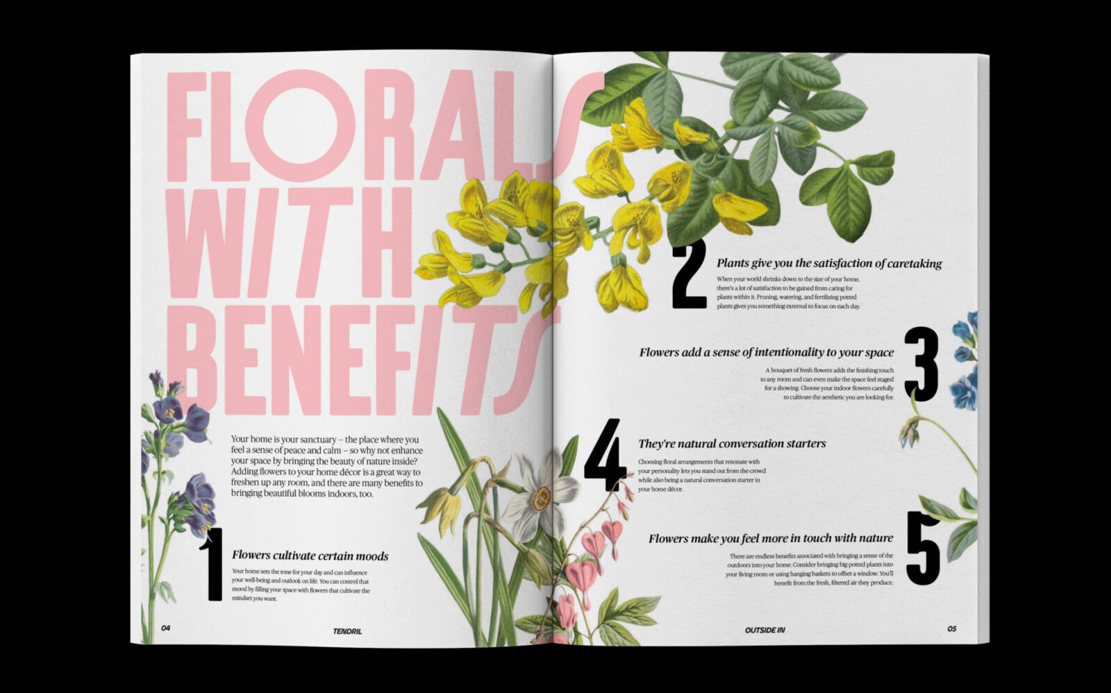
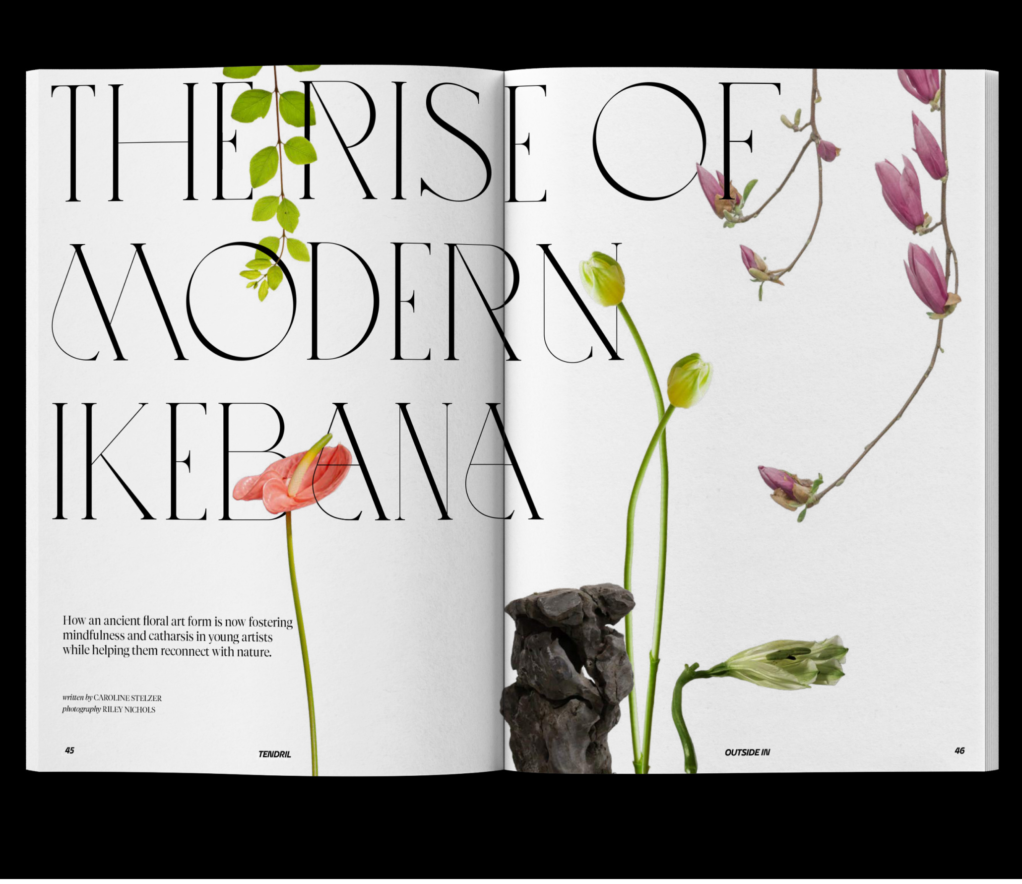
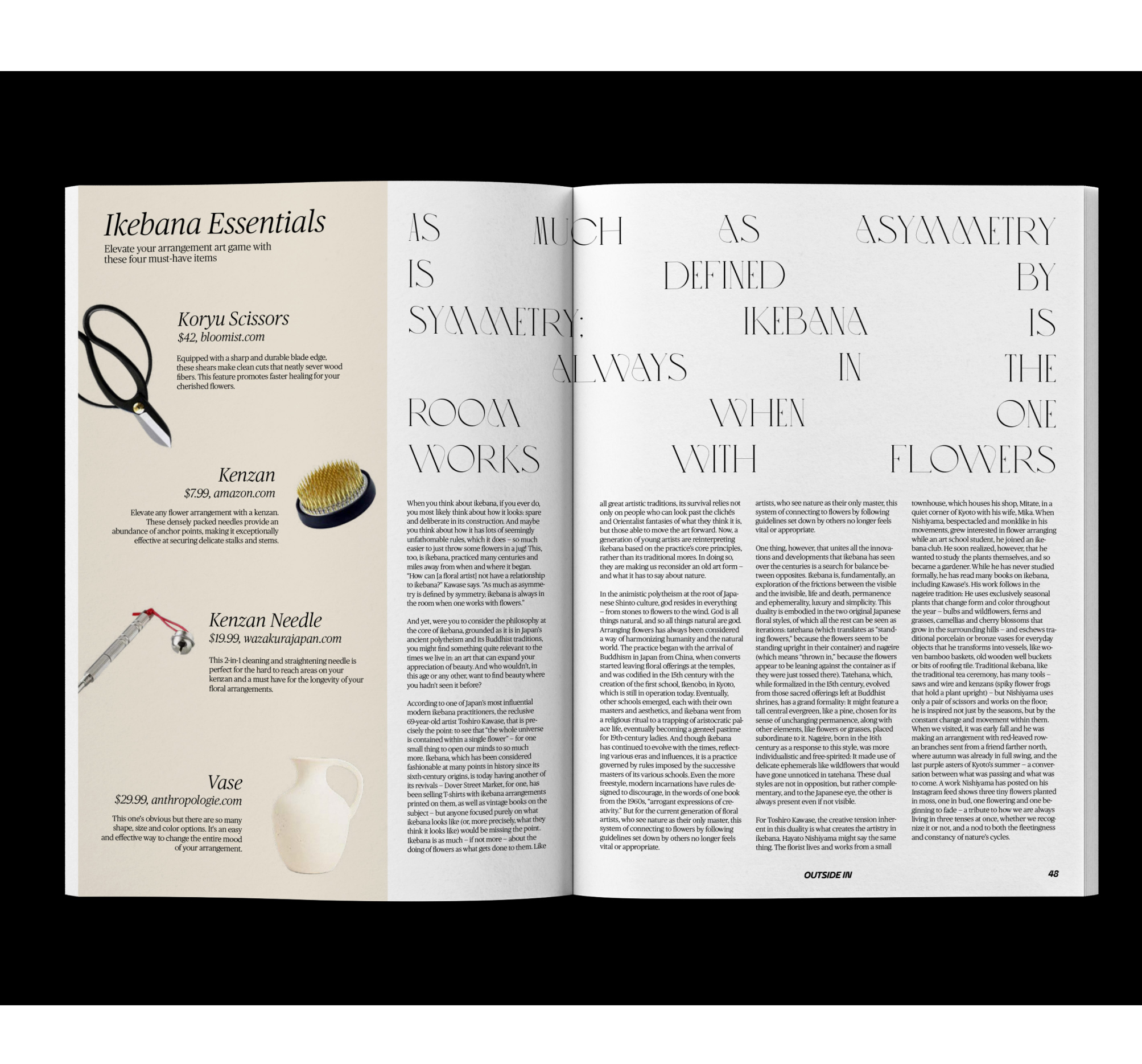
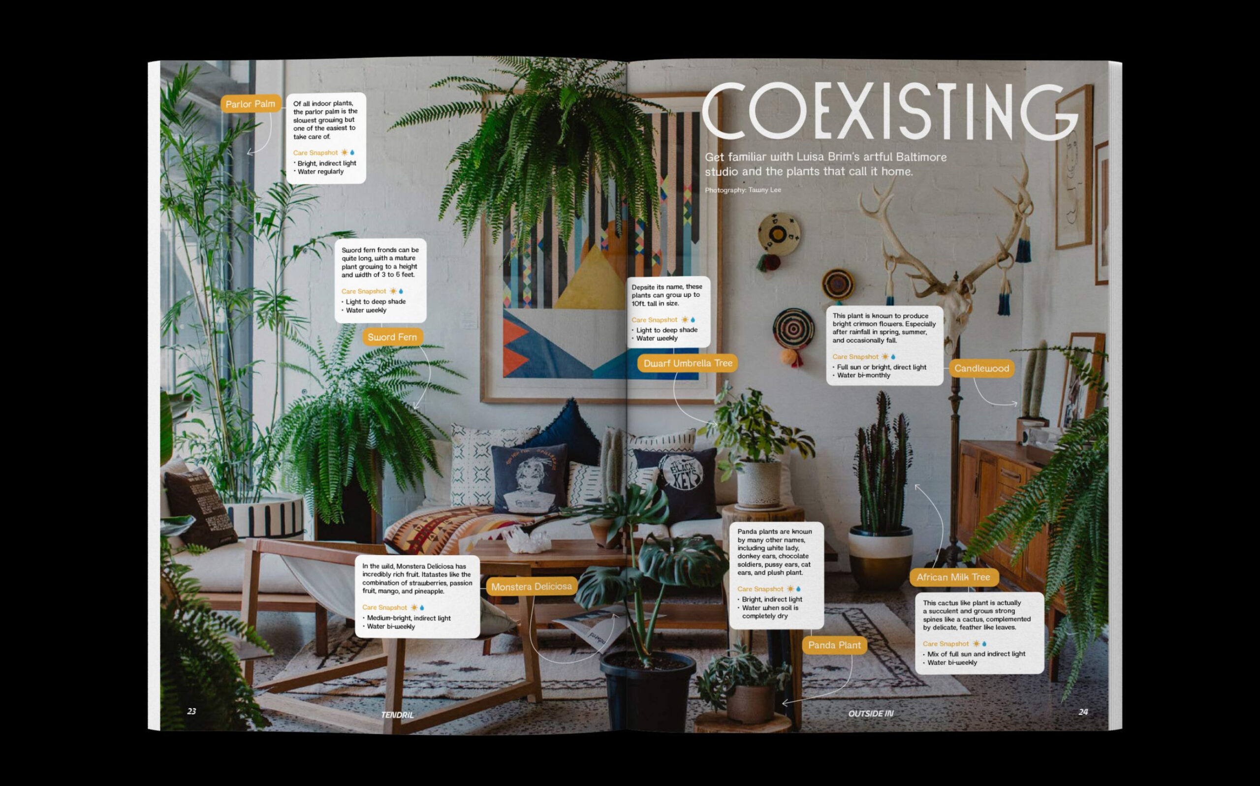
Inside the magazine, spreads make use of bold typographic contrast to create an engaging visual experience. Imagery and type are layered and woven together, providing delightful touches and special details that draw readers in. This approach enhances the magazine’s visual appeal and reinforces its thematic focus on the interplay between nature and design.
Feature stories within Tendril Magazine are designed to be highly varied in their layouts, allowing each story to adopt a personality of its own. This variety ensures that the magazine remains fresh and dynamic, with each article offering a new and unique perspective. The content of the articles is carefully balanced to provide both practical advice and inspirational ideas, making Tendril a valuable resource for anyone looking to integrate nature into their living spaces.

CREDIT
- Agency/Creative: Katie Wald
- Article Title: Katie Wald’s Graphic Design Student Concept for Tendril Magazine Celebrates Nature in Every Space
- Organisation/Entity: Student
- Project Status: Non Published
- Agency/Creative Country: United States of America
- Agency/Creative City: San Diego
- Project Deliverables: Graphic Design, Print Publication, Typography
- Industry: Mass Media
- Keywords: WBDS Student Design Awards 2024/25
- Keywords: WBDS Student Design Awards 2024/25
-
Credits:
Educational Institution: San Diego City College
Educator’s Name: Sean Bacon & Bradford Prairie


