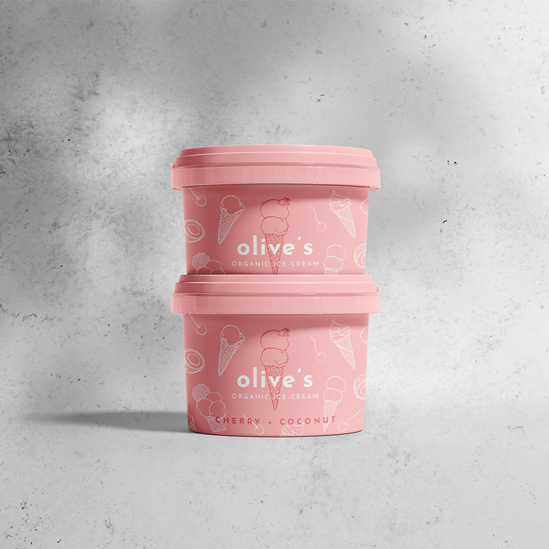
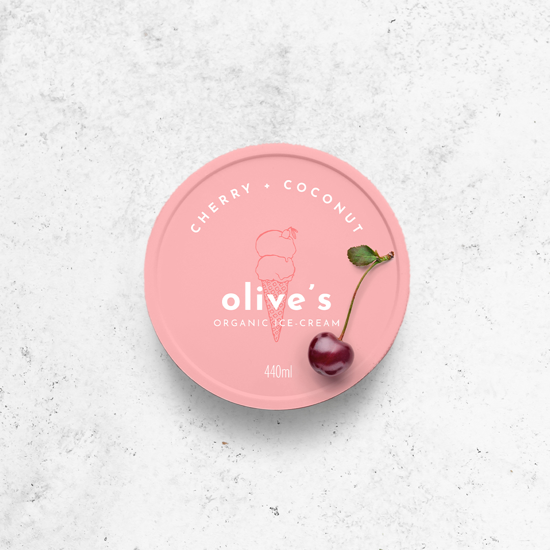
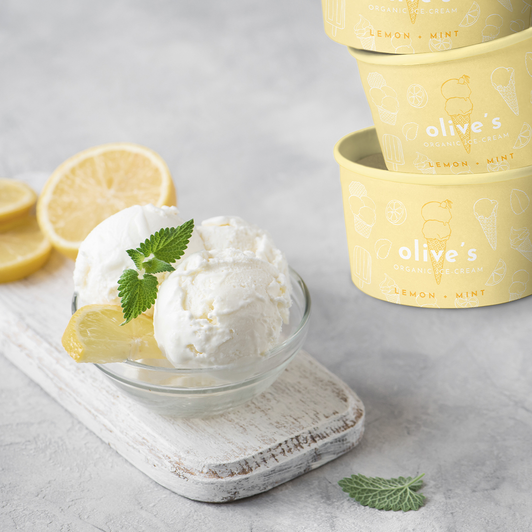
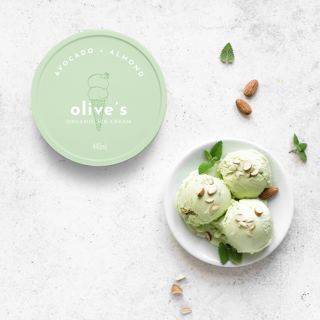
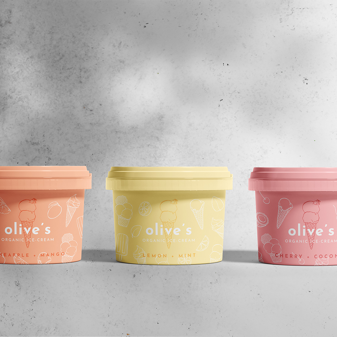
This brand identity and packaging design project for an organic ice-cream brand is an example of how a simple colour palette paired with minimalist line illustrations can be used to create an inviting, mouth-watering brand experience. Olive’s Organic Ice-Cream is a fun, modern brand working with delicious organic ingredients to create the most delightful treats. Their brand identity and packaging had to reflect the simple, natural, pure qualities of their products to let them speak for themselves, while still evoking the playful, vibrant vibe of the brand. This effect was achieved by pairing minimalist illustrations of yummy ice-cream with a rich pastel colour palette and an elegant sans serif font. The custom, hand-drawn line illustrations create a natural feel of the design and elevate it by adding a beautiful detail, while still keeping the modern, minimalist feel. It’s a simple, elegant, and delicious take on a brand identity for a brand that’s all about transforming beautiful organic ingredients into delightful ice-cream.

CREDIT
- Agency/Creative: Karolina Król Studio
- Article Title: Karolina Król Studio Brand Identity for a Playful Olive’s Organic Ice-Cream
- Organisation/Entity: Freelance, Non Published Concept Design
- Project Type: Packaging
- Agency/Creative Country: Poland
- Market Region: Europe
- Project Deliverables: Brand Creation, Brand Identity, Brand Naming, Brand World, Branding, Graphic Design, Illustration, Packaging Design, Product Architecture, Product Naming, Research
- Format: Pot
- Substrate: Plastic


