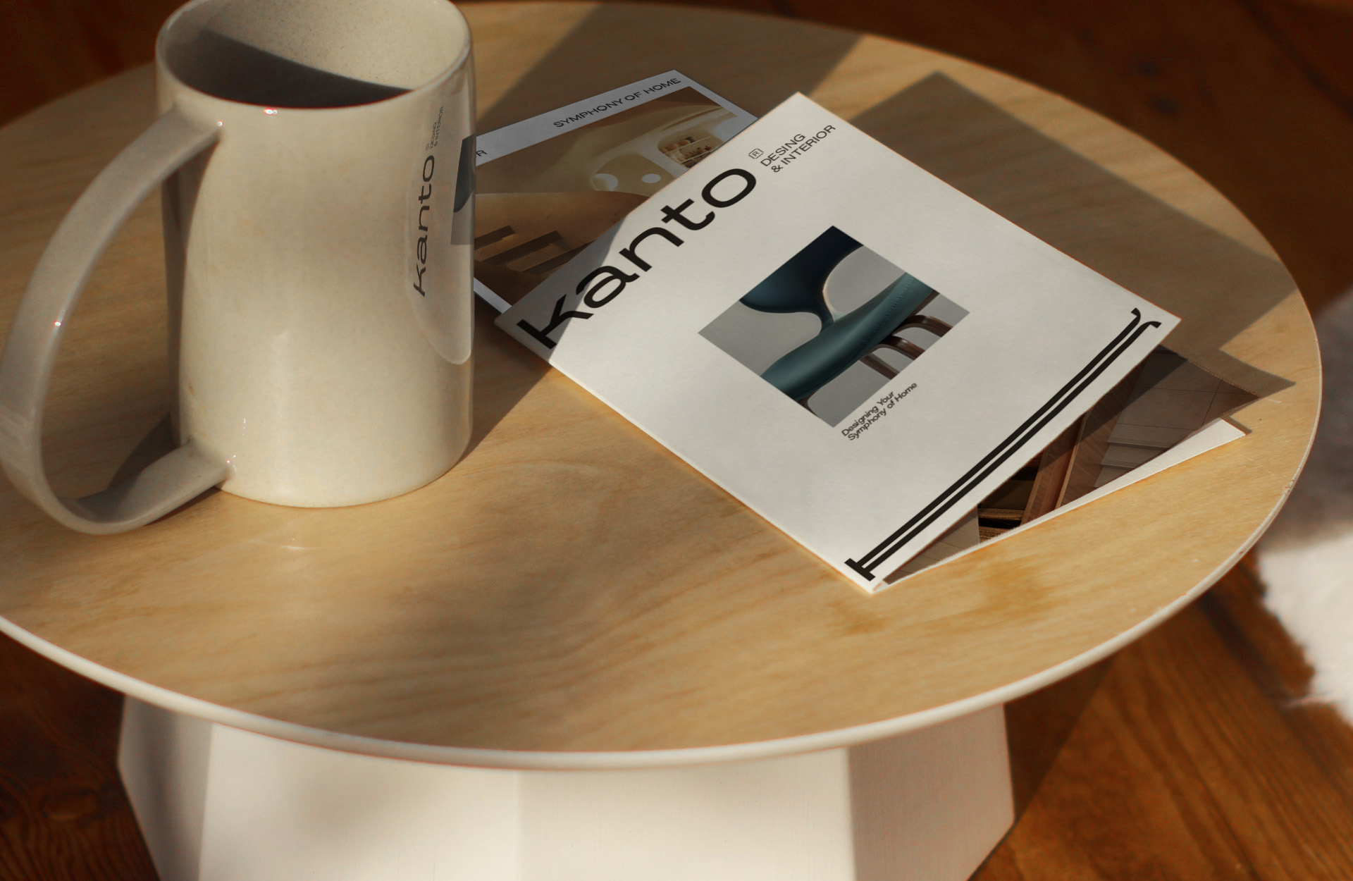
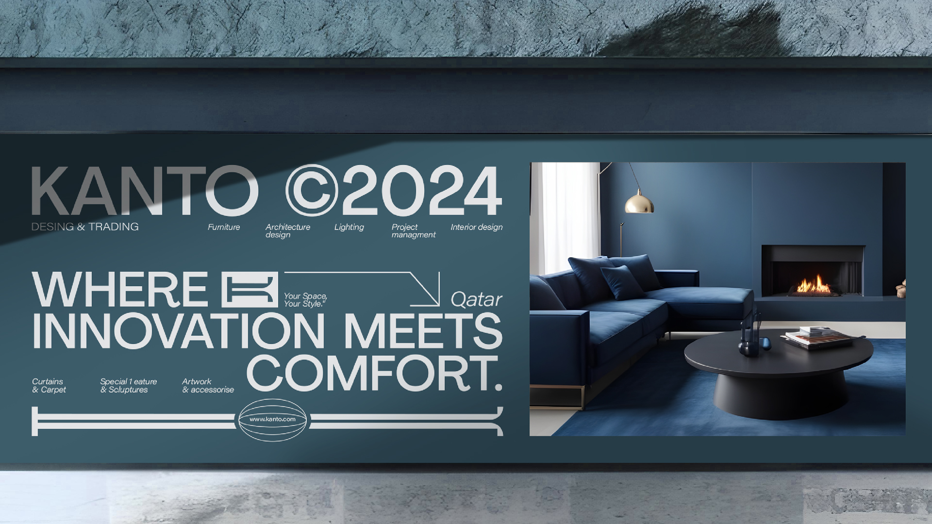
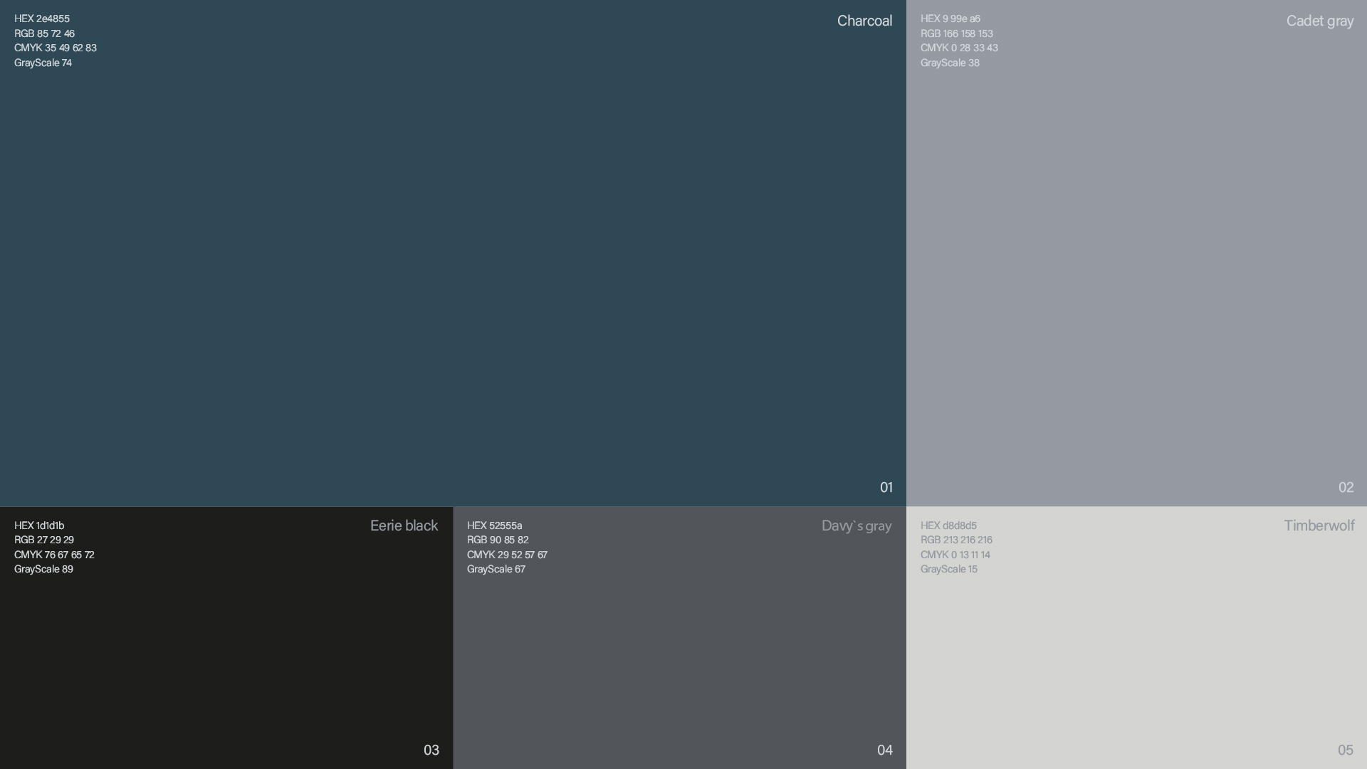
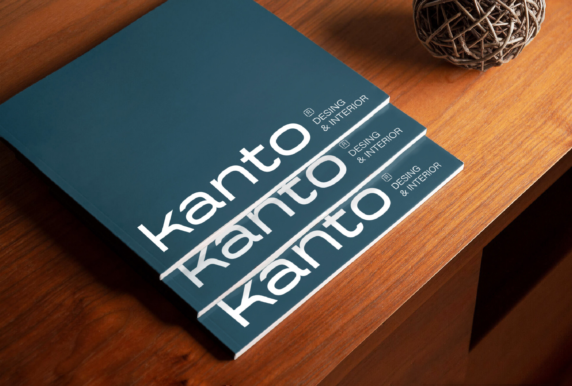
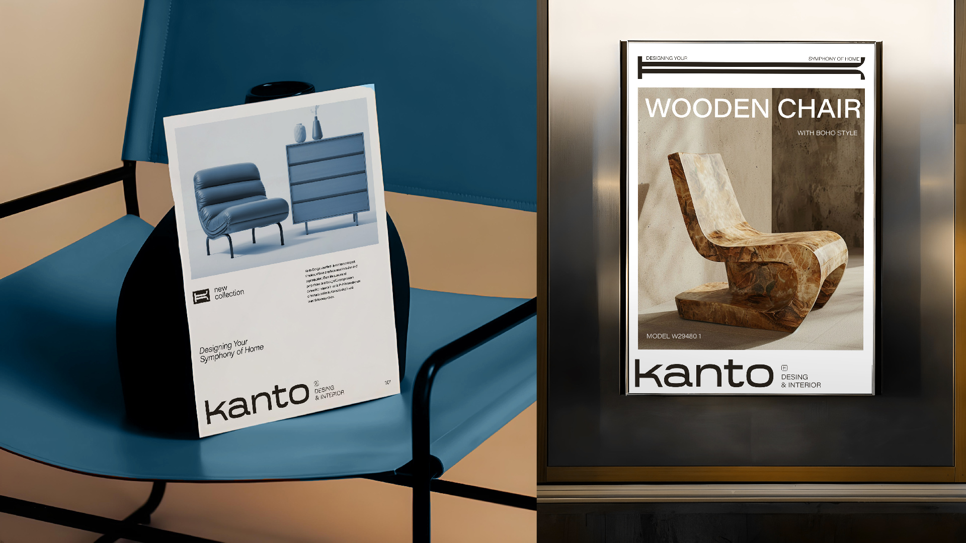
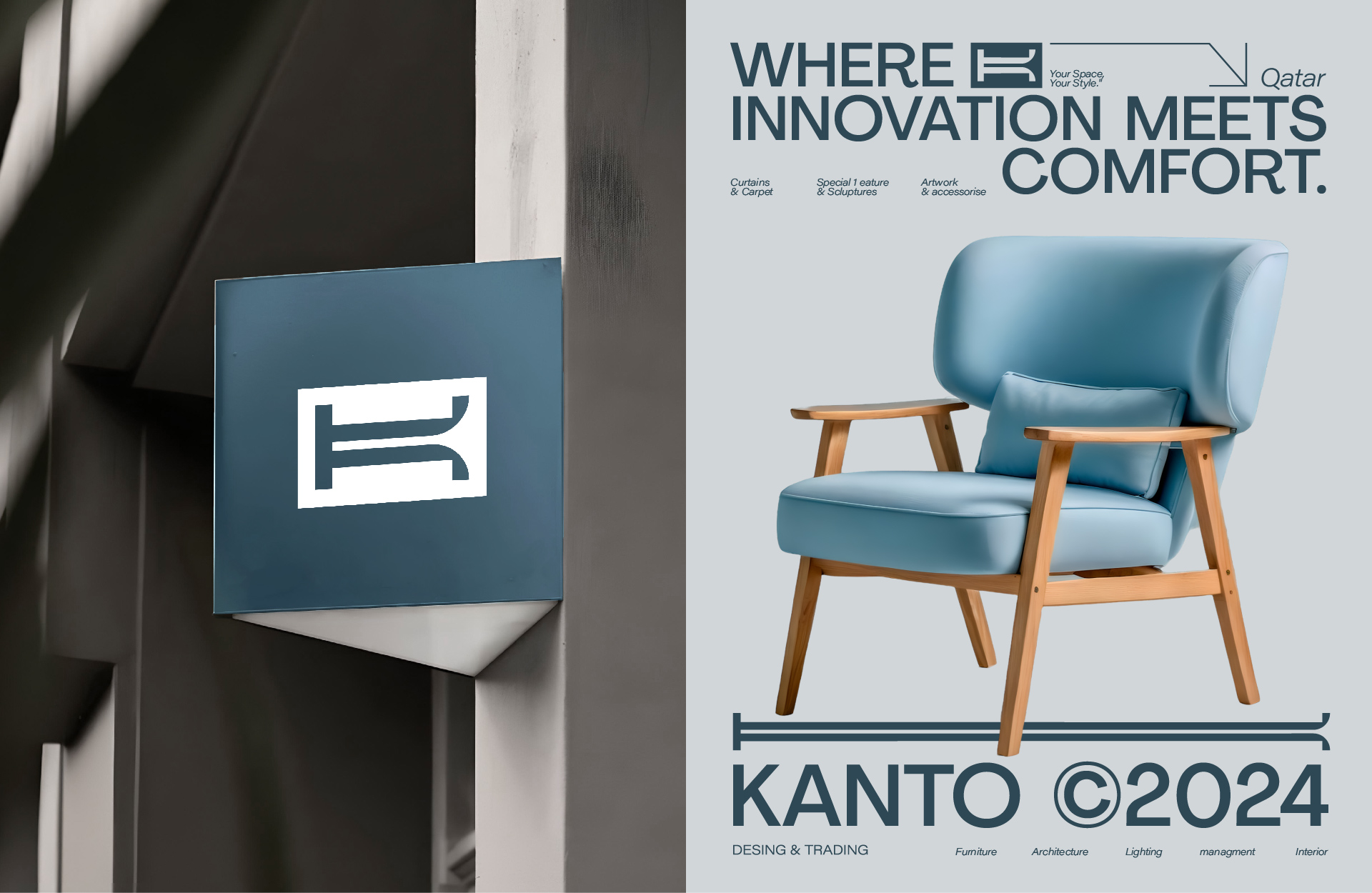
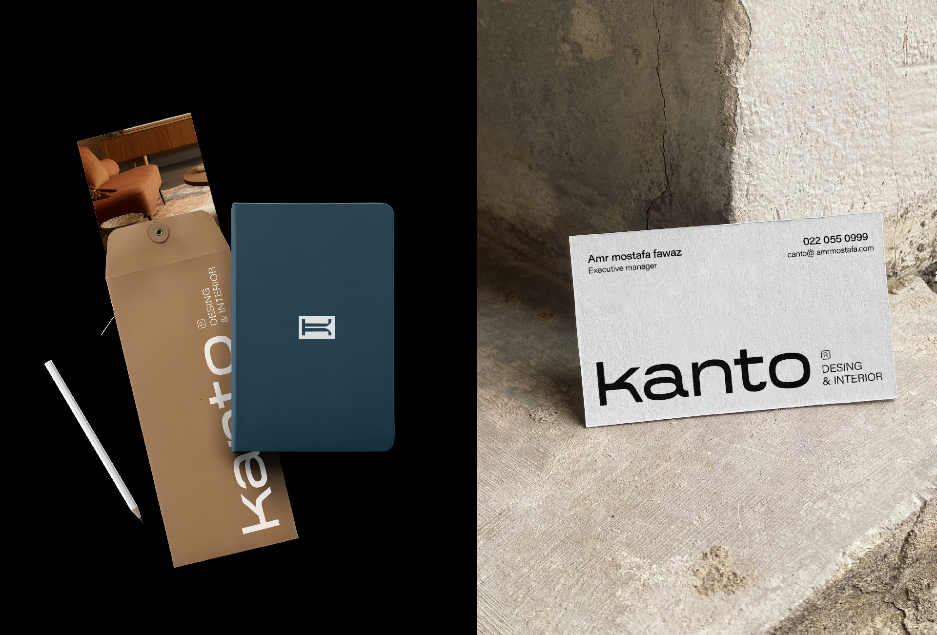
Kanto is a design studio whose brand identity draws inspiration from the Spanish word “canto,” meaning “song.” This choice symbolizes the rhythm, flow, and harmony that permeates every design Kanto creates. Just as a song resonates through its melody and structure, Kanto’s approach to design emphasizes a seamless balance between creativity and precision. By blending music’s fluidity with a modern, minimalist aesthetic, the studio crafts designs that feel alive with energy, yet refined and timeless. The color palette centers on Dark Slate Gray, a deep, sophisticated hue that complements the clean lines and uncluttered nature of the studio’s work. This color evokes a sense of elegance and modernity, while remaining versatile enough to adapt to a variety of design contexts. Dark Slate Gray is not just a color, but a reflection of Kanto’s core principles: simplicity, sophistication, and understated beauty. Every design is approached with a rhythmic precision, ensuring that all elements come together in perfect harmony. Kanto’s philosophy emphasizes functionality as much as form, with each project reflecting a forward-thinking mindset and an eye for innovation. The studio embraces cutting-edge technologies and design trends, combining them with a timeless sense of style that avoids unnecessary complexity. The result is work that is visually striking yet simple, bold yet subtle, and always purpose-driven. Kanto’s designs are not only aesthetically pleasing but also crafted to meet the needs of a constantly evolving world, making them as relevant today as they will be in the future.
CREDIT
- Agency/Creative: amrelarbi&mustafa karim
- Article Title: Kanto Design Studio Modern and Minimalistic Brand Identity
- Organisation/Entity: Freelance
- Project Type: Identity
- Project Status: Published
- Agency/Creative Country: Qatar
- Agency/Creative City: kanto
- Market Region: Middle East
- Project Deliverables: Brand Architecture, Brand Design, Brand Identity, Logo Design, Type Design, Typography
- Industry: Real Estate
- Keywords: branding - brand identity - logo type - packaging
-
Credits:
Senior Graphic Designer: amrelarbi


