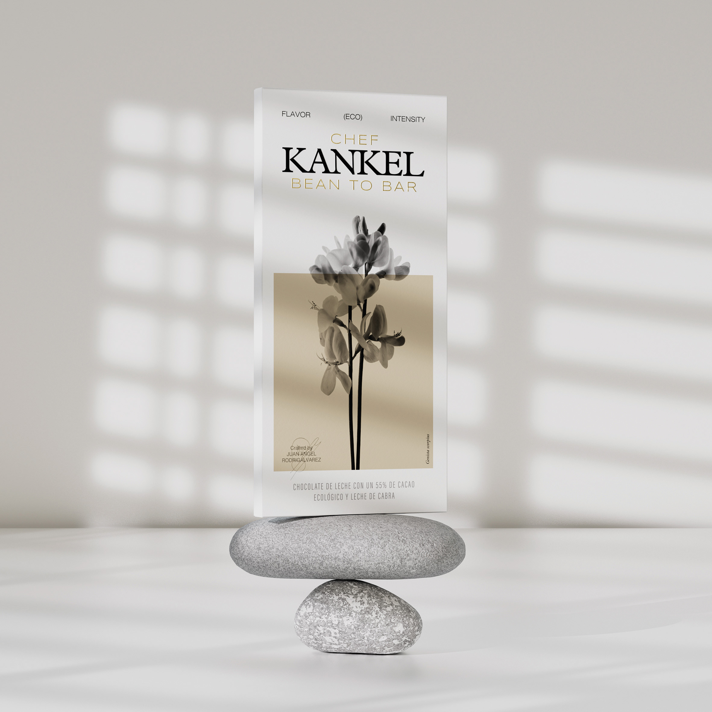
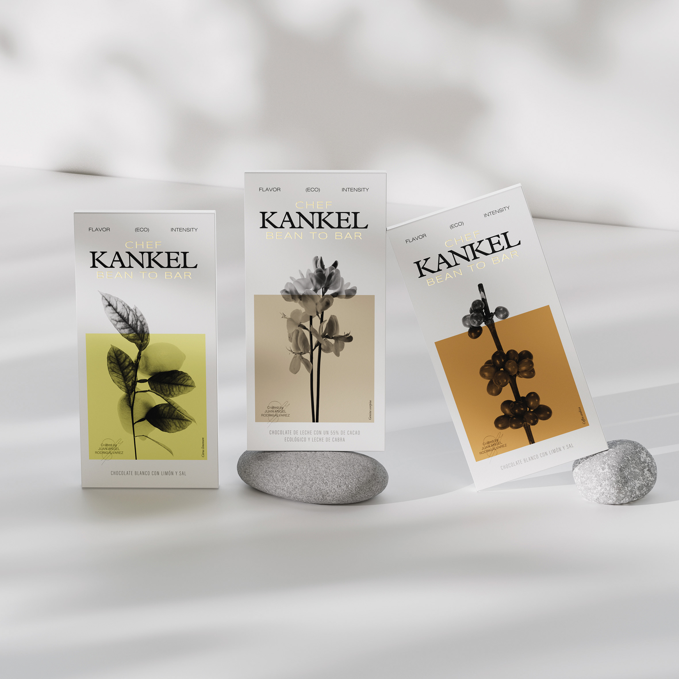
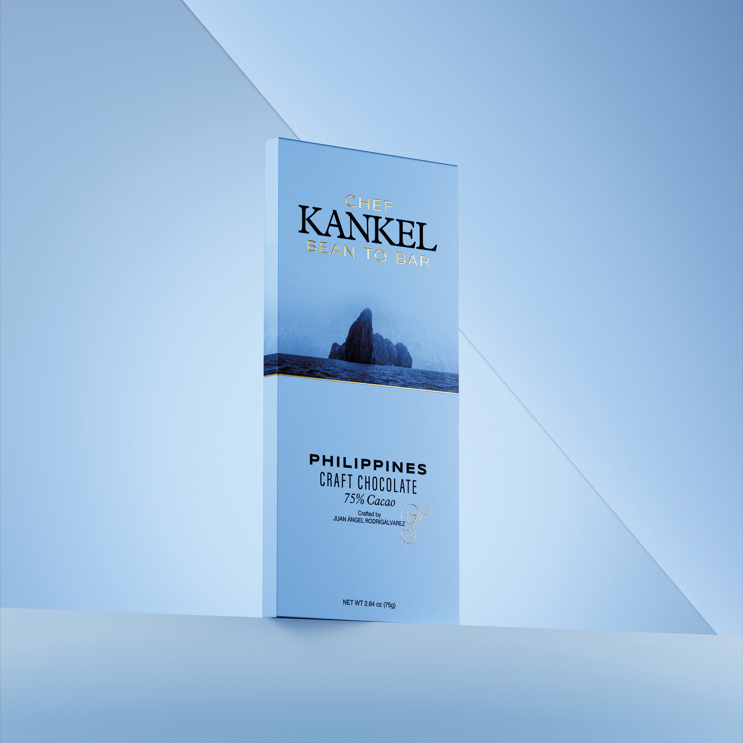
Kankel Cacao has once again entrusted us with the task of creating a new packaging for its Bean-to-Bar, in this case a packaging which focuses on the imaginary of the countries of origin and seeks to transport us to the most primal sensations of the different origins.
We capitalise on the imagery which each country generates so that each of the bars reflects the full intensity of its origin. The most primary territory represented with rawness and naturalness. An attractive purity which leads us to seek out and explore each of the new varieties it offers.
A strip divides the most emotional part from the rational part, with each bar encasing knowledge and wisdom, training and art, combined with the precision and mastery of the Cacao Chef: Juan Ángel Rodrigálvarez, who endorses each of these creations.
Objectives
To appropriate the imaginary from each country of origin, thereby making the consumer experience more complete and rounded. To launch a new product range which is more clearly understood and decoded on the mass-market shelf.
To highlight the proposal, through messages and the lay-out, from a more rational
point of view which better represent the territory, the process, and the origin.
Proposal
We explore an imaginary country which transports us to the root and origin of each of the bean-to-bars which Juan Angel offers under the Kankel Cacao brand. We draw attention to the nature and rich authenticity of the territory as a way of connecting origin-process-consumer-consumption.
A different way for consumers to interpret what they are going to consume. A rich plethora of flavours and nuances which are evident in the configuration of the bar itself.
We do not lose sight of the fact that the packaging has a didactic role to play in educating the consumer about a product as unknown as the bean-to-bar, so we reflect synthetically on how it has been developed and the processes it has undergone to become the bar they hold in their hands.
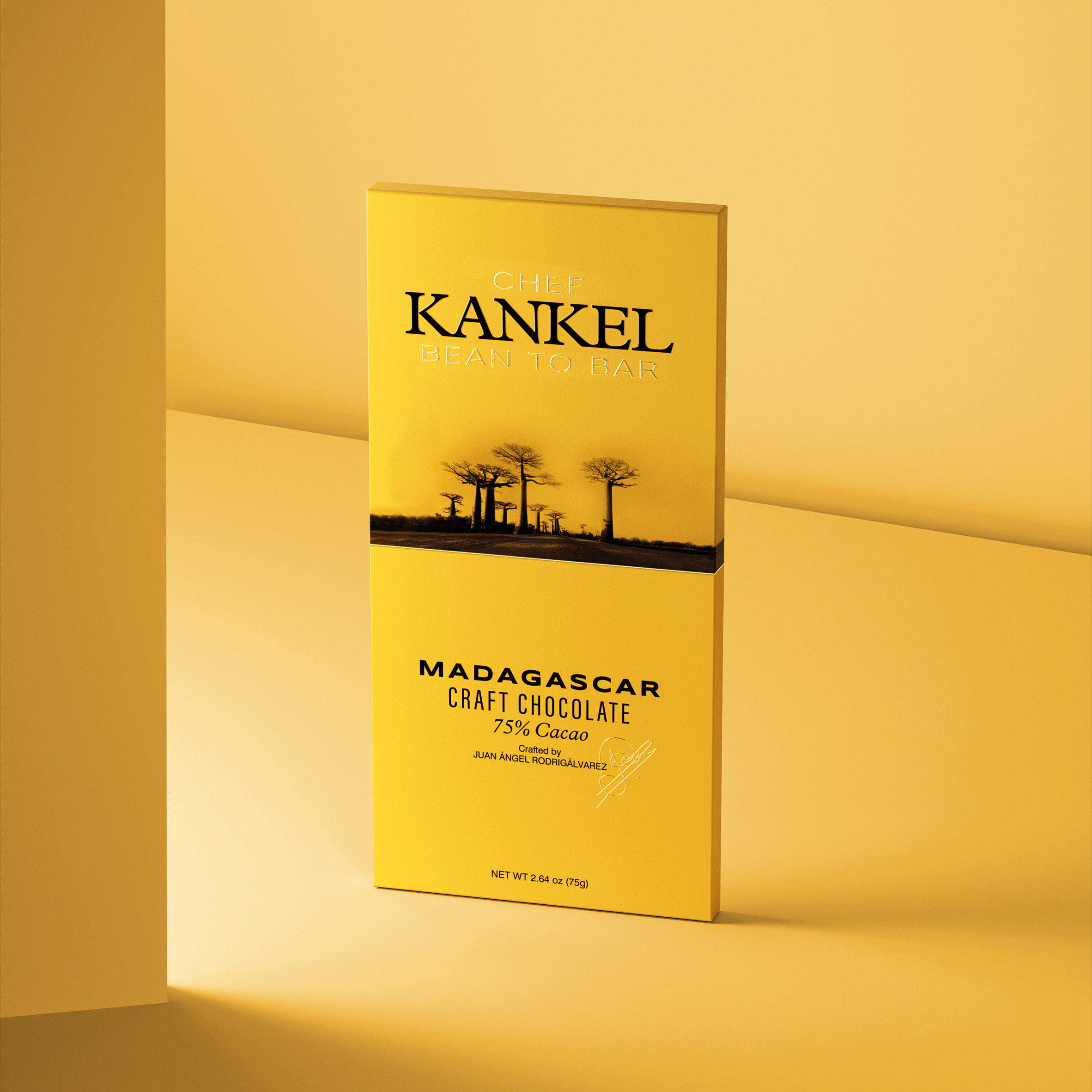
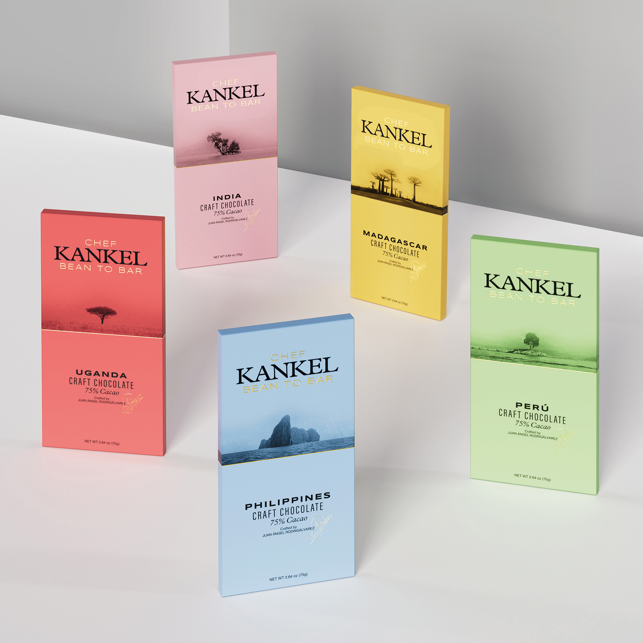
To identify each of the countries, we assigned each of them a colour, to distinguish and differentiate each of the varieties, while at the same time helping to lock the origin each consumer likes in their memories. A challenge which encourages the value of memory in repeat purchases.
Graphic Solution
A layout which uses language to divide the front into two spaces: an entirely visual, emotional space representing the untamed and captivating nature of each country, and another more rational space in which the renowned expert Kankel Chef describes how this bean-to-bar is a visual metaphor of art and technique, the emotional and the rational reflected in just a few square centimetres.
The rest of the elements underpin this way of hierarchising information and lend the whole range a structure which serves as the constructive mortar of how product architecture works. An exercise in organisation and synthesis which contributes to the consumer’s decision.
Production
With the unwavering commitment to make the packaging as premium as possible, we use materials clearly inspired by nature: textures, composition, sensations… This ensures the consumer experience reinforces the commitment to authenticity. A material which has barely been treated, raw and unadorned, and whose beauty lies in the spontaneity and simplicity of its resolution.
Social Media
Kankel Cacao presents us with a new challenge: to take the consumer back to the origin which lies behind each bean-to-bar they produce, with a different approach and from a different angle. Appropriating the imaginary of each country to create a visual metaphor which transports us, with each piece, to a delightful, uncharted world of taste and pleasure.
CREDIT
- Agency/Creative: TSMGO
- Article Title: Kankel Cacao Packaging Design – Taking Us Back to the Origins
- Organisation/Entity: Agency
- Project Type: Product
- Project Status: Published
- Agency/Creative Country: Spain
- Agency/Creative City: Logroño
- Market Region: Europe
- Project Deliverables: Brand Design, Branding, Food Photography, Packaging Design
- Industry: Food/Beverage
- Keywords: Packaging, branding, food, chocolate, cacao, origins
-
Credits:
Agency: TSMGO


