


Kanikurgan is a modern logistics terminal in the Russian Far East located 30 km from Blagoveshensk on the border with China. Terminal’s location allows to shorten the route inside Russia by 1500 km compared to the nearest train stations in Vladivostok and Ussuriysk without adding extra distance in China. Besides providing logistics support for China and Russia, it works as customs and provides several convenient services. The client commissioned us for a complete rebranding: from logo to website.
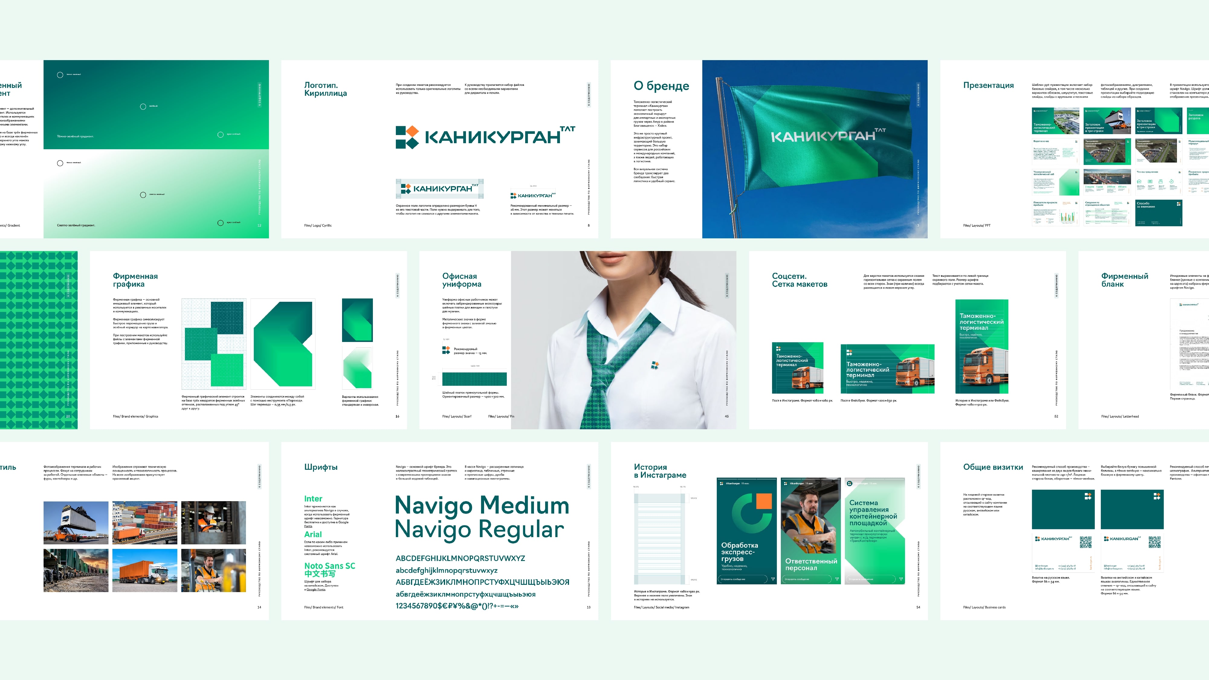
The company’s specific (customs and logistics) and the terminal’s location got us thinking about the green corridor that allowed to move freely between borders. Then we figured that the main graphic element should be a rectangle with a skewed side that looked really dynamic. The angularity of graphics was inspired by the shapes of freight containers and docks.
The same element became the base for the main graphic concept: we just pulled it aside to create more volume and movement. All icons were also cut at 45 degrees, similar shapes were used in the pattern and font. The pattern could only be used locally: on branded tape and scarves of the office staff.
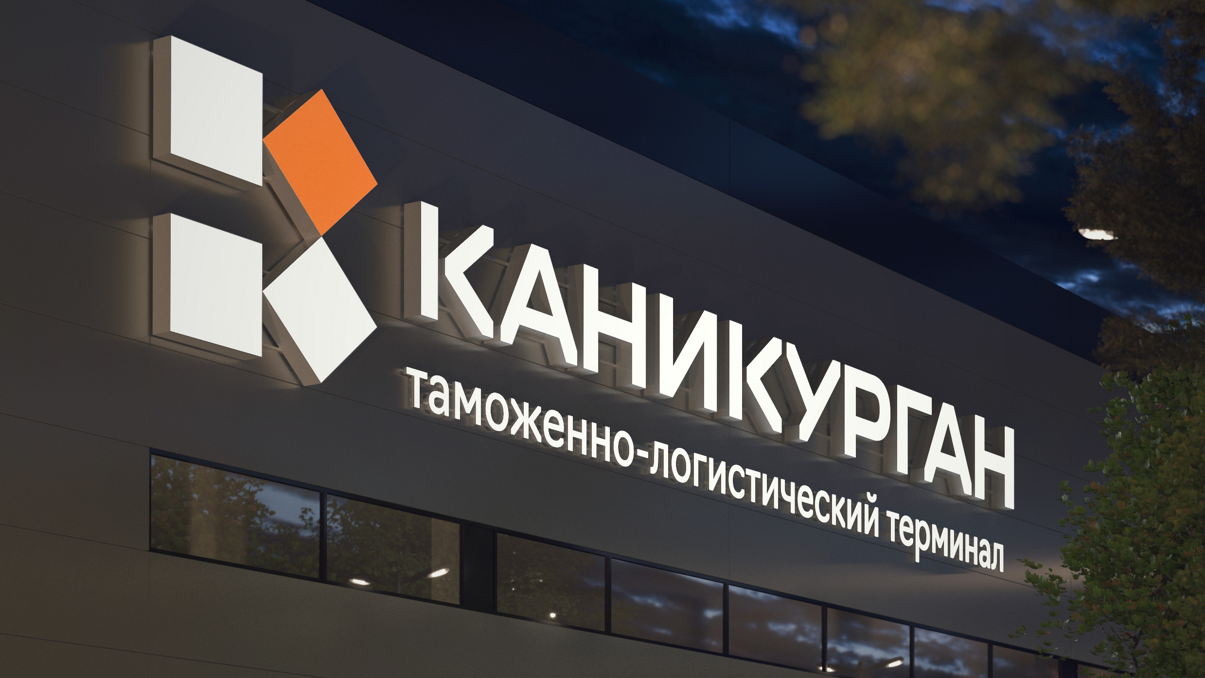
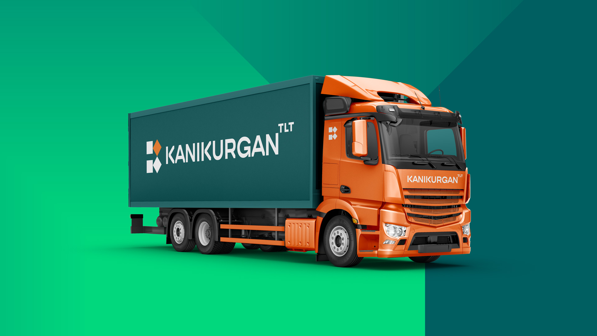
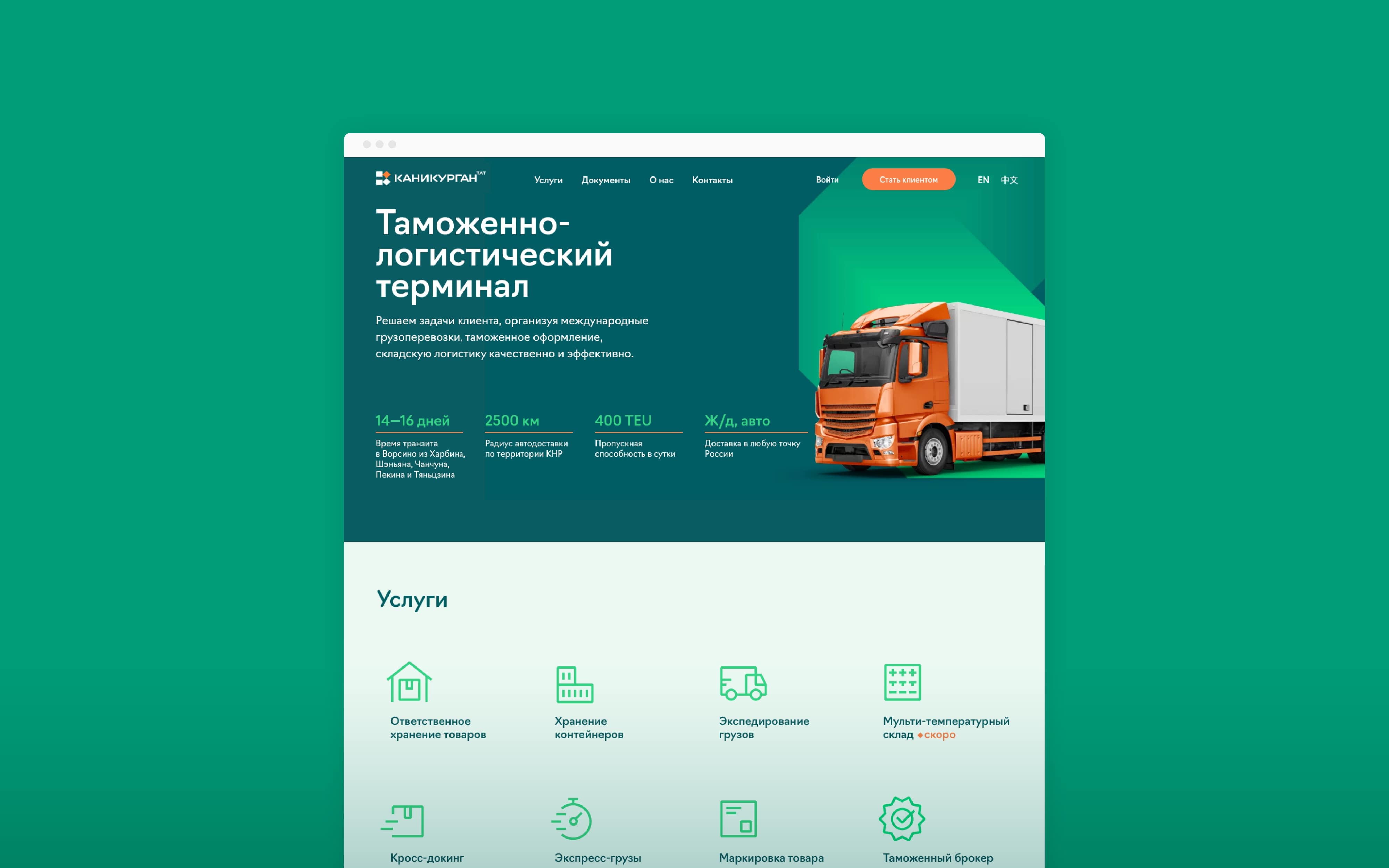
The logo was comprised of 4 squares symbolizing freight containers and an arrow showing the logistics profile of the company. The logo came out quite traditional for the logistics sphere but bold for the customs sphere that usually copied the reserved governmental image.
We chose traditional customs colours, however, the combination of light and dark green helped us add a hint of IT company image.
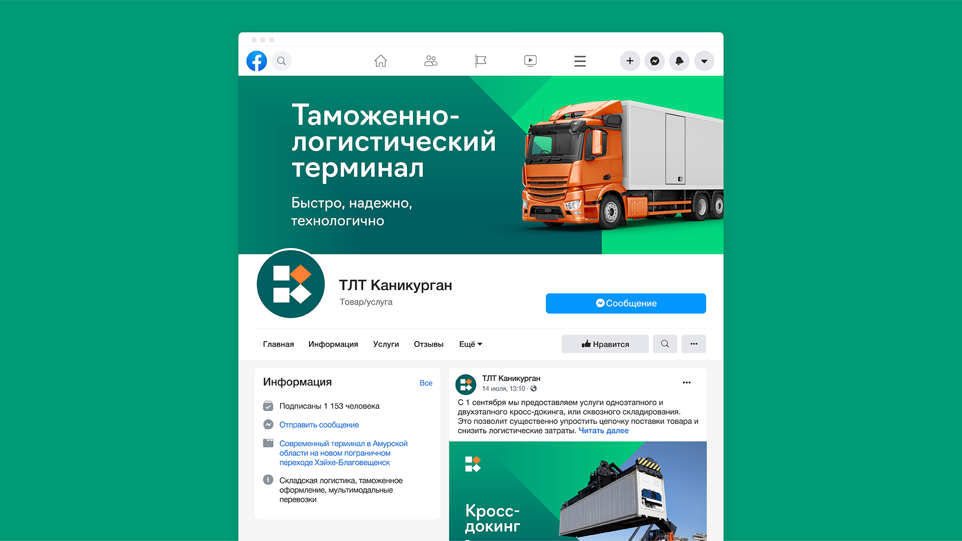
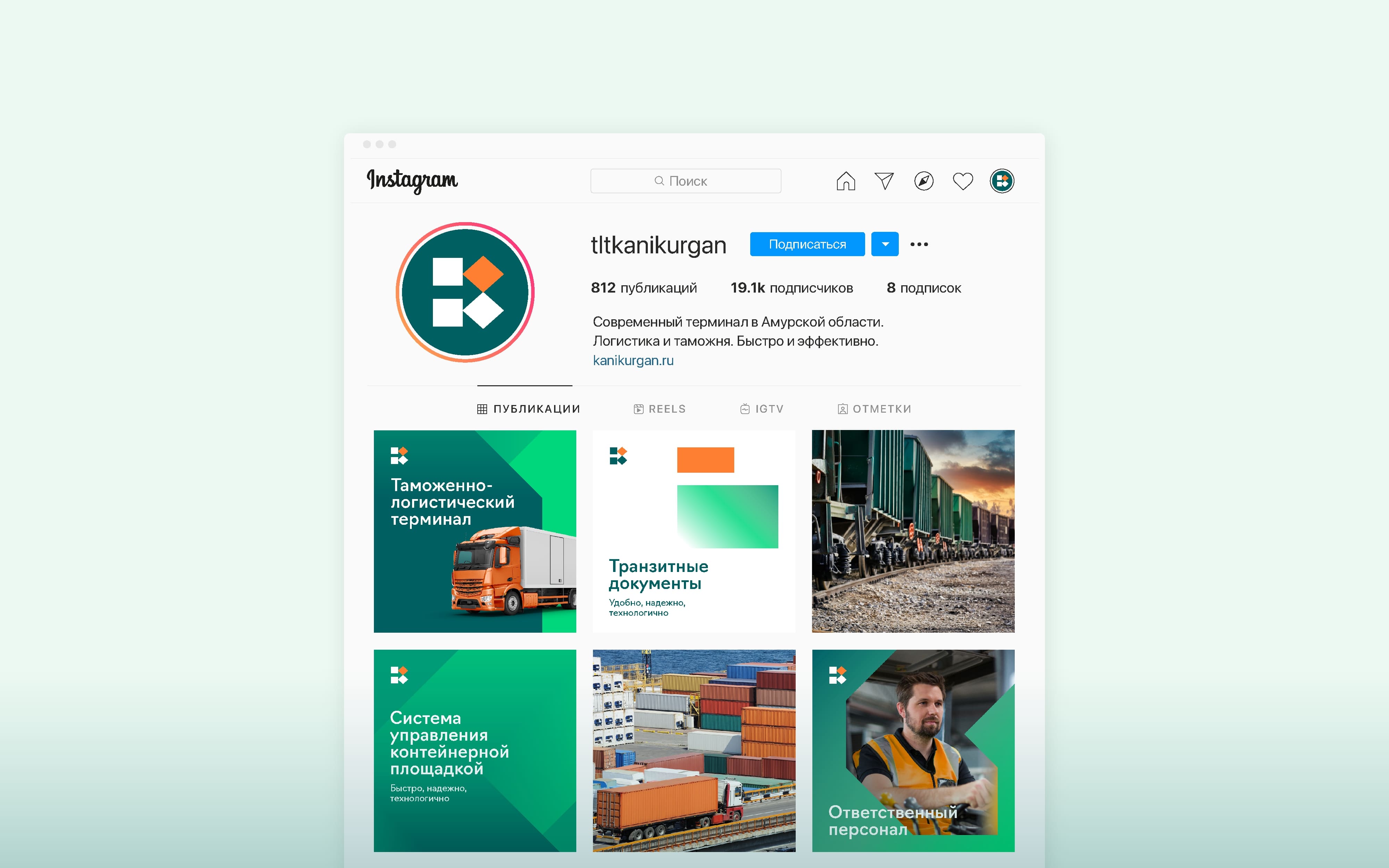
For convenience we introduced 2 types of icons: service icons (for wayfinding and website) and image icons (abstract and emotional, used for presentations and advertising). For the photostyle we recommended using green and orange colours and feature staff at work.
We also provided variations of brand graphics for dark and light backgrounds. They could be combined with the main graphic element showing it individually or used as a container for photos and illustrations.
Interesting detail: all printed media were adapted for Russian, English and Chinese markets, however, we only put large QR-codes on business cards for Chinese market as it was very common there and allowed to save contact details directly into the smartphone.
The staff uniform turned out brutal but stylish. The logo on the sleeve of the jacket became large and reflective, so that staff could be visible inside the docks.
The wayfinding system we created was also based on the main graphic element, but it did not look boring. We offered a simple and relevantly cheap solution that would support the new style.
The sign on the facade came out quite traditional in terms of graphics but innovative when it came to the solution: it looked dark green in daylight and white at night. That could be achieved using perforation.
The last stage of the project was about creating an informative website that the client has been using ever since.

CREDIT
- Agency/Creative: Plenum
- Article Title: Kanikurgan Customs and Logistics Terminal Branding
- Organisation/Entity: Agency
- Project Type: Identity
- Project Status: Published
- Agency/Creative Country: Russia
- Agency/Creative City: Moscow
- Market Region: Europe
- Project Deliverables: 3D Modelling, Architecture Concept, Brand Identity, Branding, Identity System, Typography, User Experience, Visualisation, Web Design
- Industry: Transport
- Keywords: Logistics, Customs, Transportation, Brand Identity, Way Finding, Website
-
Credits:
Producer: Alyona Naumova
Creative Director: Egor Myznik
Art Director: Mikhail Ivanov
Designer: Irina Purtova
Designer: Evgeniya Khludentsova
Architect: Nikita Boldyrev
Head of Marketing, Kanikurgan: Natalia Kazarina


