


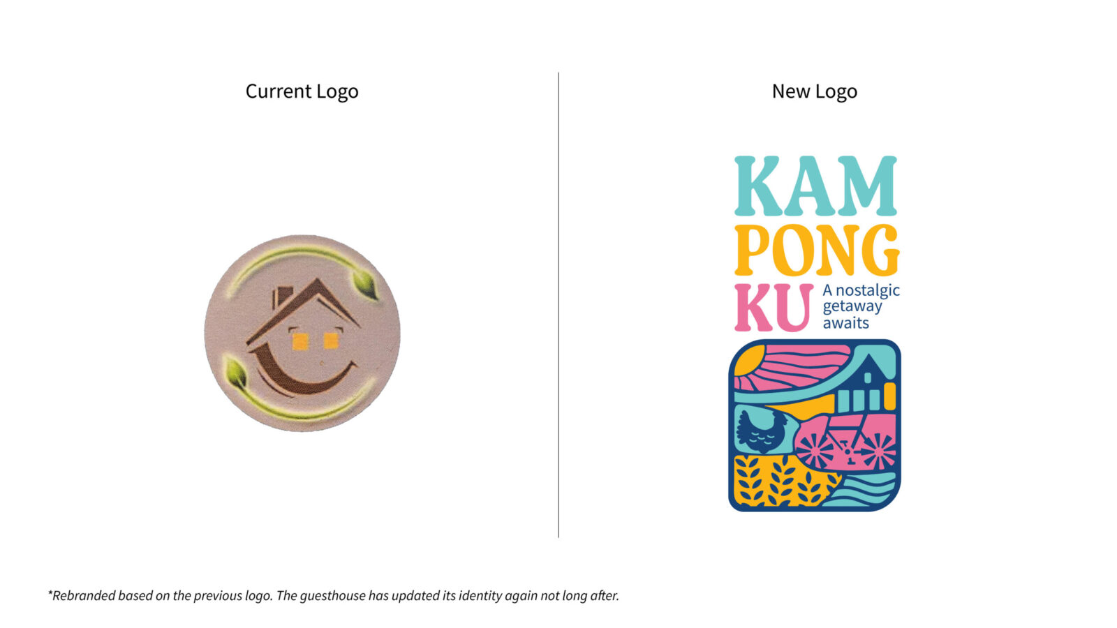
Originally known as Audi Guest House, this guest house in Balik Pulau, Penang, Malaysia, had long relied on its bicycle rental service to attract passersby. However, with an outdated logo, minimal digital presence, and a brand identity that failed to resonate with today’s audience, it struggled to stand out. I saw the potential to breathe new life into the space, not just visually but experientially.
The idea of Kampongku, which means My Traditional Village, came from a deeper reflection. Many young people today, like myself, never got to experience true kampung (traditional village) life. We hear about it through our parents’ stories of their carefree days, the warmth of the community, and the beauty in simplicity. That nostalgia became my foundation. In a time when the island is rapidly modernising, I wanted to create a brand that offers balance, a place where people can take a break from the city and reconnect with their roots.
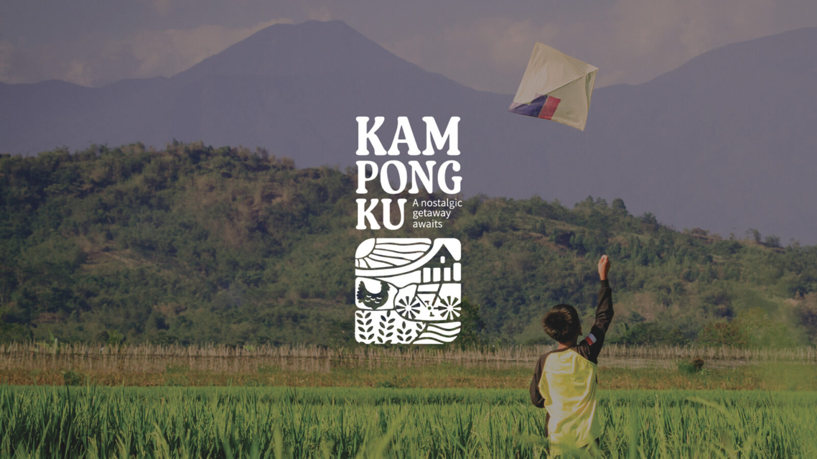
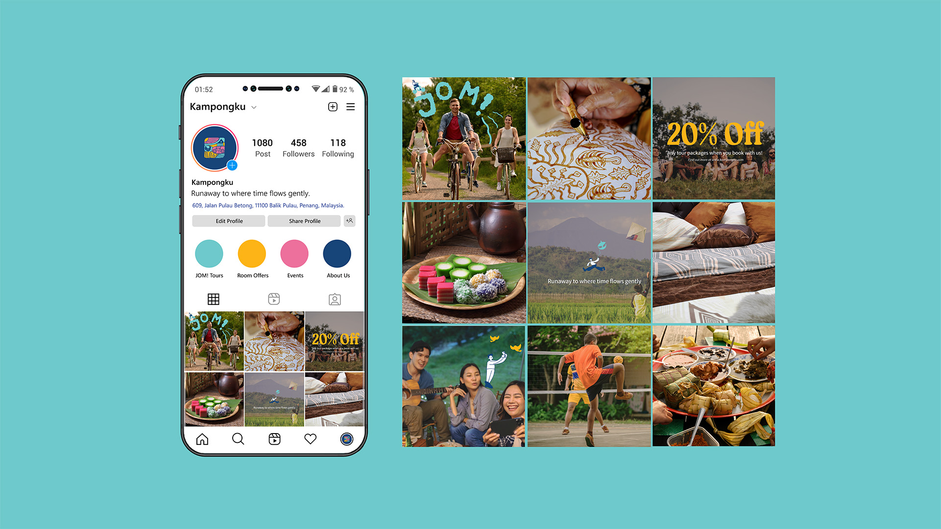
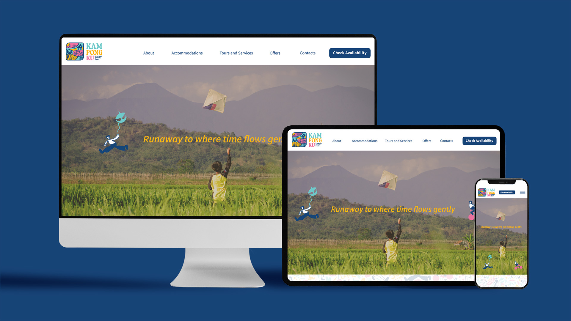
With the slogan “Runaway to where time flows gently,” I reimagined the brand to evoke comfort, warmth, and familiarity. The brand voice is nostalgic yet friendly, fun yet grounded. The visuals reflect a colourful, modern take on tradition, appealing to young adults aged 18 to 35 who are seeking meaningful getaways.
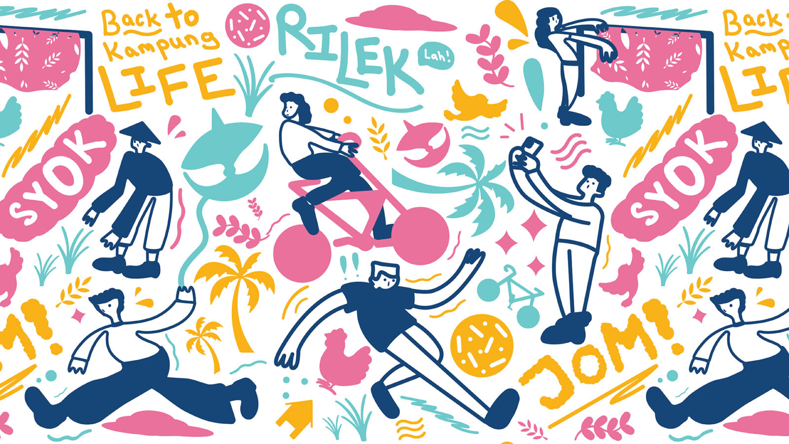
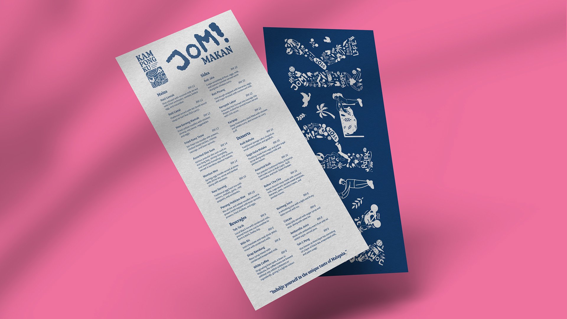
Kampongku’s new identity is a visual love letter to Malaysian kampung (traditional village) culture. I created six key illustrations depicting scenes such as a boy harvesting the paddy, one riding a bicycle, a boy playing sepak takraw (a traditional Malaysian sport), a girl drying her sarong, one flying a wau (a traditional Malaysian kite), and a boy birdwatching. These visuals introduce a slice of Malaysian heritage to those who never got to experience it firsthand.
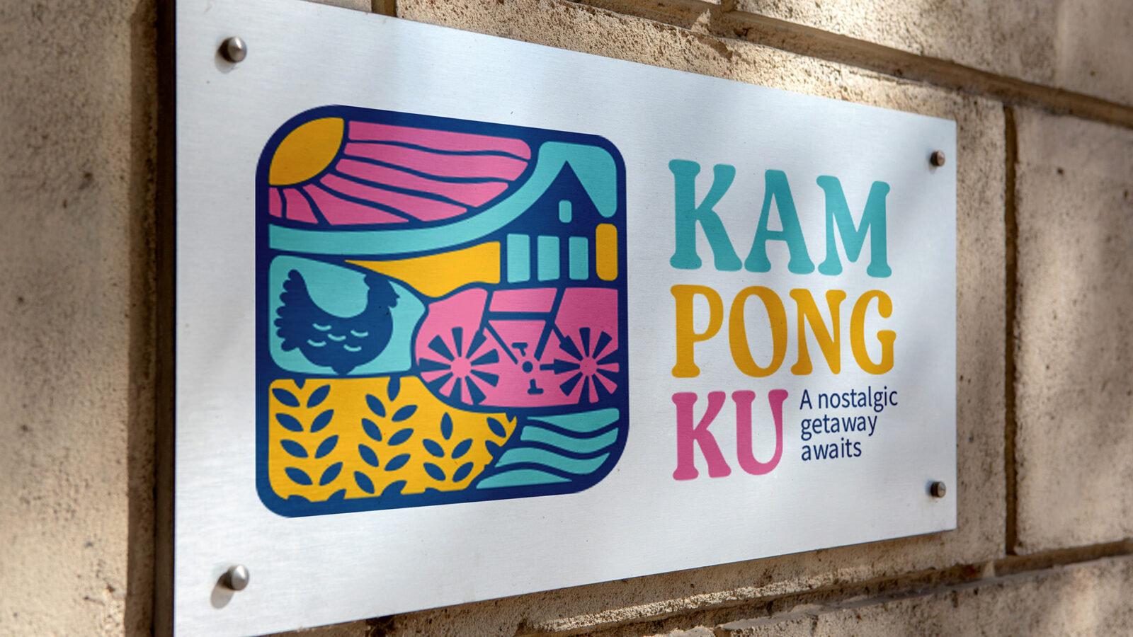
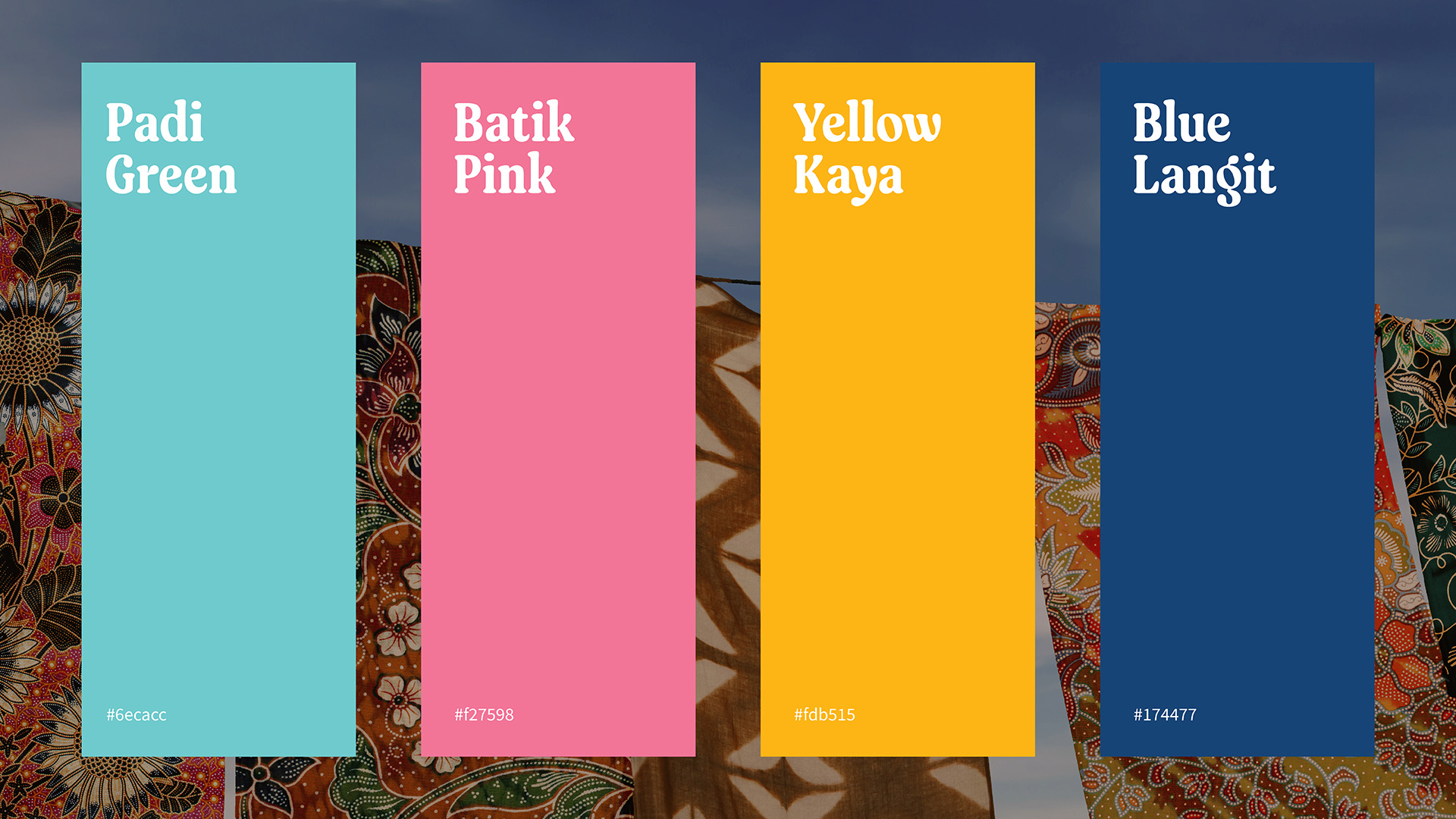
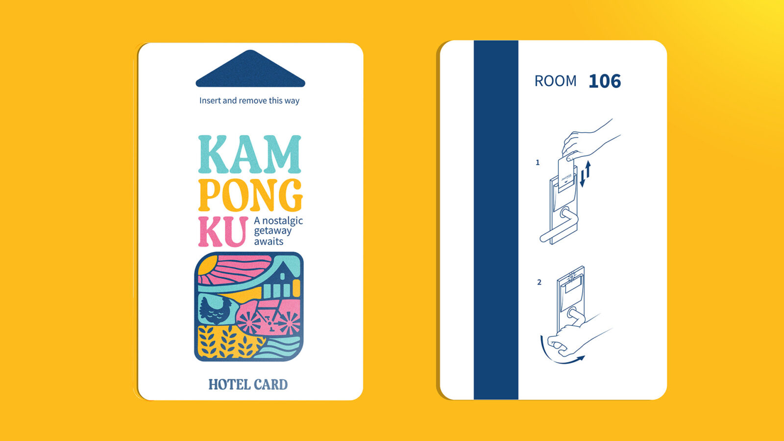
The logo subtly blends key kampung elements including a traditional house, a chicken, a bicycle, the sun, waves, and rice paddy. Its slightly embossed look hints at vintage signage, giving the brand a familiar and nostalgic warmth. The chosen colour palette features Yellow Kaya (coconut jam yellow), Batik Pink (traditional fabric pink), Blue Langit (blue sky), and Padi Green (rice paddy green), all bright, friendly, and very Malaysian.
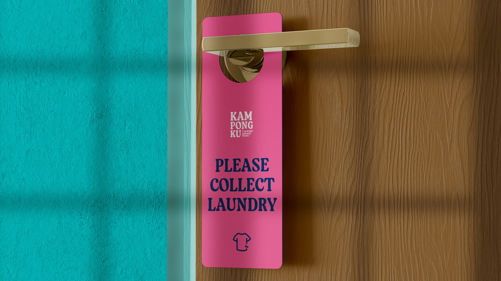
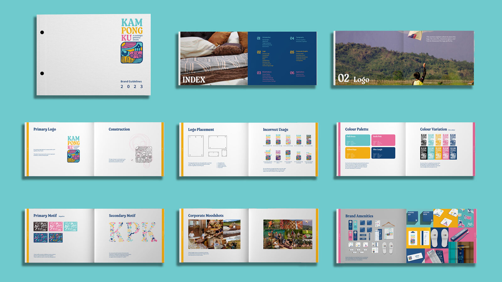
Every brand touchpoint was redesigned, from room signage to stationery, room amenities, and interior concepts. The signature motif featuring the six kampung (traditional village) characters appears across different materials alongside local phrases such as ‘Rilek lah’ (meaning ‘just relax’), ‘Back to kampung life’, ‘Jom’ (meaning ‘let’s go’), and ‘Syok’ (meaning ‘enjoy’), encouraging guests to slow down and enjoy life at a gentler pace.
Kampongku is not just about design. It is about cultural storytelling. It challenges the misconception that kampung life is dirty, boring, or outdated. Through thoughtful visuals and narrative, I aimed to show how kampung life can be beautiful, exciting, and deeply meaningful in a world that often moves too fast.
So, if you are ready to slow down, reconnect, and rediscover joy in the little things, let us run away to where time flows gently at Kampongku.


CREDIT
- Agency/Creative: Alyson Wong Sze Shuen
- Article Title: Kampongku: Student Alyson Wong’s Cultural Rebrand Reviving Malaysian Heritage for Modern Escapes
- Organisation/Entity: Student
- Project Status: Non Published
- Agency/Creative Country: Malaysia
- Agency/Creative City: Georgetown
- Project Deliverables: Art Direction, Brand Creation, Brand Guidelines, Brand Identity, Brand Redesign, Graphic Design, Logo Design, Rebranding
- Industry: Hospitality
- Keywords: WBDS Student Design Awards 2025/26 , Malaysian Culture, Traditional, Brand Identity, Heritage, Village, Kampung


