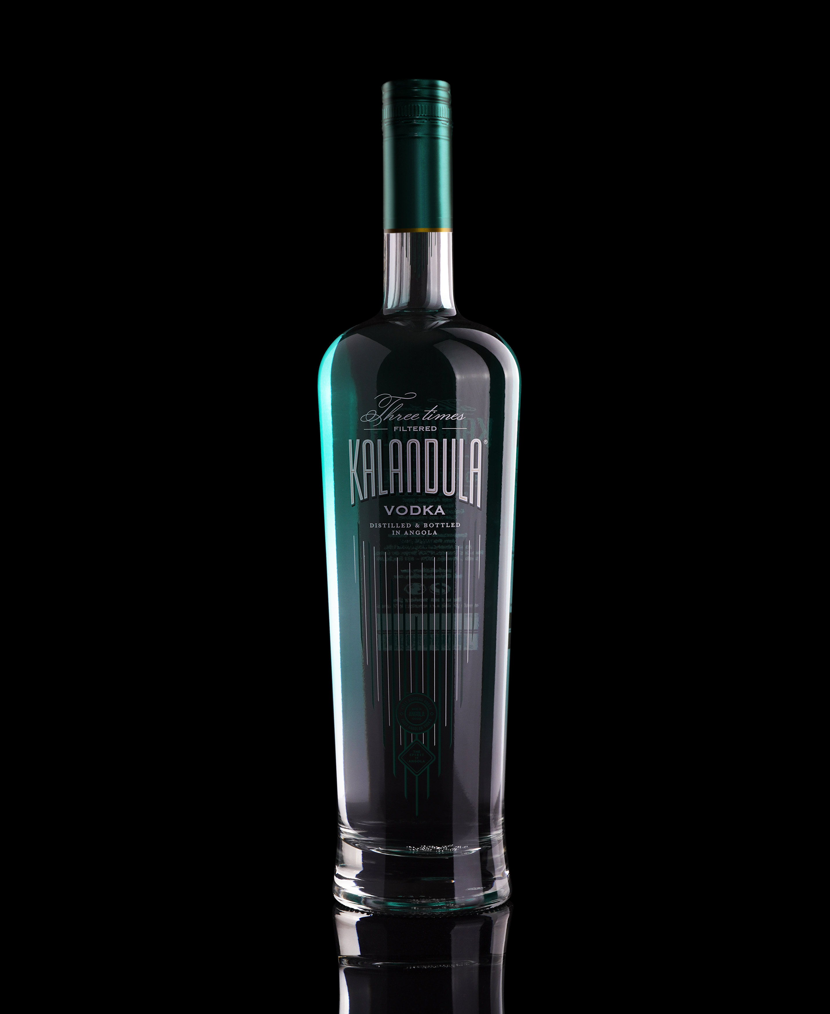
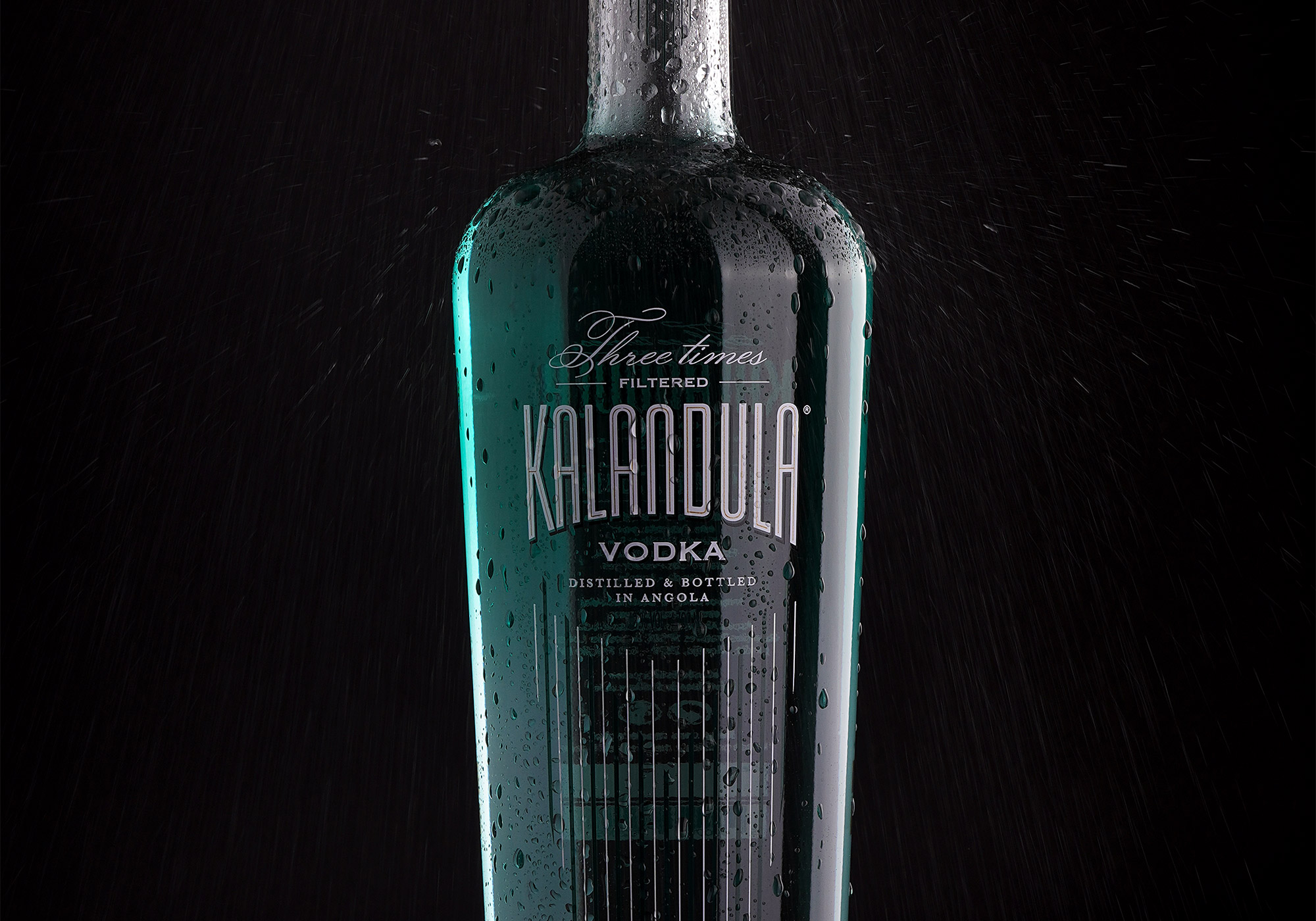
Inspired by the Kalandula waterfalls in Angola, this is the first Angolan vodka.
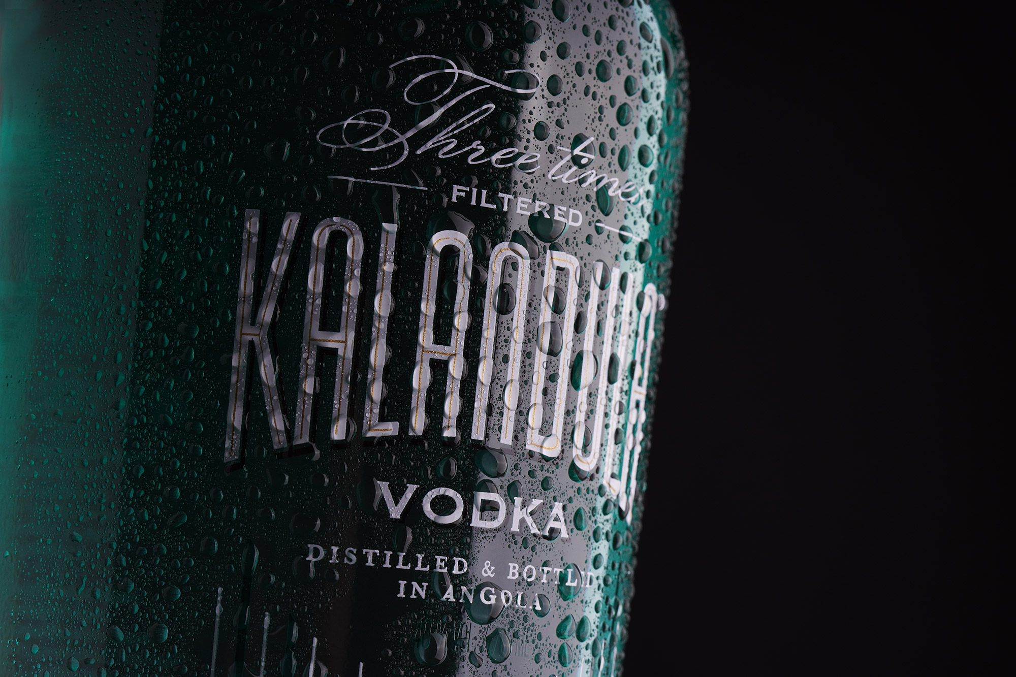
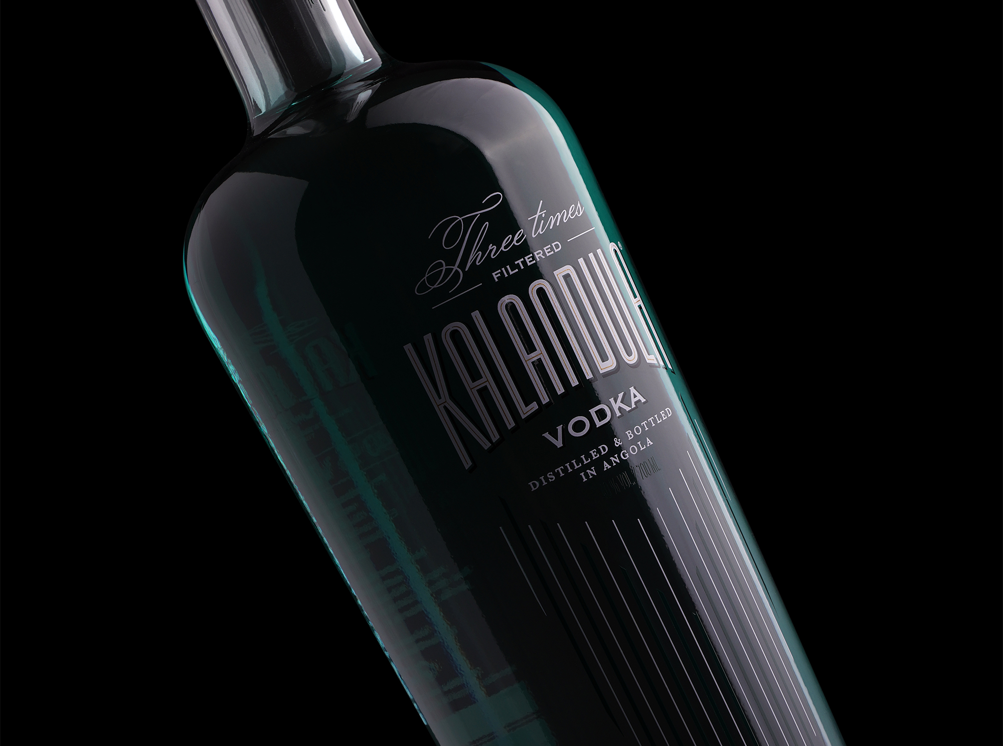
The identity and all the packaging work are intended to evoke the beauty of these waterfalls.
From the shape of the bottle, which in its curvature resembles the movement of falling water and at its height reinforces the verticality that is common to large waterfalls, this packaging aims to represent one of the natural wonders of Angola.
The bottle also has a green gradient color that starts at the top and then fades, due to the Kalandula waterfalls being characterized by a large green mantle at the top, which fades with the fall of the waters.


CREDIT
- Agency/Creative: OWL Creative Studio
- Article Title: Kalandula – The First Angolan Vodka
- Organisation/Entity: Agency, Published Commercial Design
- Project Type: Packaging
- Agency/Creative Country: Portugal
- Market Region: Africa
- Project Deliverables: Brand Creation, Brand Identity, Brand Strategy, Branding, Graphic Design, Packaging Design, Photography, Product Architecture
- Format: Bottle
- Substrate: Glass, Glass Bottle
FEEDBACK
Relevance: Solution/idea in relation to brand, product or service
Implementation: Attention, detailing and finishing of final solution
Presentation: Text, visualisation and quality of the presentation


