Overview
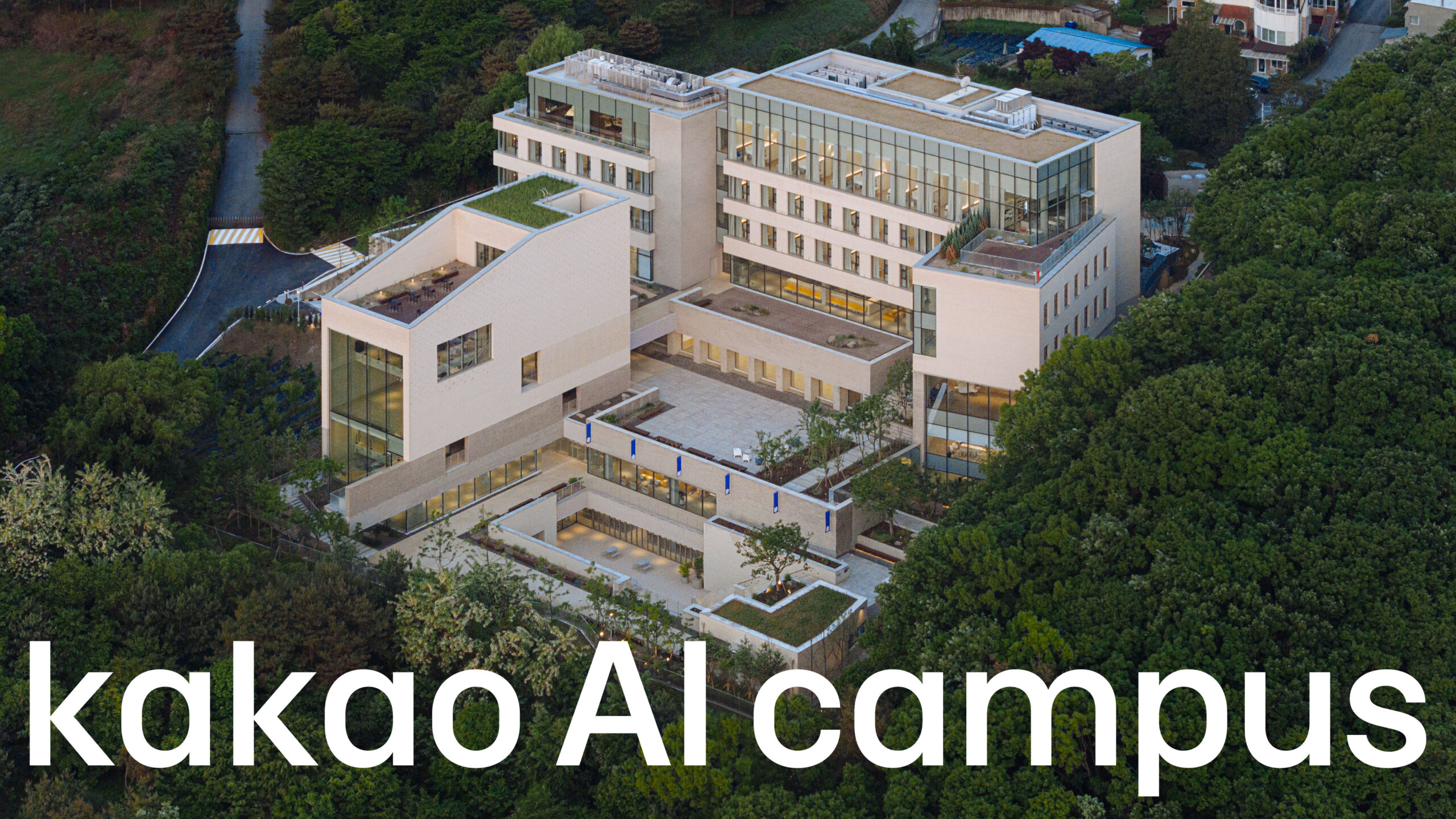
Kakao, Korea’s leading IT company, enhances the quality of life for all citizens by connecting every aspect of their lifestyle, starting with a free messenger app. Driven by responsibility towards the national AI strategy and commitment to genuine ESG practices, Kakao has established an inclusive campus engaging local communities, focused on nurturing AI talent and strengthening its future vision. We have named this symbolic space “Kakao AI Campus”, and have developed a comprehensive BX design, including BX principles for space operation, practical experience programs to bring these principles to life, and new, innovative design guidelines differentiated from Kakao’s existing design identity to build a culture of sustainable growth.
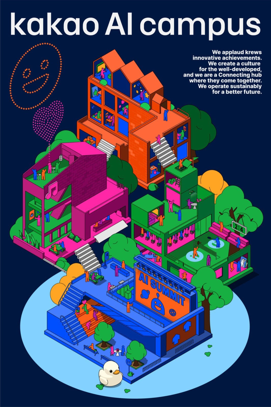
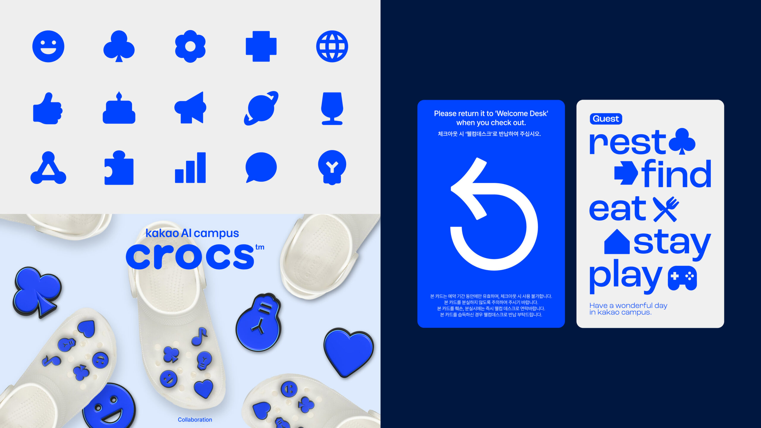
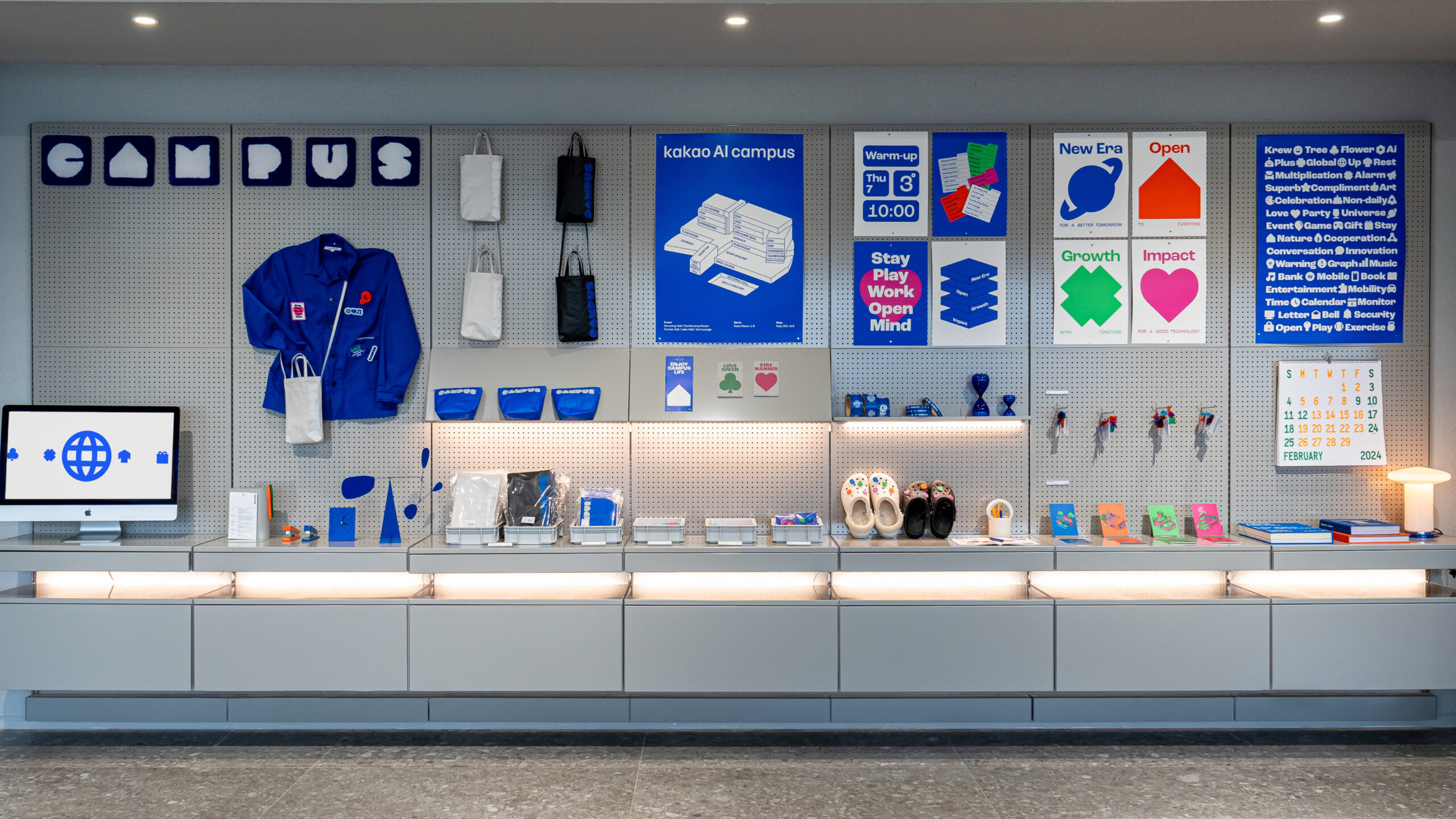
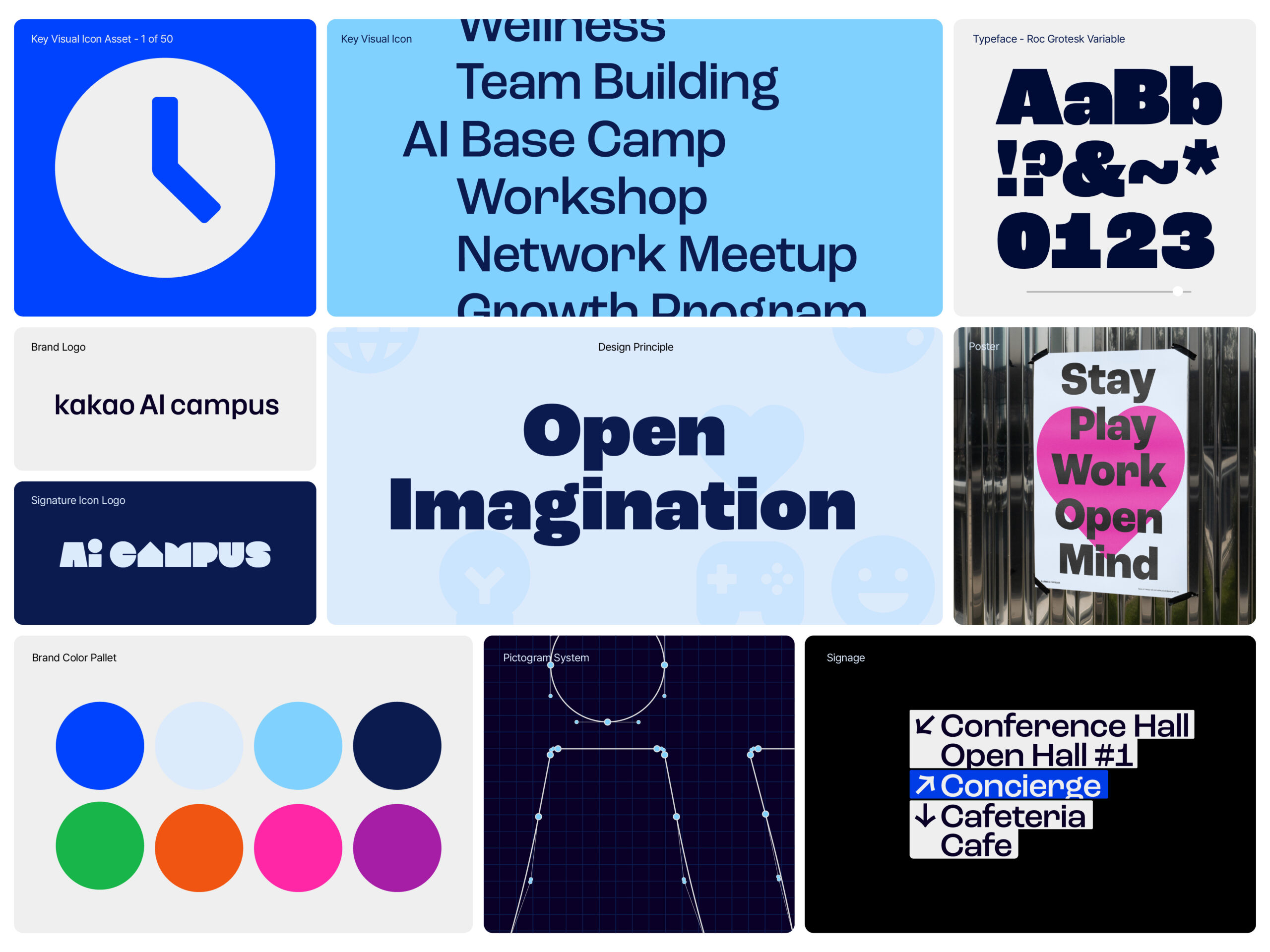
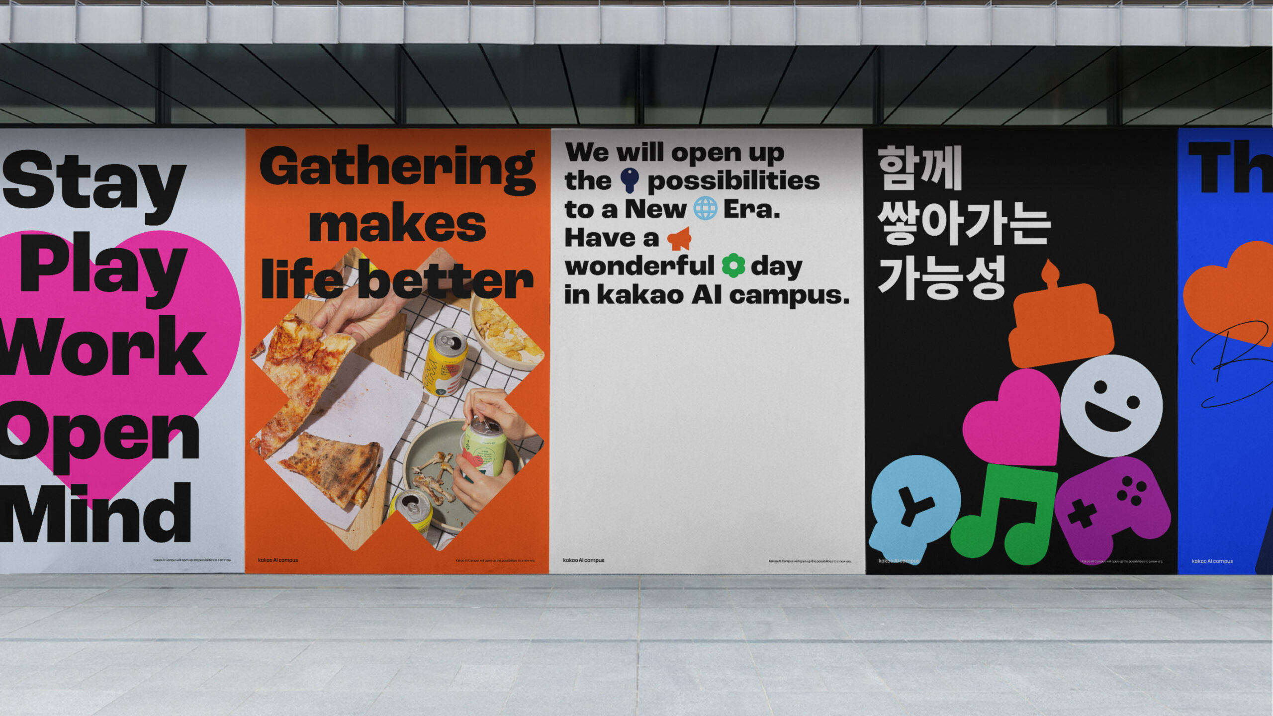
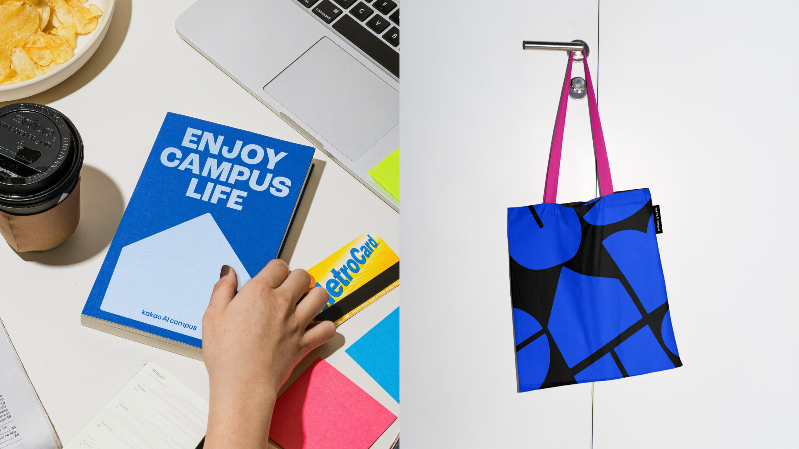
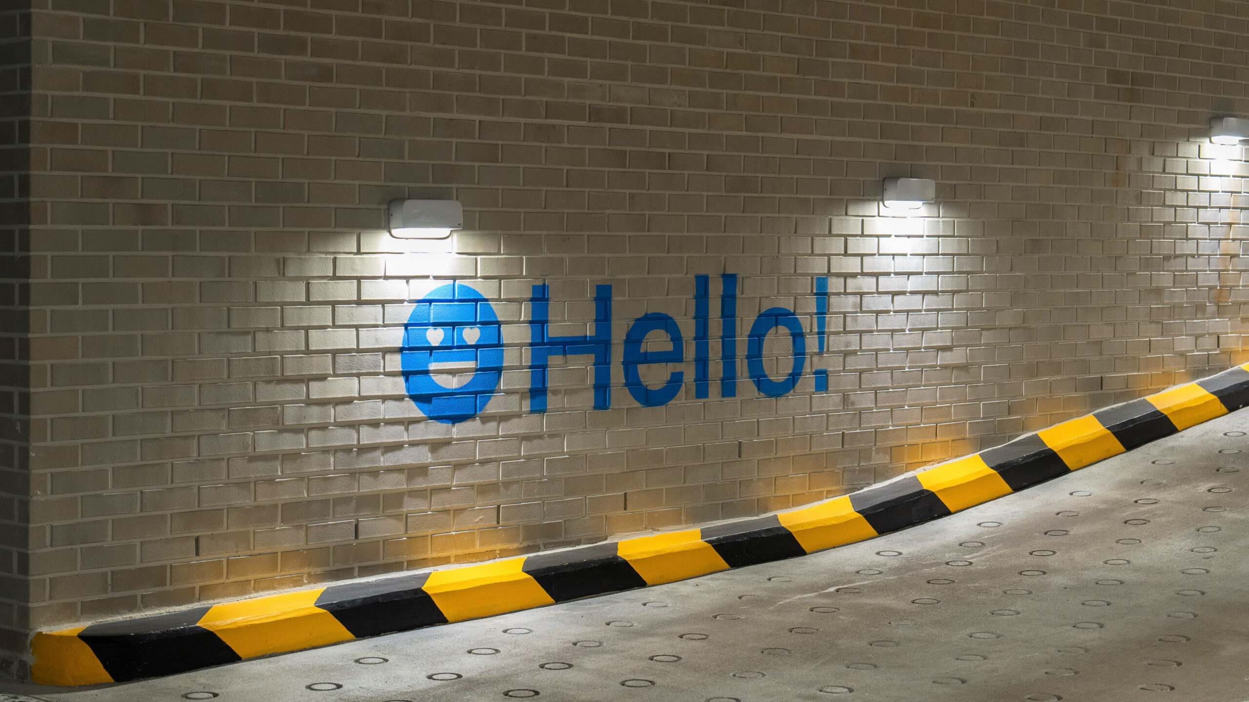
We created a set of over 50 icon assets and crafted hip and stylish graphic design using morphing motion. These design elements were thoughtfully developed to resonate with personal identities and reflect the lifestyles of Millennials and Gen Z, while breaking apart from conventional, rigid aesthetics often associated with large corporations.
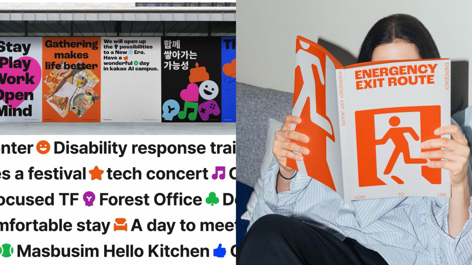
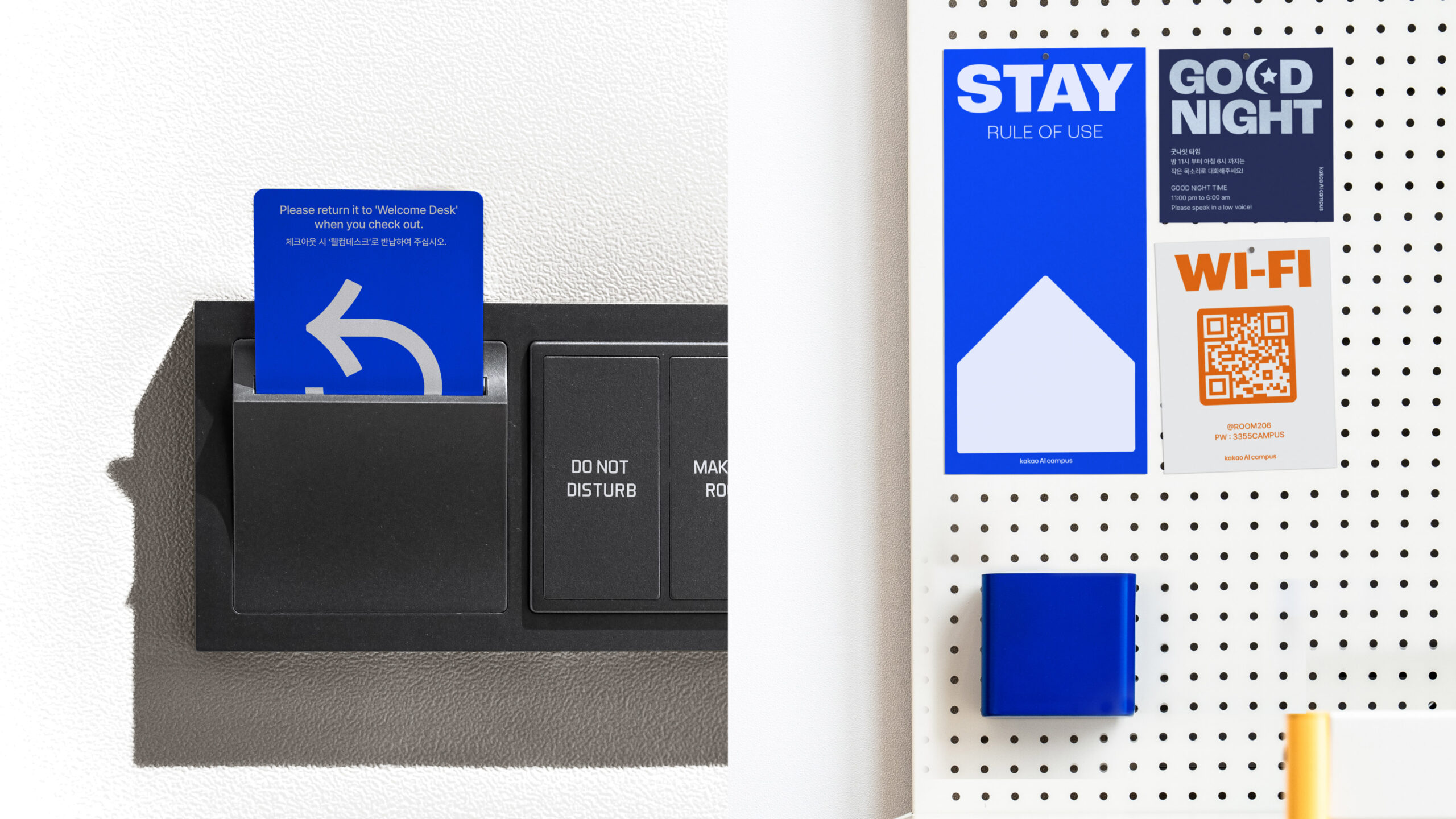
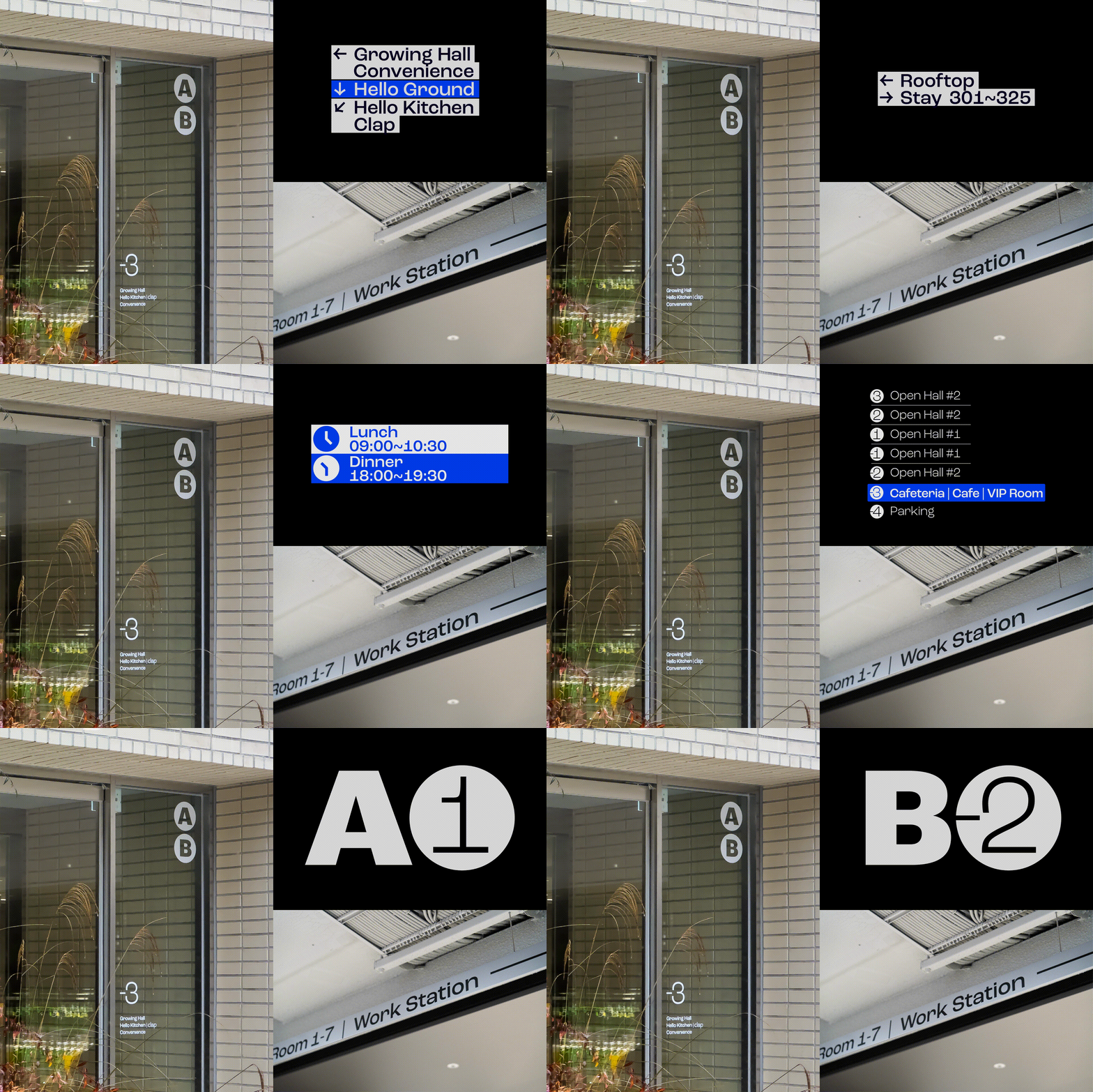
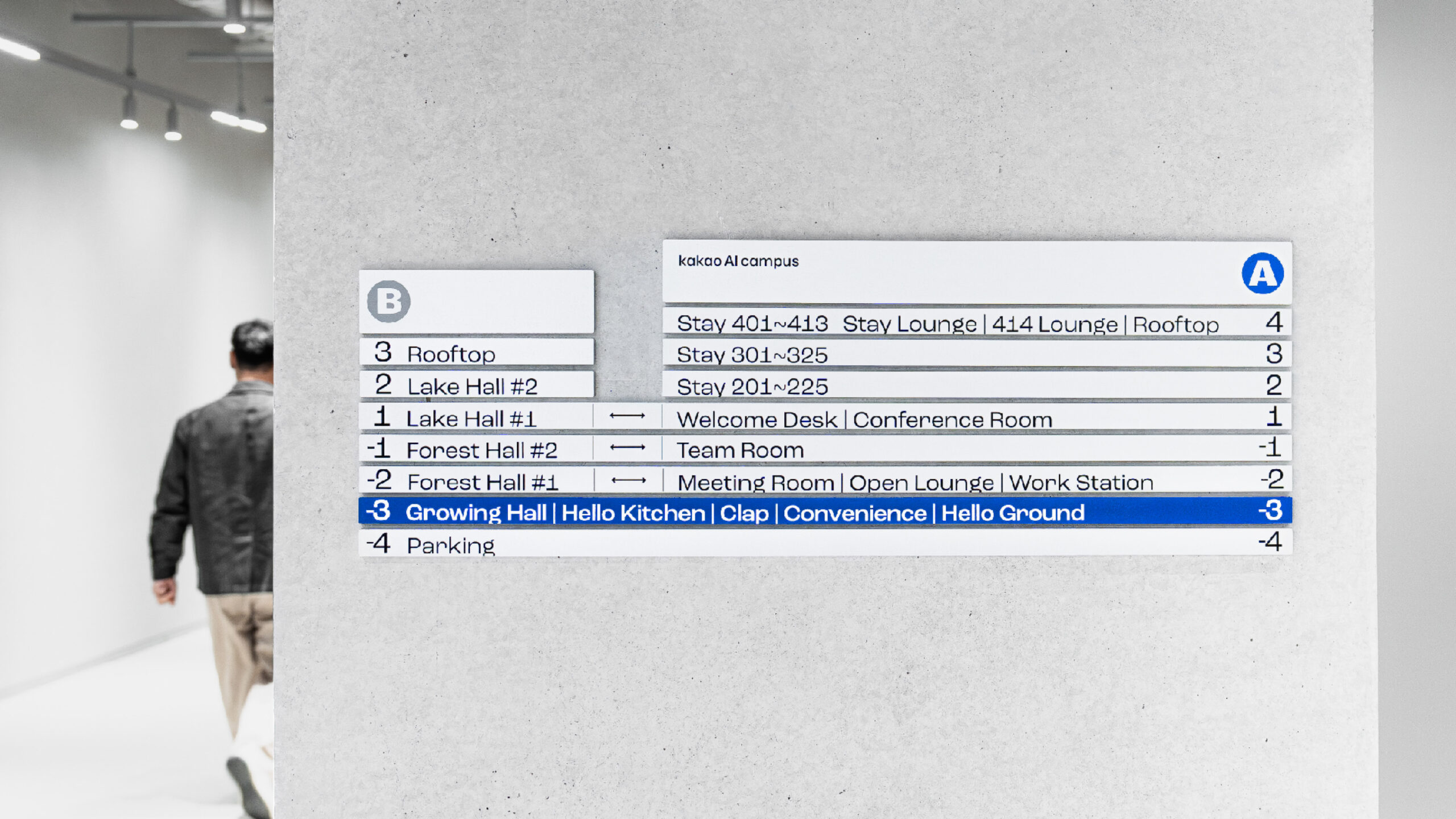
These design elements expanded to a multi-dimensional experience system of visuals, illustrations and signage systems, all built around the theme of “boundless potential of individuals”. We also incorporated the traditional “universal design” icon style into our key visual graphics, introducing a clean and highly visible Exformation (Experience + Information) design approach. This strategy implemented a DFA (Design For All) system, thoughtfully considering experience and mobility of people of all ages, genders, and abilities within and outside the space. This “design as media” approach allowed employees and the public to discover a fresh perspective on the Kakao group.
Business Definition
“Kakao AI Campus is a space dedicated to nurturing talent with unlimited potential in the AI era. It serves as a stage where community members can discuss diverse interests, gain new experiences, and unfold their boundless possibilities.
By genuinely connecting and integrating online and offline environments, it functions as a ‘Global AI Basecamp’ working towards a better world. This campus caters not only to the Kakao community and global AI talent but also to stakeholders, local societies, and those who are digitally disadvantaged.
Brand Essence
The brand essence “Trans” encompasses multiple meanings. It signifies new innovation that breaks away from existing conventions and represents a better “us” for the future. It also represents the new community of Kakao that fosters a better collective through growth, rest, connection, and care.
Brand Color Approach
kakao Group companies have traditionally used yellow as their main color. We utilized Trans Blue, which is complementary to the existing color, to add a new perspective to kakao’s DNA and to emphasize their new innovation through AI talent development.
Visual Motif
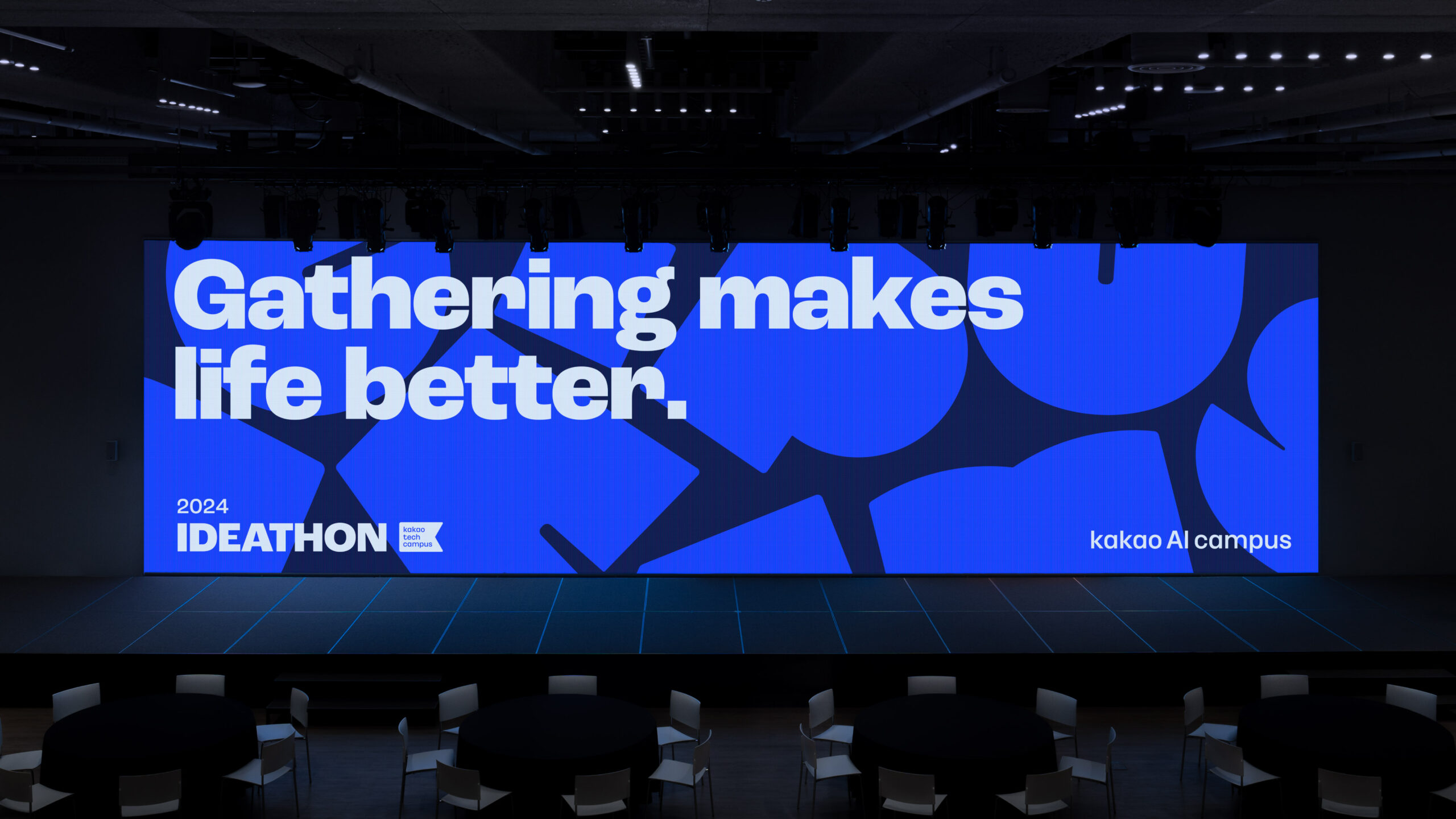
The key visual was developed using morphing techniques, transforming from a single ‘circle’ symbolizing an individual into various icons. This graphic expansion represents diverse innovations for a better ‘us’, not limited to just one form. The icons also visualize the various programs, emotions, experiential elements, and values within the campus. It symbolizes individual innovations for a better ‘us,’ beyond just one form.
Key Visual Usages
The key visual icons are based on the design principle of “Open Imagination” and are dynamically utilized in three expressive styles: the ‘Flexible’ style, which continuously transforms a single icon using morphing motion; the ‘Various’ style, which combines different icons with patterns or text; and the ‘Positive’ style, which represents icons coming together in an infinite space.


CREDIT
- Agency/Creative: LMNT Company , kakao Corp.
- Article Title: Kakao AI Campus: Basecamp for Empowering the Innovators of Tomorrow
- Organisation/Entity: Agency
- Project Status: Published
- Agency/Creative Country: Korea, Republic of
- Agency/Creative City: Seoul
- Market Region: Global
- Industry: Education
- Keywords: WBDS Agency Design Awards 2024/25 Brand Identity, Brand Experience, Brand Strategy, Motion Graphic, Creative Direction, Signage Design, Iconography Design, Illustration Design, Campus Design, Space Design
- Keywords: WBDS Agency Design Awards 2024/25 Brand Identity, Brand Experience, Brand Strategy, Motion Graphic, Creative Direction, Signage Design, Iconography Design, Illustration Design, Campus Design, Space Design
-
Credits:
Creative Director: Choe Jangsoon
BX Director: Noh Jihoon
BX Director: Han Hyungmin
BX Designer / BX Strategy & BX Design: Hwang Euiseong
BX Designer / BX Strategy & BX Design: Na Hyunjoo
BX Strategist / Verbal Design: Kim Joeun
BX Strategist / Verbal Design: Ghimb Yerim
BX Designer / BX Design: Choi Sangcheol
BX Designer / BX Design: Kim Sehyeon
BX Designer / BX Design: Hong Sungmin


