


The Warlis. An Indian tribe from the state of Maharashtra is the primary source of inspiration. Both in content and form. The Belgian-Indian marriage can be felt in Kahut, thanks to its phonetics and its history. The cahute is both the Warlis dwellings, a warm place of exchange and tradition, and the place in Belgium where you go to get your chips.
Kahut is a place, almost a community, where anyone can come and enjoy delicious Ayurvedic meals inspired by Belgium, while respecting nature and each other.
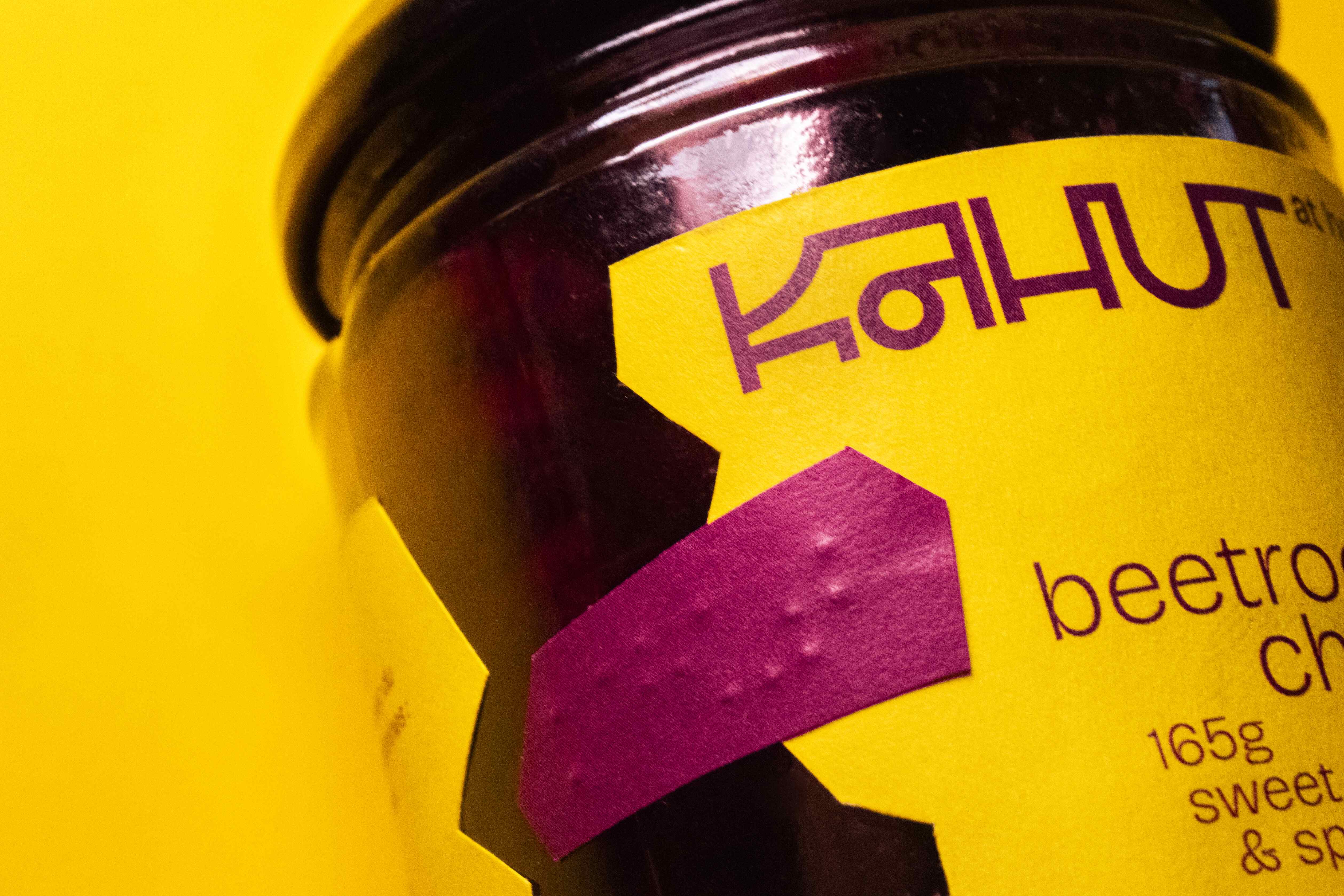
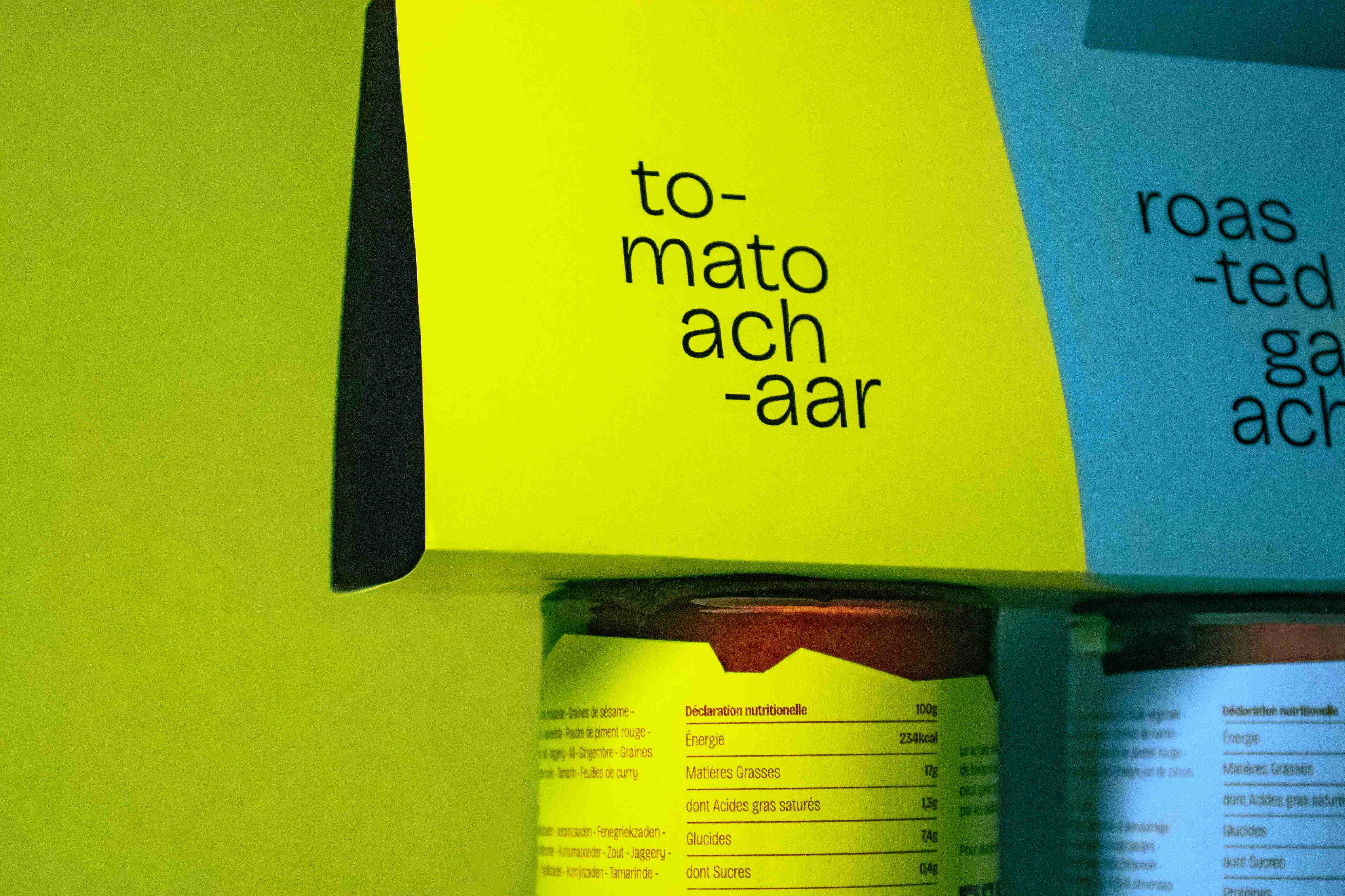
The typography blends the world of Latin letters with the Devanagari alphabet. Rooted in the Indian art of the Warlis tribe, the geometry of the typefaces evokes the simple forms of their paintings, as well as Western rigor. This unicase uses the iconic head bar, characteristic of Devanagari, in its ligatures. Each letter is closer to one universe than the other, creating a harmonious, balanced and unique whole. Kahut wanted to capture the essence of the Warlis paintings while adding a more contemporary touch to create a typography with character. This fusion is at the heart of the restaurant’s identity and atmosphere.
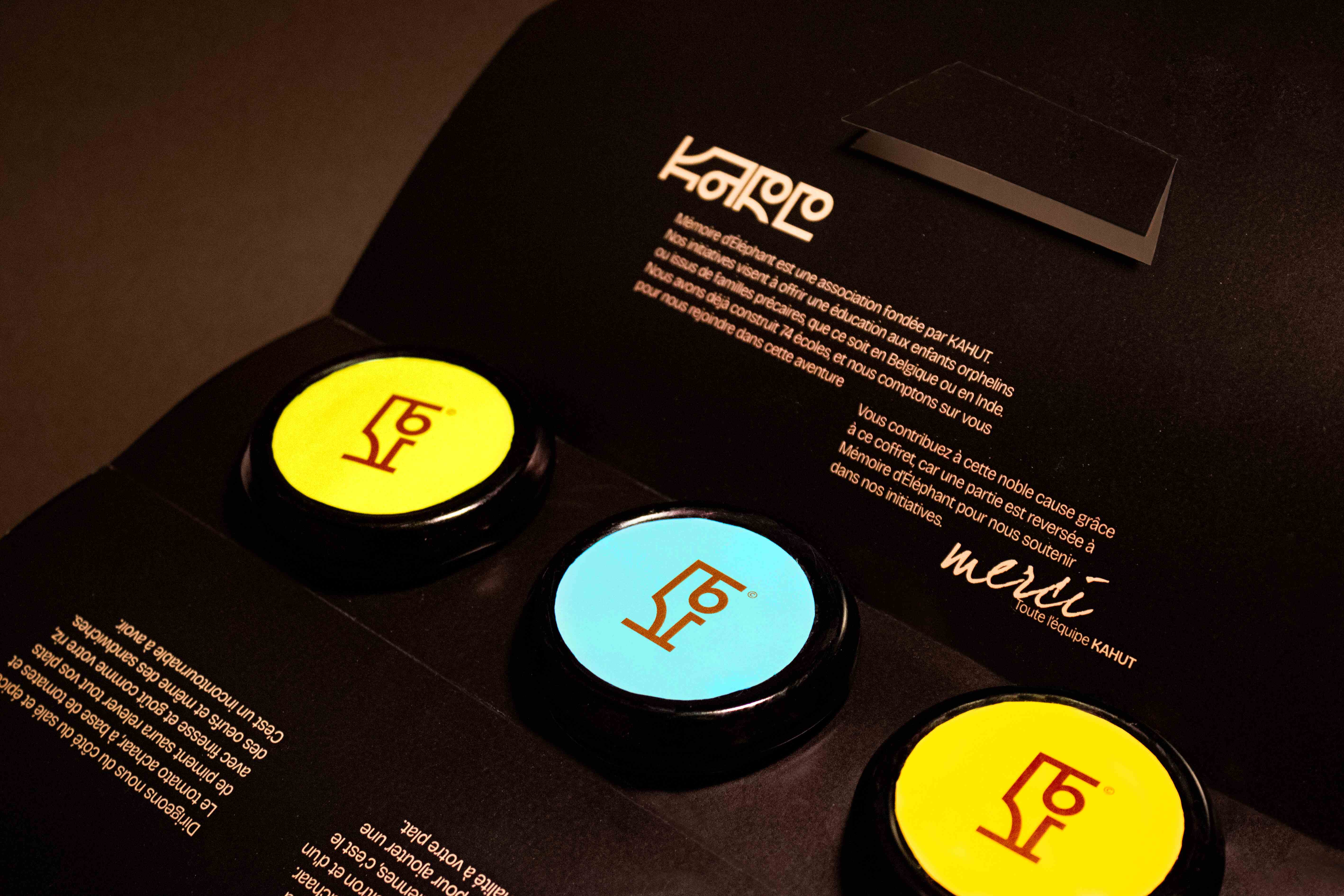
The Warli tribe paint their daily life scenes, but also their visions. In their paintings, only the round, the square and the triangle are drawn, they are the basis of all their representations. The logo takes up these characteristics to show the unbreakable link with the Warlis. By giving it a more contemporary look, it also gives it that more Western feel. Kahut thus becomes a skillful blend of Indian and Belgian traditions. Even the way the name is written reflects this blend. “KA” is a phoneme from the Devanagari (Indian alphabet) and “HUT” is from the Latin alphabet.
This fusion is at the heart of the restaurant’s identity and atmosphere.
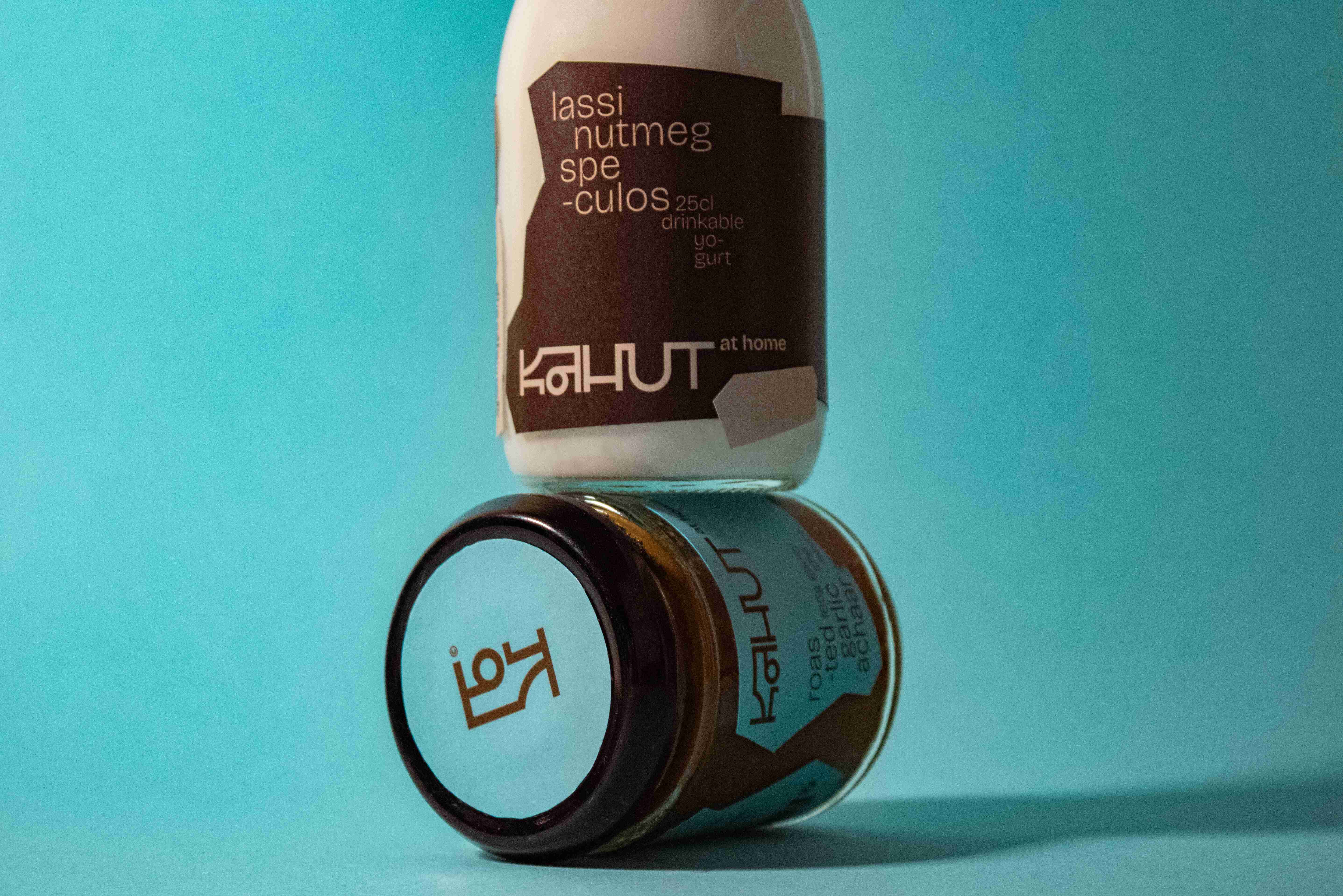
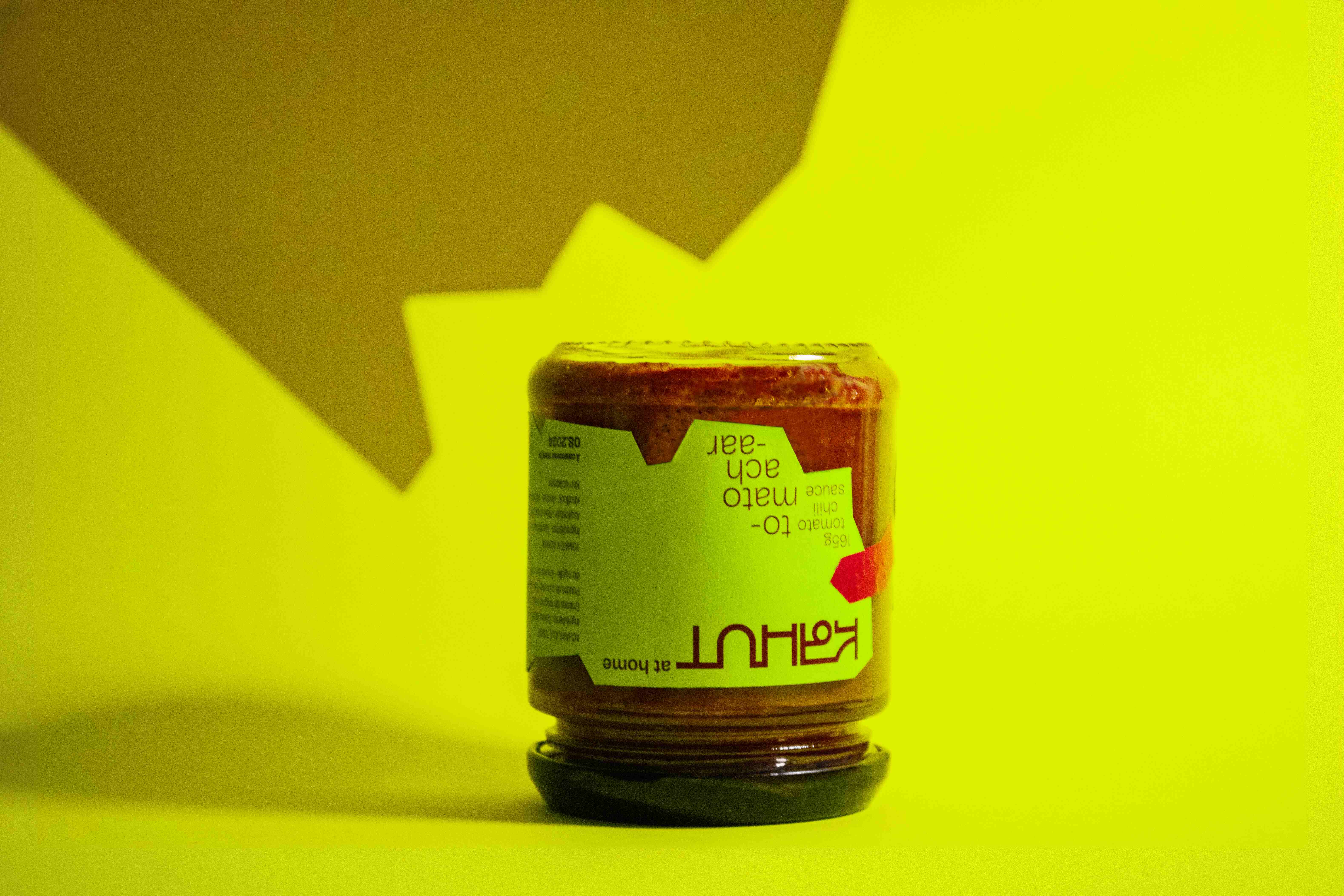
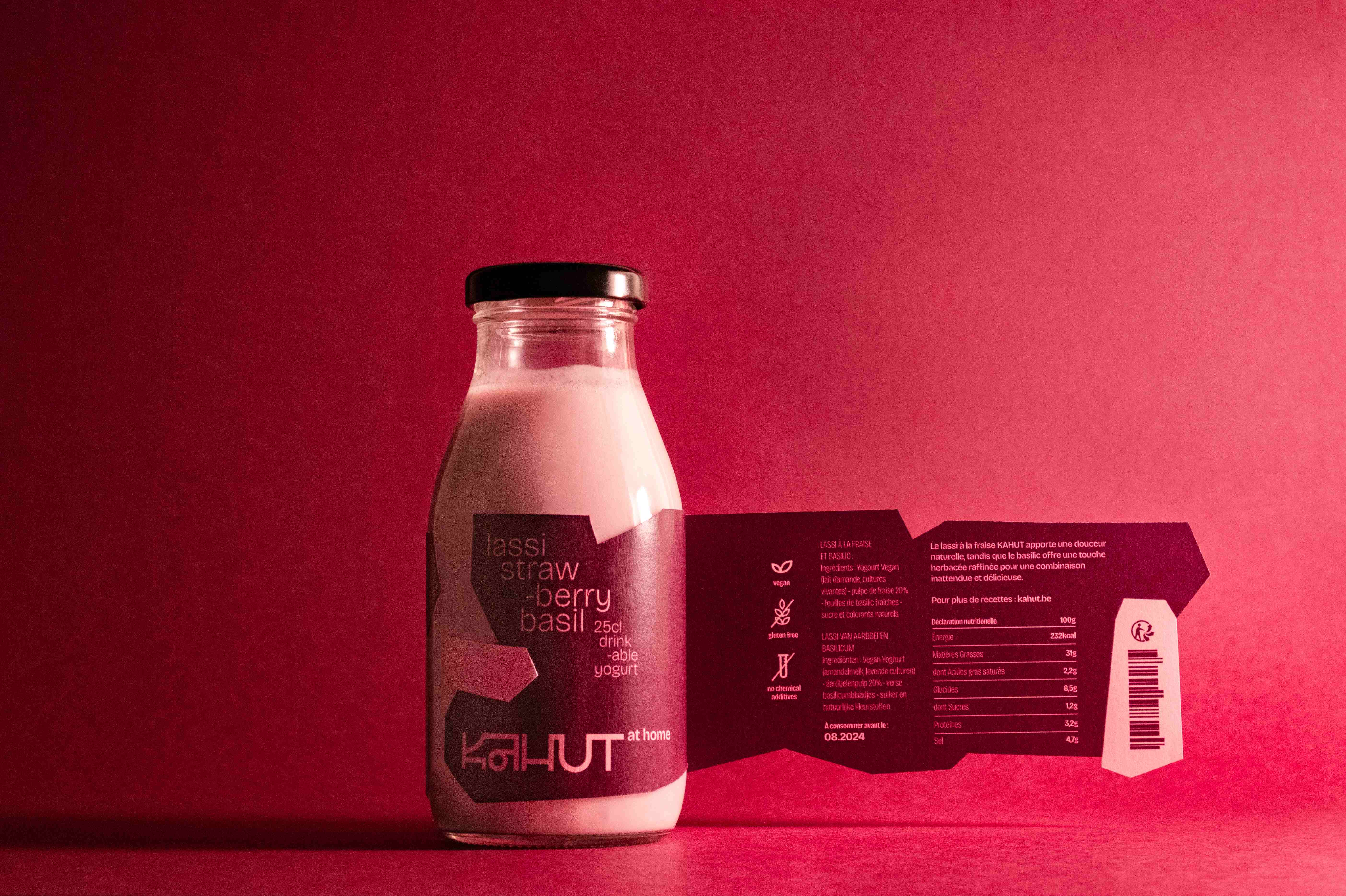
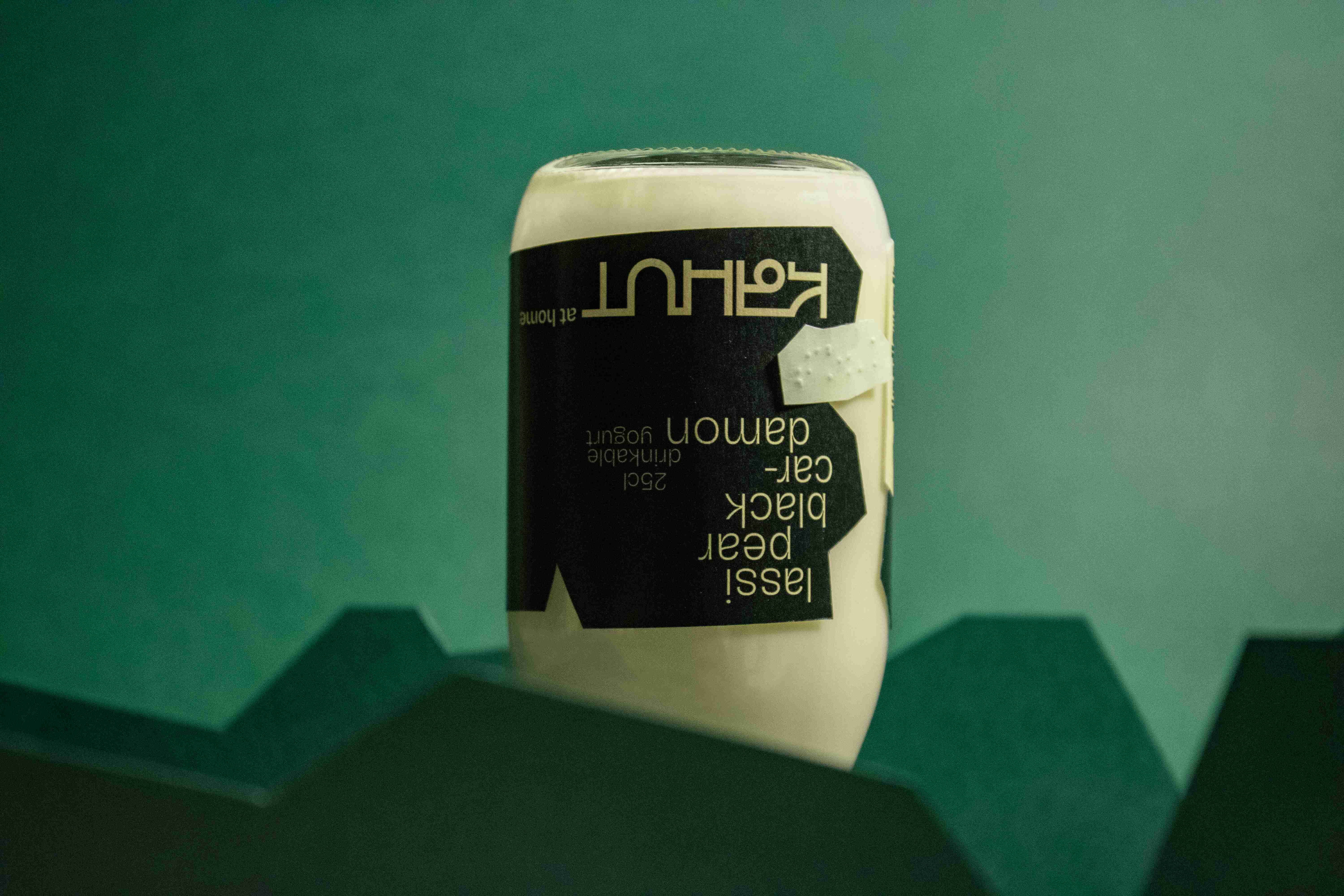
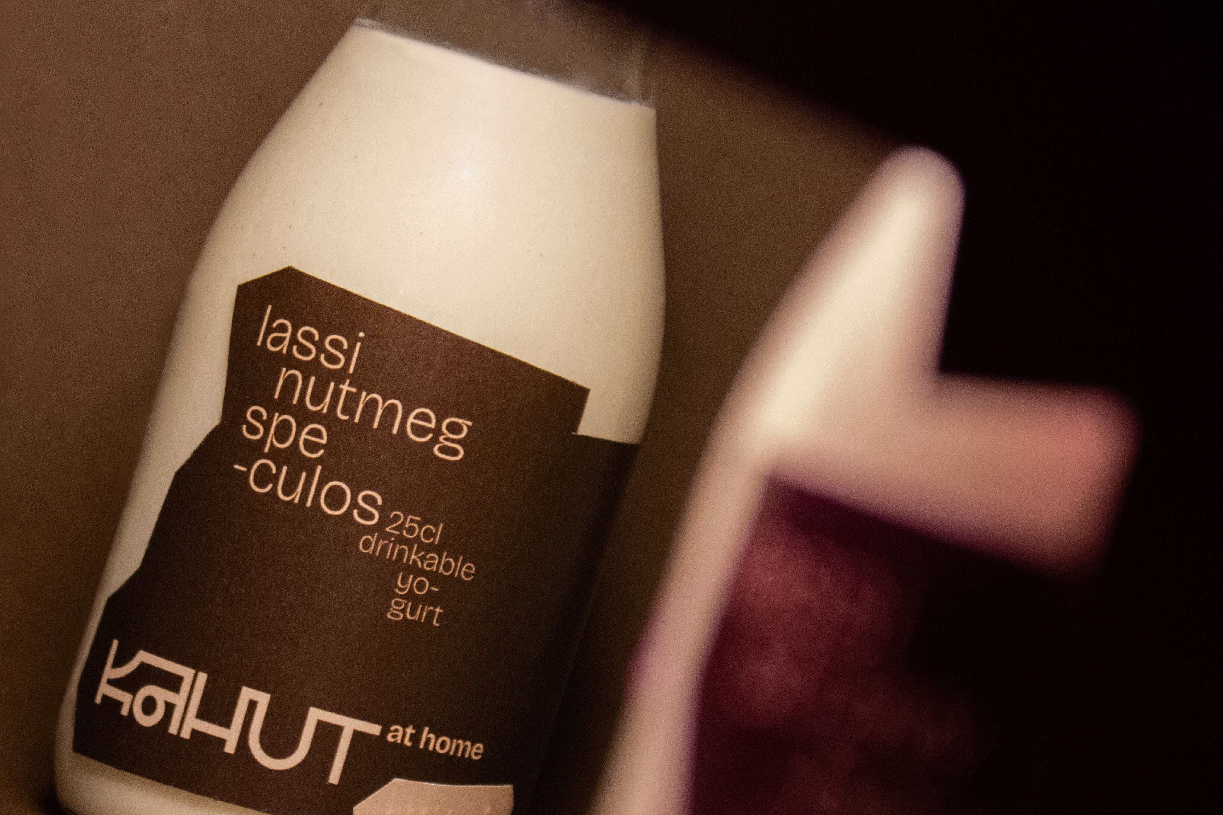
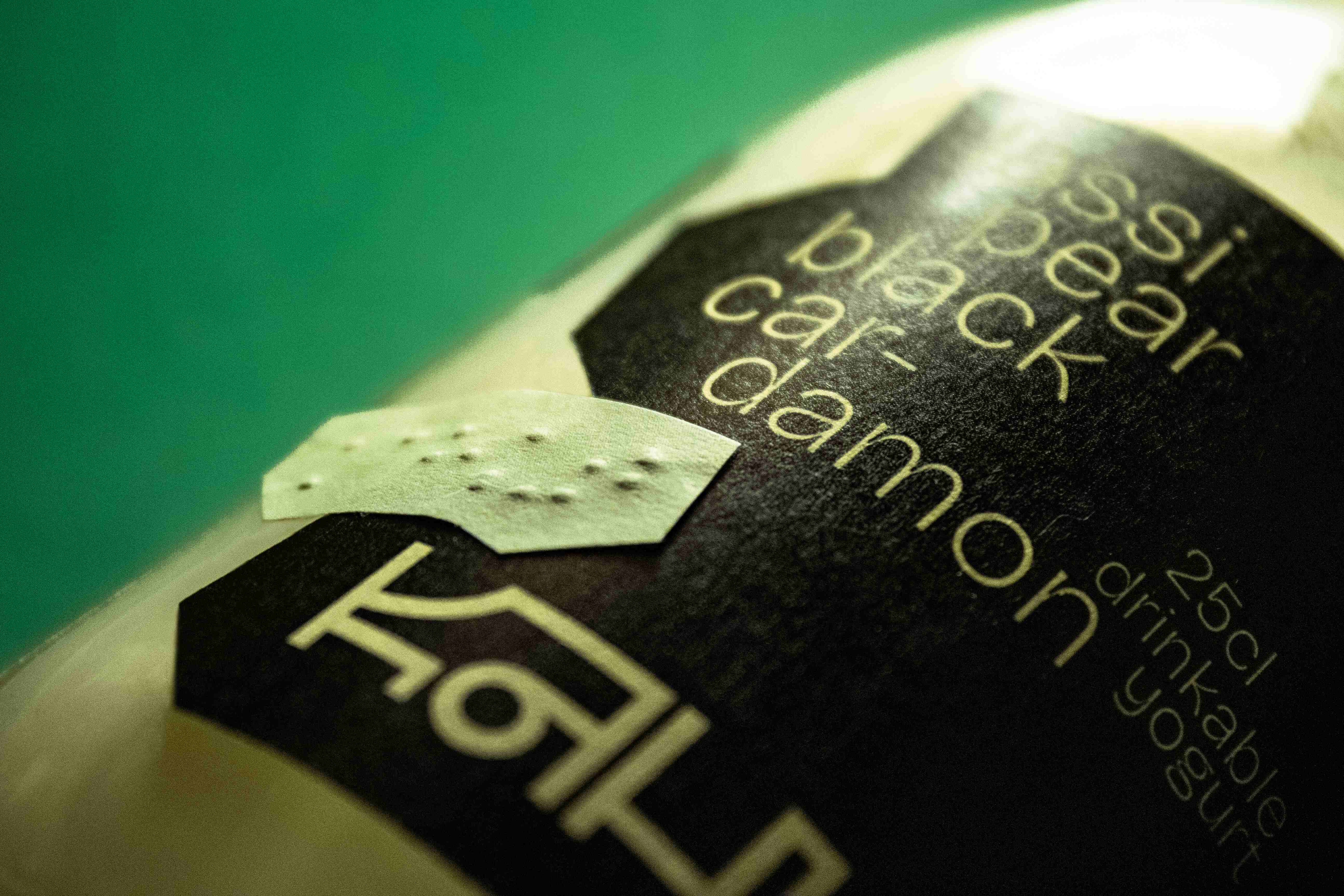
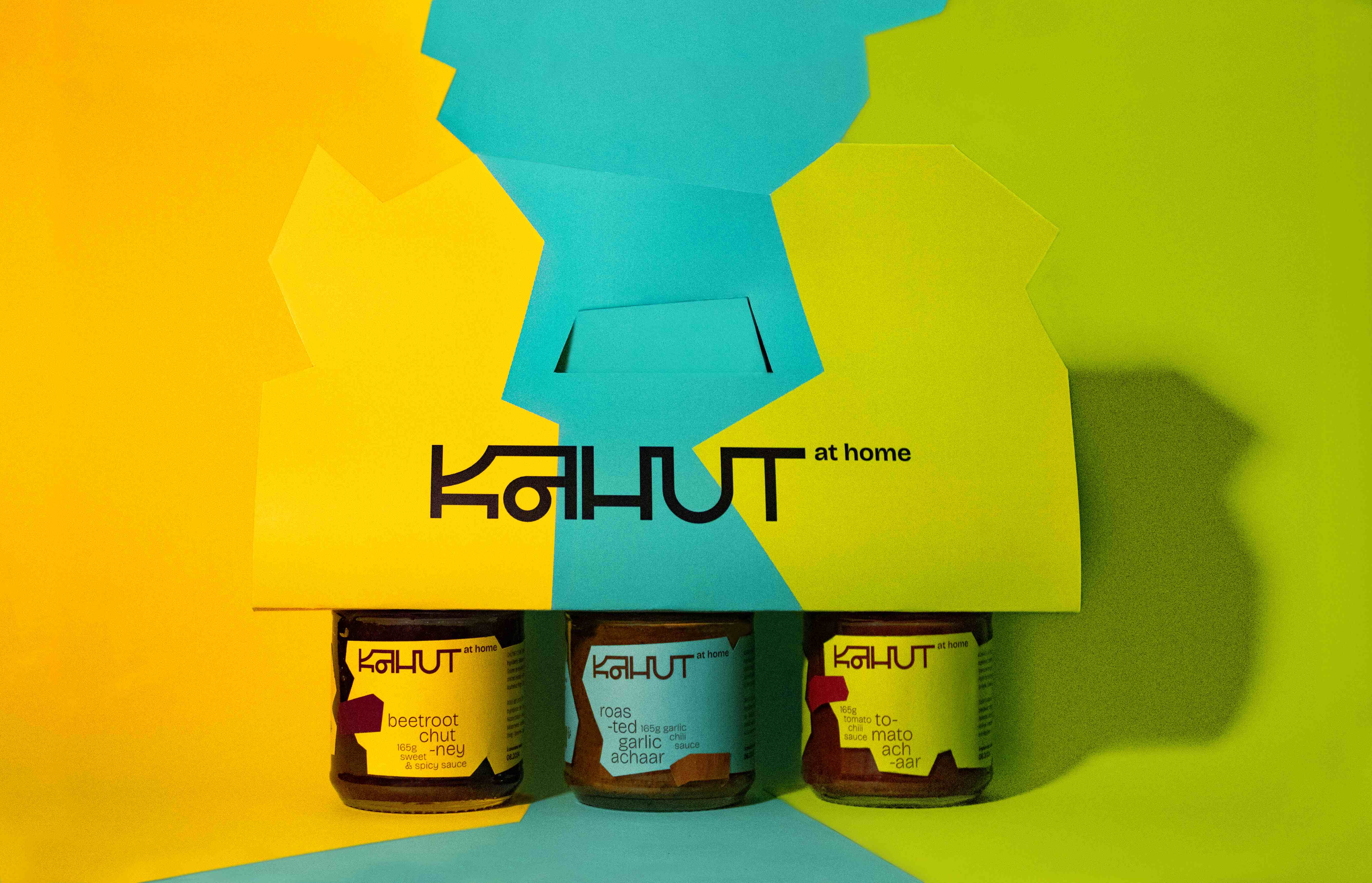
Our values are passed on in the hut, and even beyond. Our new range of “at home” products reflects our identity and our commitments, with each label being unique, irregular and imperfect, just like each of us. The marriage of cultures is perceptible in the color combinations: the darker tones are taken from the traditional clothing and environment of the Warlis, and the more fluorescent tones add a more contemporary touch. The use of two colors means that less ink is used, which is in line with our commitment to the environment. The Braille label adds the finishing touch to make our range accessible to everyone. Kahut at home reflects our values and our restaurant.
CREDIT
- Agency/Creative: Mattéo Tabutieaux , Hugo Gentinne
- Article Title: Kahut, Tout Azimut ! An Inclusive Restaurant Brand Designed by Hurtikonn
- Organisation/Entity: Student
- Project Type: Packaging
- Project Status: Non Published
- Agency/Creative Country: Belgium
- Agency/Creative City: Namur
- Market Region: Europe
- Project Deliverables: Brand Creation, Brand Identity, Graphic Design, Logo Design, Packaging Design, Typography
- Format: Bottle, Jar
- Industry: Food/Beverage
- Keywords: WBDS Student Design Awards 2024/25 , Food, Sauces, Lassi, Indian, Belgian, Ayurveda, Fast-Good, Vegan, Veggie, Ecology, Inclusive, Braille, Packaging, Logo, Branding
-
Credits:
Graphic Designer: Mattéo Tabutieaux
Graphic Designer: Hugo Gentinne


