


Nourvie — A Sensory Language for Olive Oil
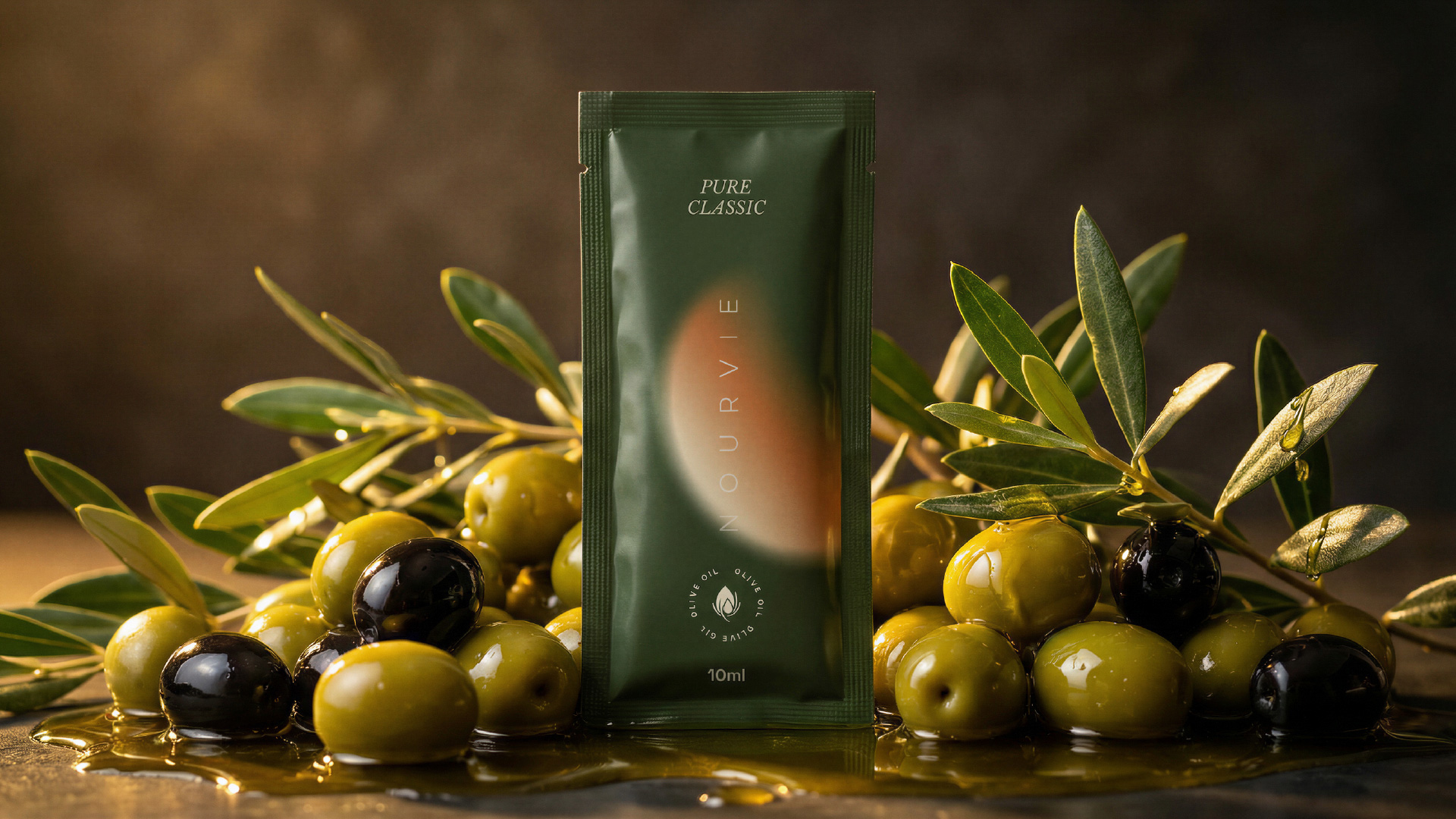
Nourvie is a premium infused olive oil brand built around a single, unconventional format: the 10ml sachet. In a category long dominated by glass bottles and ornate labels, Nourvie strips the ritual of olive oil down to its most intimate and portable form — a single-use, single-serving vessel designed for the modern gourmet. The challenge was to make something so small feel unmistakably luxurious.
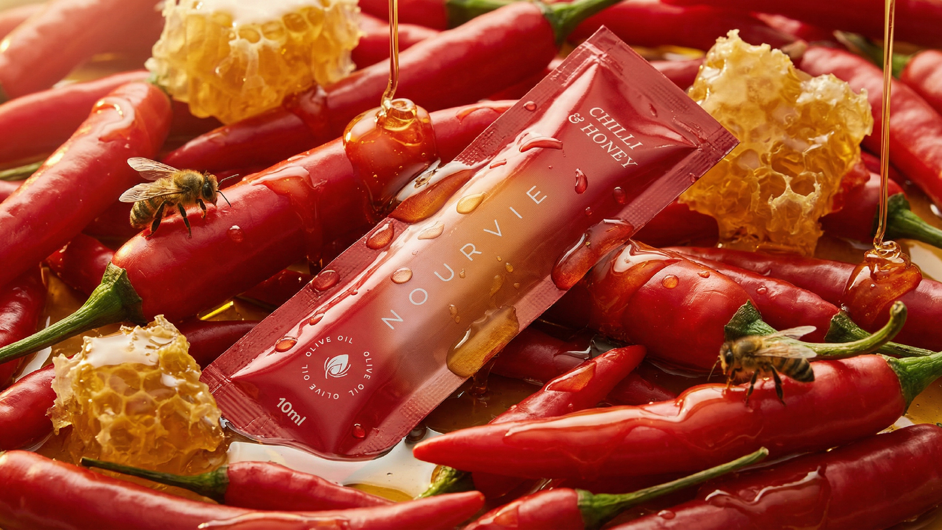
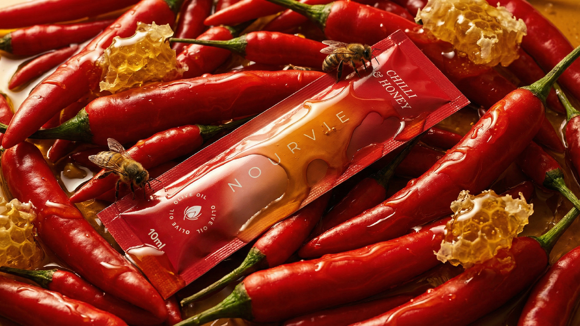
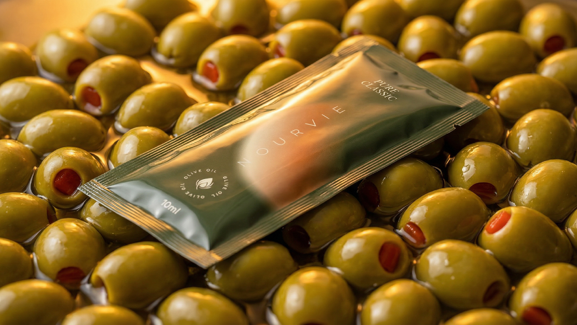
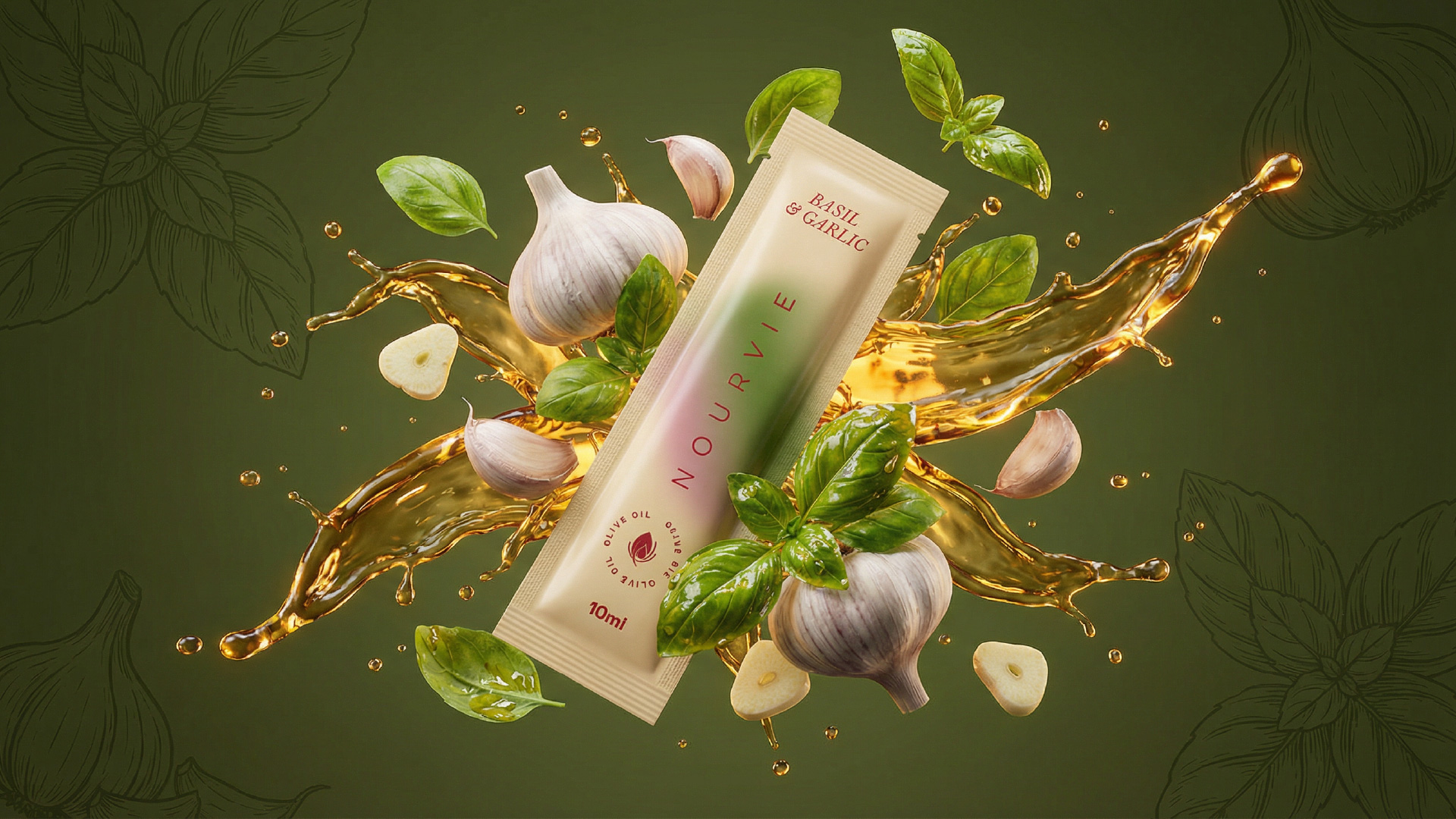
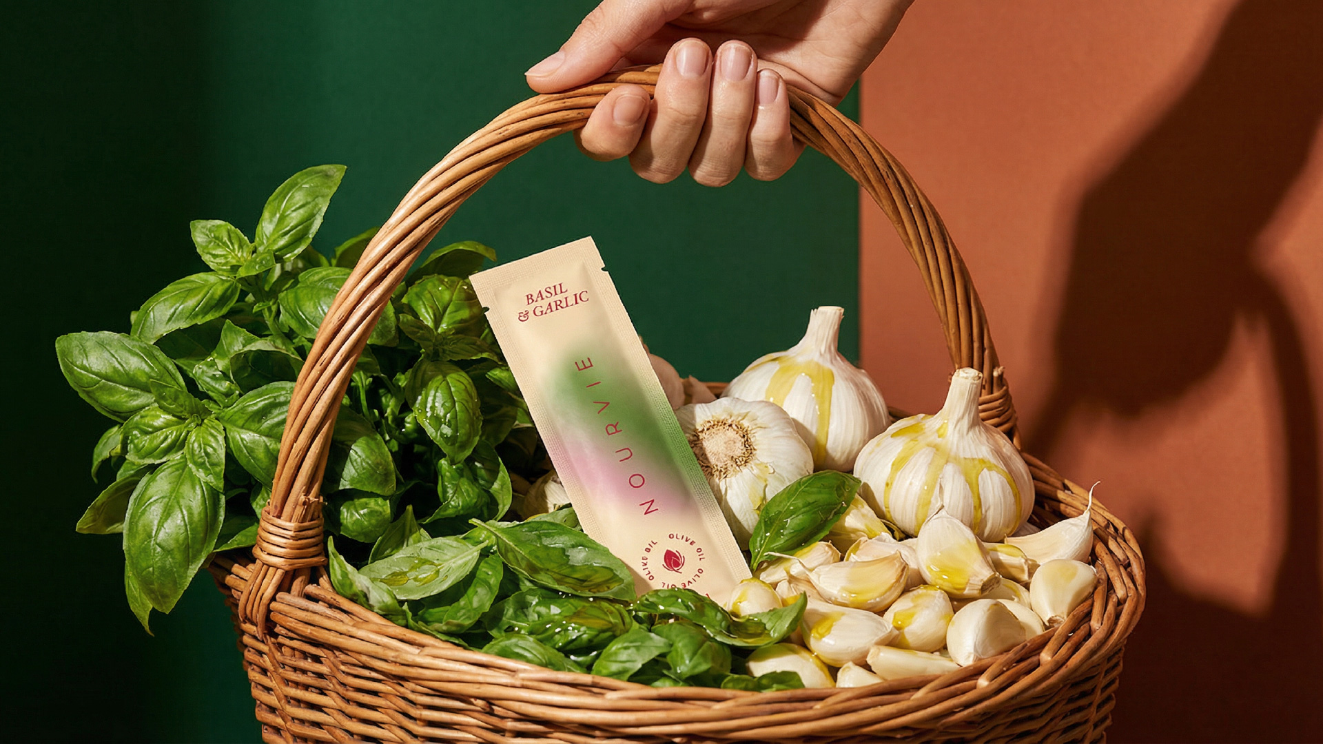
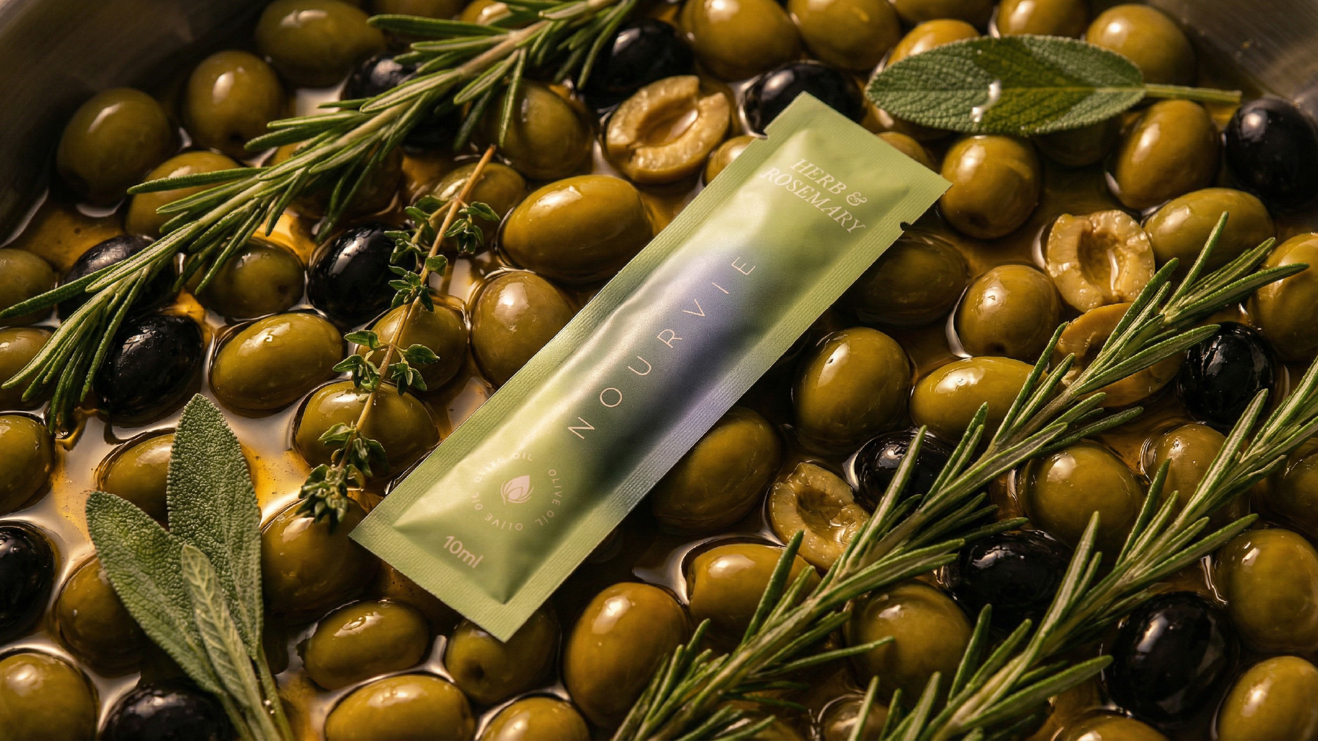
The design system is founded on a principle of chromatic empathy: each variant in the collection is assigned a colour palette drawn directly from the sensory character of its ingredients, not from convention. Pure Classic wears the deep, matte forest green of an olive grove at dusk. Herb & Rosemary takes on the hazy, sun-bleached sage of dried botanicals. Chilli & Honey burns through a rich crimson that melts into warm amber — fire yielding to sweetness. Basil & Garlic settles into creamy blush tones that evoke the warmth of a kitchen at work.
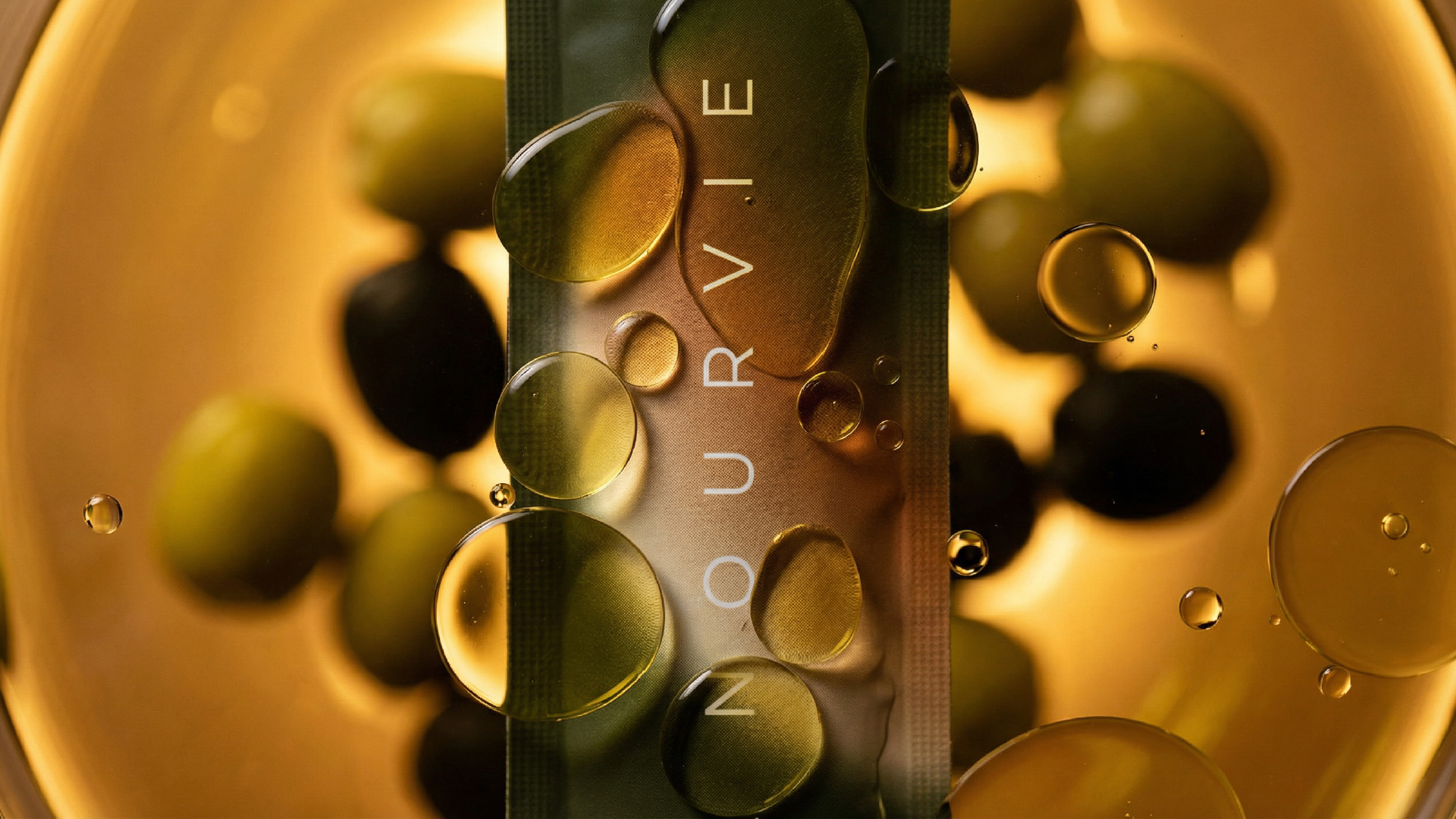
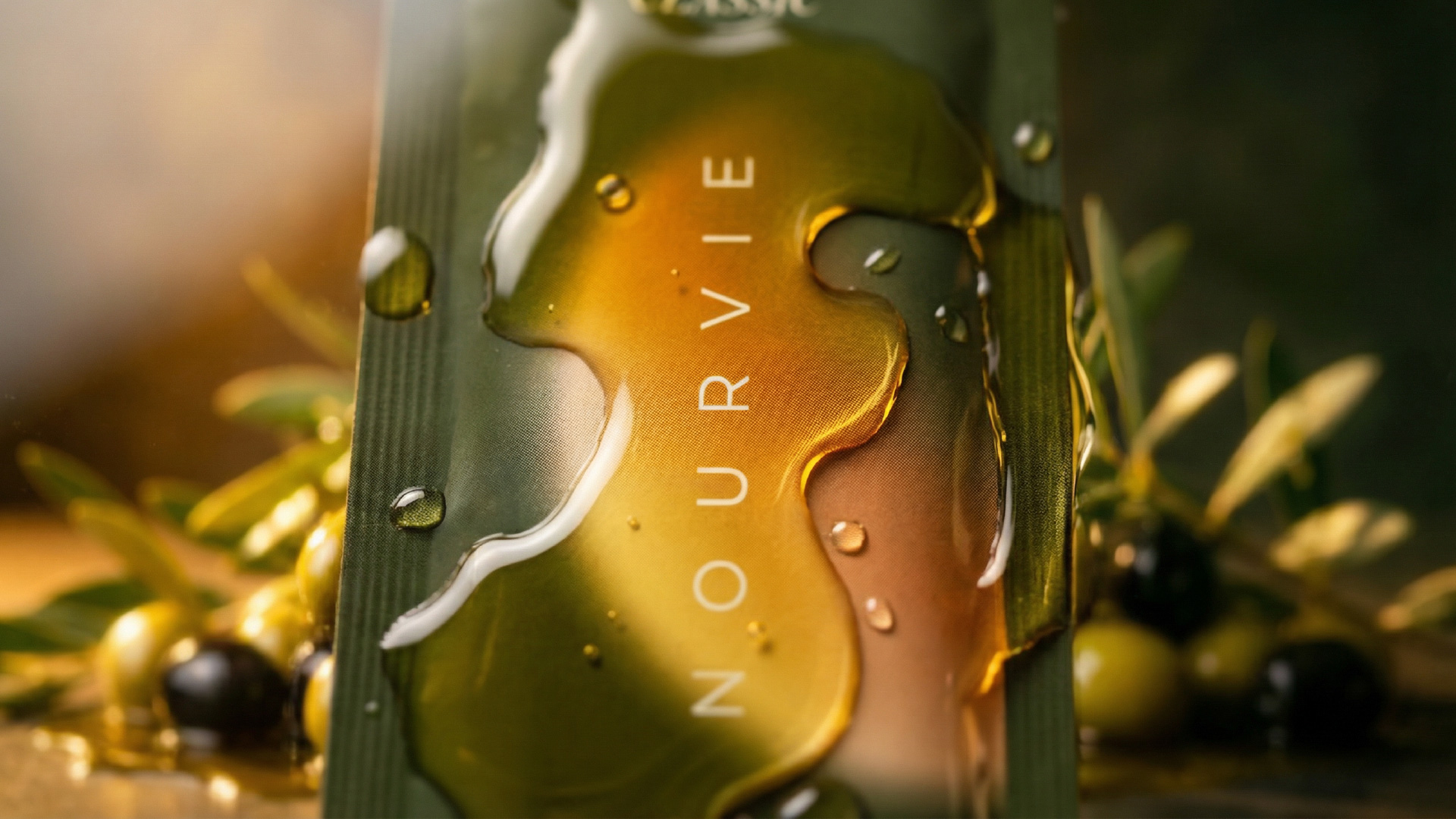
Across all four variants, the typographic approach is deliberately restrained. The wordmark “NOURVIE” is set in a wide-tracked, elegant serif arranged vertically along the sachet face — running the full height of the pack, commanding space without shouting. Flavour names are set in a refined italic at the top, functioning almost as a whispered annotation. The circular olive oil stamp at the base adds a craft-credential mark without disrupting the overall quietude of the surface.
The central design signature — a soft, luminous glow at the heart of each sachet — is the collection’s most distinctive visual device. This blurred ellipse of warm light, rendered differently in each variant’s palette, evokes the quality of oil catching light in a shallow bowl. It is neither illustrative nor purely abstract: it operates between the two, creating a sense of internal radiance that feels alive and natural on the foil substrate.
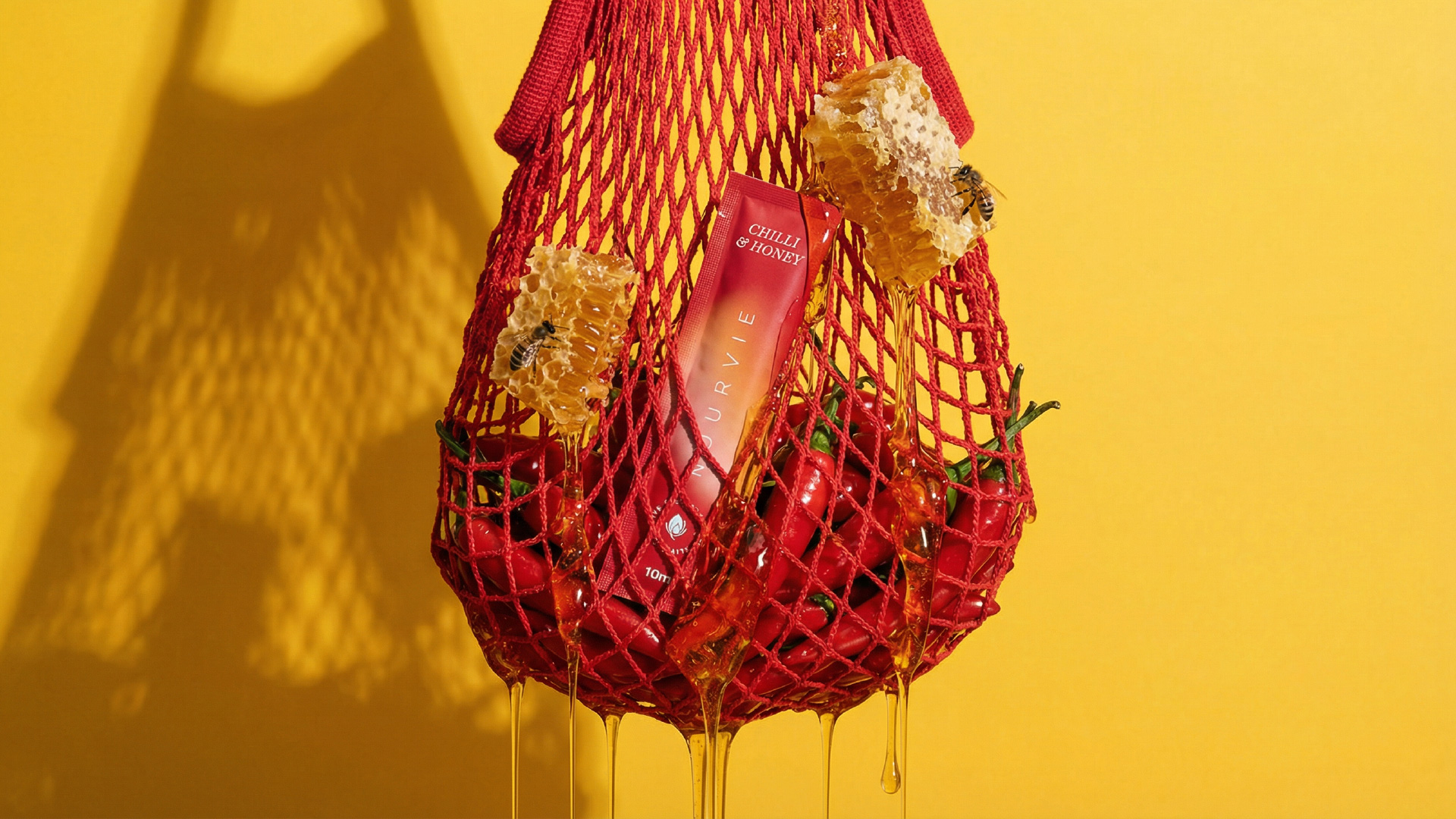
The creative photography amplifies the design’s sensory ambition. Each variant is staged within its own ingredient world — chillies and dripping honeycomb for the Chilli & Honey, a flat-lay of wild herbs for the Rosemary, olives gleaming in oil for the Classic — making the packaging feel inseparable from the ingredients it carries. Together, the design and art direction form a coherent visual language that positions Nourvie not merely as a condiment, but as an object of culinary intention.
CREDIT
- Agency/Creative: Kabir Kashyap Design Co
- Article Title: Kabir Kashyap Design Co Shapes Nourvie into a Luxury Olive Oil Sachet Brand with Sensory Appeal
- Organisation/Entity: Agency
- Project Type: Packaging
- Project Status: Non Published
- Agency/Creative Country: India
- Agency/Creative City: Bengaluru
- Market Region: Asia
- Project Deliverables: Packaging Design
- Format: Sachet
- Industry: Food/Beverage
- Keywords: Infused Olive Oil, Sachet Packaging, Premium FMCG, Sensory Design, Colour Storytelling, Luxury Food, Botanical, Indian Design, Single-Use Format, Artisanal
-
Credits:
Creative Director & Packaging Designer: Kabir Kashyap


