


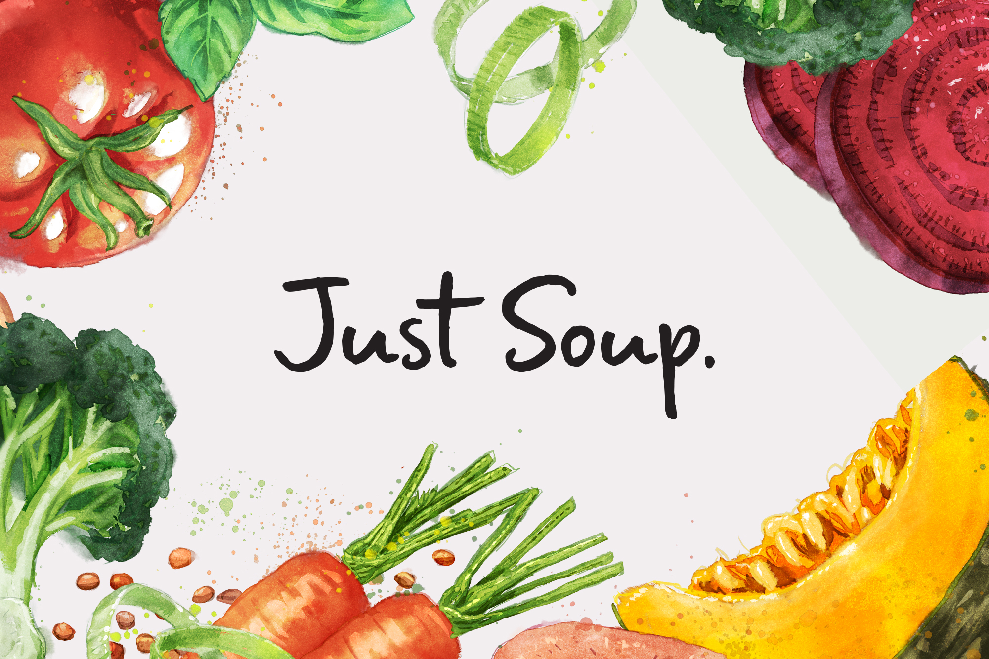
Today ‘convenience’ food doesn’t have to mean ‘fast’ food!
People are looking for something that says simple and wholesome – something that takes away the clutter and noise. Something convenient that nurtures and restores.
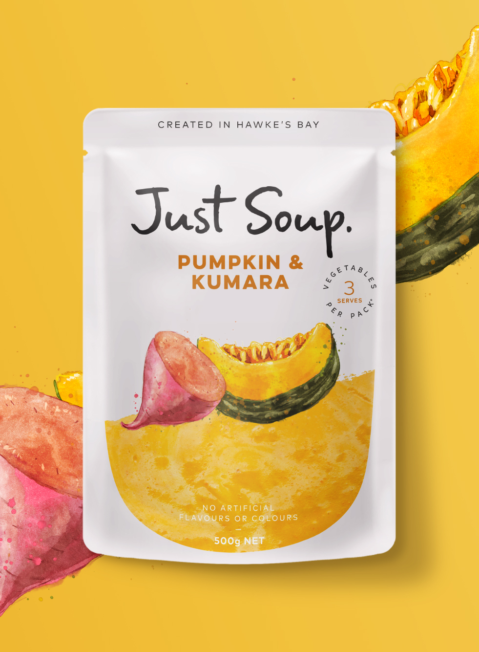
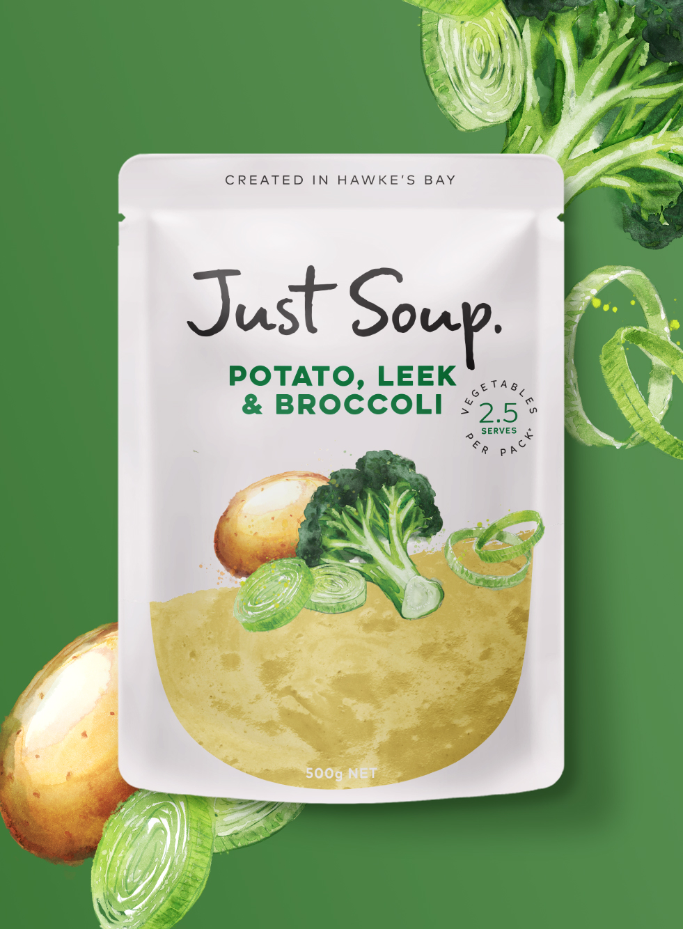
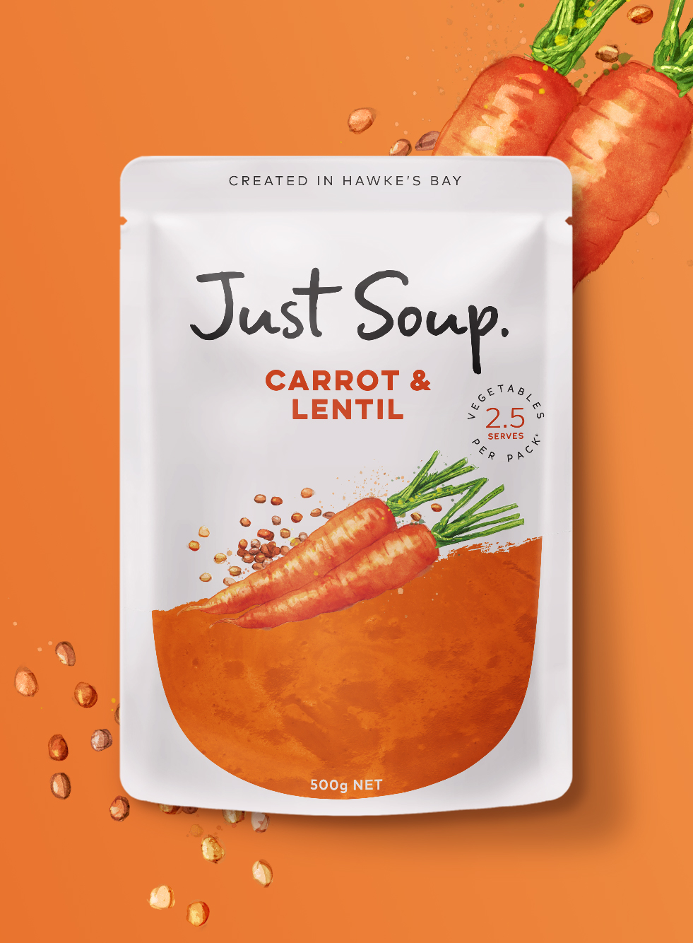
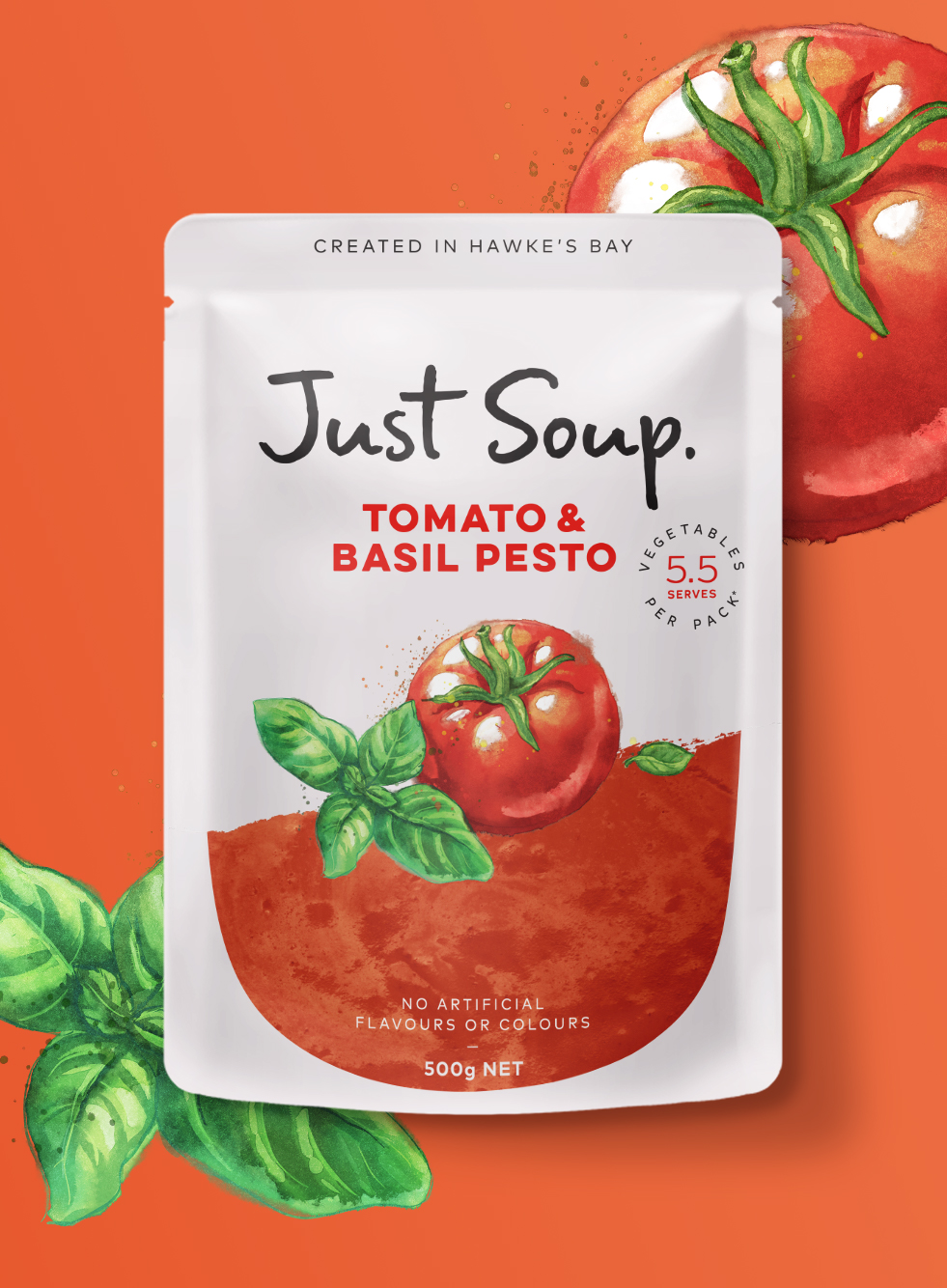
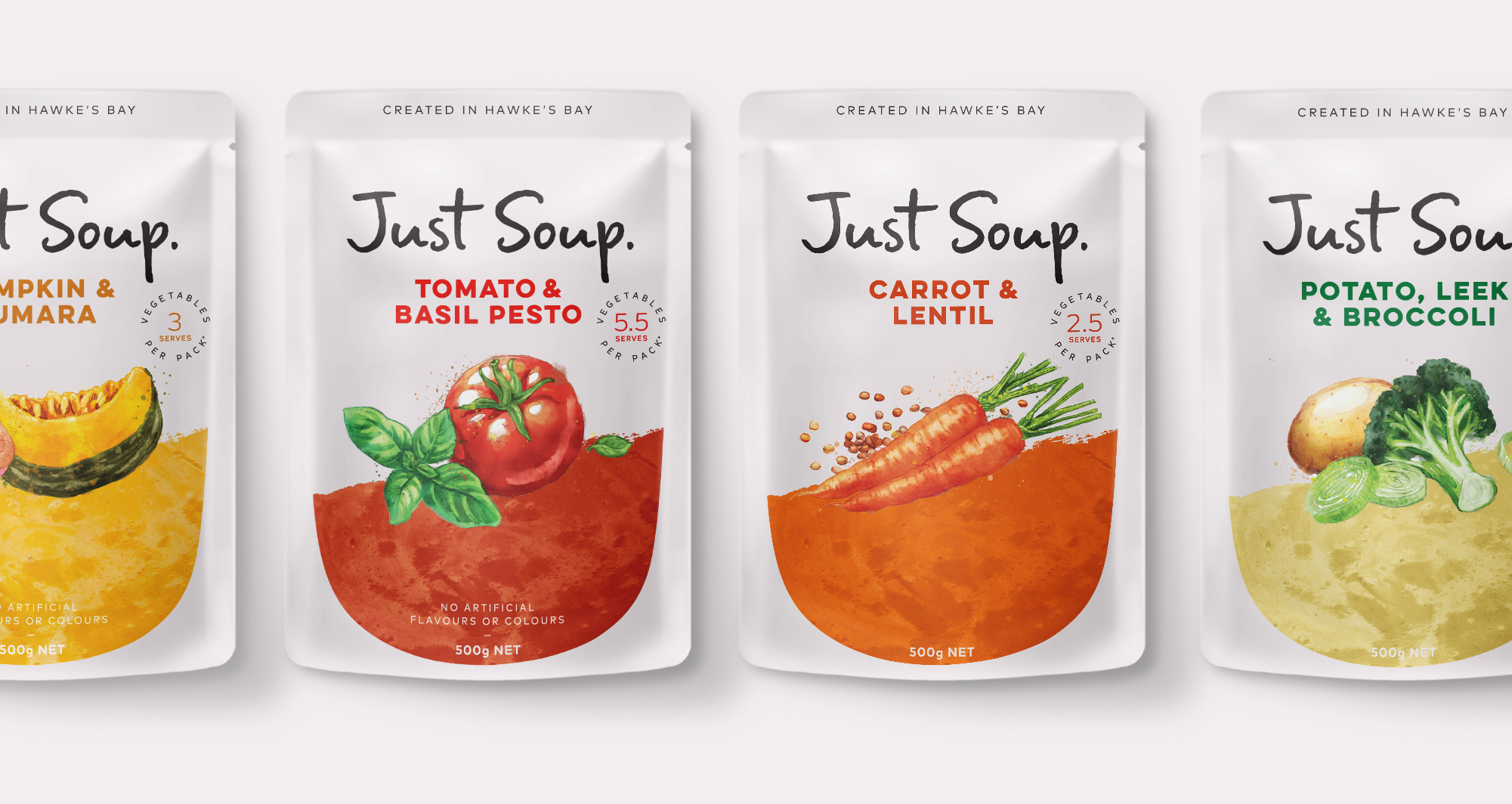
Just Soup delivers to this insight with the proposition ‘simple wholesomeness’.
We crafted a fresh hand written logo, celebrating the simplicity of white and ensuring transparency of the product helps deliver an honest and genuine look and feel.
Collaborating with Phillip Small of Watermark Creative, we created beautifully crafted watercolour illustrations to get the perfect balance of natural and wholesome across this new delicious range.
CREDIT
- Agency/Creative: Unified Brands
- Article Title: Just Soup’s Striking New Look
- Organisation/Entity: Agency, Published Commercial Design
- Project Type: Packaging
- Agency/Creative Country: New Zealand
- Market Region: Oceania
- Project Deliverables: Brand Architecture, Brand Redesign, Brand Strategy, Graphic Design, Illustration, Packaging Design, Product Architecture, Rebranding, Research
- Format: Pouch
- Substrate: Plastic
FEEDBACK
Relevance: Solution/idea in relation to brand, product or service
Implementation: Attention, detailing and finishing of final solution
Presentation: Text, visualisation and quality of the presentation


