


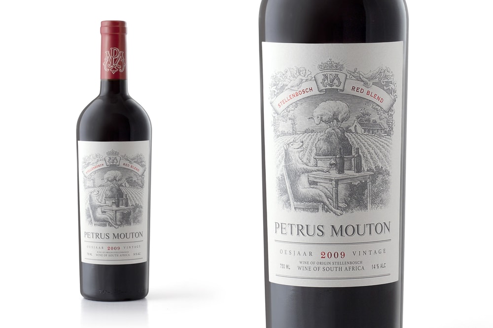
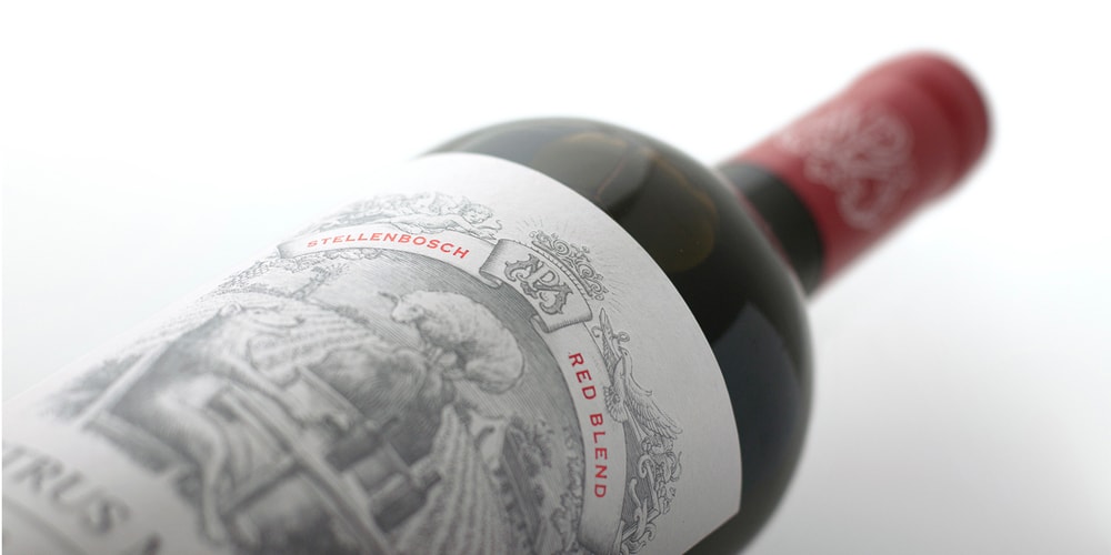
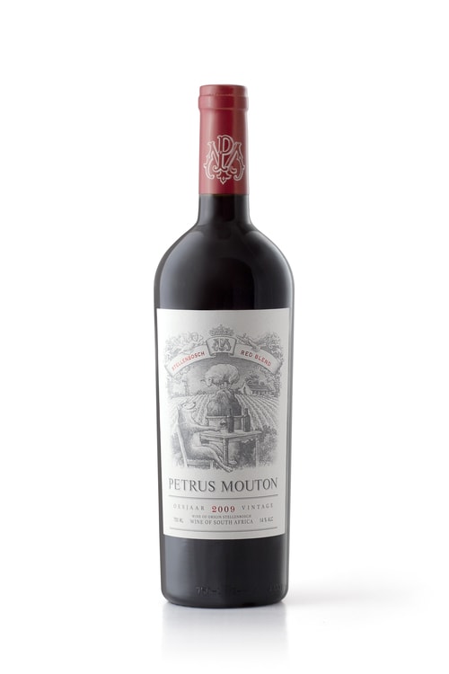
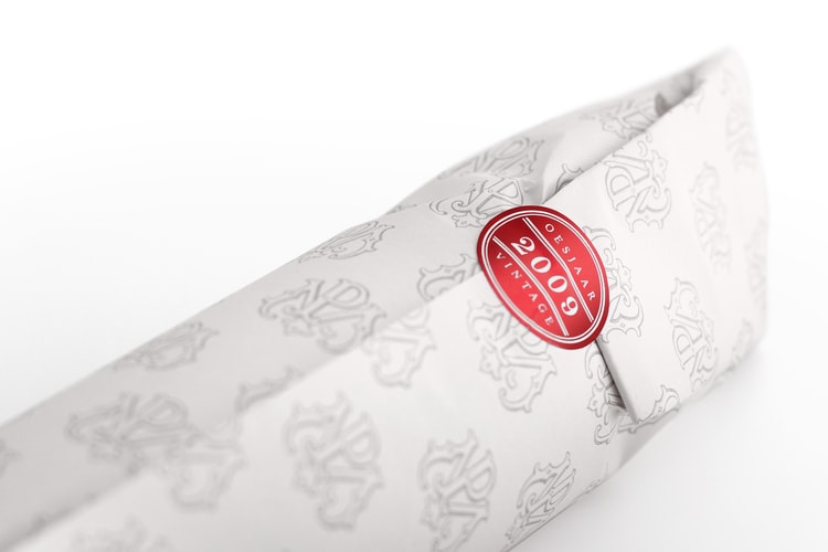
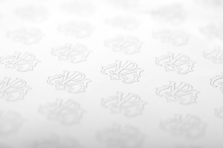
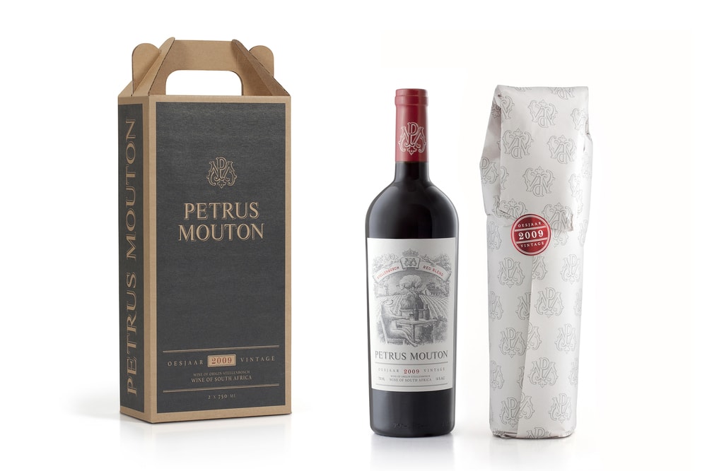
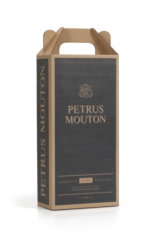
“Incorporating hidden details like the pigeon, angel and crown representing the Mouton family and their Karoo farm, the label is printed on uncoated paper and embellished with embossing and red foiling. The concept is just as textured. The sheep on the rock is the literal interpretation of Petrus meaning ‘rock’ and Mouton meaning ‘sheep’; but look a little deeper and the sheepish wolf in the foreground with his two bottles of Bordeaux reveals the cross-continental innuendo – an evocatively elegant execution of an ingeniously intricate idea.”
CREDIT
- Agency/Creative: Just Design
- Article Title: Just Design – Petrus Mouton Wine
- Project Type: Packaging
FEEDBACK
Relevance: Solution/idea in relation to brand, product or service
Implementation: Attention, detailing and finishing of final solution
Presentation: Text, visualisation and quality of the presentation


