


The Brief
Two passionate beekeepers from Durbanville approached Just Design with a clear mission: to redefine South African honey through a brand and packaging system grounded in transparency, purity, and purpose. Southern Gold Honey needed to become a bold voice for ethical sourcing, farmer upliftment, and bee sustainability, delivered through packaging that could cut through shelf noise while honouring the brand’s natural origin story.
The Challenge
The local honey category is saturated with plastic bottles, overused illustrations, and greenwashed claims. Southern Gold needed to earn consumer trust quickly while claiming premium space in mainstream retailers such as SPAR and Checkers. The brand had to feel both authentic and eye-catching, without compromising its core values or its premium positioning.
Design Inspiration
We looked to the geometry of honeycombs, the botanical richness of bee habitats, and the principle of crafted simplicity. Our creative exploration balanced modern minimalism with nature’s intricate beauty. Through typographic storytelling, organic motifs, and gold-infused detailing, we built a brand language that felt both elevated and honest, rooted in natural cues, yet confident on shelf.
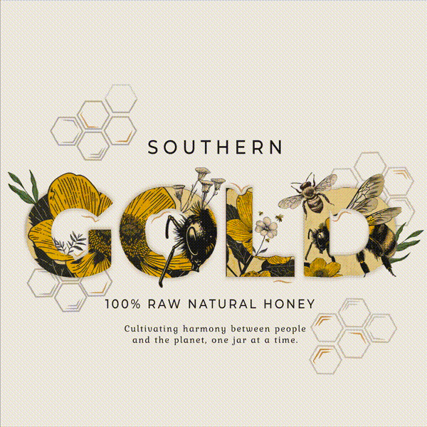
Design Solution
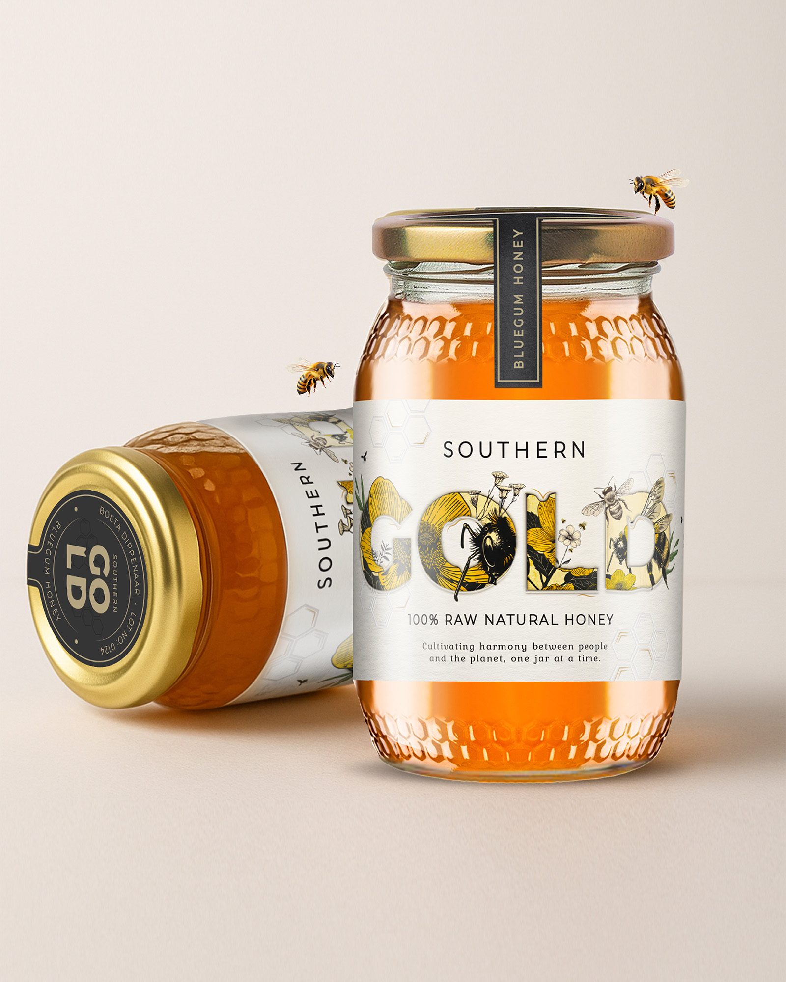
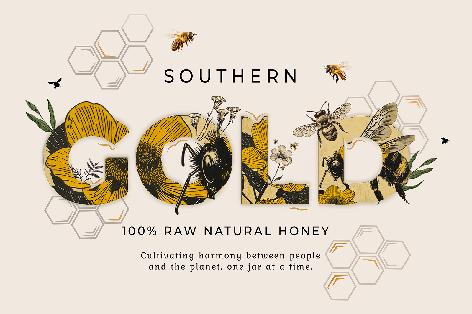
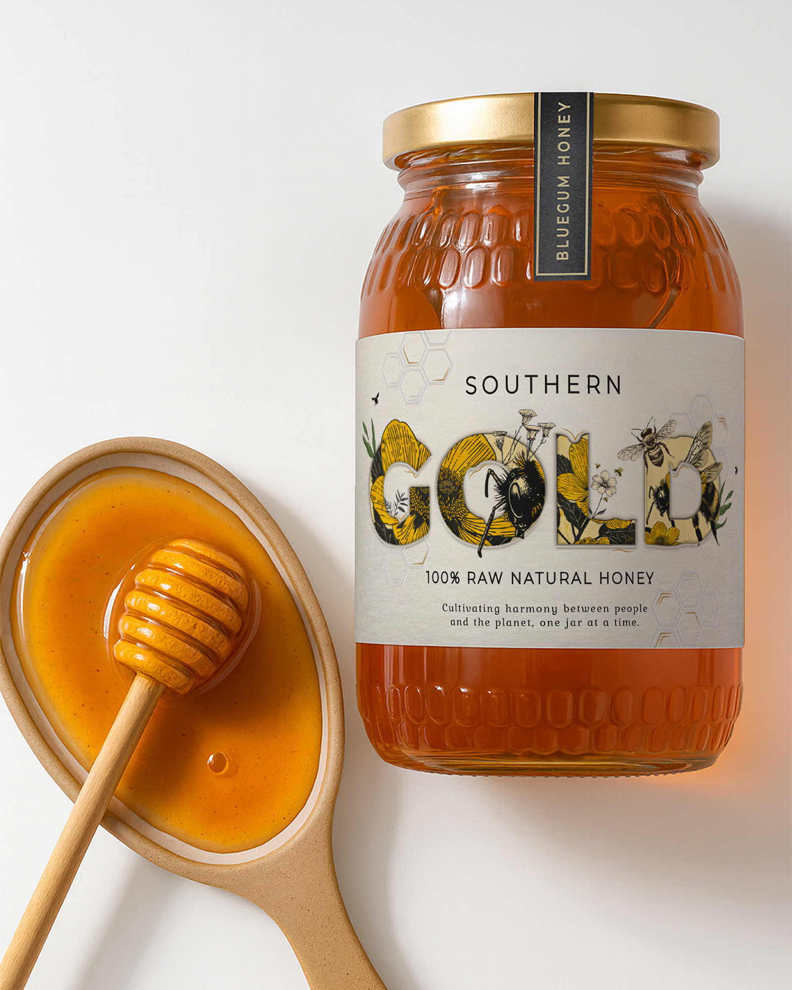
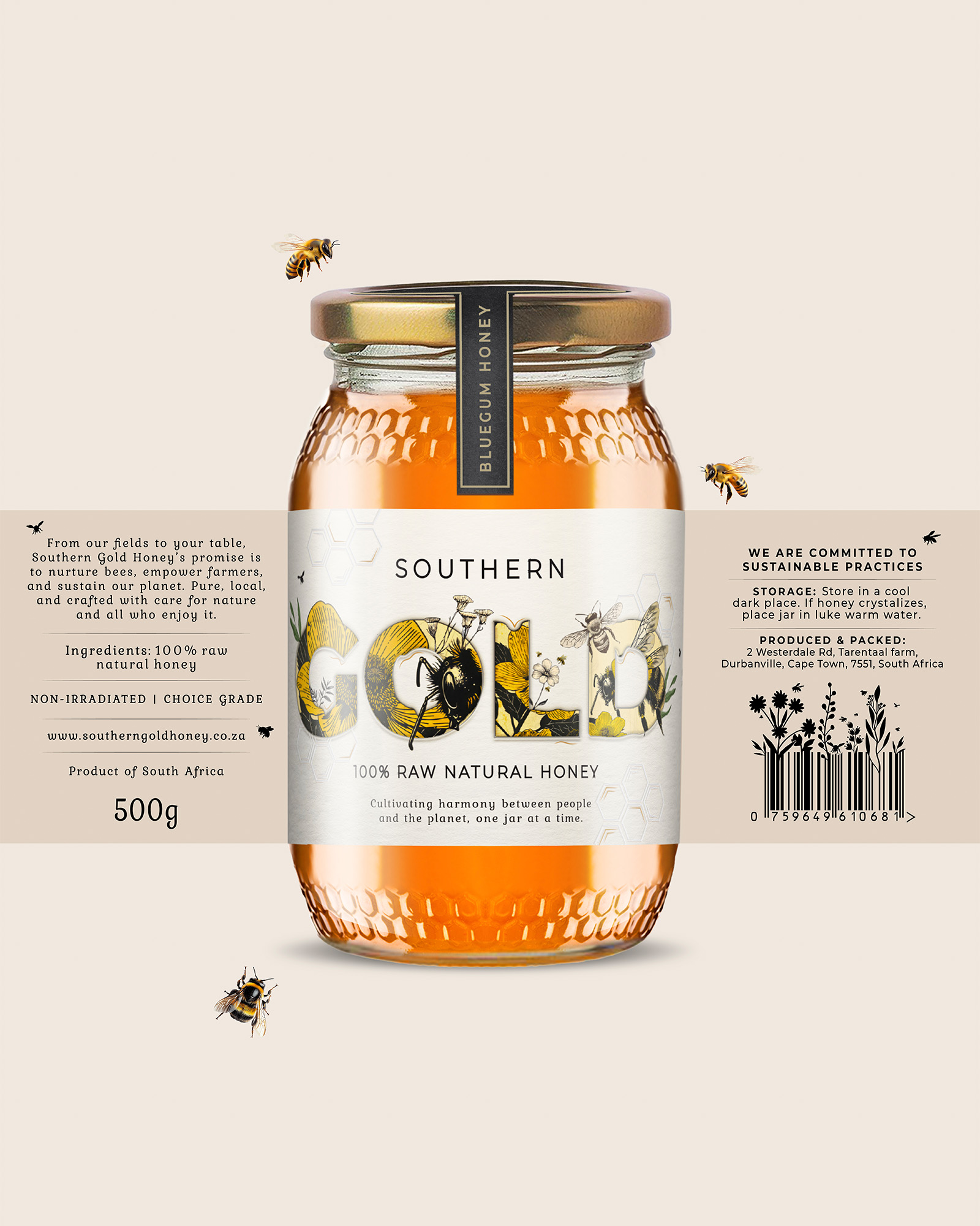
From hive to hand, every jar was designed to feel like a keeper. The wordmark serves as a living canvas: the letters in “GOLD” are intricately illustrated with bees, blooming botanicals, and soft pollen trails, bringing nature into the heart of the identity. We paired uncoated cotton-white paper with high-build embossing and gold foil accents to create a rich, tactile experience that mirrors the purity of the product inside. A signature black lid ribbon, featuring a QR code linking back to the beekeeper, adds a final layer of transparency and storytelling. The result is a balance of contemporary clarity and slow-crafted indulgence: a jar that feels as good in the hand as it does in purpose.
The Result
Southern Gold launched as a proudly South African, modern honey brand with soul. A true challenger in a plastic-dominated category, crafted to be as pure in story as it is on shelf. A quiet harmony between people and planet, one jar at a time.
CREDIT
- Agency/Creative: Just Design
- Article Title: Just Design Created The Sustainable Standout
- Organisation/Entity: Agency
- Project Type: Packaging
- Project Status: Published
- Agency/Creative Country: South Africa
- Agency/Creative City: Cape Town
- Market Region: Africa
- Project Deliverables: Packaging Design
- Format: Jar
- Industry: Food/Beverage
- Keywords: #JustDesign #SouthernGoldHoney #PackagingWithPurpose #DesignForGood
-
Credits:
Creative Director: Thelmarie Toerien
Senior Designer: Estee Oberholzer


