


EL BRAVO – Agave with a Kick
THE BRIEF:
Edward Snell & Co. approached Just Design with a bold ambition: to launch a new brand into the low-ABV shooter space. The goal? Introduce a “friendly tequila” that’s fun, flavourful, and fridge-ready, with broad appeal to social drinkers aged 18–34. The new brand needed to confidently claim space in both refreshment and shooter occasions, positioned as a flavour-forward agave spirit at an accessible price point. The scope spanned from naming and brand creation to bespoke bottle structure, flavour navigation, and outer carton design.
THE CHALLENGE:
To break into a category dominated by a single iconic brand and build a challenger brand that felt instantly drinkable, distinctive, and ownable. The identity had to balance premium cues and Mexican storytelling with a tone that was light-hearted and culturally respectful. Early design routes explored visual tropes like bold rebels and fiesta caricatures, but the winning idea fused agave authenticity with playful wit. The packaging needed to be production-friendly, fridge- and freezer-ready, and visually disruptive.
THE DESIGN INSPIRATION:
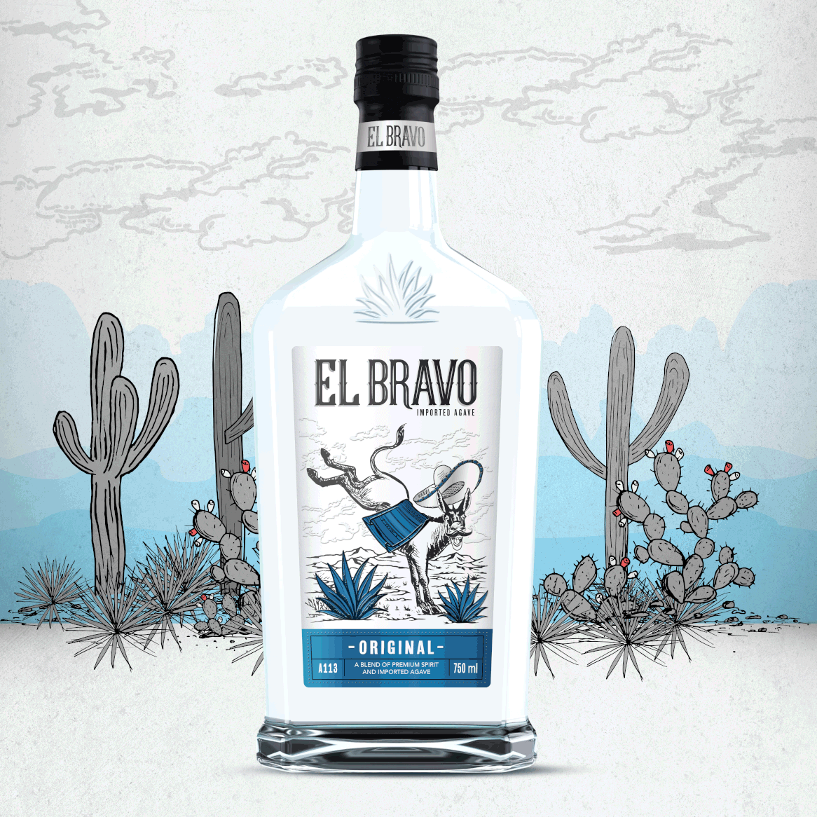
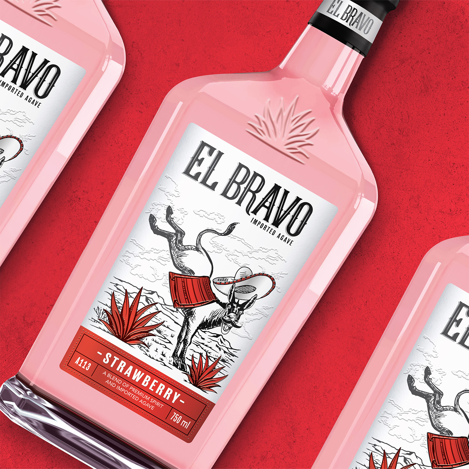
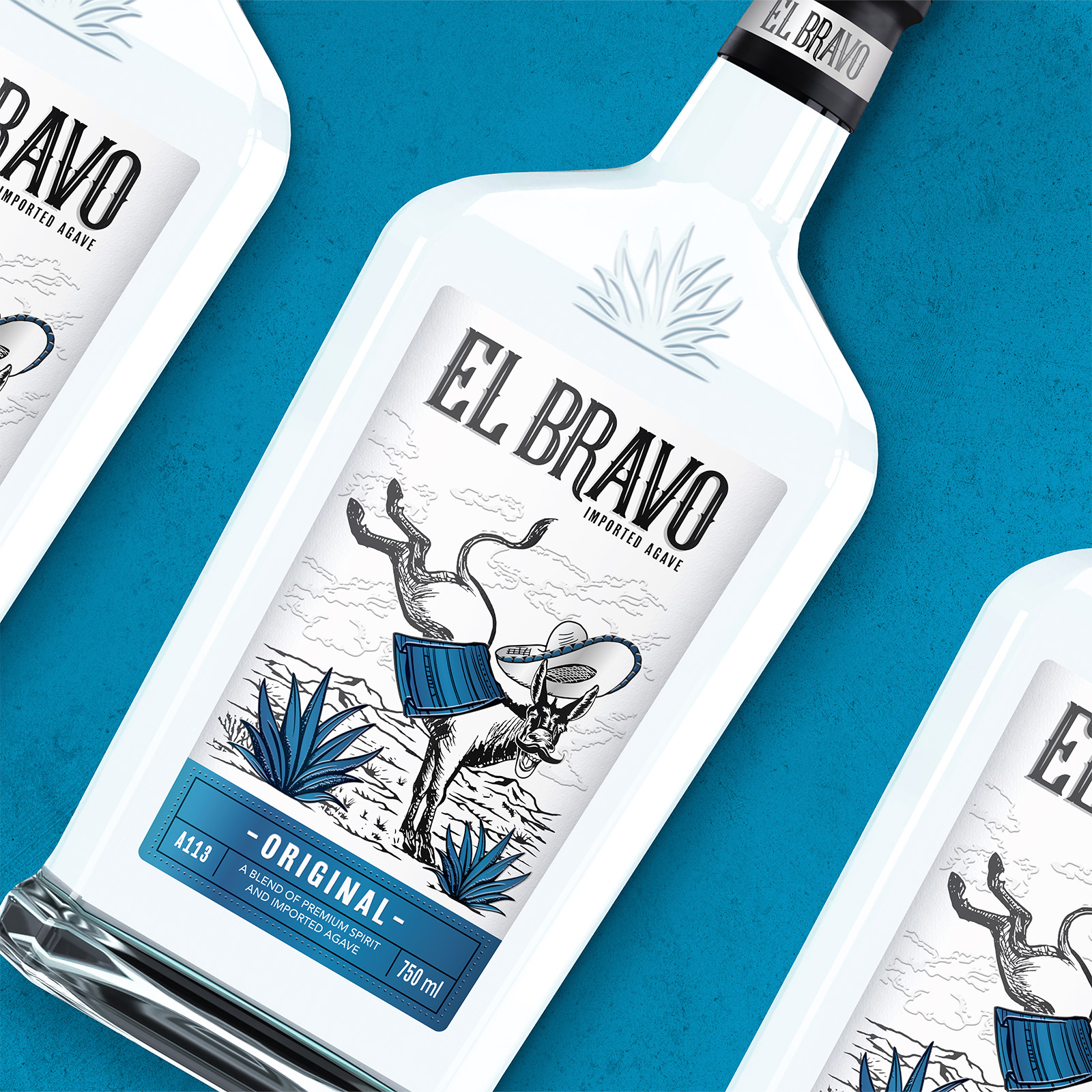
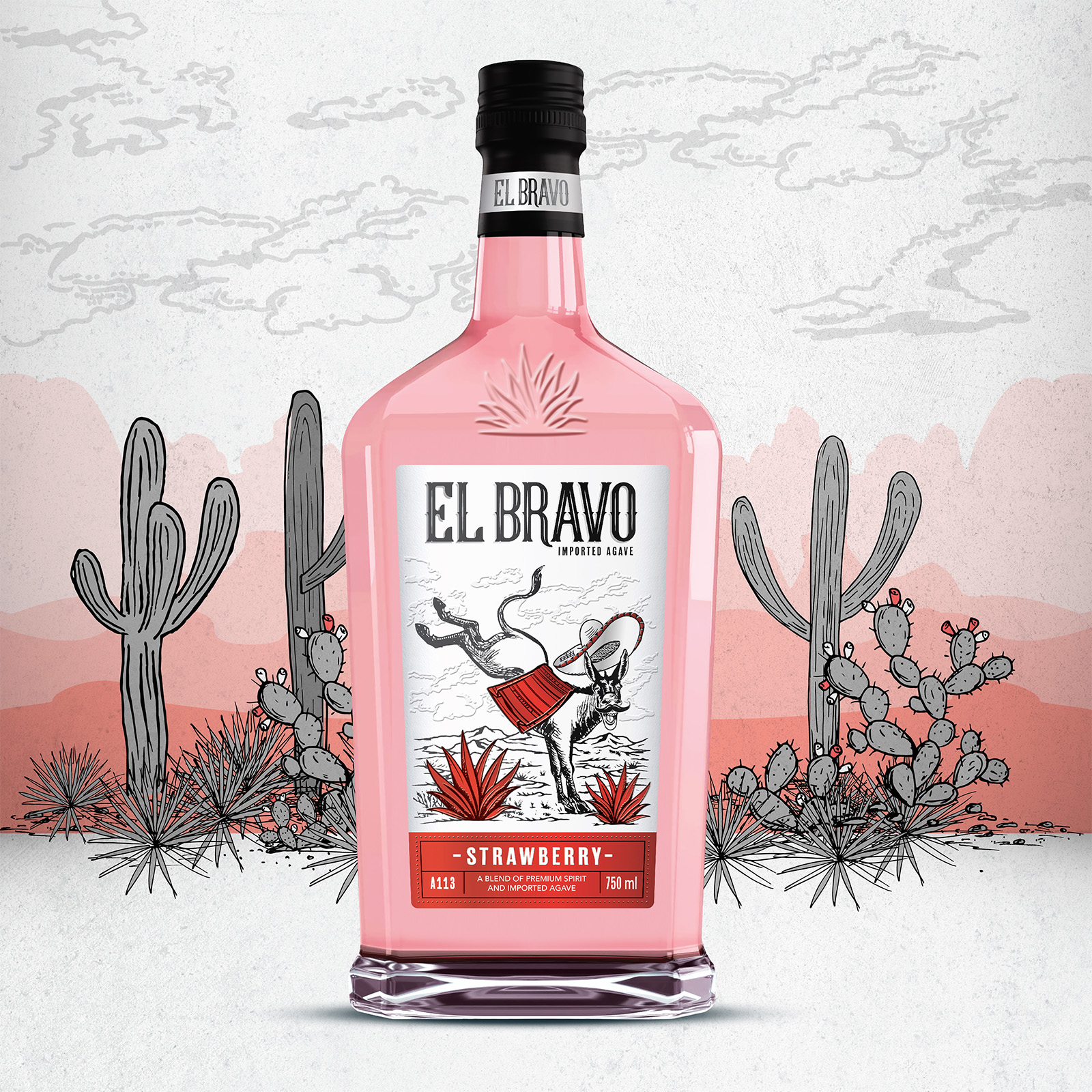
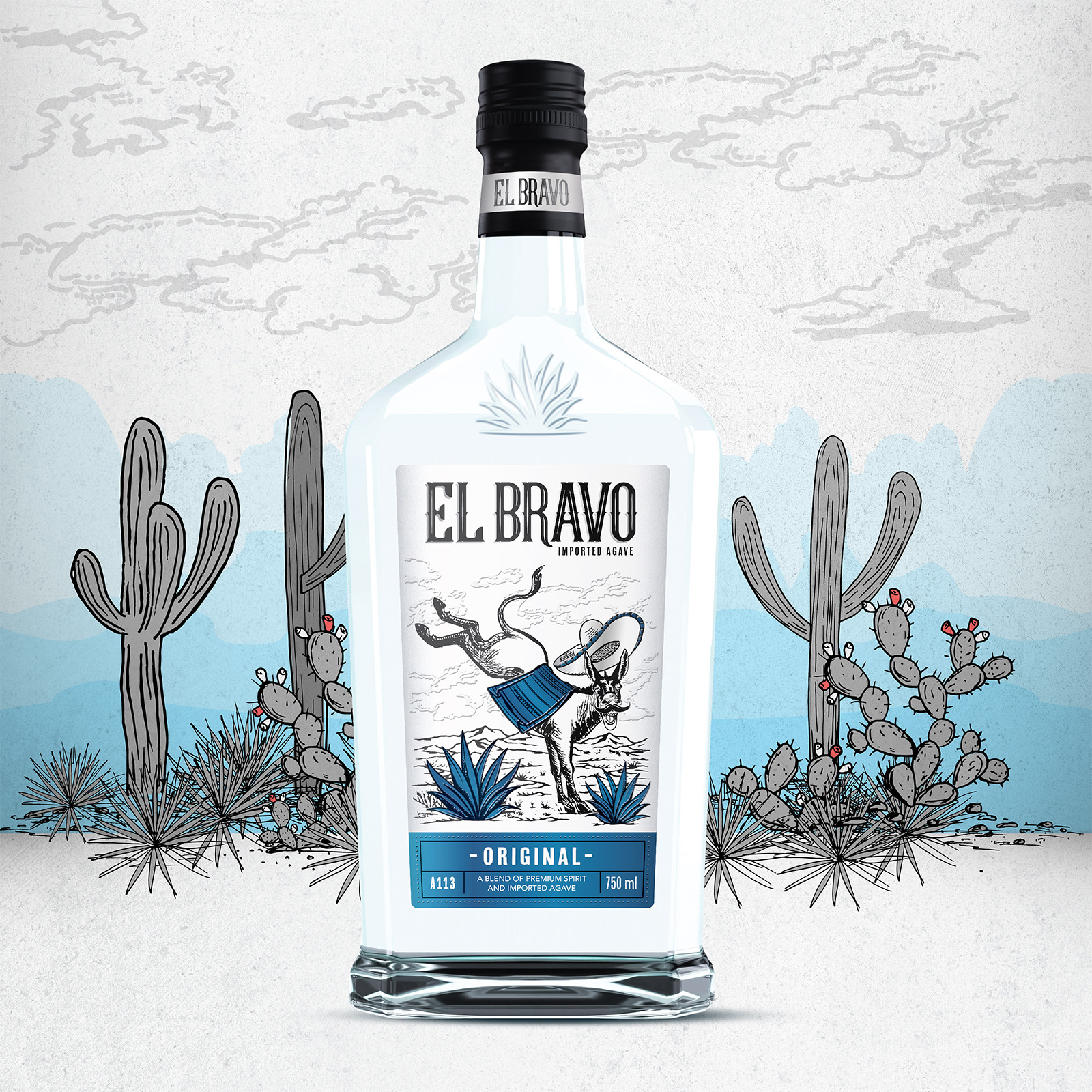
Mexican vibrancy meets mischievous charm. We needed an icon that captured the drink’s light-hearted energy and “friendly tequila” spirit. Something instantly memorable, a little cheeky, and with just enough kick to get the party started. Enter the donkey: a fun, irreverent mascot with unmistakable attitude. His mid-kick stance nods to the flavour punch in every sip, while his playful personality mirrors the drink’s low-alcohol promise, so you can party longer, laugh louder, and have all the fun without burning out too soon. Bold linework, vibrant colour blocking, and irresistible character combine to create a design that’s as unforgettable as the first round.
THE DESIGN SOLUTION:
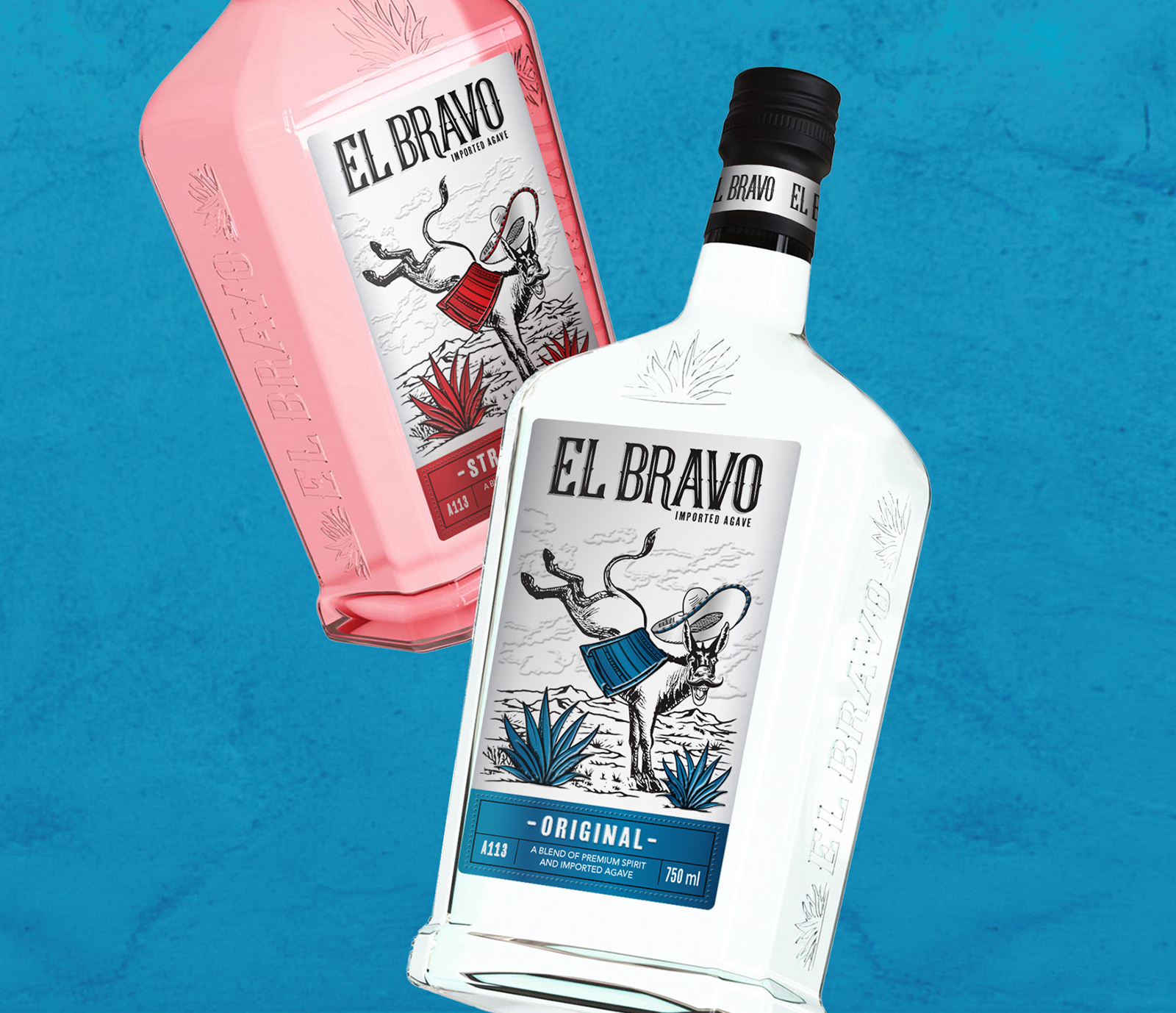
At the heart of the visual identity is a stylised, mid-kick donkey. Iconic, irreverent, and full of flavour. Each variant is built around expressive flavour blocks and playful, characterful typography. But what truly sets El Bravo apart is its custom-designed bottle shape, developed from scratch to ensure a unique and ownable structural silhouette for the brand. The shape is masculine yet approachable, tall with rounded shoulders and a confident stance. Designed to chill comfortably in the fridge, while standing tall in the category.
Details like the El Bravo wordmark and agave embossing on the bottle shoulders elevate the sense of craft and authenticity, reinforcing the premium cues embedded in the form. Topped with a wooden cap and paper seal, the stripped-back colour palette lets the vibrant liquid take centre stage; blue for Original, red for Strawberry. The outer cartons echo the bottle’s bold attitude with punchy, high-impact visuals designed to command attention online and in-store.

CREDIT
- Agency/Creative: Just Design
- Article Title: Just Design Brings El Bravo to Life as the Fun and Flavorful Face of Modern Agave
- Organisation/Entity: Agency
- Project Type: Packaging
- Project Status: Published
- Agency/Creative Country: South Africa
- Agency/Creative City: Cape Town
- Market Region: Africa
- Project Deliverables: Brand Creation, Design, Graphic Design, Label Design, Packaging Design, Structural Design
- Format: Bottle
- Industry: Food/Beverage
- Keywords: #ElBravo #ProductDesign #BottleDesign #StructuralPackaging #AgaveSpirit #BrandWithKick #DesignMatters #CreativeBranding
-
Credits:
Senior Designer: Jolize Jacobs
Creative Director: Thelmarie Toerien


