Just Date is a doctor and women-led company revolutionizing your pantry with a better sugar made from healthy, wholesome organic dates.
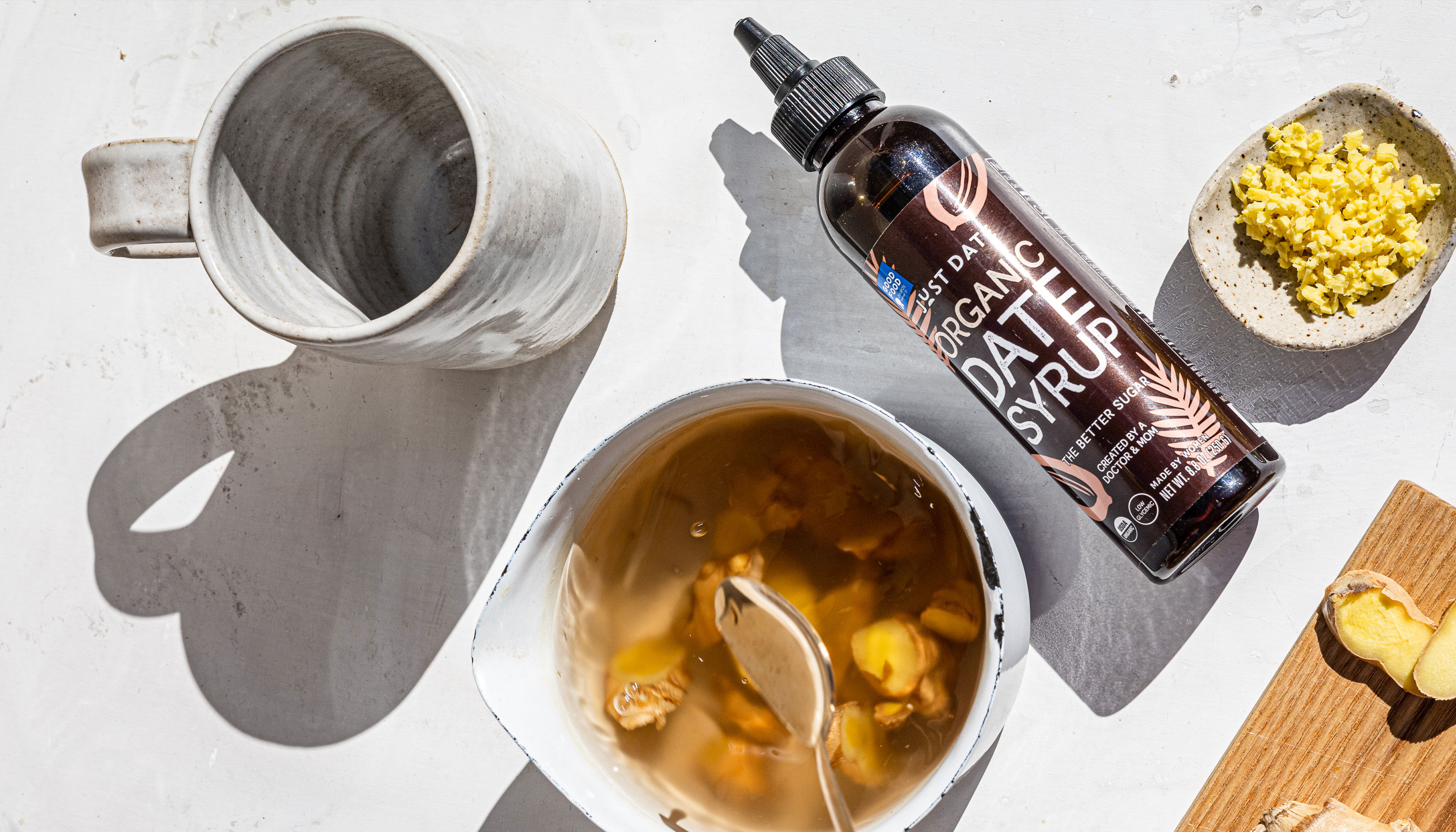
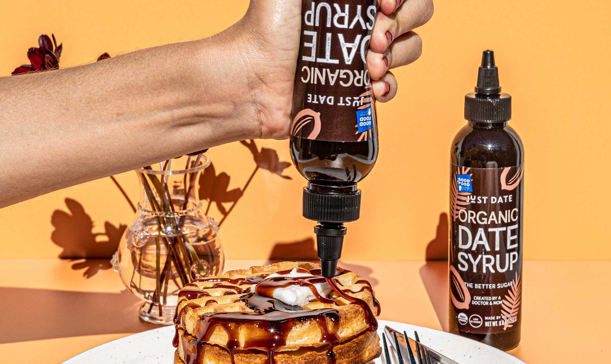
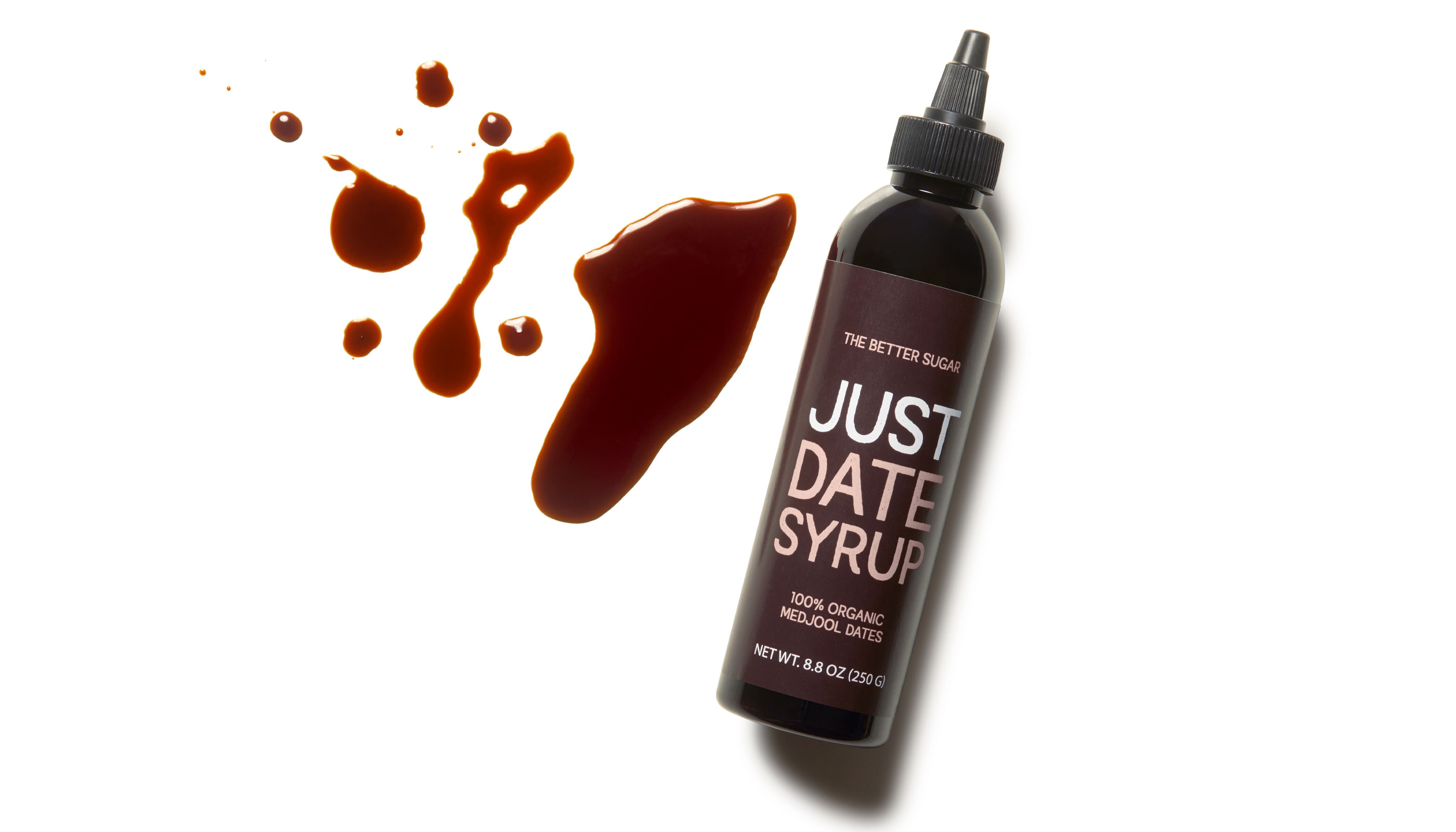
Simplicity and natural wholesomeness are at the center of Just Date’s mission, and our design and brand strategy to launch was centered around a simple and clear brand identity with arresting packaging design that boldly communicates what’s inside each package, how you can use it, and the nutritional benefits, proving itself a healthier more delicious alternative to your average sugar.
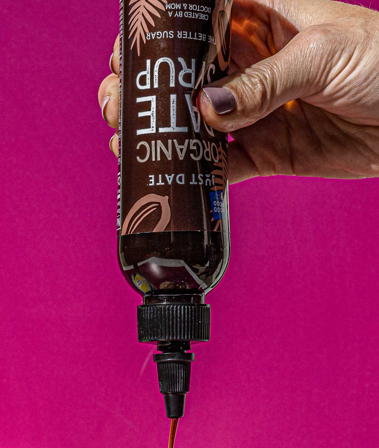
For the brand’s initial launch we delivered packaging design that is as simple as the ingredients inside each Just Date product, keeping the bottles minimal and typographic in order to visually grab attention and become what is now a very popular stand-out item in the grocery aisle. The utlity of our creative approach encouraged shoppers to get creative with the sweetener in their kitchen, and supporting iconography explains the versatility of the products.
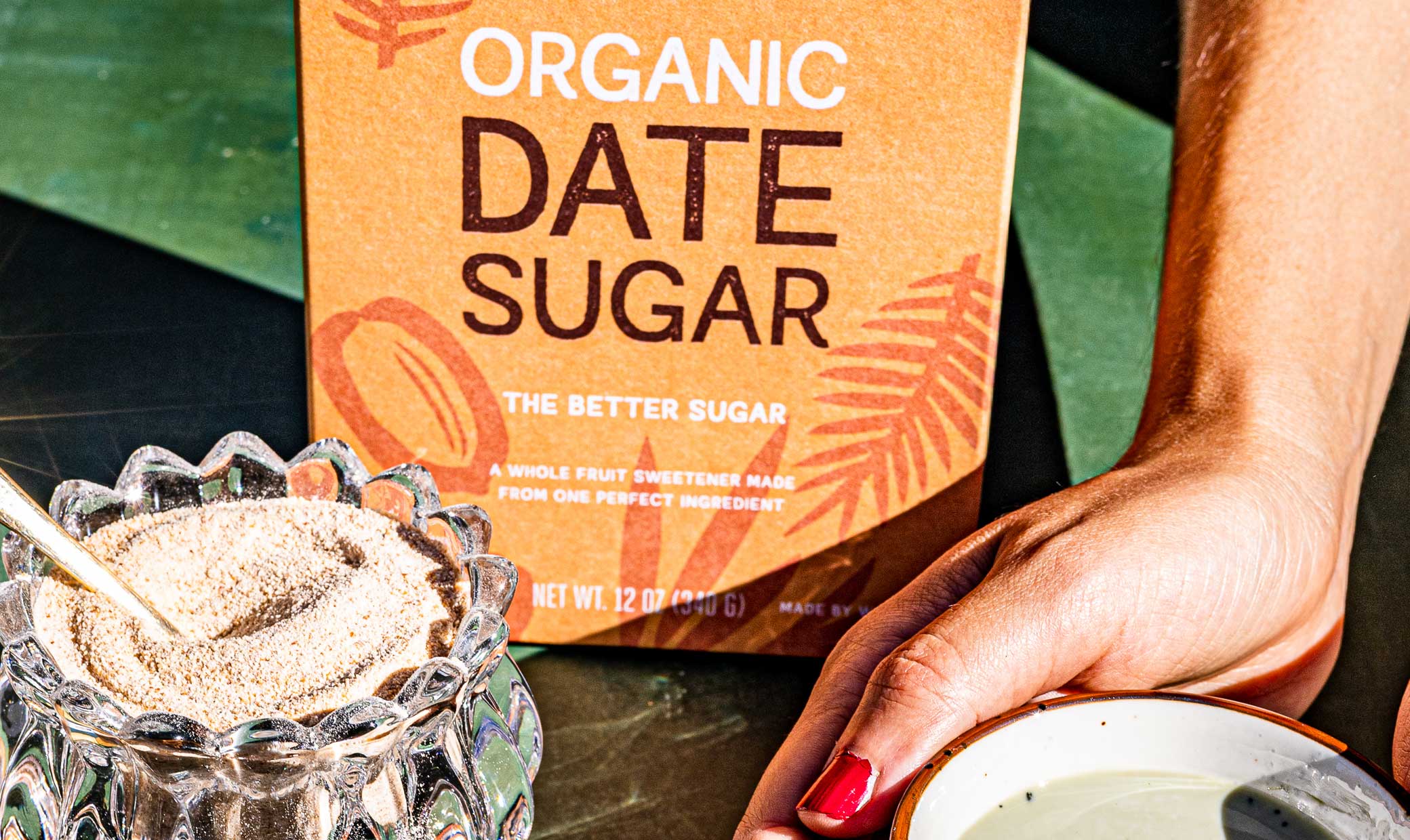
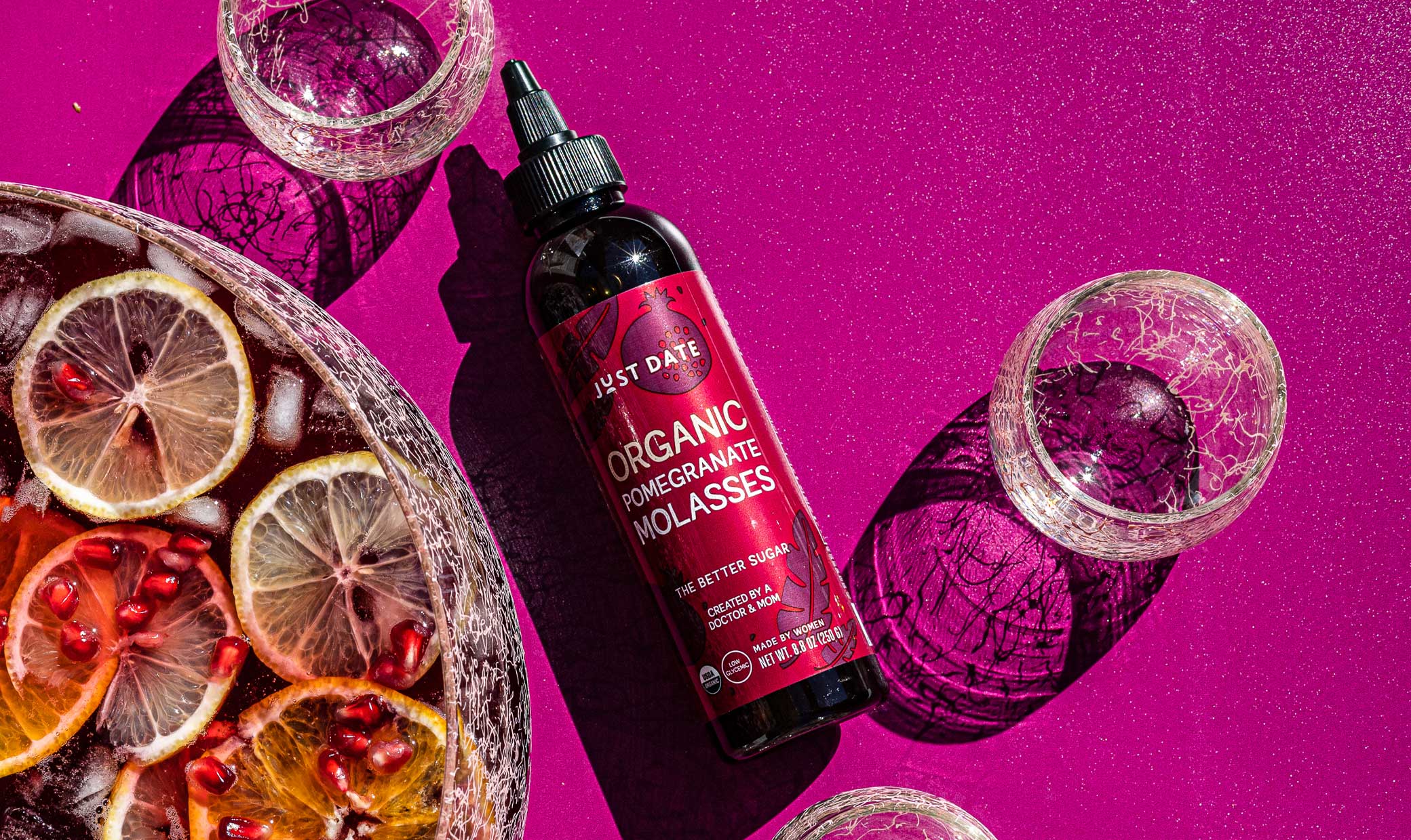
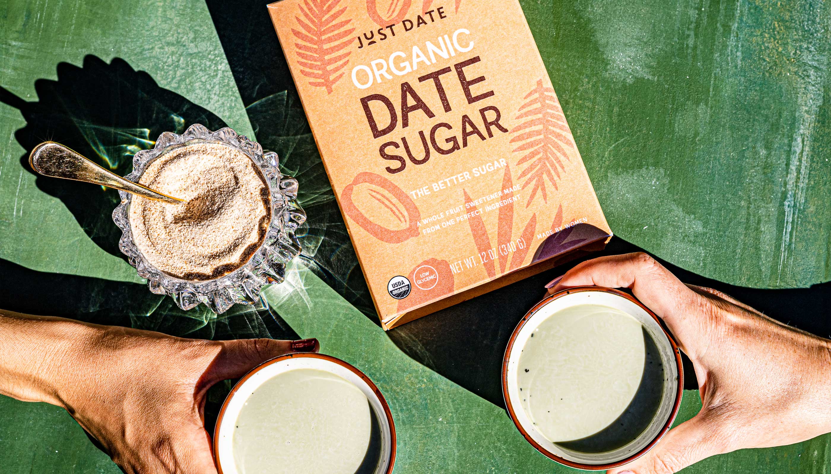
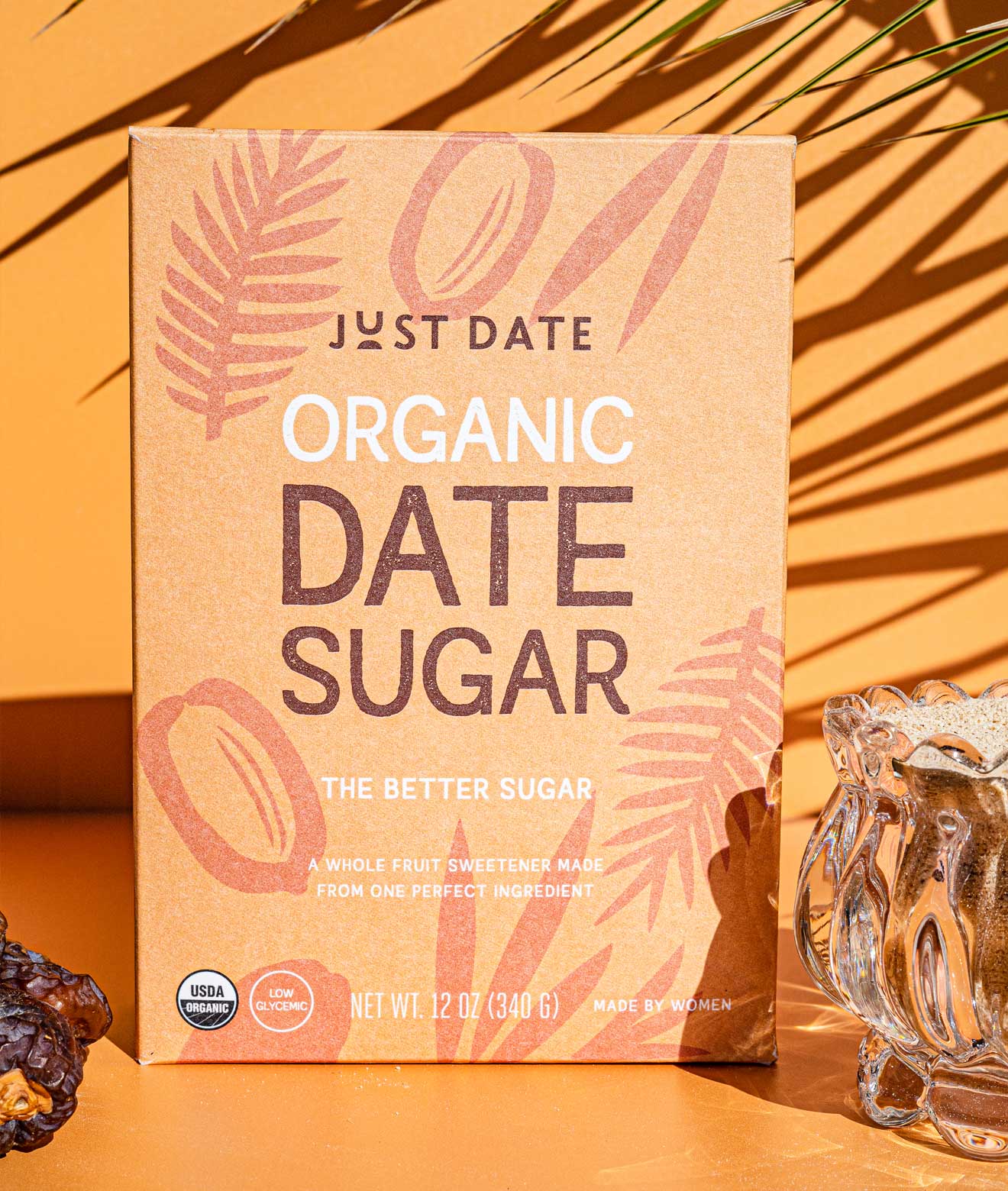
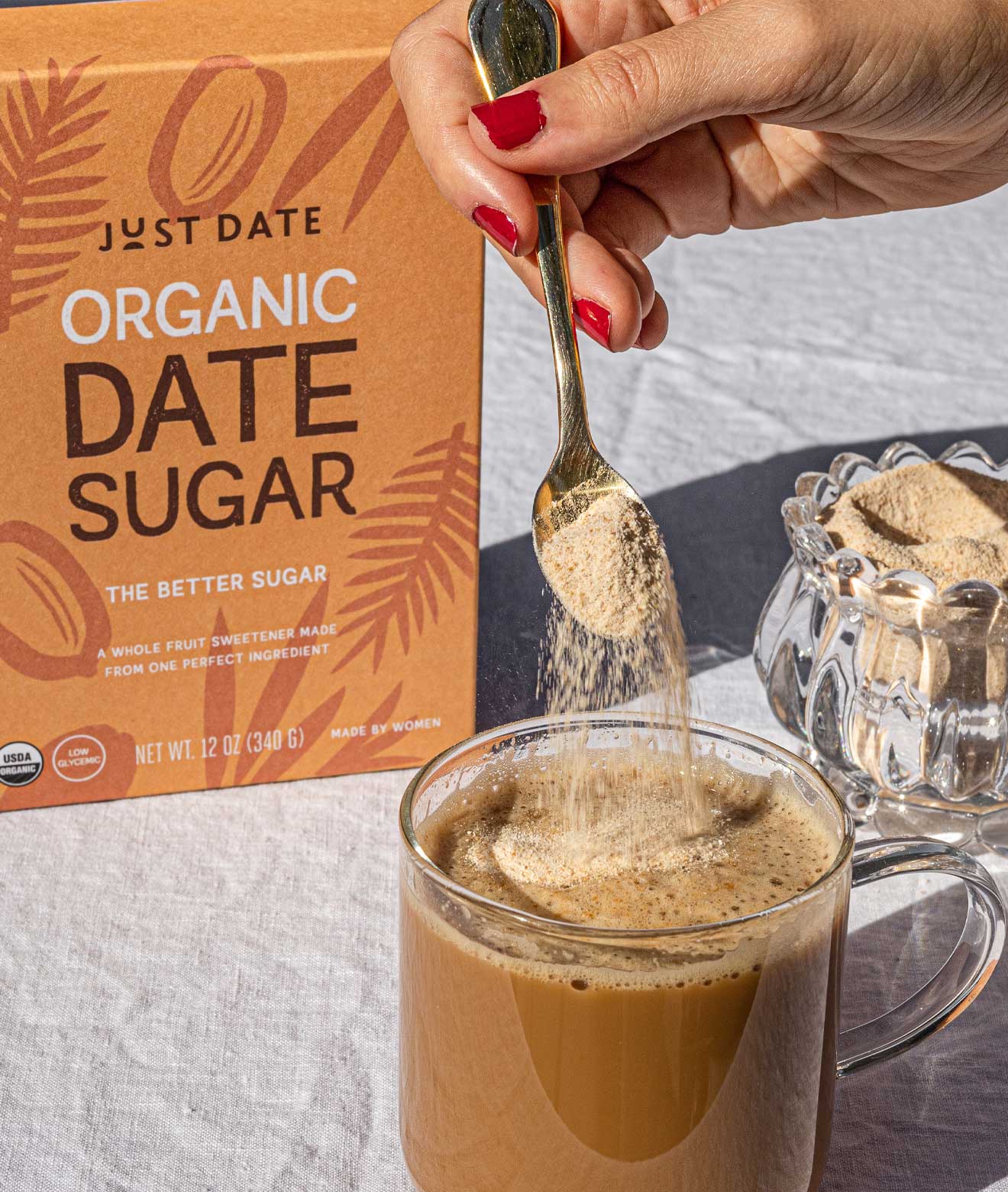
As the Just Date grew and expanded their product offering, they launched a pomegranate syrup and date sugar. The date sugar box design brings a nibble of California sun into your kitchen, and is guaranteed to be your new favorite pantry item. With these new products came a design evolution celebrating the source of their flavor and high quality ingredients through the addition of playful illustrations with each their own sweet California twist.
Sweet Success
Just Date has sold more than 250,000 bottles of their syrup to date and has quickly become a household name to many. The branding and packaging design stood out to retail buyers, leading to their acceptance into Whole Foods nationwide within several months of launching. Within the 2 years to follow, the brand built up its distribution to over 1,750 stores nationally, and were named Amazon’s Choice for date syrup, and now several years later continue to expand and grow.
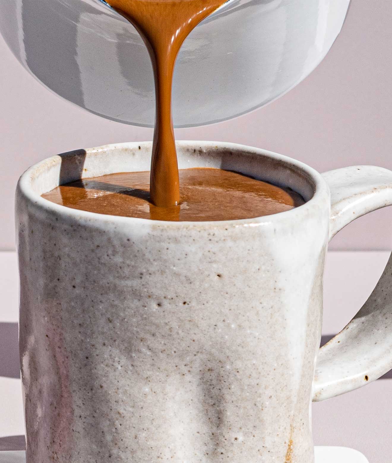
Just Date’s products have been featured in Bon Appetit, New York Times, Forbes, and The Wall Street Journal. Their beautiful Instagram feed is also worth a visit, full of drool-worthy food photography and delicious recipes, and if that’s not satisfying enough you can pick up a copy of The California Date Cookbook, a collaboration between Just Date & Rancho Meladuco Date Farm.
CREDIT
- Agency/Creative: Design Womb
- Article Title: Just Date Branding and Packaging Design – Nothing is Sweeter Than Growth
- Organisation/Entity: Agency
- Project Type: Packaging
- Project Status: Published
- Agency/Creative Country: United States
- Agency/Creative City: San Francisco
- Market Region: North America
- Project Deliverables: Brand Identity, Icon Design, Illustration, Logo Design, Packaging Design, Structural Design
- Format: Bottle, Box
- Substrate: Plastic, Pulp Carton, Pulp Paper
- Industry: Food/Beverage
- Keywords: graphic design, packaging design, creative agency, award winning design, award winning packaging, food packaging design, packaging expert, branding, brand strategy, logo design
-
Credits:
Creative Agency: Design Womb
Creative Director: Nicole LaFave
Designers: Nicole LaFave & Audrey Green
Lifestyle Photography: Rezel Kealoha


