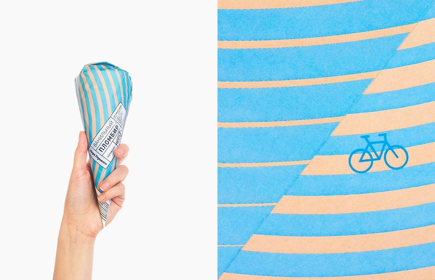
” Before the summer season the design studio from Moscow “Just Be Nice” was working with the main park of the capital.
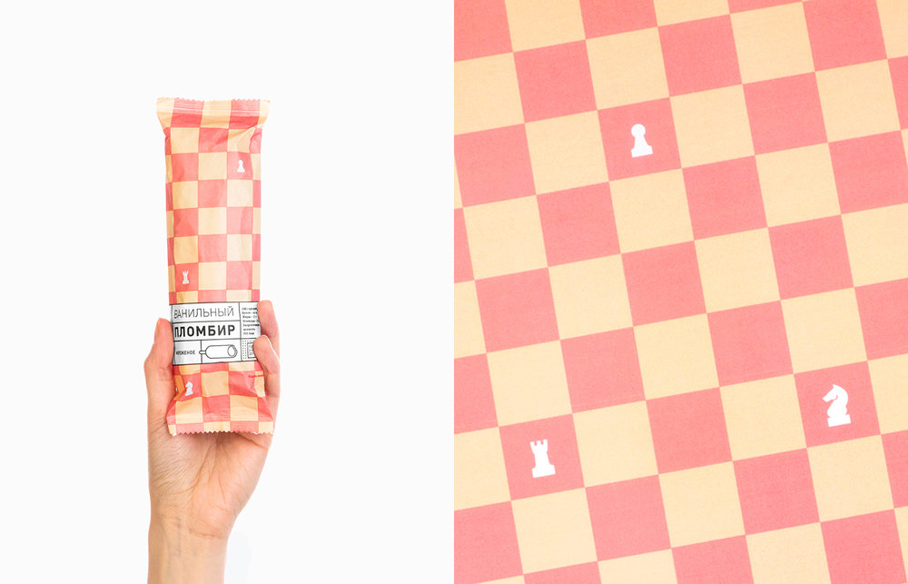
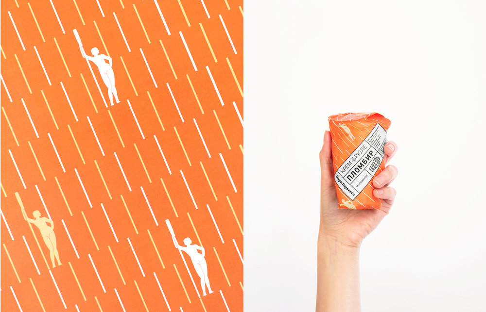
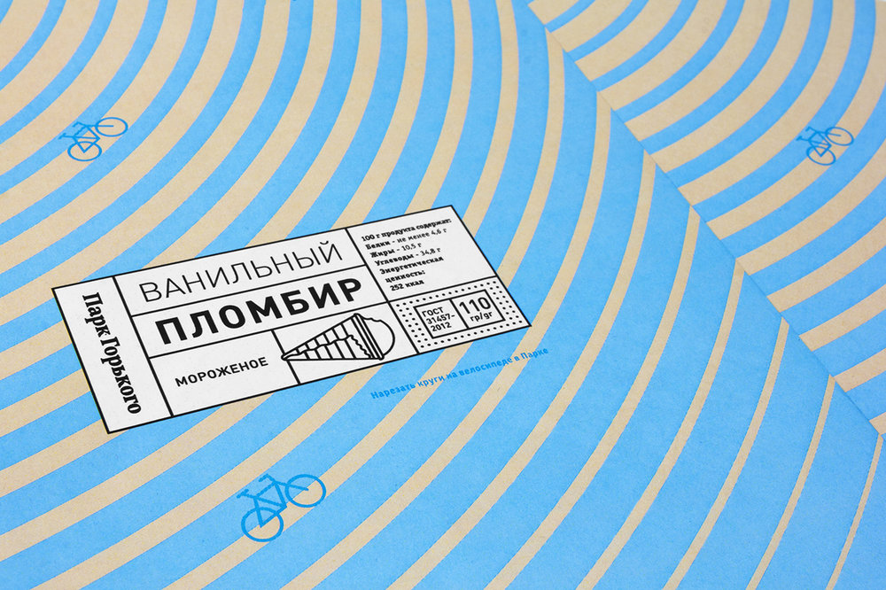
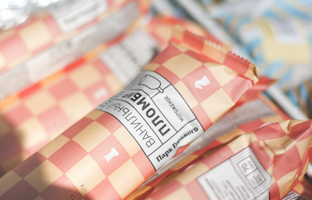
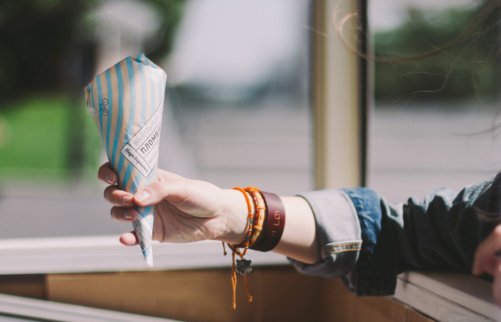
The main aim of this work was to redesign the package of famous ice cream, which you may try only in the Gorky Park. The Designers decided for not a simple package but to make, let’s say, a graphical description of the Park life.
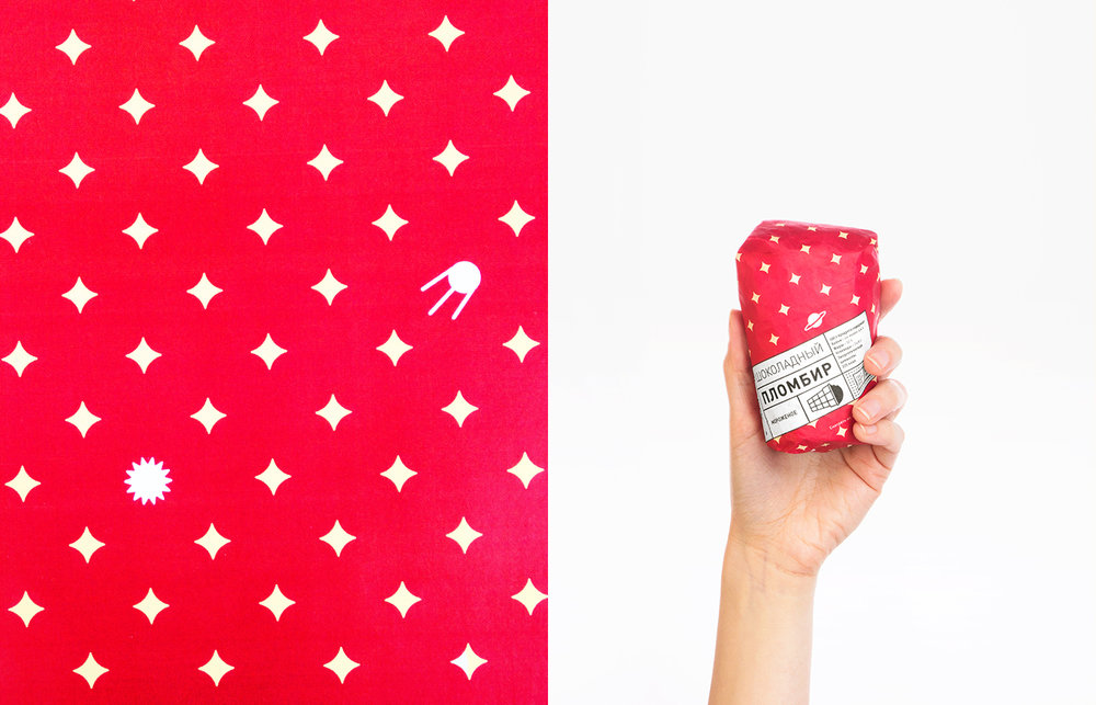
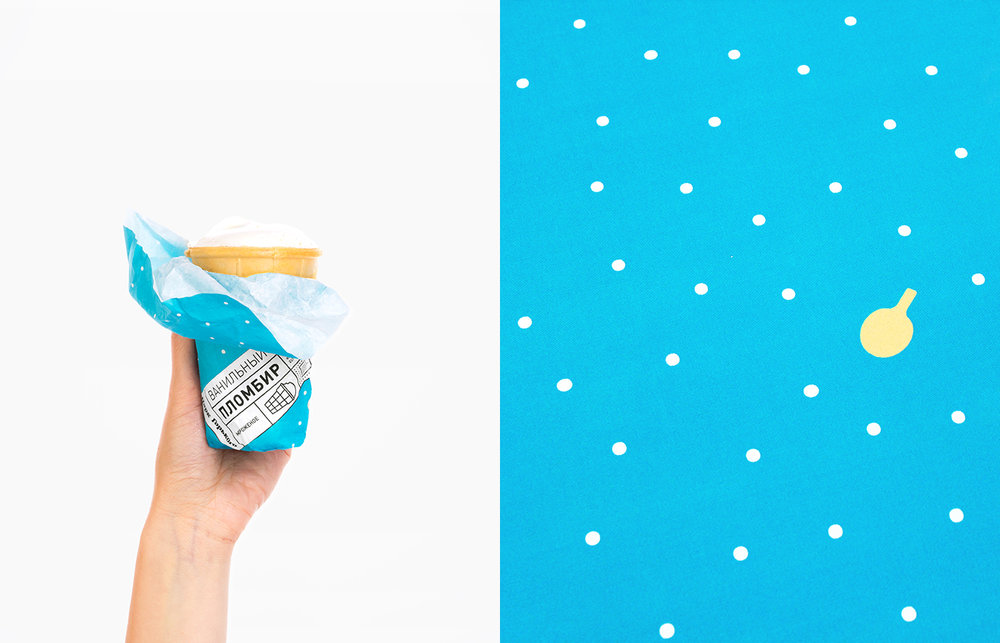
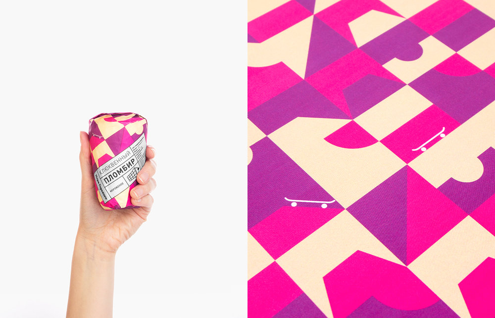
The studio created several patterns, each of them reflects the most interesting things in the park like: ping pong places, chess club “Belaya Ladya”, the recreated sculpture of a girl with a paddle, skateboarding park etc.
However, the bright colors were used in a new package creation, the basic color of the package became beige, because this color has the most direct association with an ice-cream cup. Designers used the traditional approach of the composition, just simple and bright images.
Never the less we considered the work with the Gorky Park observatory pattern as the most special one. “We are sure that you will agree that the observatory is not a common thing for a park. We can see quiet often bicycles, ping-pong tables, skateboarding places but observatory, which is staying surrounded by flowers, is a super unique thing.” – mentioned the designers.
Gorky Park just like a living being talking with its visitors in a common language. The new package design is a new example of such a dialog. Despite the fact that the package itself is very simple, it was very important for the designers of “Just Be Nice” to make every ice cream lover interested in and charmed by the new design.
Art-director: Stas Khrustalev, Designer: Anastasia Itkina”
CREDIT
- Agency/Creative: Just Be Nice studio
- Article Title: Just Be Nice studio – Gorky Park Ice Cream
- Project Type: Packaging
- Format: Wrap
- Substrate: Pulp Paper


