


Jusi is a fun-filled, culturally inclusive juice brand that makes use of fabulous colour and beautiful South African patterns. It was formed because few South African juices commit themselves to sustainability via their packaging’s capability to dissolve or be reused. Thus, Jusi fills a gap in the market that guardians would be pleased to see filled, given that, currently, roughly 75% of parents are opting to choose more sustainable brands that are better for the family. Hence, Jusi targets parents because they have more buying power, but its colourful style and South African presence make it a charming brand that is sure to win over South African children. In other words, Jusi advertises to parents or guardians by first appealing to their kids.
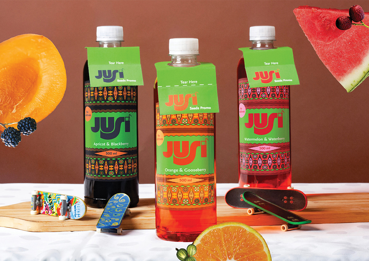
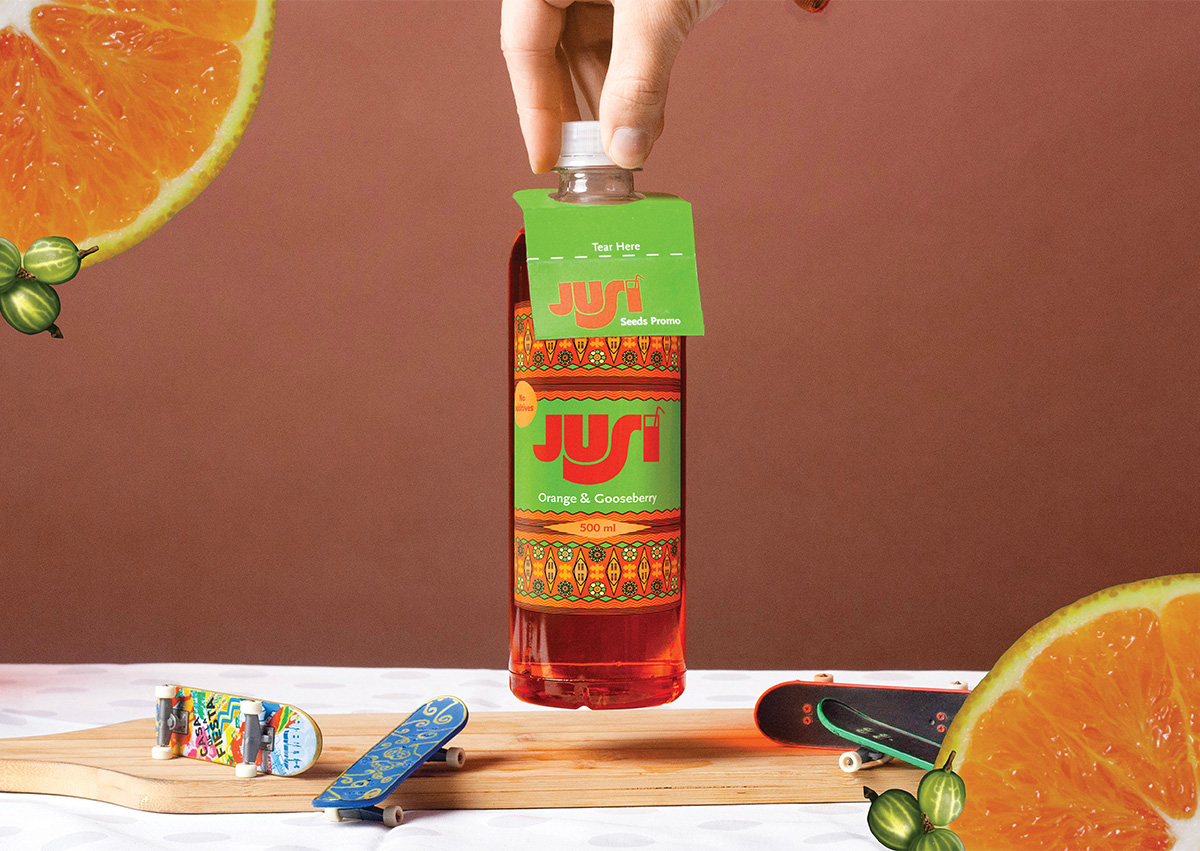
The modern-day parent would also find Jusi an appealing option because its packaging is reusable and easily recyclable. Furthermore, since these characteristics align with what parents are looking for in brands nowadays, Jusi will not just have a platform, but will have space to grow in popularity and maintain favour with its target market. One such way Jusi plans to do this is through various informative, fun, and environmentally friendly promotions such as the “Seeds Promo.” During this promotion, each Jusi bottle will have berry seeds, which can be germinated in the bottle, in its bottle tag. Hence, the bottles will be multi-functional. Once the seeds have germinated and been removed from the bottle, you can return the bottle (or what’s left of it) to Jusi, who will recycle it.
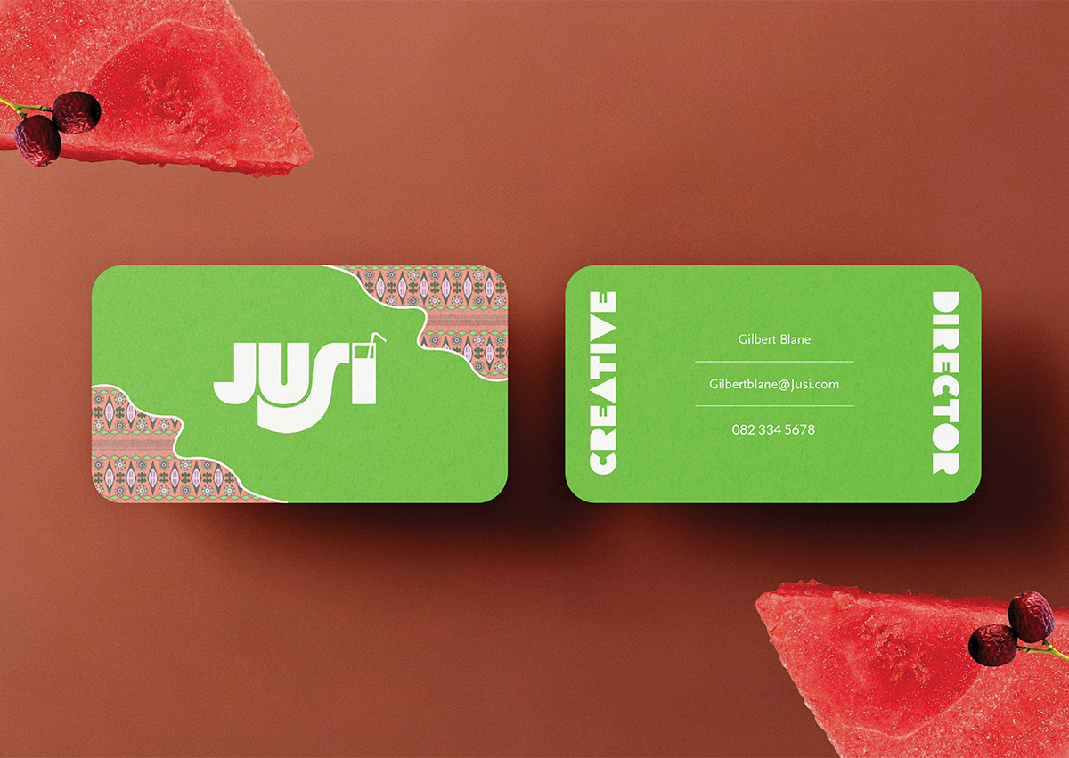
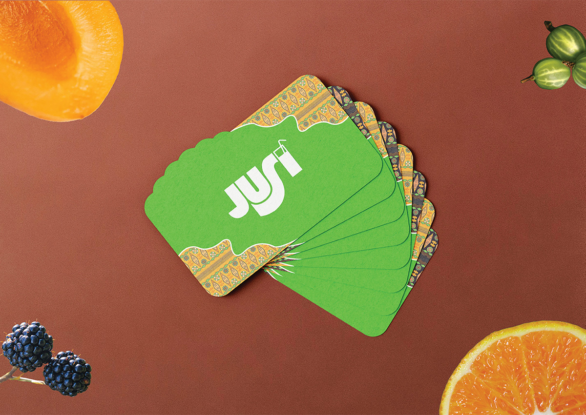
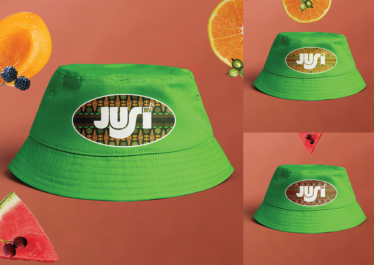
Up until this point, Jusi’s appealing packaging has been the main focus, but that packaging will struggle to function on its own without any supporting branding. Hence, both a colourful business card and striking yet simple bucket hat were created to enhance Jusi’s corporate identity. The business card’s purpose is to aid Jusi’s professional image, whereas the bucket hat is to be worn by sun-loving children to protect them from burns while also introducing passers-by to Jusi.
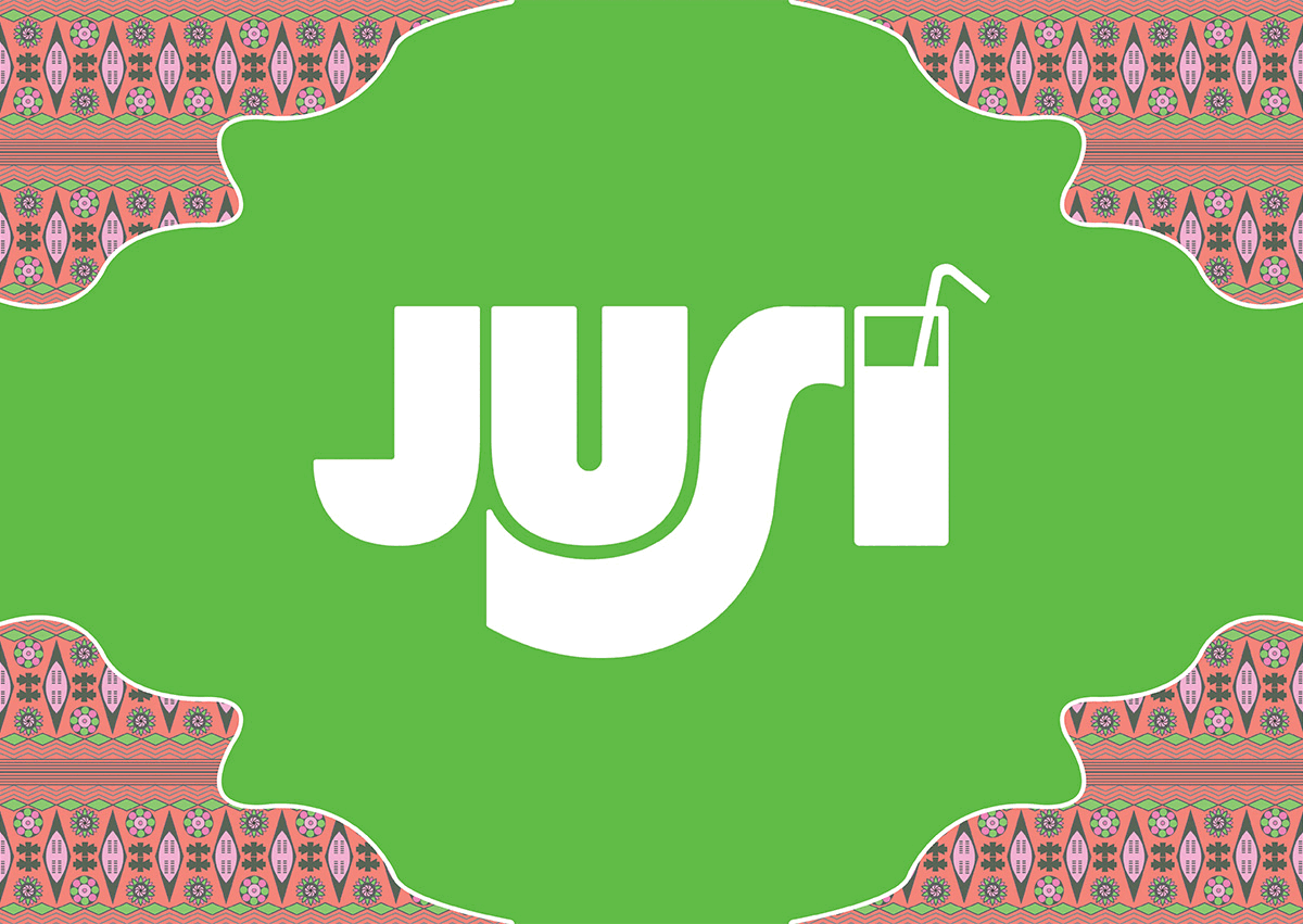
This is all good and well, but what about the name—the “header” of this corporate identity and the one word that will sum up this brand? Well, in English juice is juice, in isiXhosa juice is isijusi, and in isiZulu juice is ijusi. These three different ways to say juice combine to form the word Jusi. Not only is this a strong reminder of Jusi’s origins, but it’s a functional reminder too. It makes the brand name recognisable to many, if not all, South Africans because English, Xhosa, and Zulu are popular languages in South Africa.
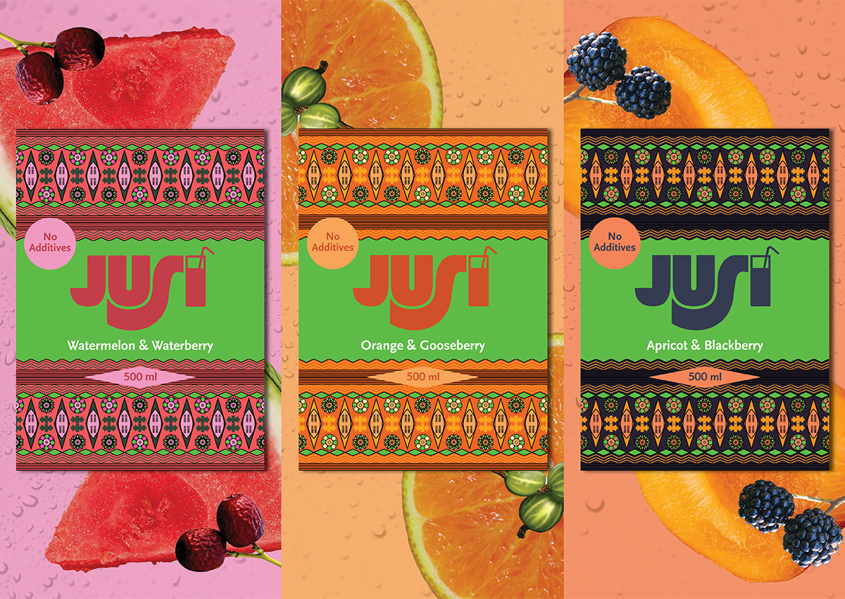
However, Jusi’s name is not its only allusion to South African culture. The patterns on the bottles are also strong references to South Africa’s Rainbow Nation. These patterns include symbols from all South African cultures, making them all-inclusive, uniquely South African visuals that are striking both in symbolism and colour. Including symbols from all cultures in one place also heavily symbolises South Africa’s diversity and emphasises the beauty of her togetherness and unity. Moreover, some individual symbols within Jusi’s pattern represent more than one culture, which refers to cultural overlaps in South Africa and solidarity.
Lastly, some of Jusi’s less important but still charming details need some attention. Starting with the business card—it may be designed to be striking and aesthetically pleasing, but it also takes inspiration from juice spills. In fact, the patterned section of each business card takes on the shape of a juice spill, which is a nice, small and entertaining “Easter egg” that those with a sharp, creative eye will enjoy. Continuing with some joyous details on the packaging, the promotional tags on the bottles are easily removable, which means the tags can be simply taken off once the “Seeds Promo” has run its course. Thus, ending a promotion will not consist of getting promotional packaging designs out and bringing new ones in, which is more problematic because it’s more wasteful. Instead, all that needs to happen is for the Jusi team to go into the stores and take the promotional tags off. No mass moving of products or mass waste—just a simple, sustainable process. Ending with Jusi’s proudly South African nature, a customer may also notice that each Jusi flavour consists of either a berry or fruit that is native to South Africa.
Overall, Jusi is a wondrously symbolic and heartily colourful juice brand that commits itself to being sustainable, fun, informative and inclusive—which are all impeccably important characteristics. South Africans everywhere will be clambering for a taste of fun, culture, togetherness and creativity—they’ll be clambering for a taste of Jusi!

CREDIT
- Agency/Creative: Thomas Burke
- Article Title: Jusi Corporate Identity Concept by Thomas Burke
- Organisation/Entity: Student
- Project Type: Identity
- Project Status: Non Published
- Agency/Creative Country: South Africa
- Agency/Creative City: Cape Town
- Market Region: Africa
- Project Deliverables: Brand Identity, Graphic Design, Identity System
- Industry: Food/Beverage
- Keywords: Graphic Design, juice, juice packaging, bottle design, hat design, business card design, corporate identity design, cultural theme, strong symbolism, creative design, diversity, South African design
-
Credits:
Graphic Designer: Thomas Burke


