


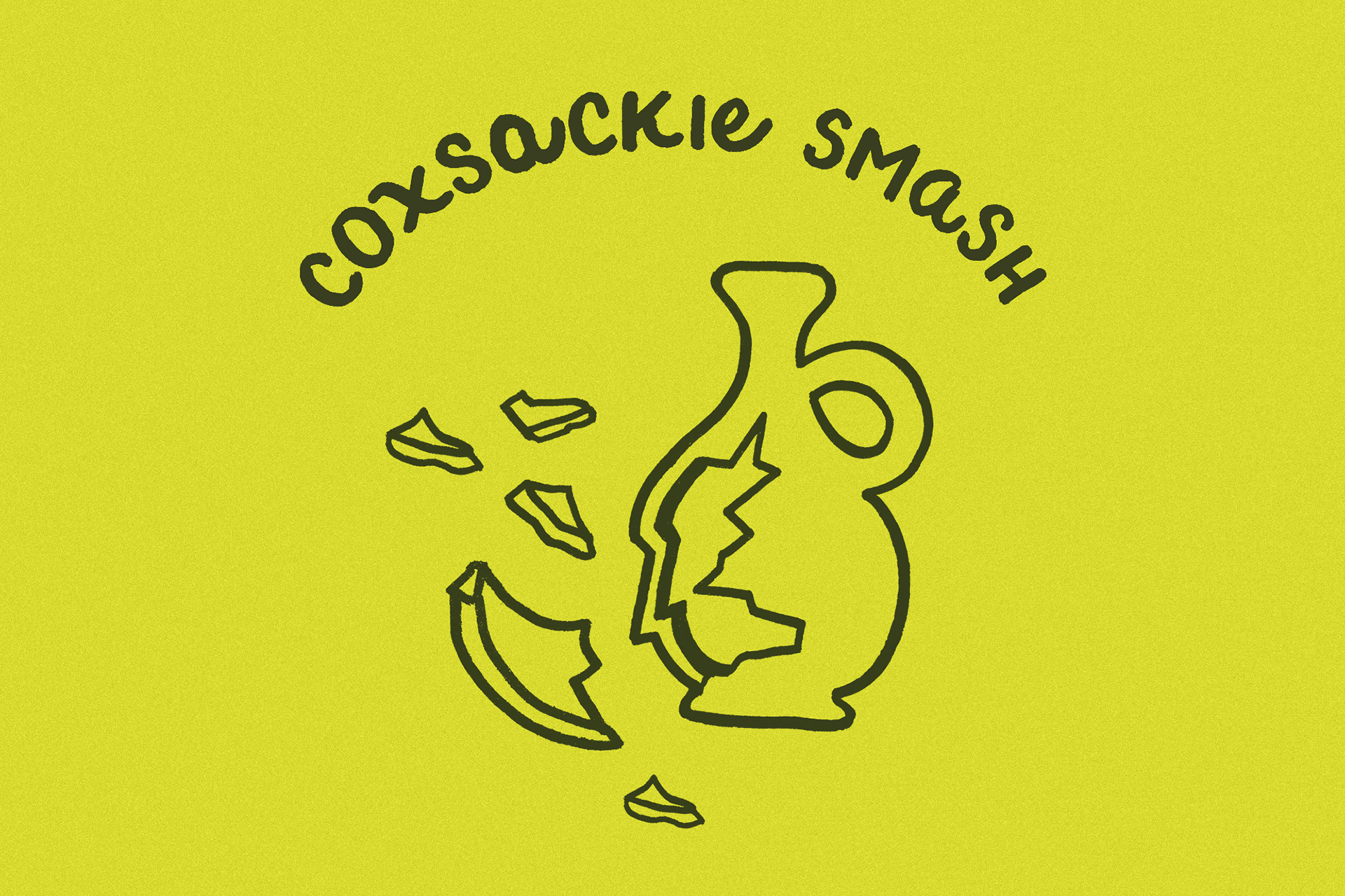
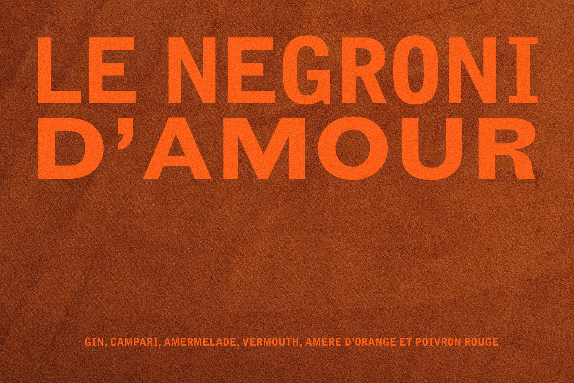
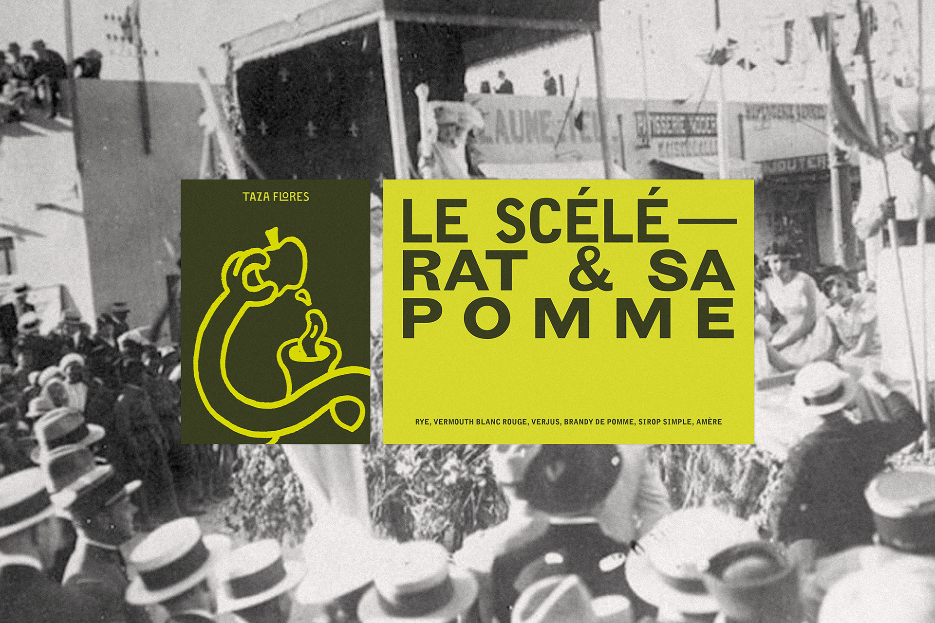
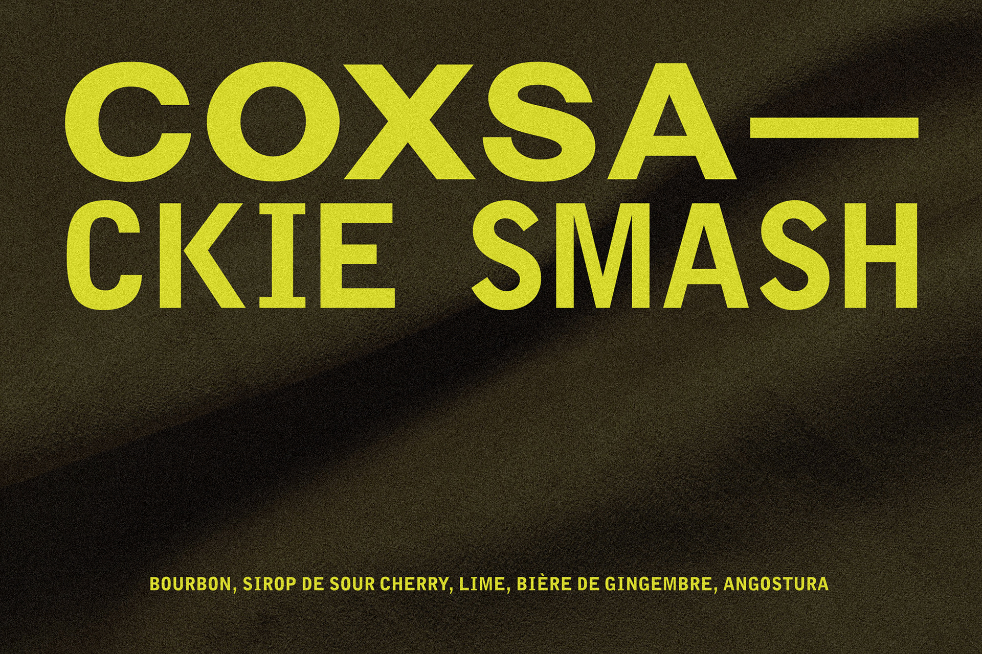
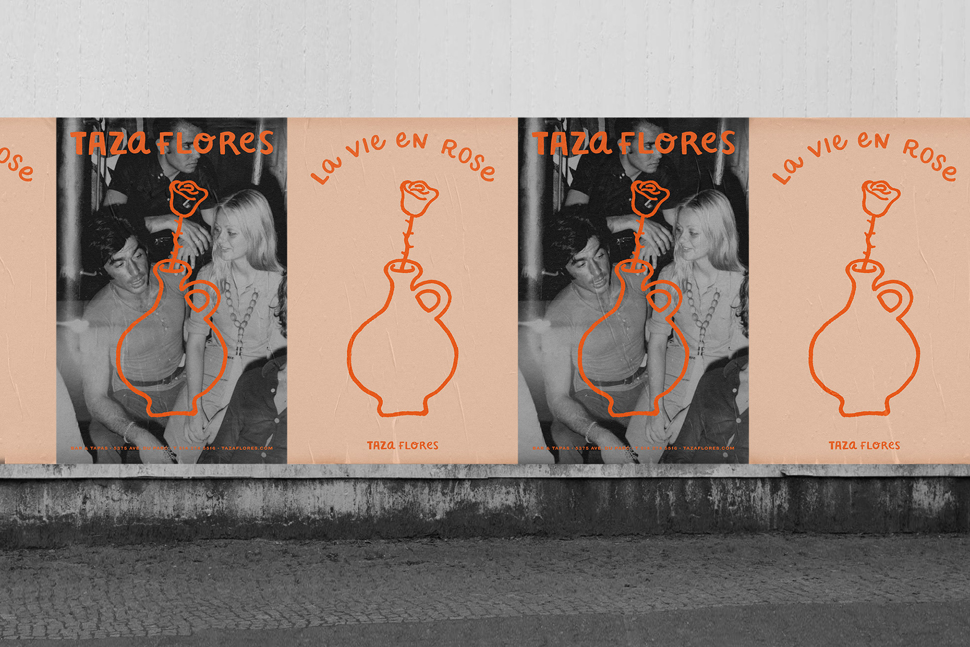
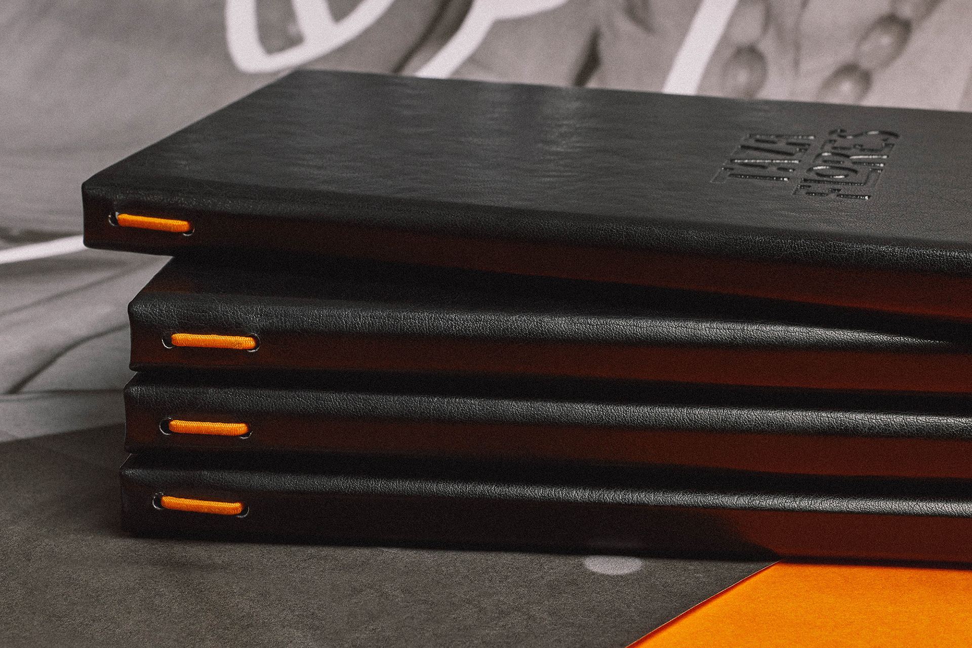
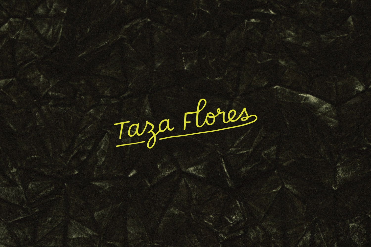
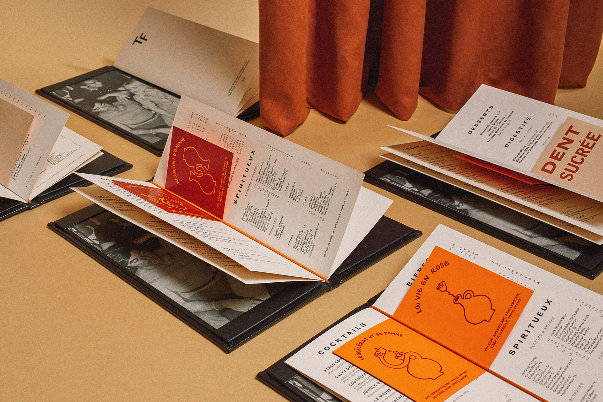
Taza Flores is a Montreal based wine and tapas bar – established in 2004 – that blends culinary elements from the Spanish-Moroccan culture. The creative intention was to portray establishment and experience, but also the notion of mess, fun and noise – simply being humans sharing food and good times. This idea lead to a blend of hand-drawn logotypes, a seemingly unbalanced yet dynamic type treatment, and hand doodles to illustrate cocktail names from the menu.
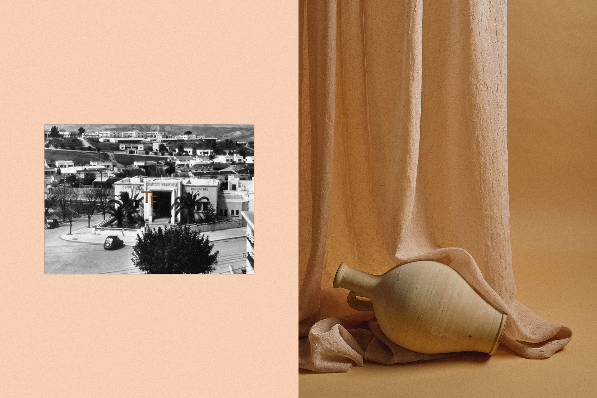
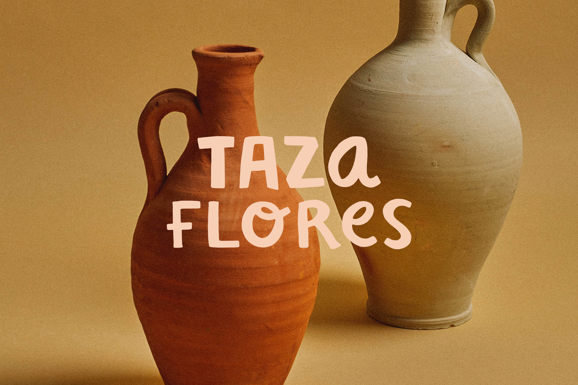
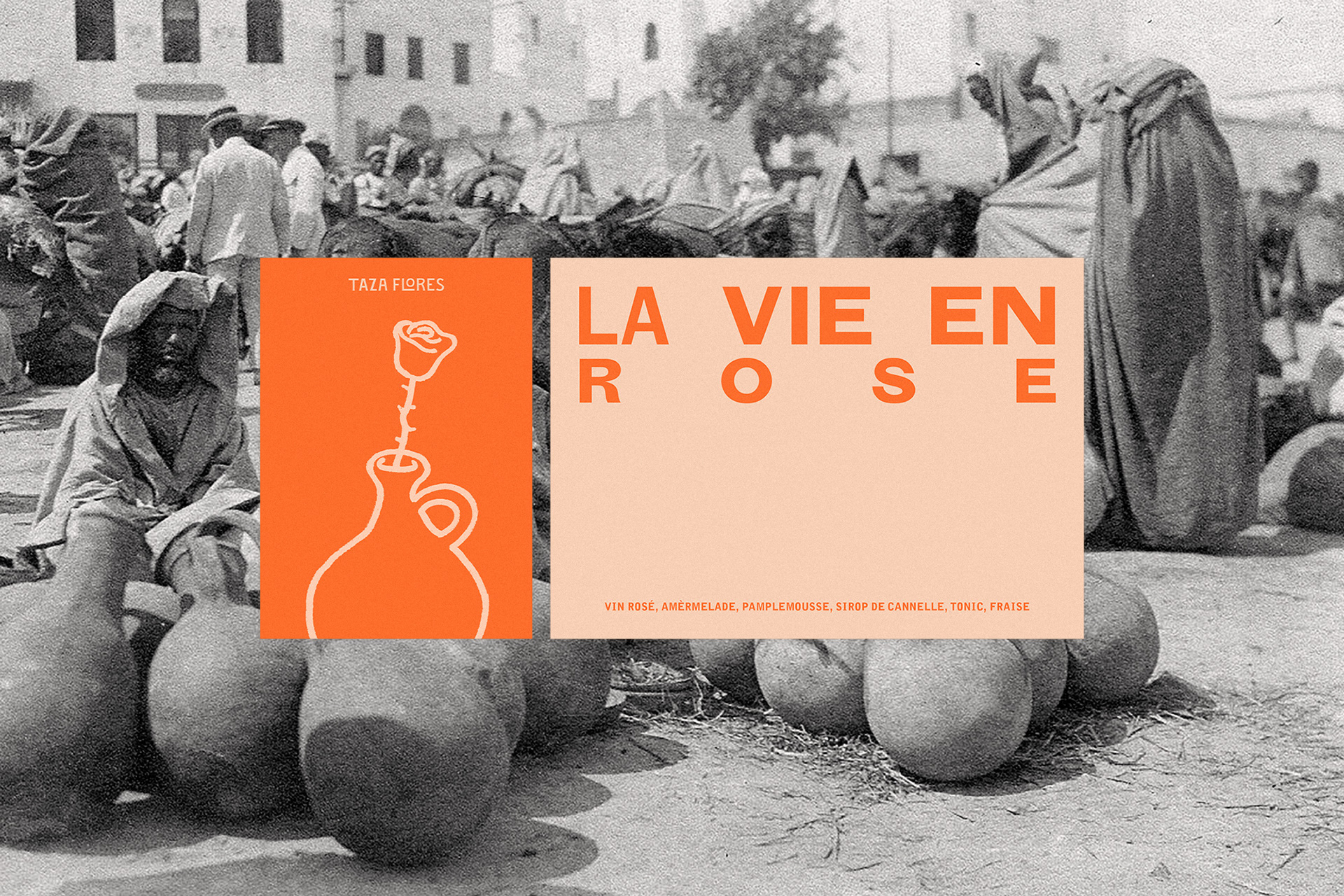
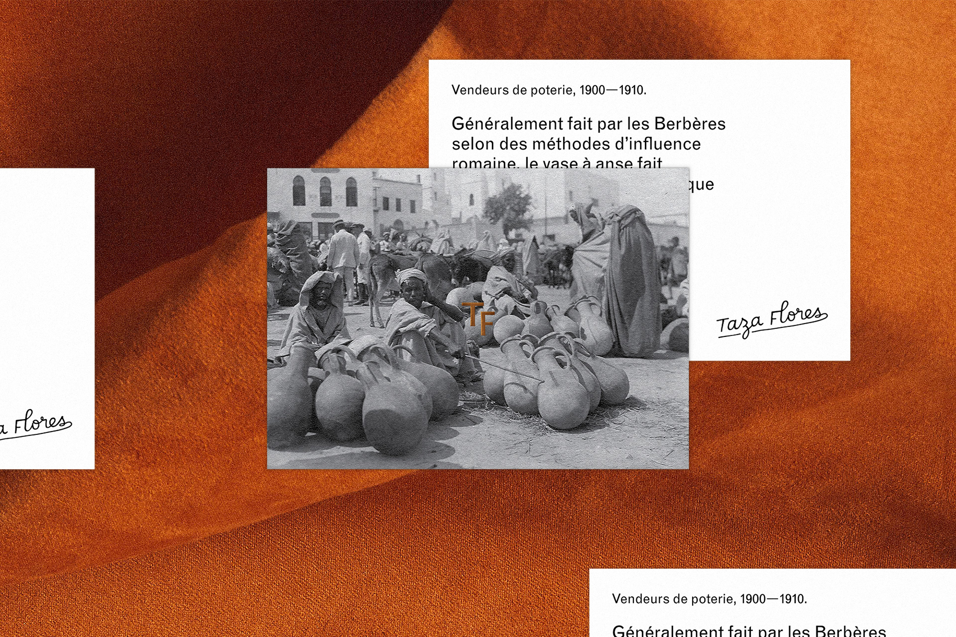
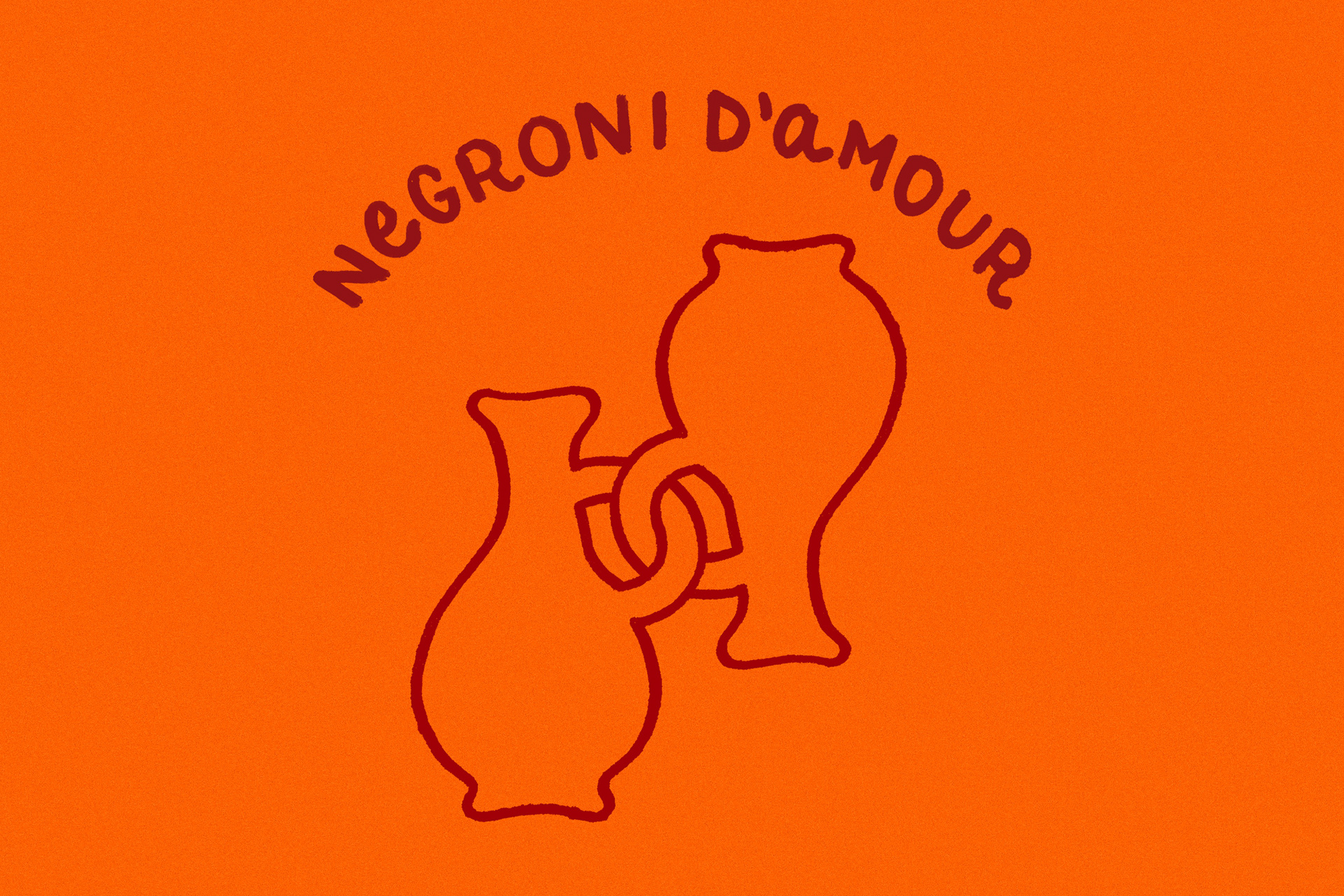
The “vase” element represents a shape of pottery that is characteristic to the city of Taza, Morocco. It was originally produced and sold in the souk’s of Taza in the early 1900’s – it also creates a parallel with the French expression “prendre un pot”, which means and implies ‘to relax and have a drink’.

CREDIT
- Agency/Creative: Studio July Inc
- Article Title: July Rebrands Taza Flores – Tapas and Wine Bar
- Organisation/Entity: Agency, Published Commercial Design
- Project Type: Identity
- Agency/Creative Country: Canada
- Market Region: North America
- Project Deliverables: Brand Identity, Brand Strategy, Graphic Design, Illustration, Product Naming, Rebranding, Tone of Voice
- Industry: Food/Beverage


