


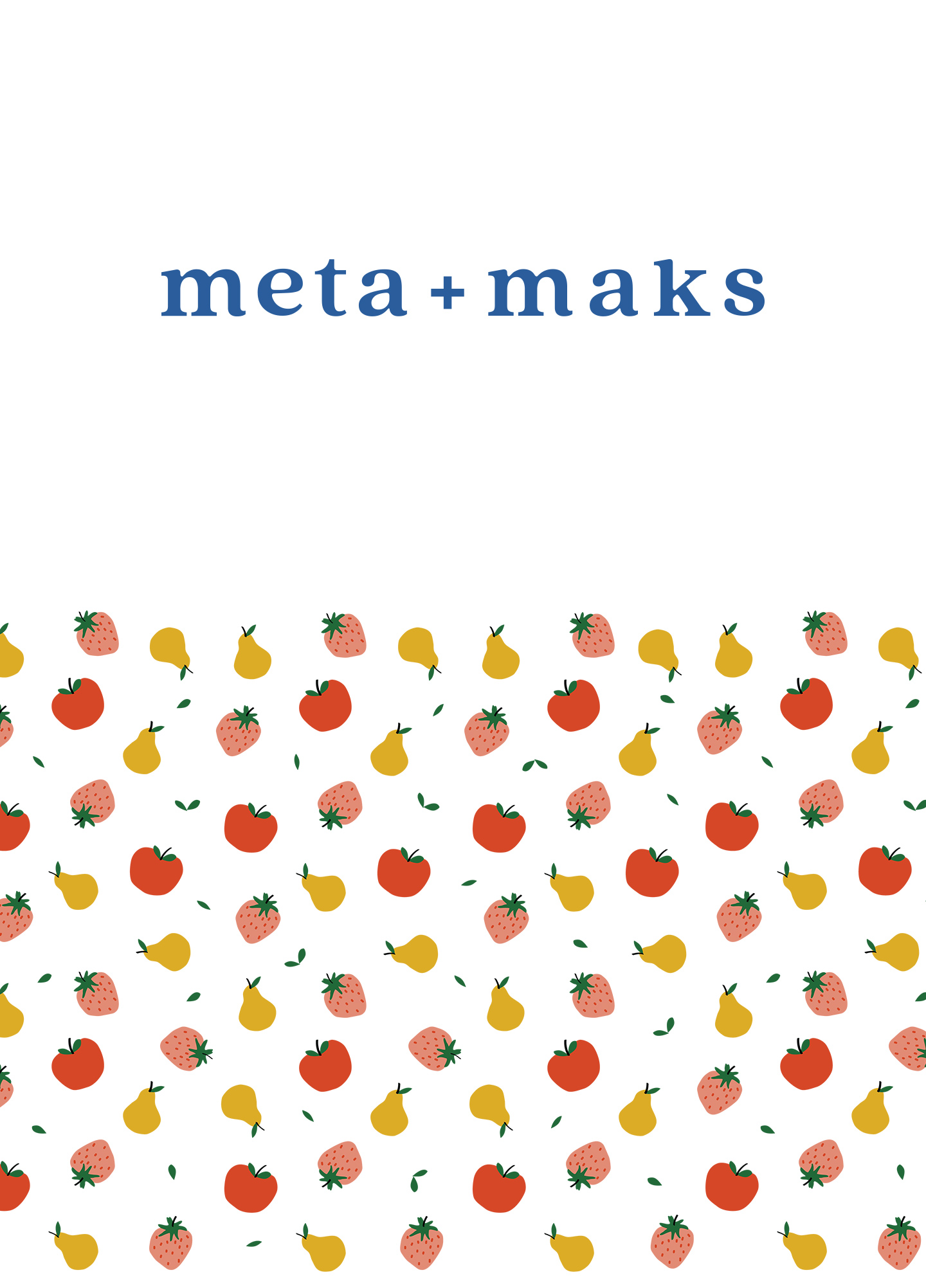
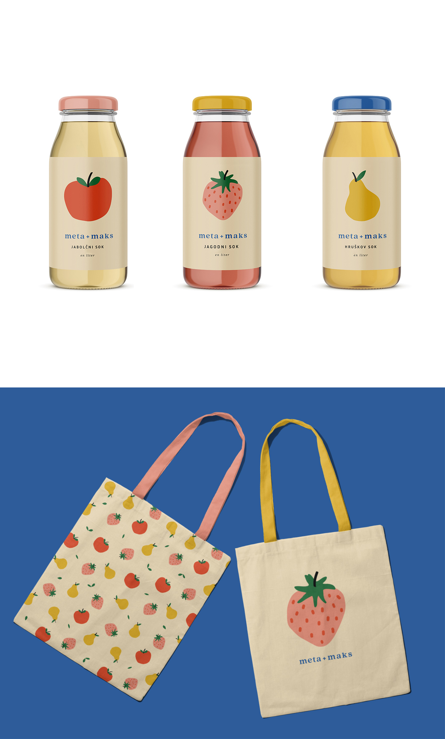
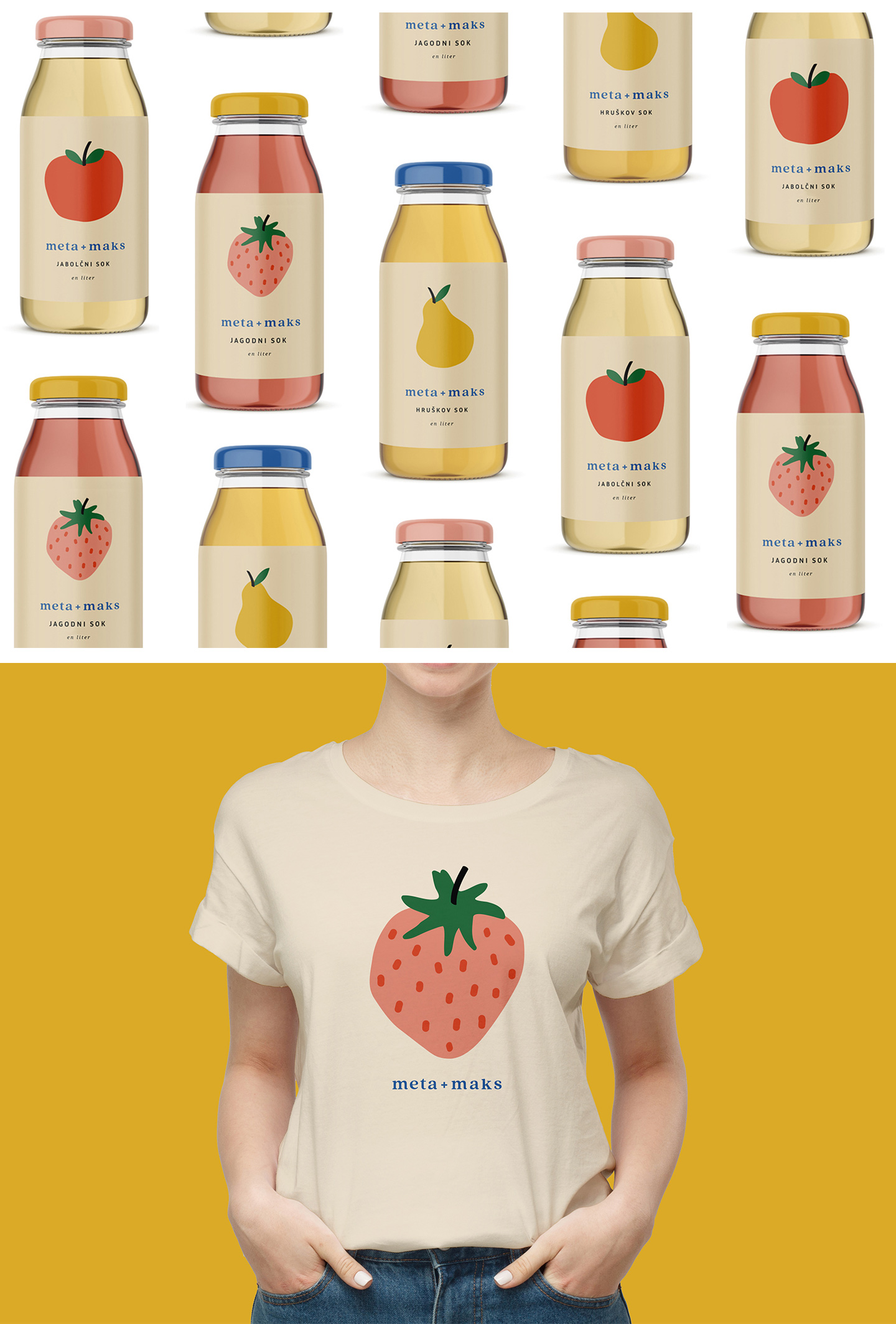
Some day the Slovenian fresh fruit juice brand meta + maks may find its way to store shelves, but today it is already defined by its joyous and friendly nature, which comes to life despite its refined label image.
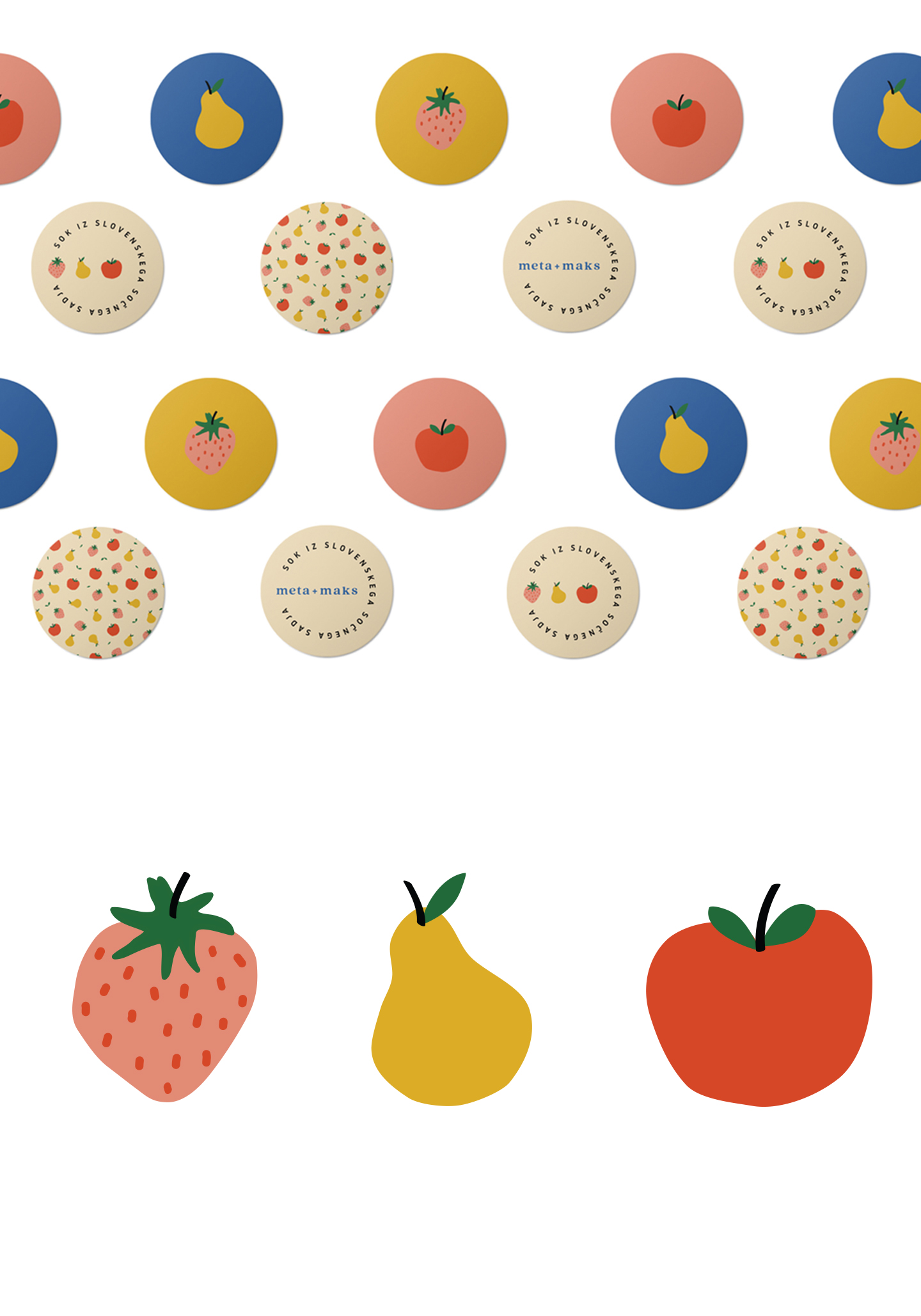
The central part of the brand’s corporate image are the illustrations, simple organic shapes and minimalist visual solution. Besides being attractive to children, the image itself clearly states that the juices are made solely from fruit, without any additives and are completely natural.
The logotype is clear and has a slight retro serif font with the plus alluding to youthful love, friendship, partnership and of course − connection.
Even though the illustration captures most of the attention on the packaging, the label and elsewhere, the brand’s corporate image is completed with a vivid palette of colors to which, in addition to the blue in the logotype, we add colors that predominate the fruits from which the juices are made of.
CREDIT
- Agency/Creative: Klun komunikacije
- Article Title: Juice Brand Meta + Maks Concept
- Organisation/Entity: Agency, Published Self Promotional Design
- Project Type: Packaging
- Agency/Creative Country: Slovenia
- Market Region: Global
- Project Deliverables: Brand Architecture, Brand Creation, Brand Naming, Branding, Graphic Design, Illustration, Packaging Design, Product Architecture
- Format: Bottle
- Substrate: Glass


