Double-Barrelled are a husband and wife team, Luci and Mike Clayton-Jones, who embarked on a year long trip around the world sampling craft beer – now that’s our kind of trip! 85,000 miles later they continued the adventure, setting up their own brewery in Reading in the UK in 2018. They went to UK branding agency, Kingdom & Sparrow, to create a brand that would capture their story and stand out in a busy market.
To ensure Double-Barrelled had a unique identity and that would reach modern craft drinkers, the Kingdom & Sparrow team needed to create a distinctive identity and range of premium beers that was inspired by their travels – but without being gimmicky.
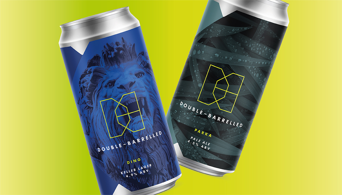
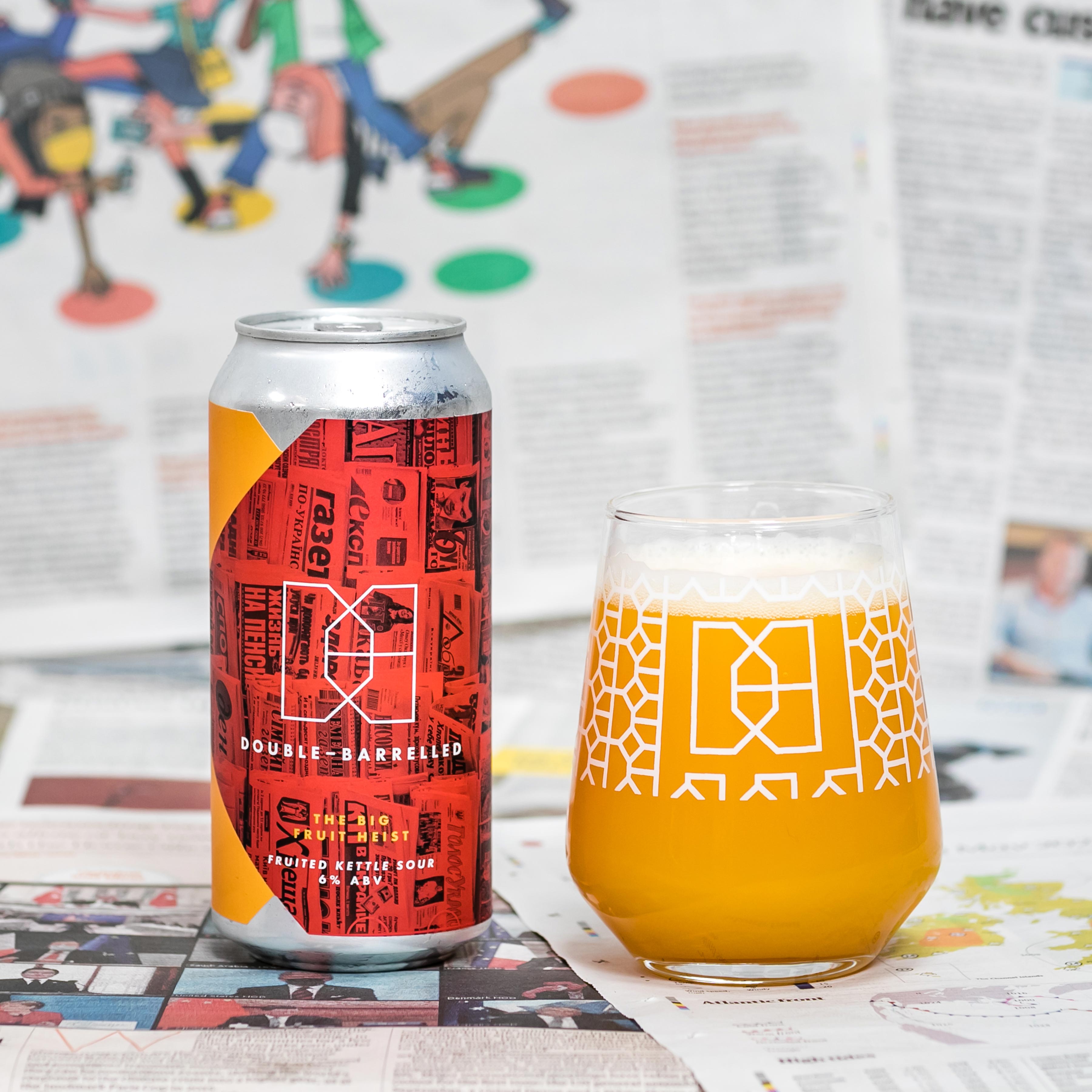
They designed an abstract interlocking D&B logo mark to echo both a backpack clip and a butterfly, as a nod to the ‘butterfly effect’ of their adventures. For each label, the team used a simple, minimalist template design to allow the flexibility that Luci and Mike needed for regular new brews. The monochrome photographic backgrounds are inspired by their unique travel stories, engaging craft beer enthusiasts in their brand world and creating a sense of anticipation for what beer – and what story – will be coming next.
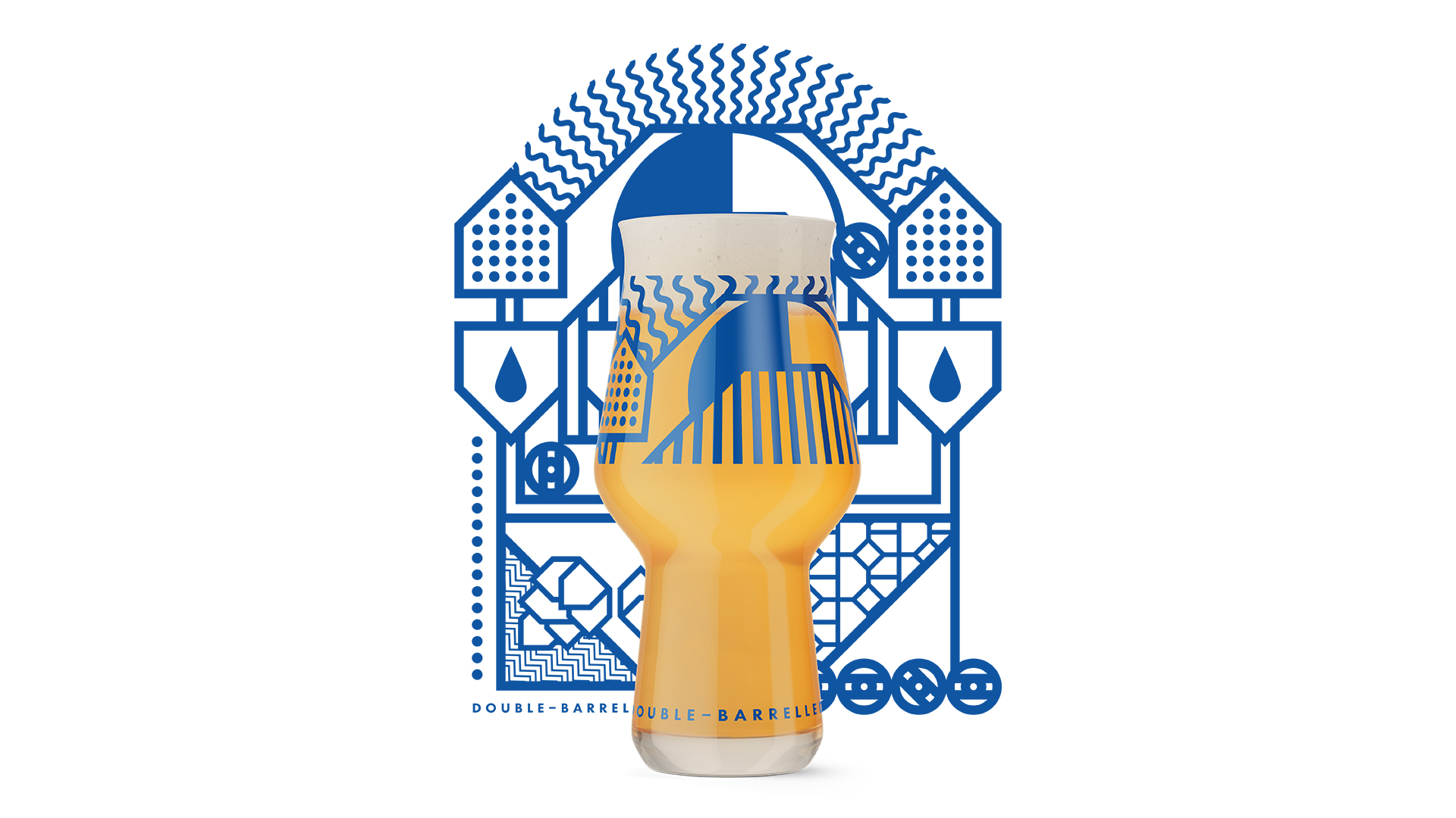
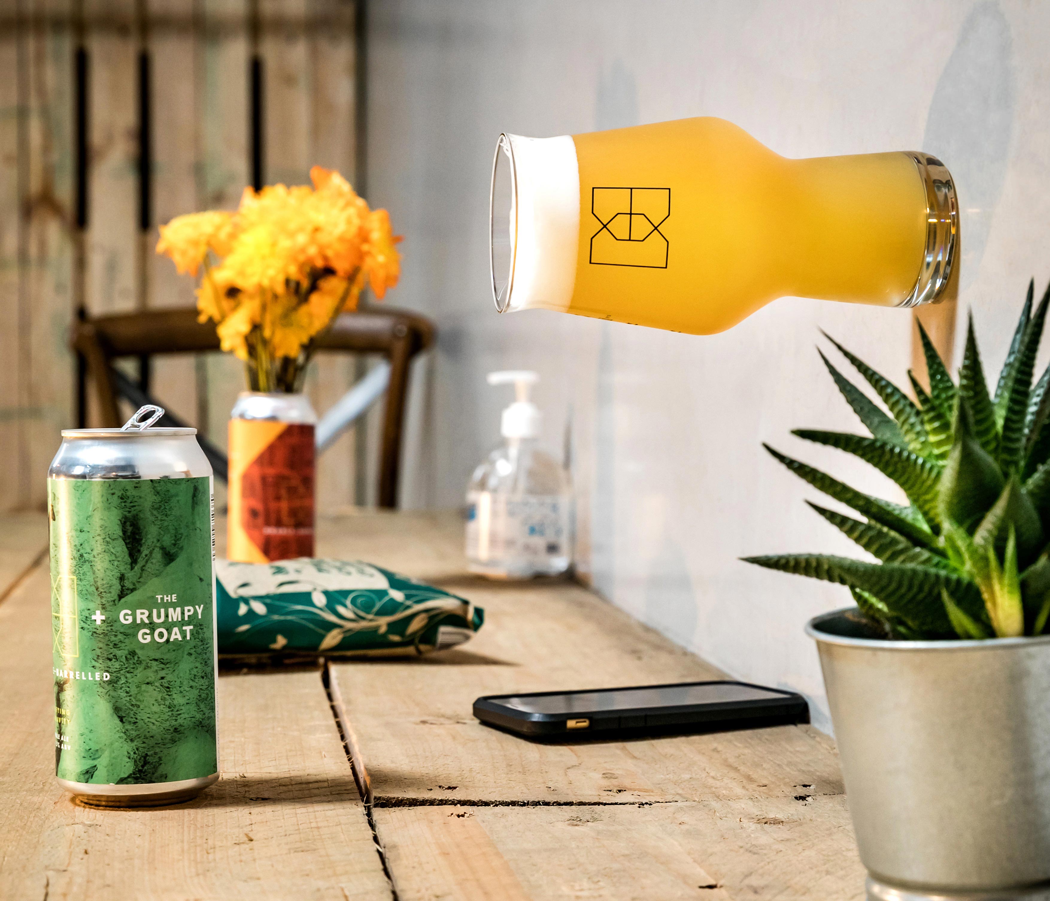
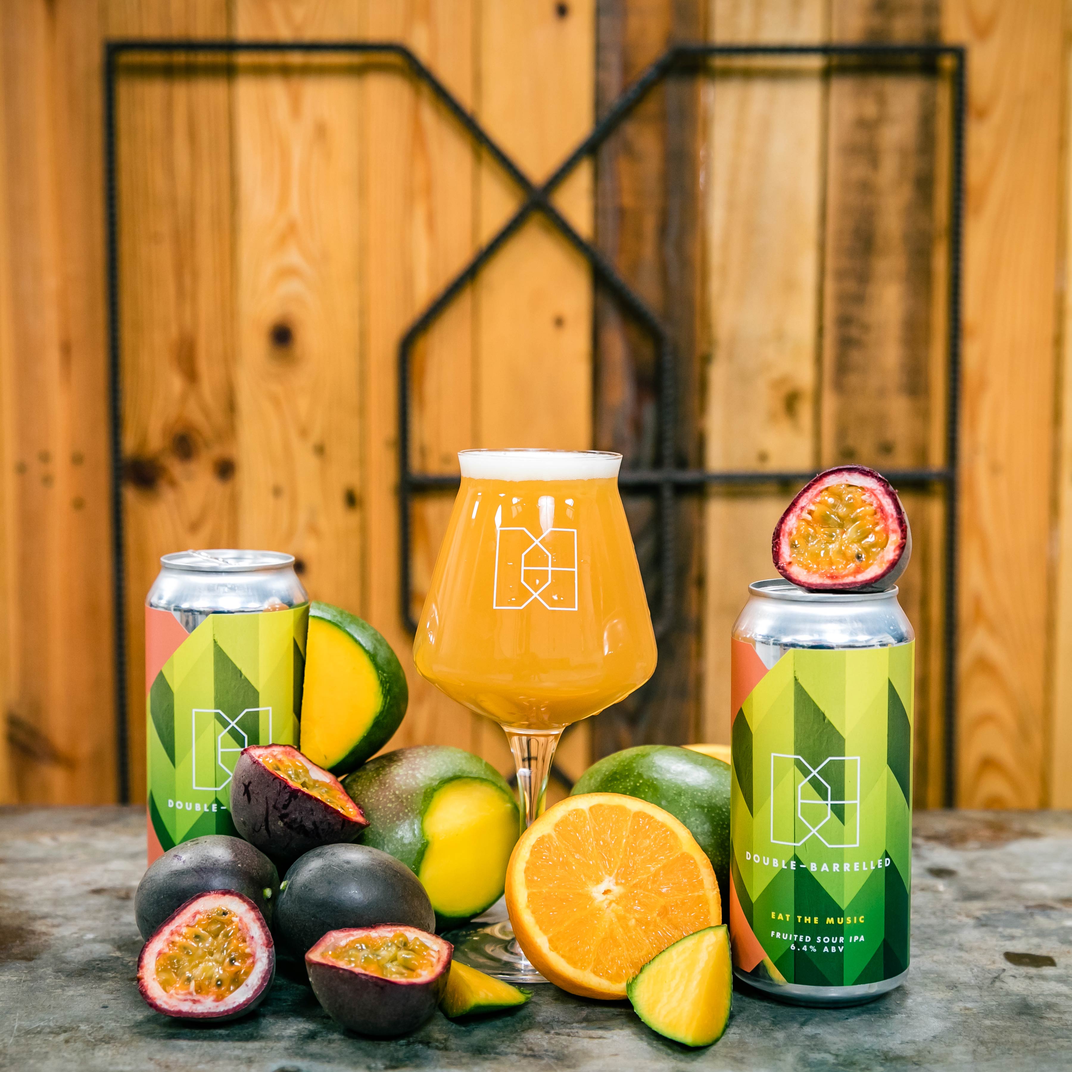
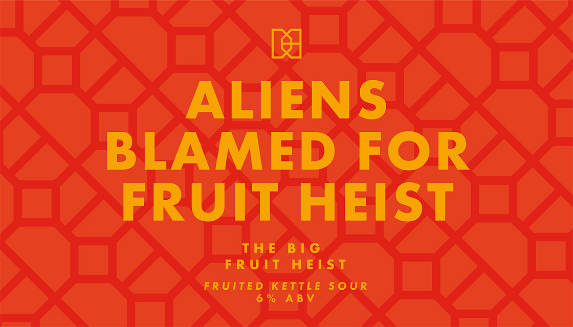
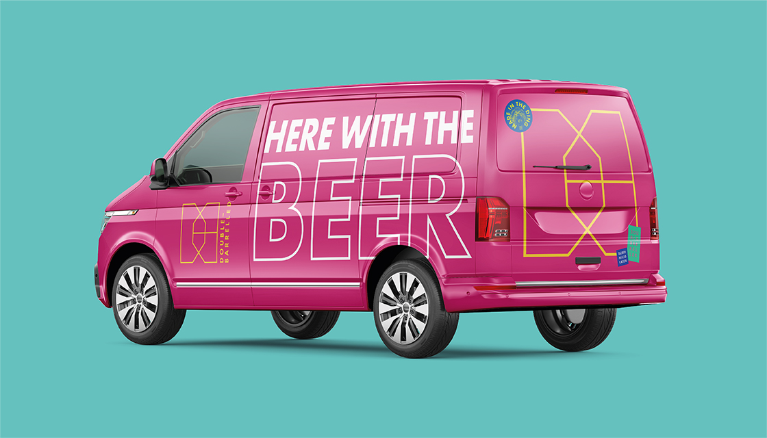
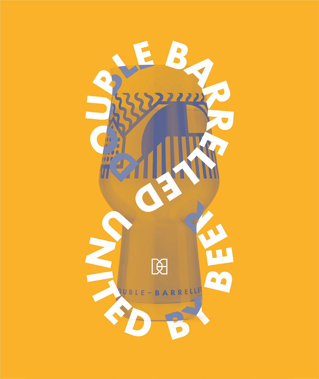
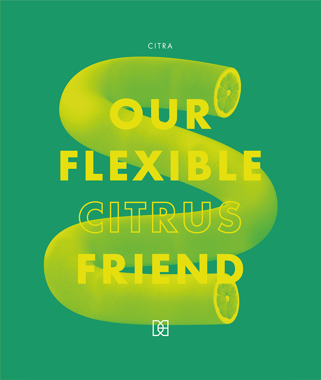
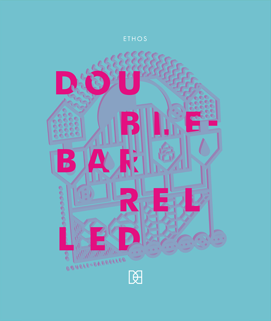
After creating the initial Double-Barrelled brand back in 2017, in 2020 Kingdom & Sparrow worked with Luci and Mike again to elevate the brand, reflecting the brewery’s growth and helping them to stay ahead in the ever-evolving craft beer market. The branding agency refreshed the can designs and developed more engaging and cohesive brand communications – including a new pattern, taproom graphics and merchandise concepts.
Luci, Co-Founder of Double-Barrelled, said “It was great to work with a branding agency who were as passionate about the industry as we are. They knew our market without needing to be told & utilised their own passions to help us create a stand out brand. The team were great to work with and we are beyond proud of the final result. And they should be too.
Launching into the market at Craft Beer Rising amongst 170 other breweries was a real test of how our brand would be received. The feedback was overwhelmingly positive with consumers, bottle shops, retailers & distributors all noting how it fit the craft market perfectly. The only negative was some said it looked too professional for a start up company brand! We’ll take that.”
CREDIT
- Agency/Creative: Kingdom & Sparrow
- Article Title: Journeys Into Craft Beer: A Brand Elevation by Kingdom & Sparrow
- Organisation/Entity: Agency
- Project Type: Packaging
- Project Status: Published
- Agency/Creative Country: United Kingdom
- Agency/Creative City: Falmouth
- Market Region: Europe
- Project Deliverables: Brand Design, Brand Redesign, Brand World, Branding, Design, Graphic Design, Label Design, Packaging Design, Rebranding
- Format: Can
- Substrate: Pulp Paper
- Industry: Food/Beverage
- Keywords: graphic design, label design, brewery identity, brand elevation, pattern design, brand world, illustration,
-
Credits:
Comms Manager: Tilly Manaton


