


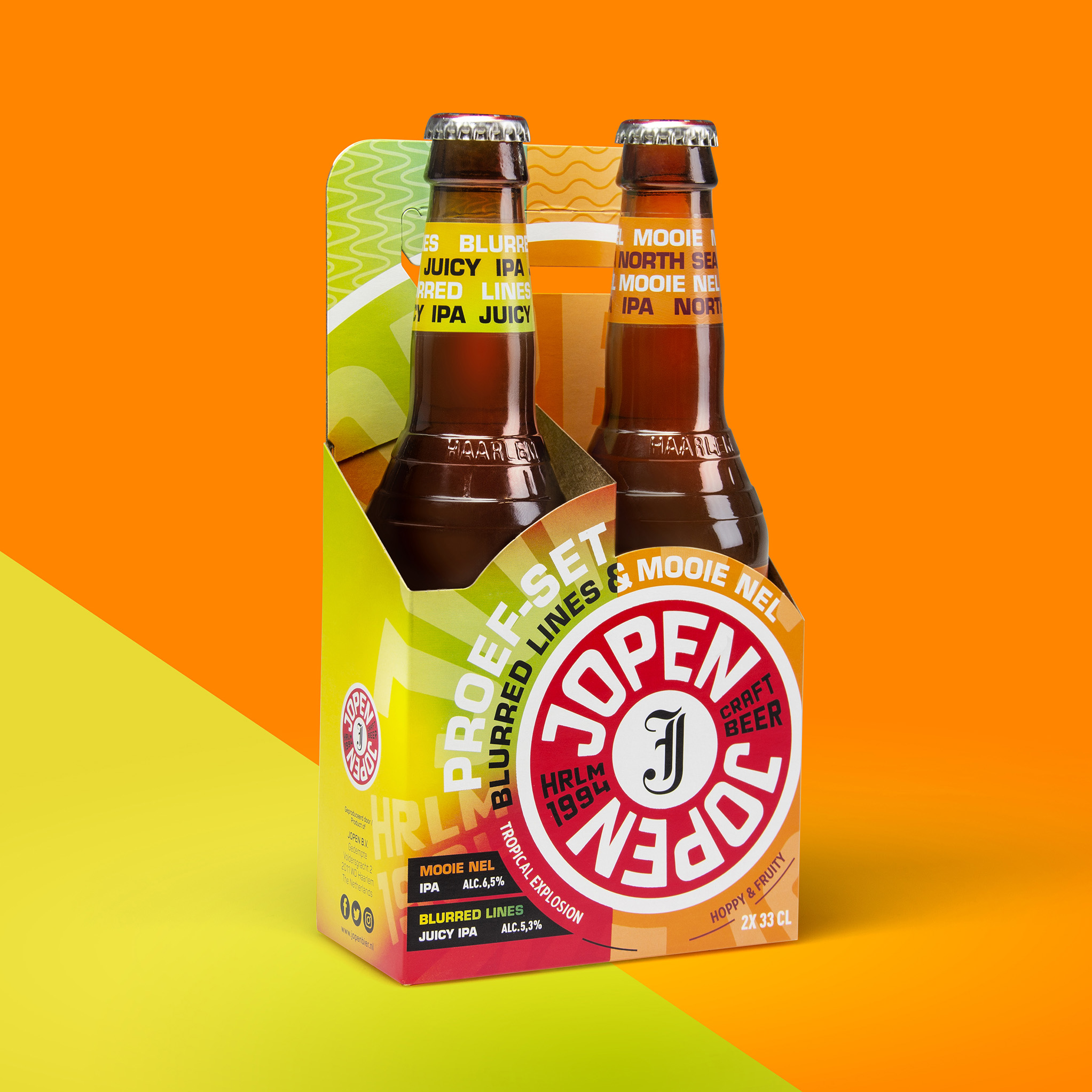
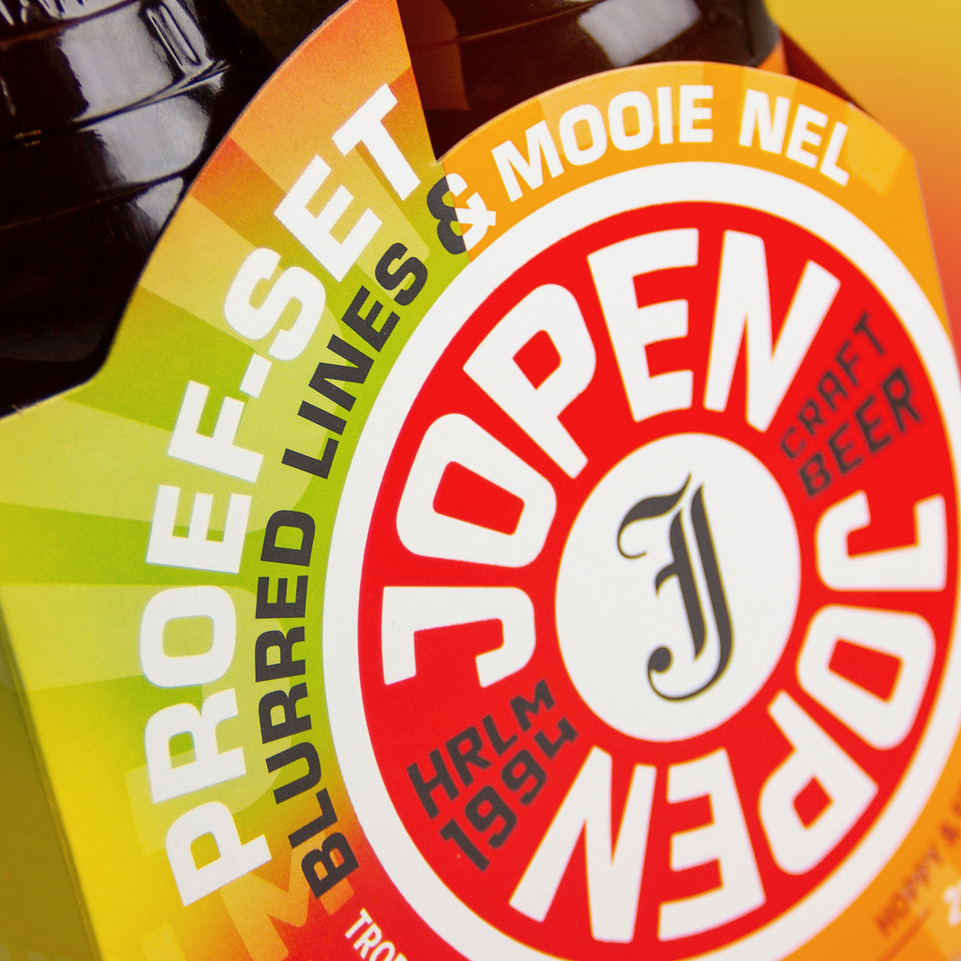
For Jopen Craft Beer, Haarlem, the Netherlands, we created a new tasting proposition. To promote a new beer, we created a tasting two-pack for the new beer Blurred Lines IPA together with their best-selling beer Mooie Nel IPA. Because people are looking for Mooie Nel, they probably are willing to spend a little more to try out a new beer together with their favorite beer in a two-pack.
For this we created a new two-pack for on the store shelves. A new construction was designed so it perfectly fits with the original bottle and label design. Using the Logo as the hero and different cutouts the two-pack really shouts from the shelves and will get lots of attention.
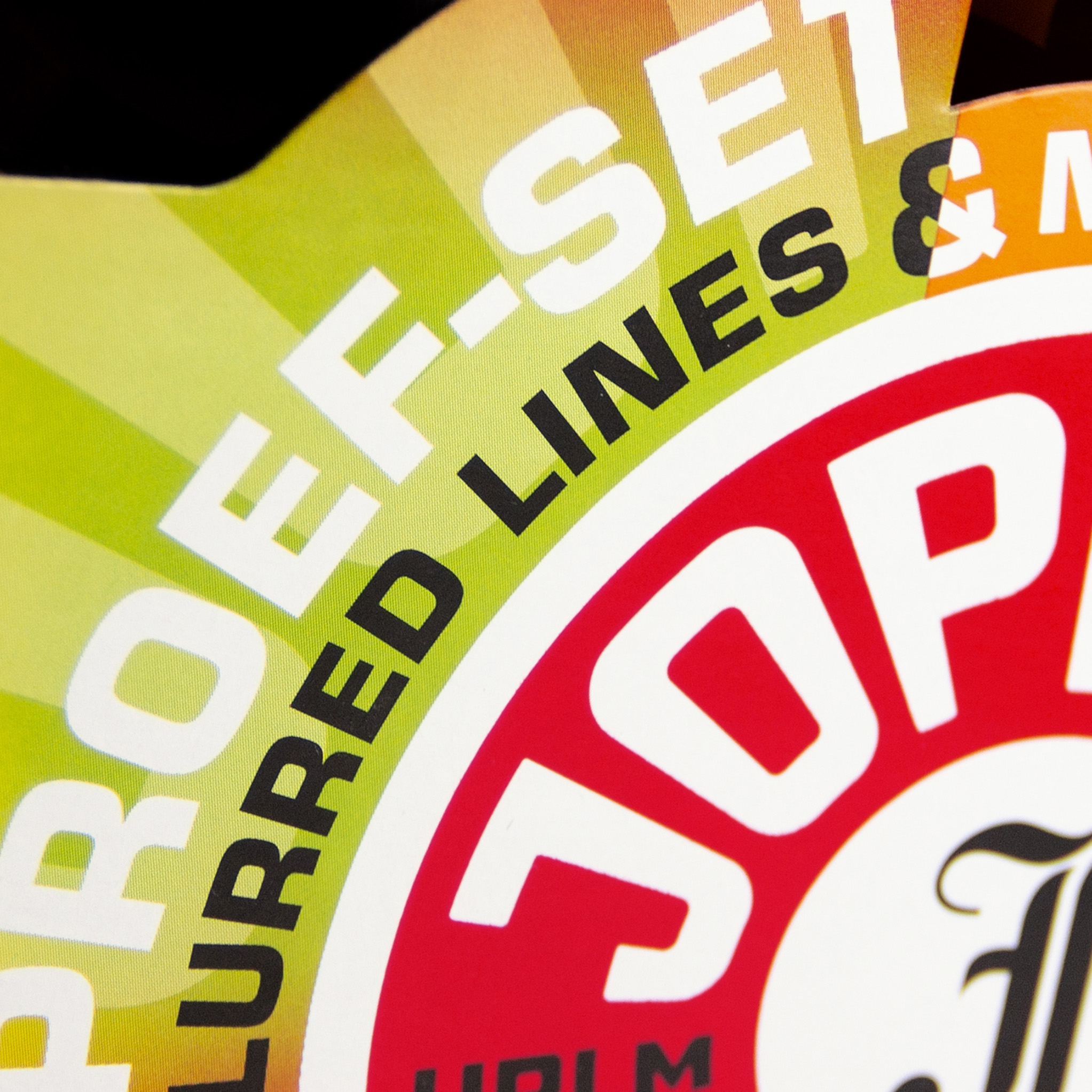
We also created the graphic design, together with the structural design, so the two are perfectly matched. In the graphic design there is lots of room for the circular design language of the brand and color of the two beers, but still keeping the difference in the two sides to stipulate the different kinds of beer in the packs.
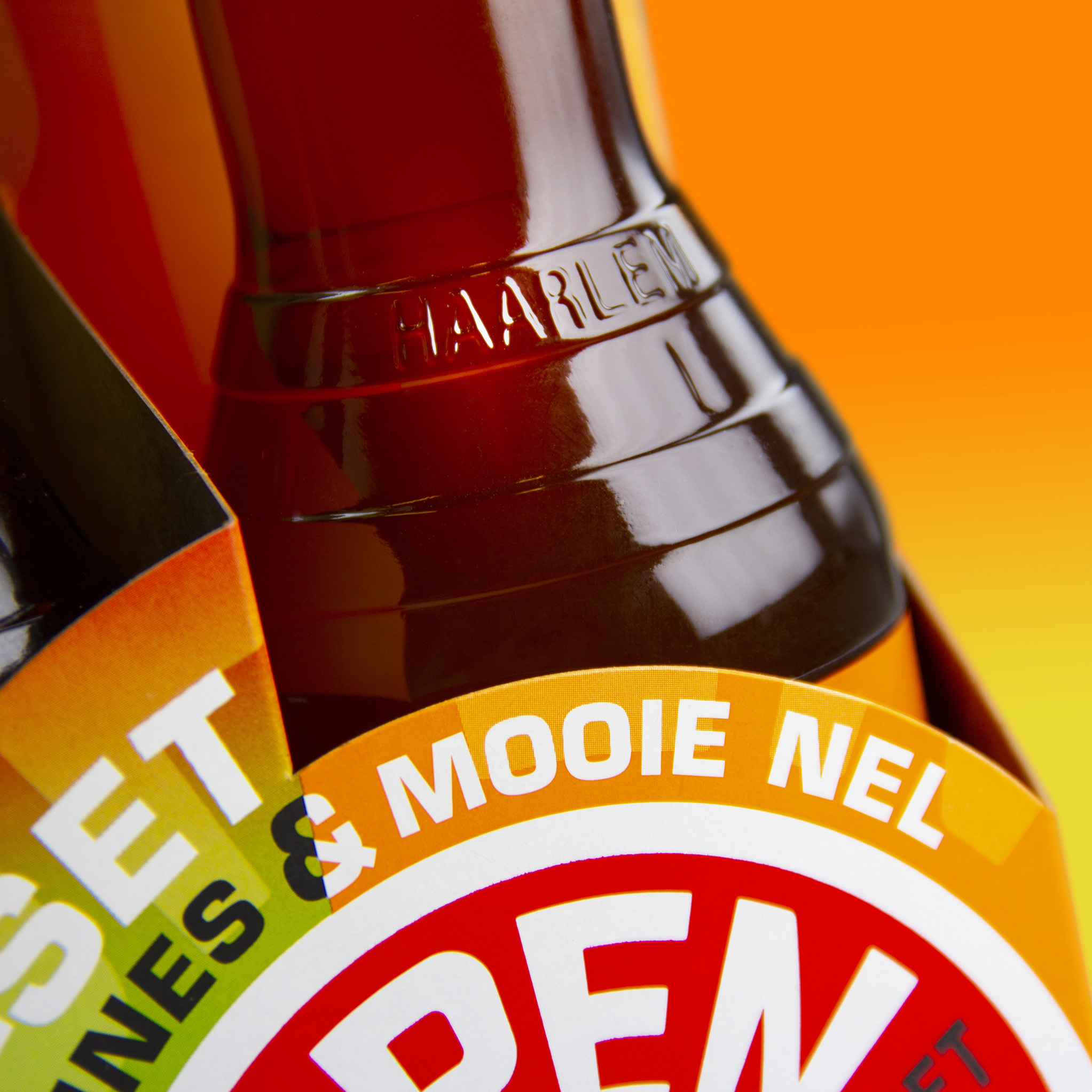
We just did the major makeover for this brand with a new logo. Using this new logo as the here on the pack it reinforces the new look and brand recognition. On the bottles the logo also is used as the main attraction.
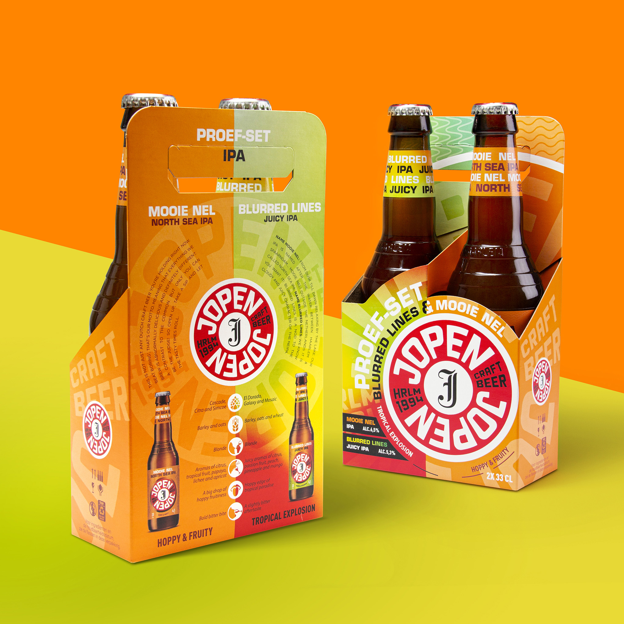
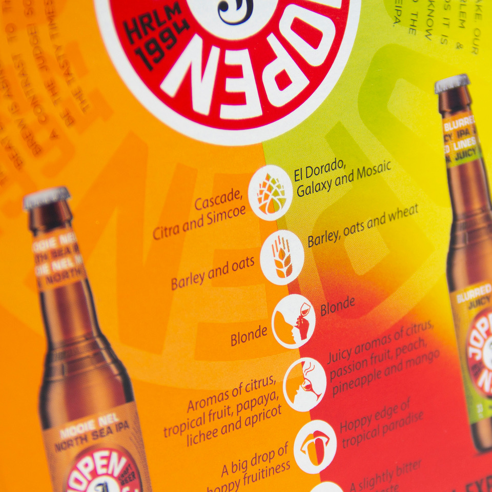
The construction gives a lot of room on the backside to use for extra information. On there, using the same circular design language we made a slit for the two beers, showing the bottle (photography) and giving the consumer lots of information about the beer, its ingredients the particular taste etc. to make the complete two-pack even more attractive for the consumer to buy.
It was a real challenge to create this visual look (construction) so it could be made on the current production machines and with one die-cut. But in the end it paid of branding wise and construction wise as it leaves us with a strong and easy to cary multipack, where the bottles are both protected and attractively presented.
When placing the packs in a display or as blocks on the store shelves the colorful packs and big logo’s will immediately attract attention. Next to a functional two-pack with a handle for carrying, it immediately functions as a branding and advertising tool for the complete brand.
CREDIT
- Agency/Creative: Van Heertum Design VHD
- Article Title: Jopen Craft Beer Two-Pack Design by Van Heertum Design VHD
- Organisation/Entity: Agency, Published Commercial Design
- Project Type: Packaging
- Agency/Creative Country: Netherlands
- Market Region: Europe
- Project Deliverables: Brand Architecture, Brand Creation, Brand Experience, Brand Identity, Brand Strategy, Brand World, Branding, Graphic Design, Packaging Design, Photography, Product Architecture, Structural Design
- Format: Box, Tray
- Substrate: Pulp Board


