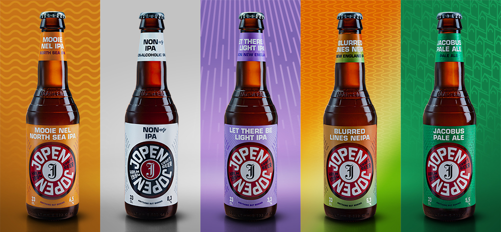
Earlier this week, on their 25th birthday, Jopen presented a new logo and labels for their core range. According to commercial director Lydian Zoetman, the previous logo from 2014, the one with the Jacobus church in which the horecabrewery is housed, was “in need of renewal”.
The new logo was designed by design agency VHD. They were instructed to create a logo that fits more with the current image of Jopen and translate that into the label. “When we started, craft beer was almost only drunk by people over the age of forty,” said director Michel Ordeman. “That has completely changed. Our new fans are much younger, those are the millennials. We are progressive in many areas. Our logo did not convey that. ”
“In addition, it has literally become a ‘madhouse’ on the craft beer retail shelf, after the craft brewers have sprung up like mushrooms in recent years,” adds VHD, Rob van Heertum. “The bottle really has to pop out at you and create stopping power.”
Logo
A contemporary logo has been chosen that stands for reliability and quality, in keeping with Jopen’s mission and ambitions. The logo supports the leading and innovative role of Jopen within the craft beer landscape. It connects with a wider audience of (beer) drinkers, while naturally retaining the current, loyal Jopen beer lover.
Iconic J
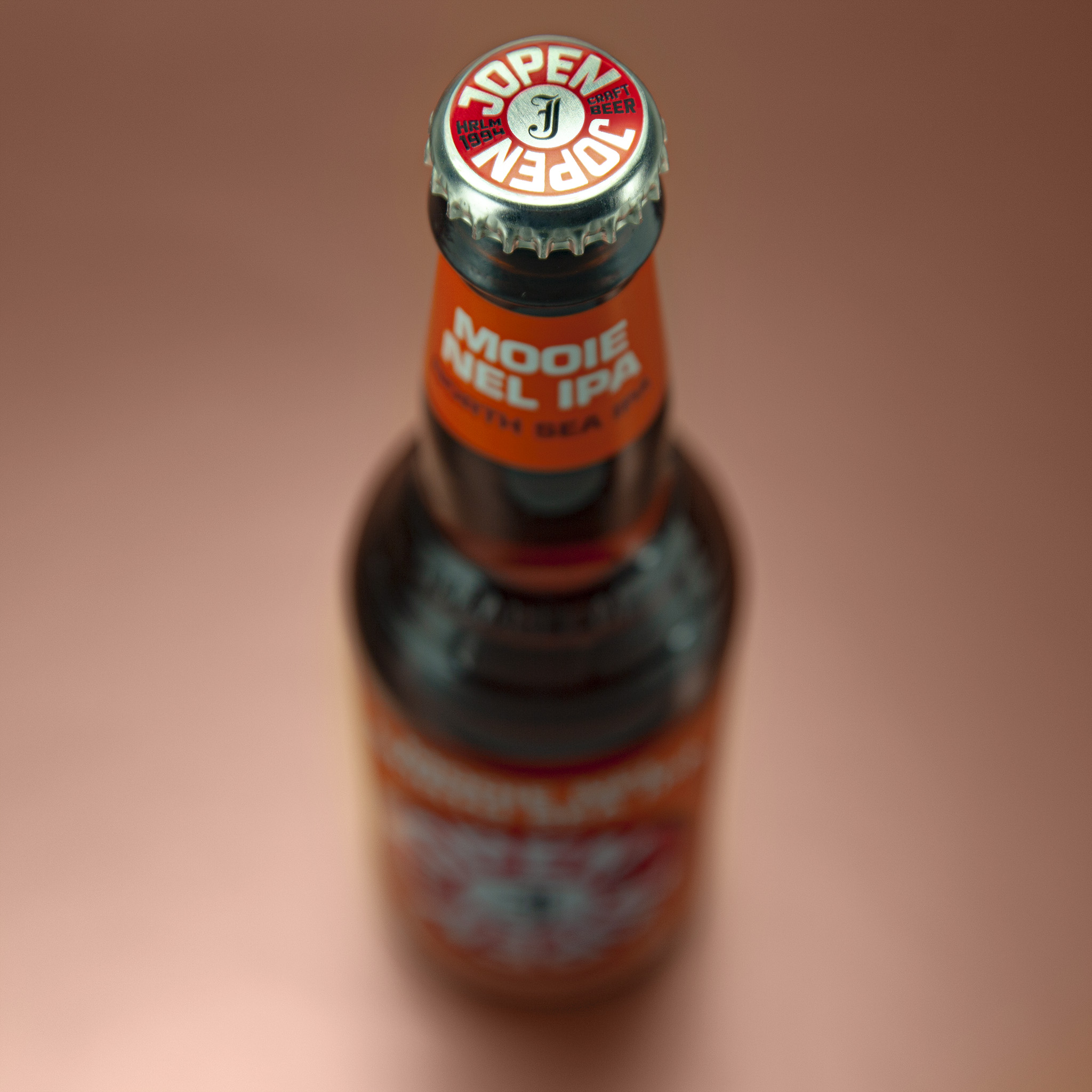
The round shape of the logo is a nod to the 112 liter “Jopen barrels” from the Haarlem brewing heritage. Furthermore, the logo consists of two parts, an inner and an outer circle. In the inner circle is the iconic “J”, which represents both the past and the future. The historic letter as a modern icon. The eye is drawn to this center and refers to the to-the-point attitude of Jopen.
Contemporary jacket
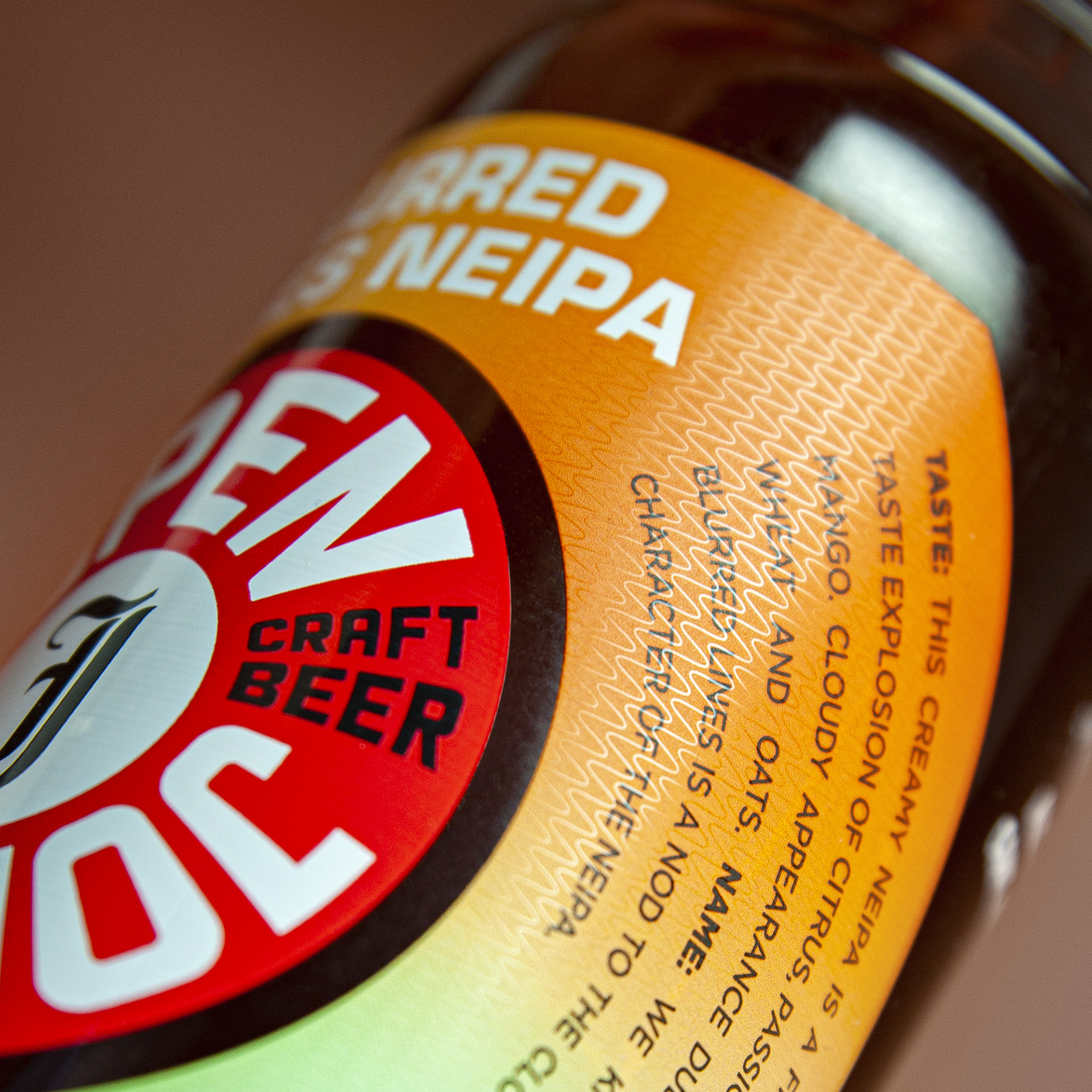
The surrounding edge is used to emphasize the young and innovative appearance of the beer brand. The designation of the Jopen brand is repeated herein. Because of the positioning and repetition, the brand is clearly visible and legible on a standing bottle, but also when consuming a mouth-tilted bottle. The font is unique and the red color is recognizable for Jopen.
Largest independent craft brewer
Moreover, this edge underlines the history and heritage of Jopen. For example, the home base “HRLM” (Haarlem), the foundation year “1994” and “craft beer” are all named. Finally, the outer circle represents the planned growth of Jopen. From the current market position, symbolically seen as the “J”, growth is started and the market expanded.
Labels and bottle
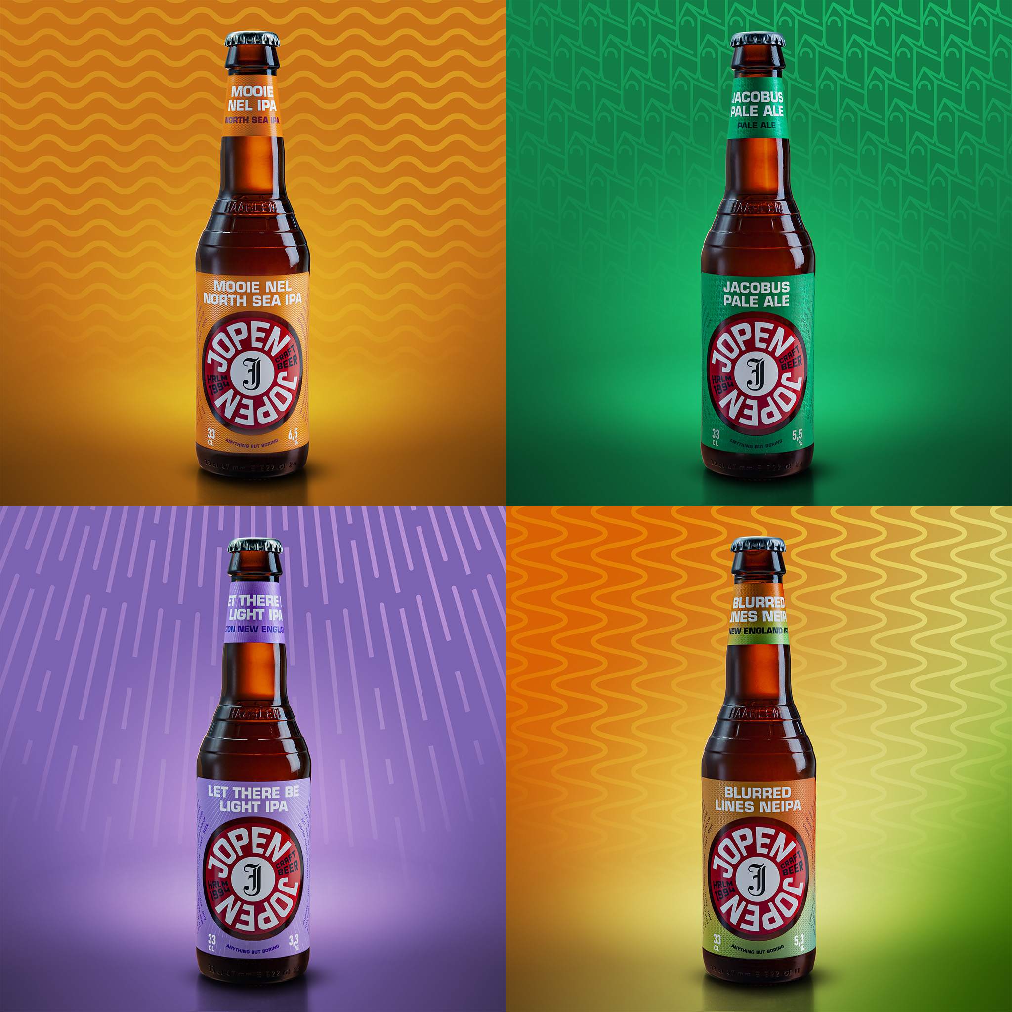
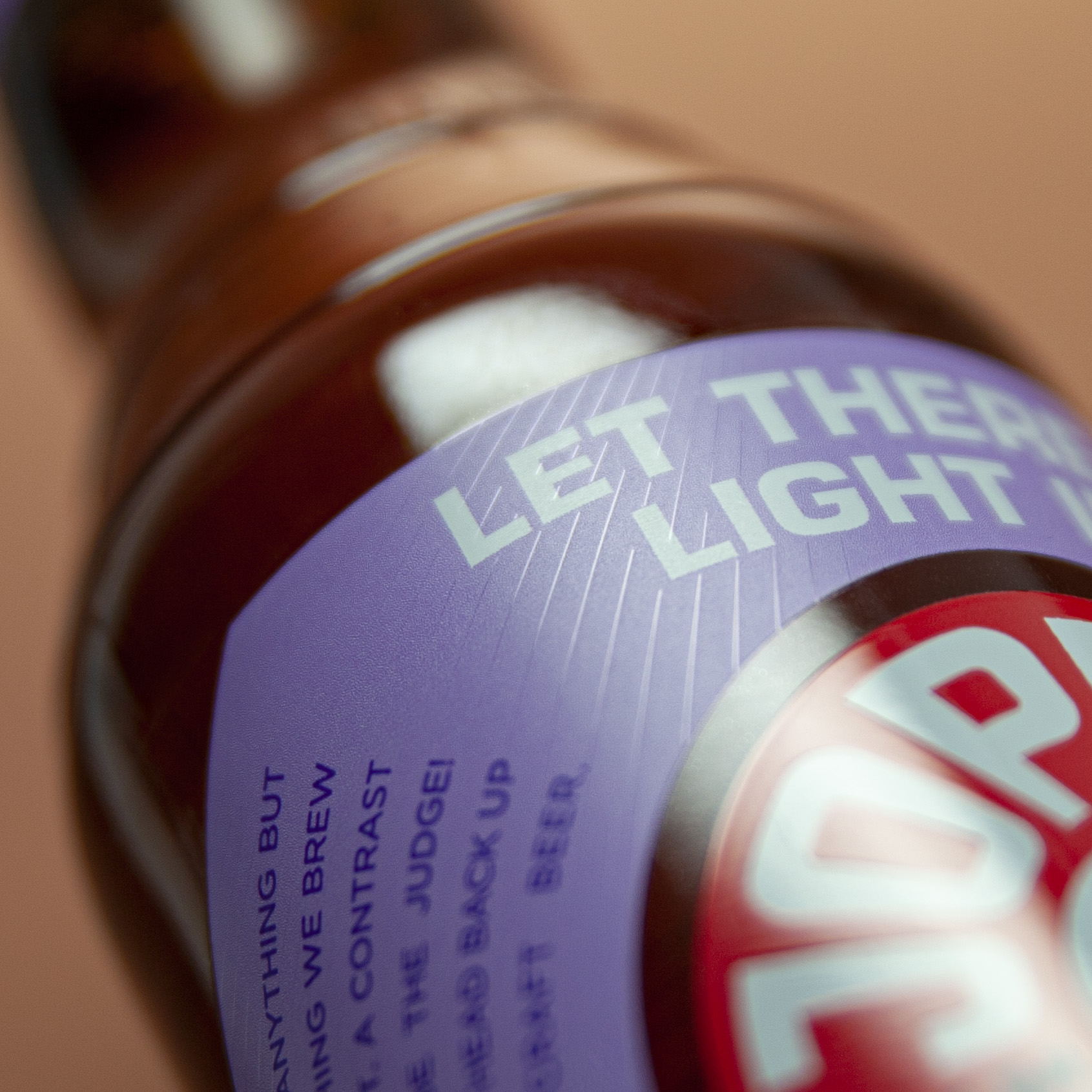
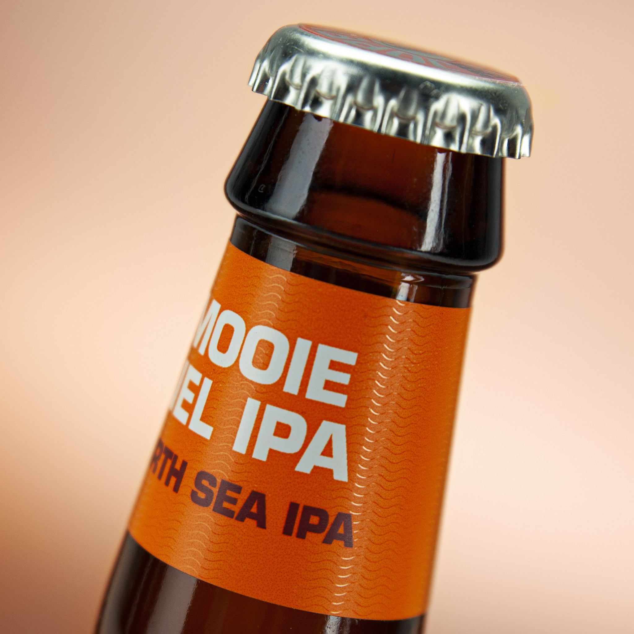
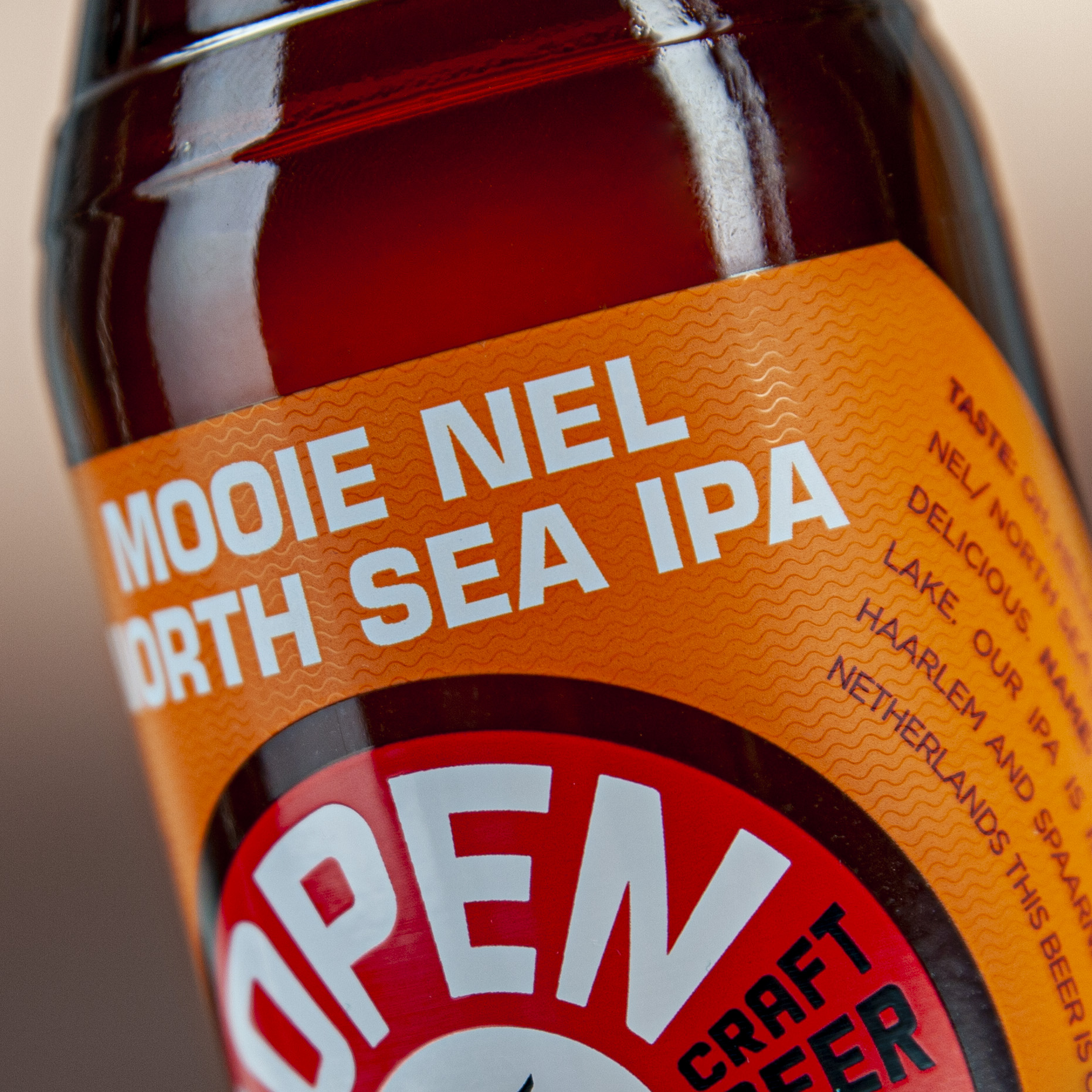
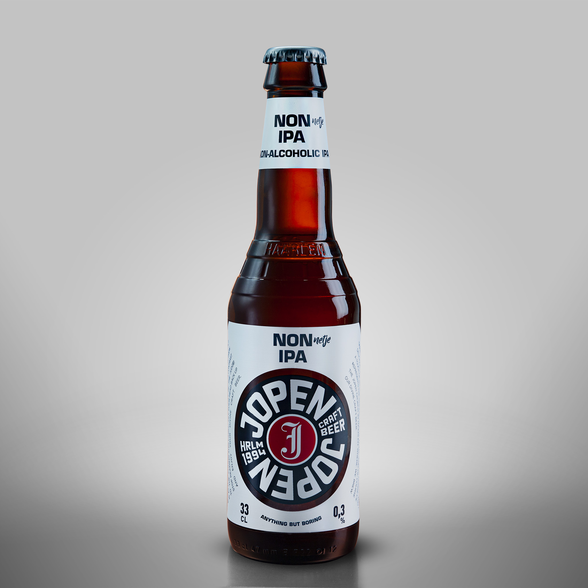
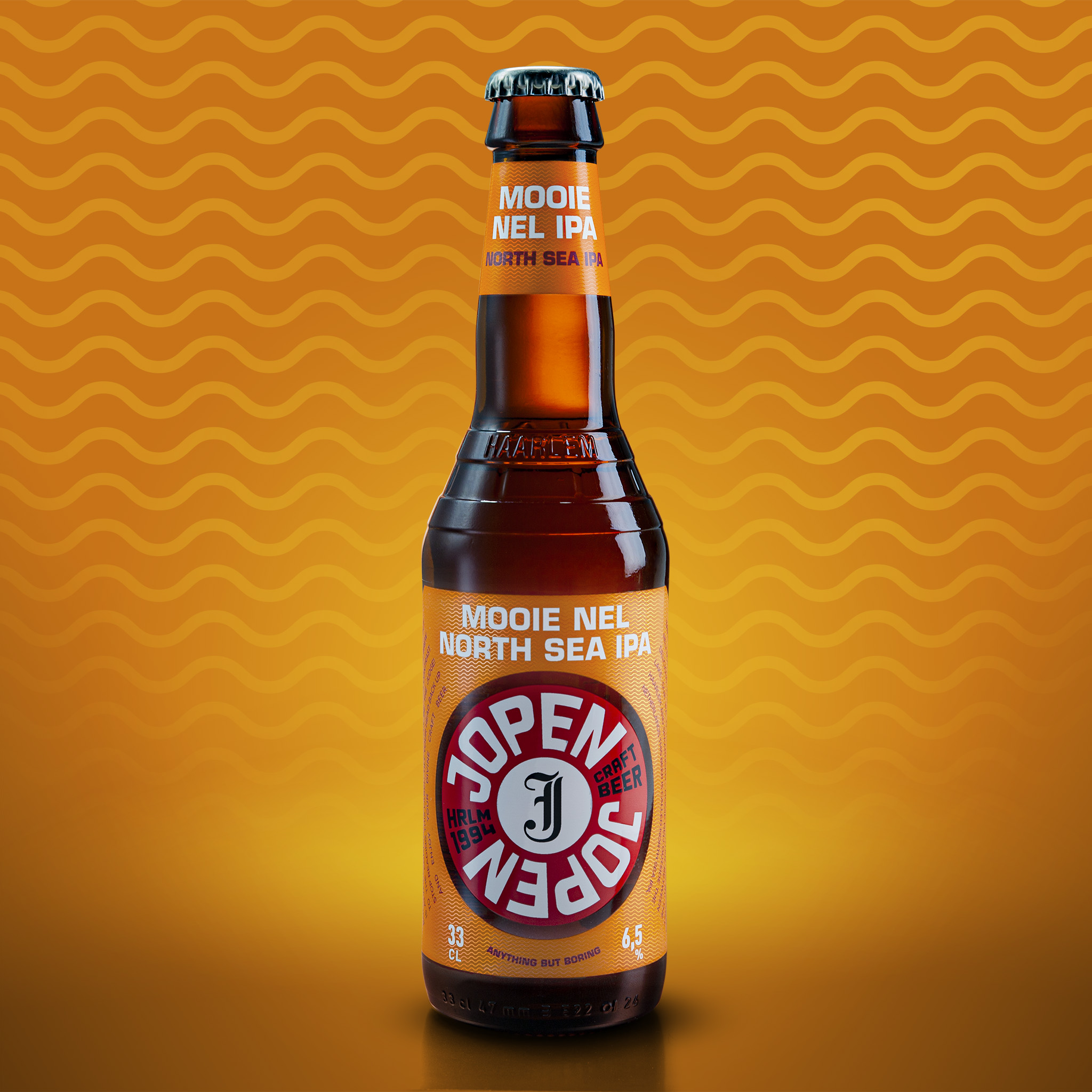
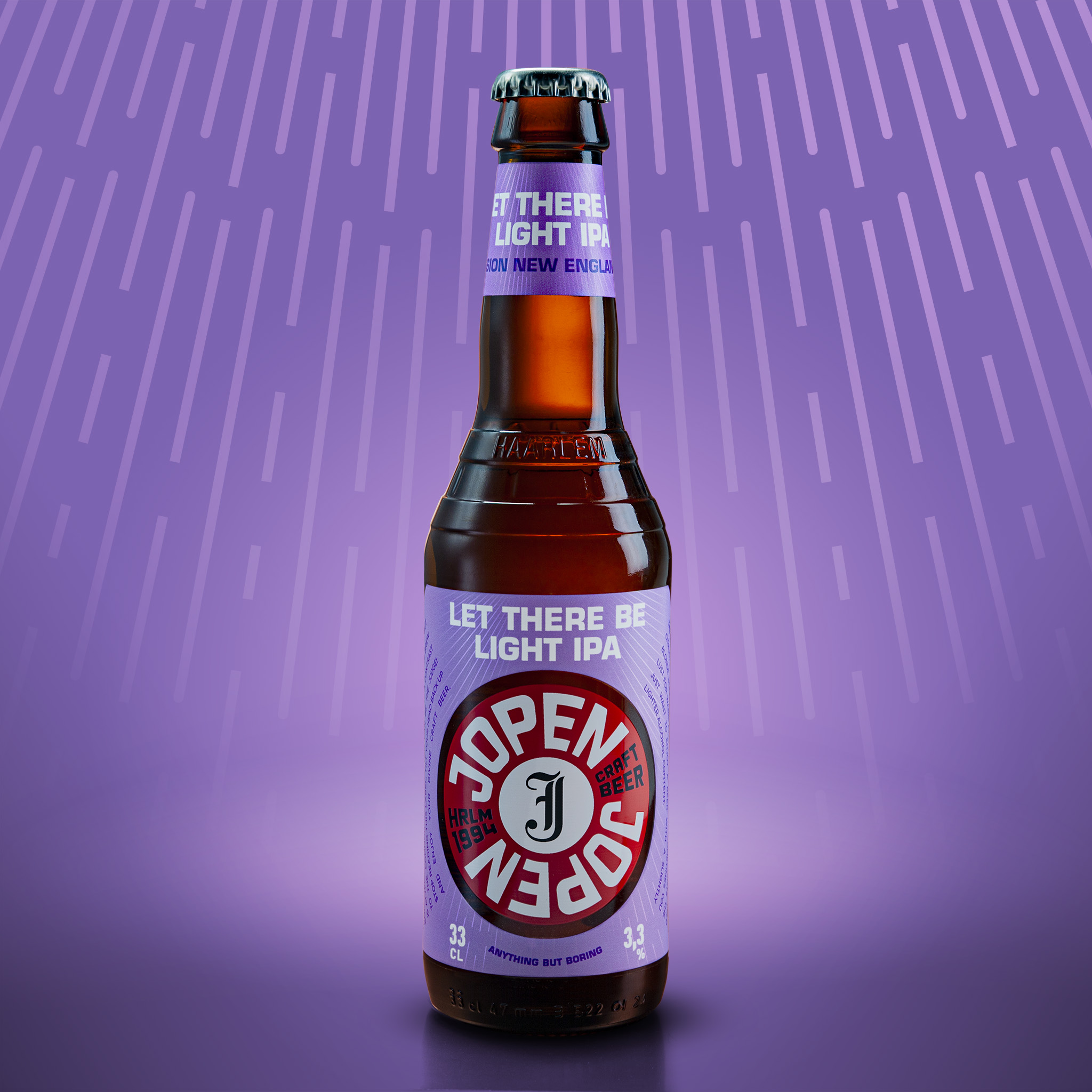
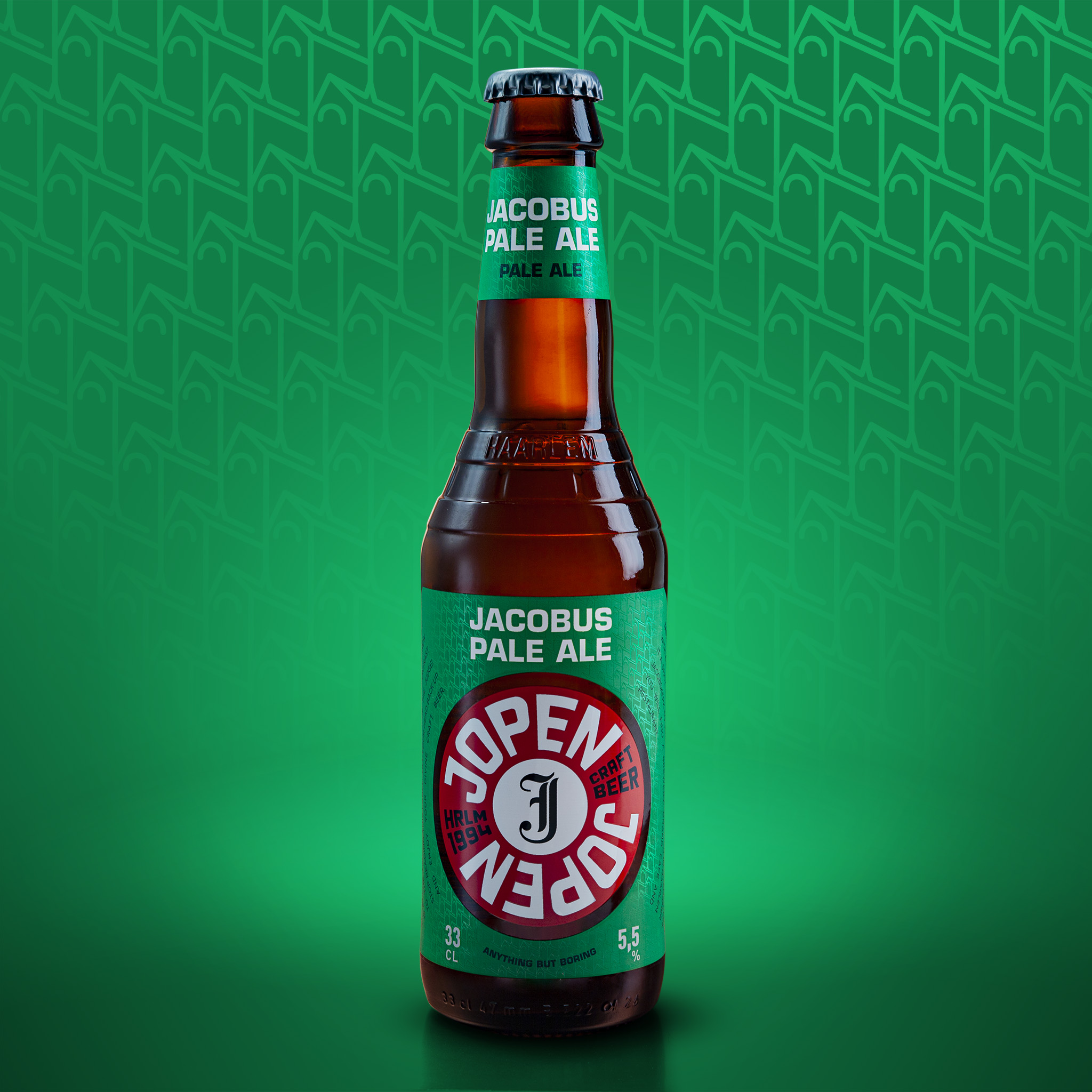
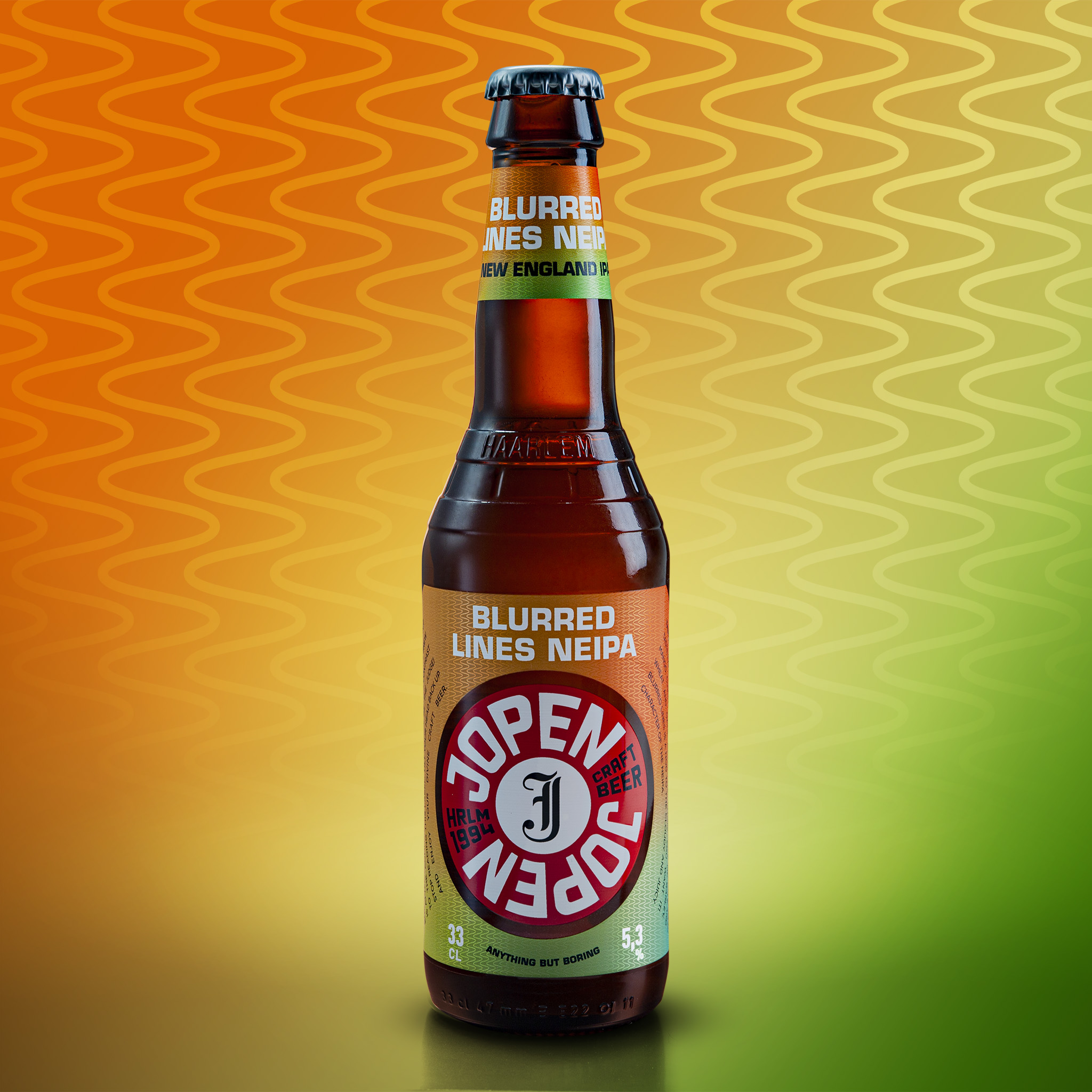
A hero position for the new logo has been created on the new clear labels. Centrally and cheekily it stares at you from the shelf. The logo literally comes loose from the single-colored background, which refers to the taste. Surrounded by beer, visible through the transparent circle, the logo floats, leaving it even more detached from the background.
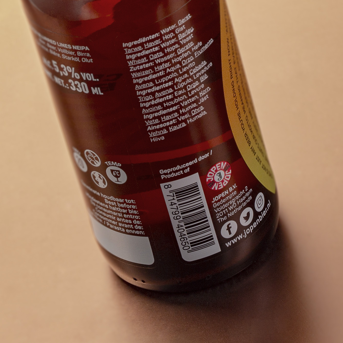
The background colors are not just chosen and link to the already known flavors of the Jopen core range. On the sides, the round shapes are continued and the text is positioned with a curved shape like an old urban vinyl record. The “empty” back gives space for a lot of readable information and the necessary references, for example the awards that the beers have won.
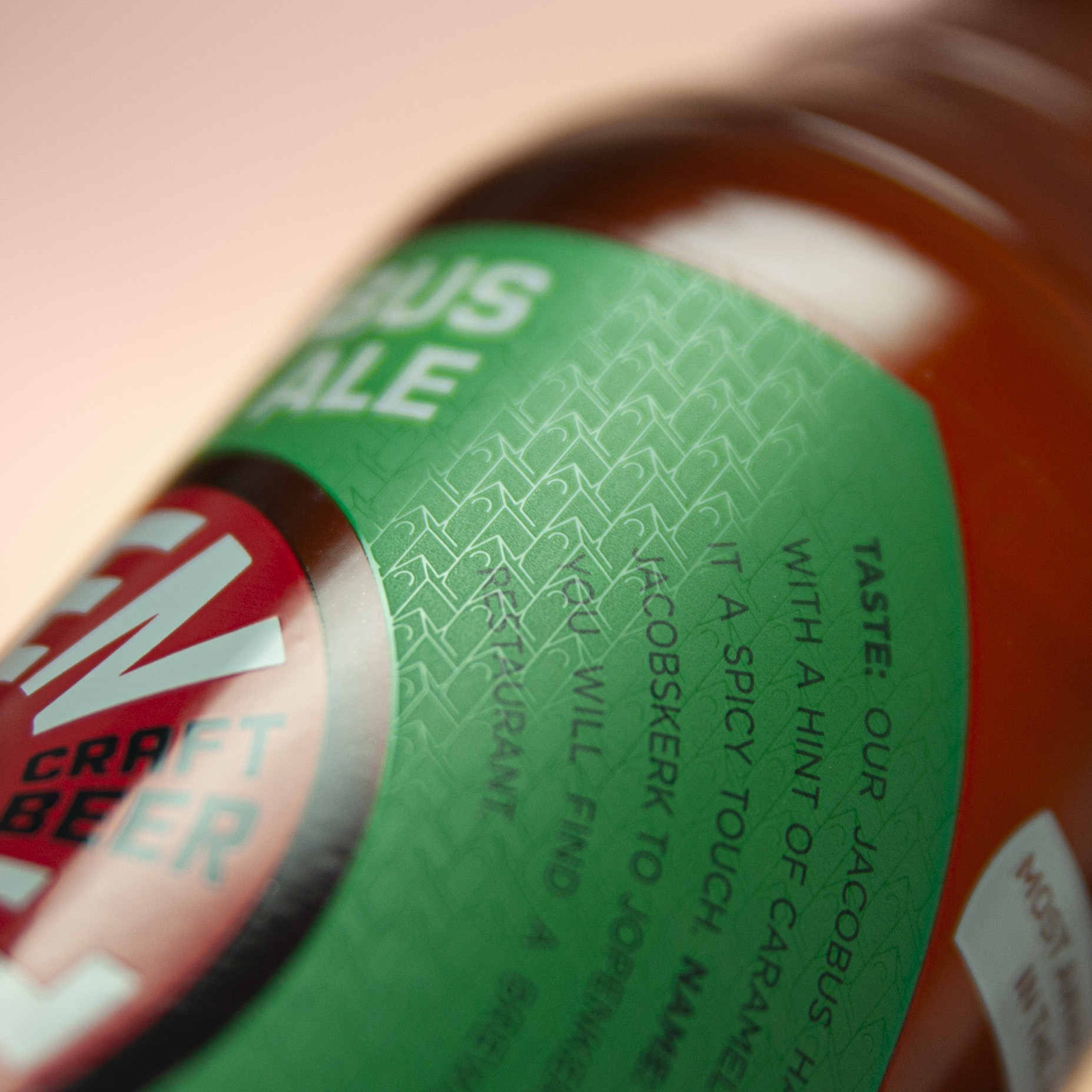
Storytelling is, of course, part of craft beer and that has also been thought of in a modern way. On the colored background of the labels, Jopen, to the left of the logo, personally addresses you with a statement about their “Anything but Boring” motto. On the right you will find feedback about the taste and name of the beer. To emphasize this even more, different patterns have been created that have been incorporated into the label and are based on the respective names of the different beers. The entire color areas on the labels are matte and the logo is glossy for extra standout. The different patterns are saved in this matte finish, so that they also shine and only become visible in your hand. They give each taste its own characteristic and support the stories that you encounter in your search on the labels, because that is also craft beer…. Discovering the story of the beer and investigating facts and facts while drinking.

CREDIT
- Agency/Creative: Van Heertum Design VHD
- Article Title: Jopen Craft Beer Restyling Logo and Packaging
- Organisation/Entity: Agency, Published Commercial Design
- Project Type: Packaging
- Agency/Creative Country: Netherlands
- Market Region: Europe
- Project Deliverables: Brand Architecture, Brand Creation, Brand Guidelines, Brand Redesign, Brand Rejuvenation, Brand Strategy, Graphic Design, Illustration, Packaging Design, Photography, Product Architecture, Product Naming, Rebranding, Research
- Format: Bottle
- Substrate: Glass Bottle


