Aspa Chroneou | Brand Identity Design – Jon’s Oilive
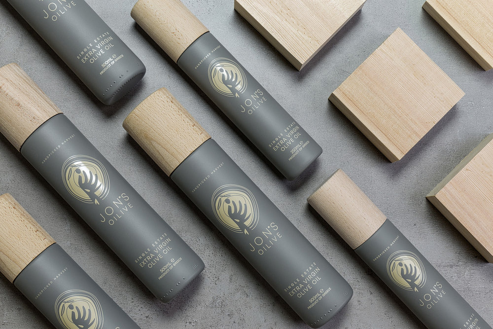
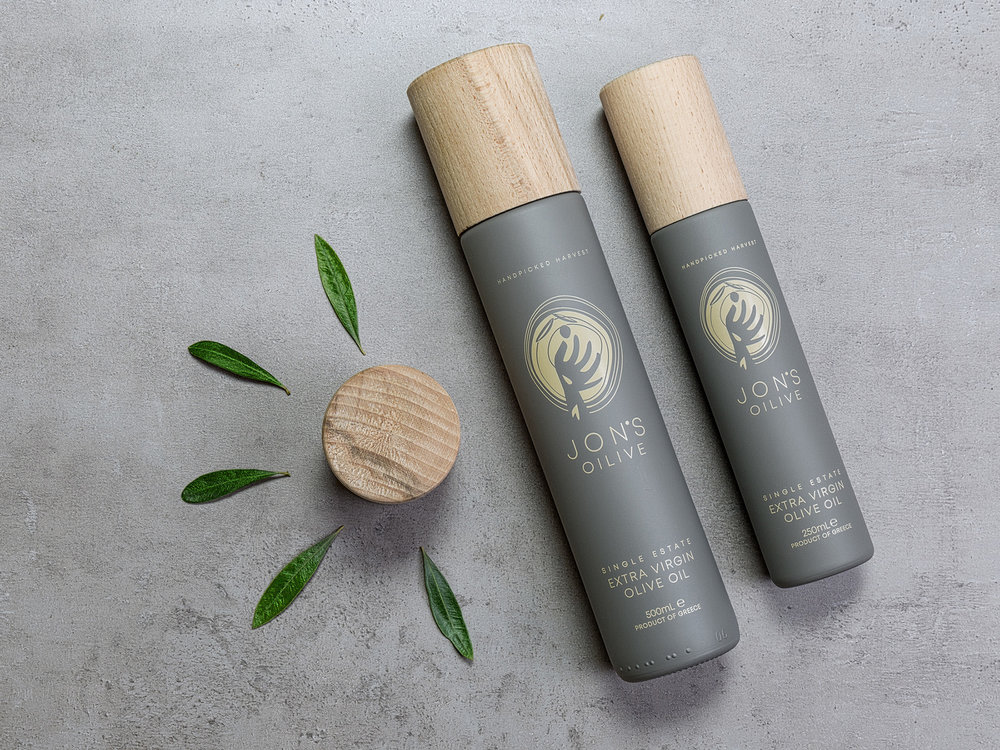
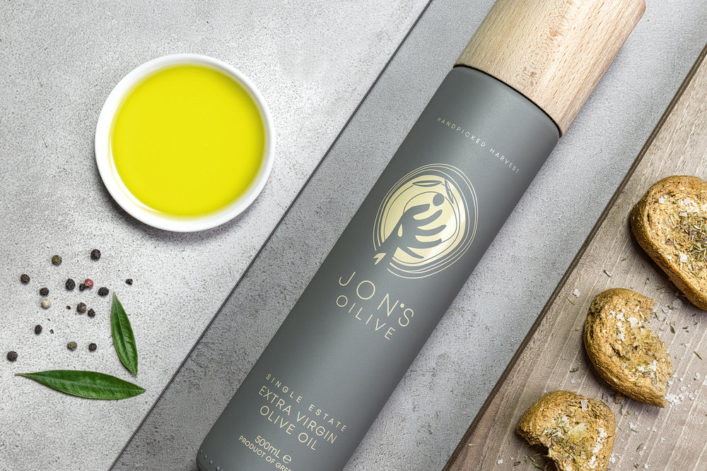
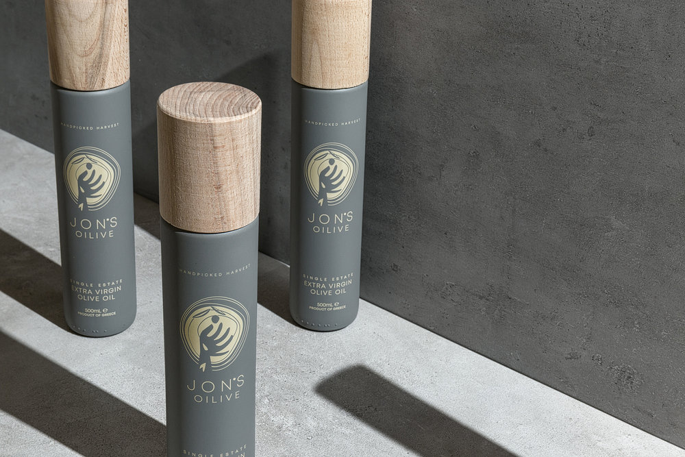
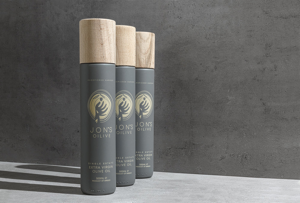
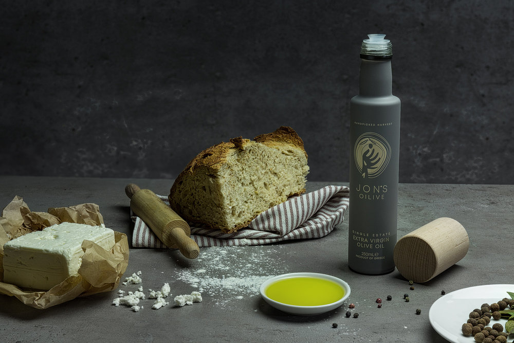
The olive tree. A symbol of peace, victory, wisdom and immortality. Surrounded by the endless beauty of nature and limitless seascape of the island of Euboea, JON and his family cultivate a limited number of 1000 Amfissa olive trees. For the love of olive fruit and passionate craftsmanship, olives are picked and selected by hand to produce excellent olive oil. We were commissioned to design a brand that captures the company’s values: honesty, authenticity, strong roots … Jon’s heritage. We used a natural colour palette combined with a wooden lid, to provide us the pure nature of the product. We visualized Jon’s hand, collecting the precious olive fruit, placed on a circular cutted olive trunk, which symbolises the circle of life… Jon’s Oilive! JON’S OILIVE, made for good taste and good life!
CREDIT
- Agency/Creative: Aspa Chroneou | Brand Identity Design
- Article Title: Jon’s Oilive Olive Oil Packaging Design
- Organisation/Entity: Agency Commercial, Published
- Project Type: Packaging
- Agency/Creative Country: Greece
- Market Region: Europe
- Format: Bottle
- Substrate: Glass, Wood


