A full branding project for a Business Innovation Park, an Institute of Entrepreneurship Development (iED) initiative.
First Step – Naming: Representative, concise, pleasing to the ear, visually operating, fresh though communicating archetypical connotations, the name of the Park describes the cornerstone of the business development, the ‘’supportive pillar’’ and the ‘’bond’’, a ‘’nexus’’, an existing one and a pursuing one, the one that we achieved and the one that we envision. It is therefore a delighted pillar and a pleasant bond: it’s Joist.
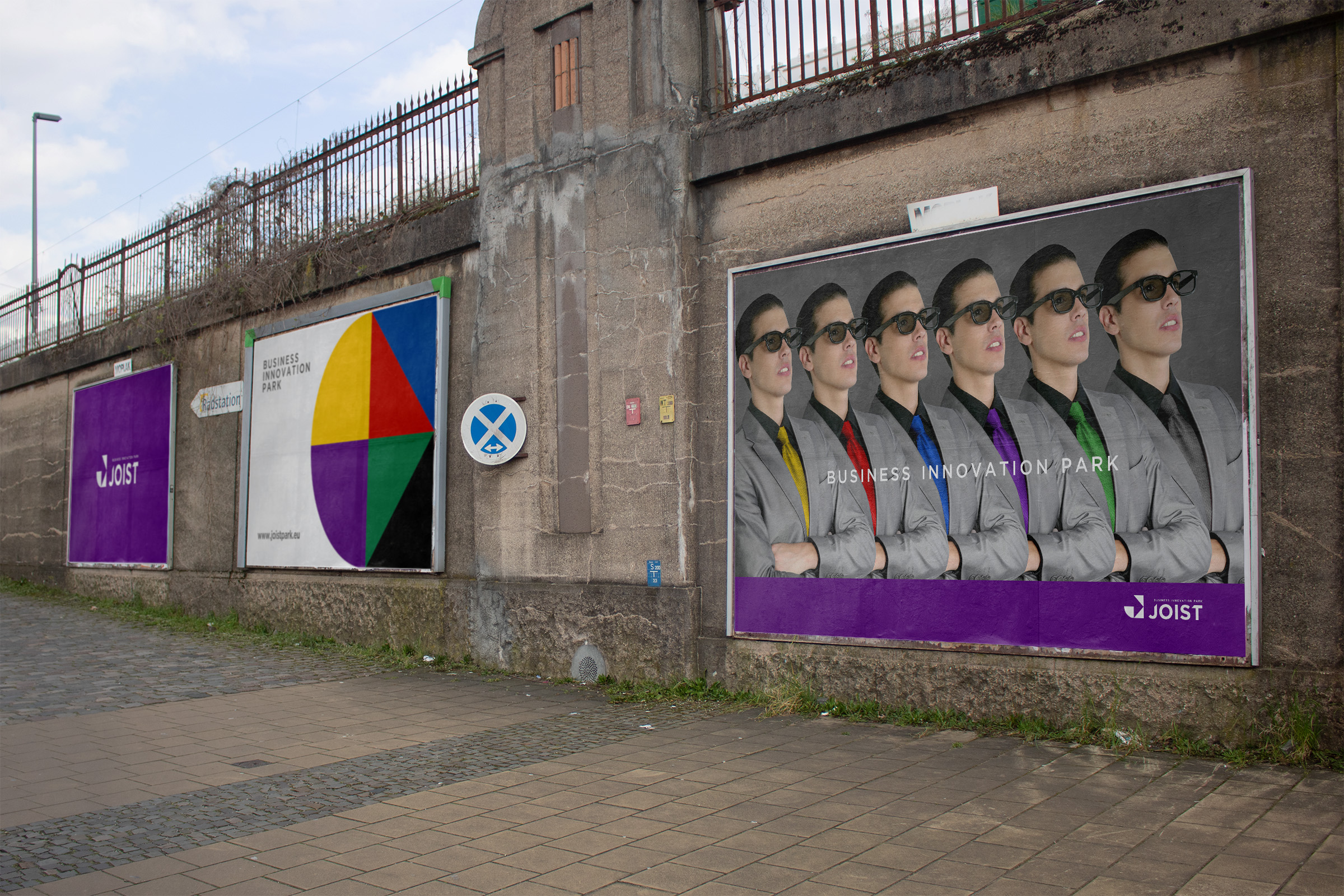
Second Step – Services Concept: The initially seven service categories reduced to six and visually commensurate the pieces of a tangram, each one with a discrete color. All assembled in a common space they are expecting the entrepreneur’s creativity, who will create their unique combinations in order to form their own visions. Each peace invites its use with a brief encouragement, which is actually describes its potentials (produce, work, meet & present, organize, fund, play).
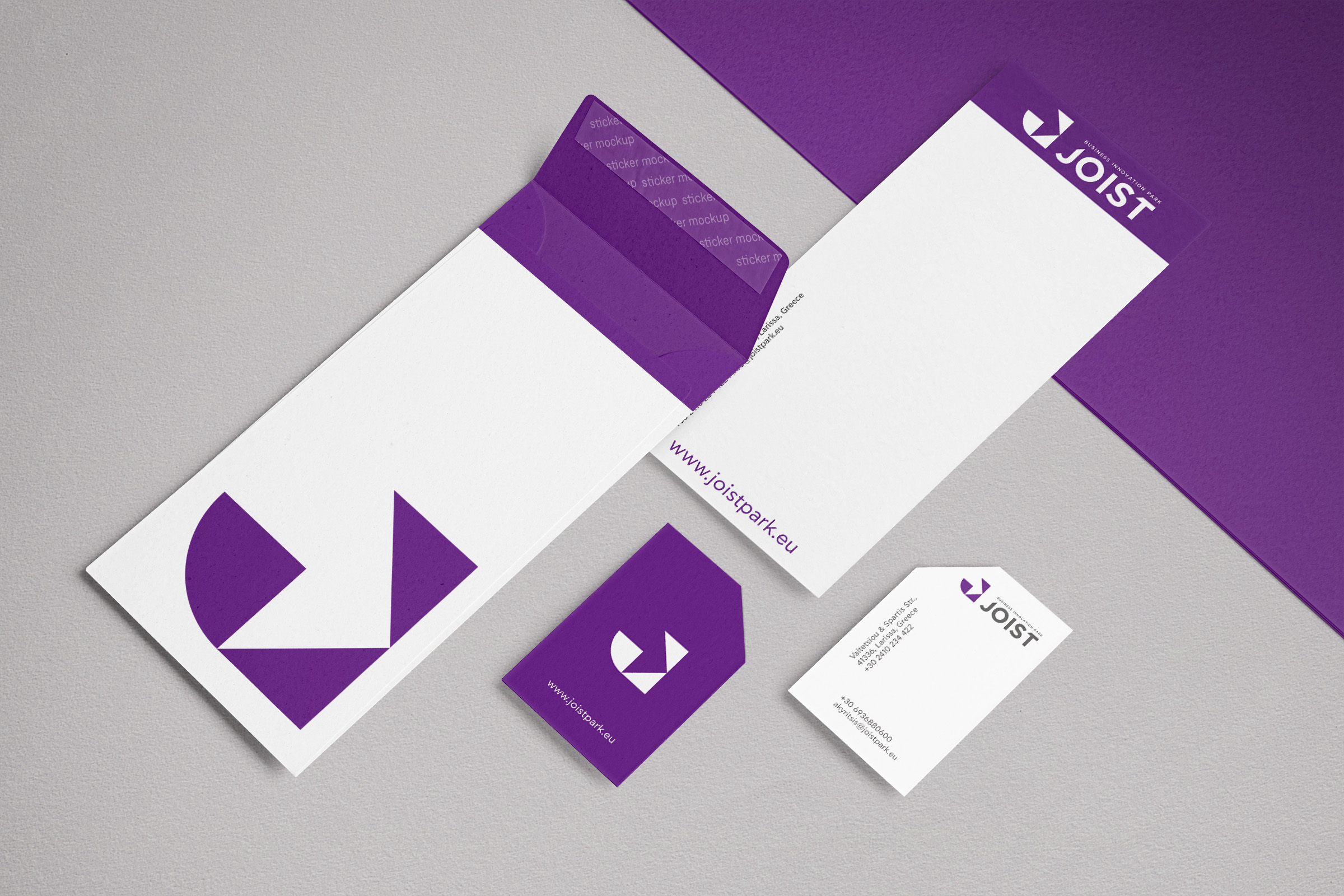
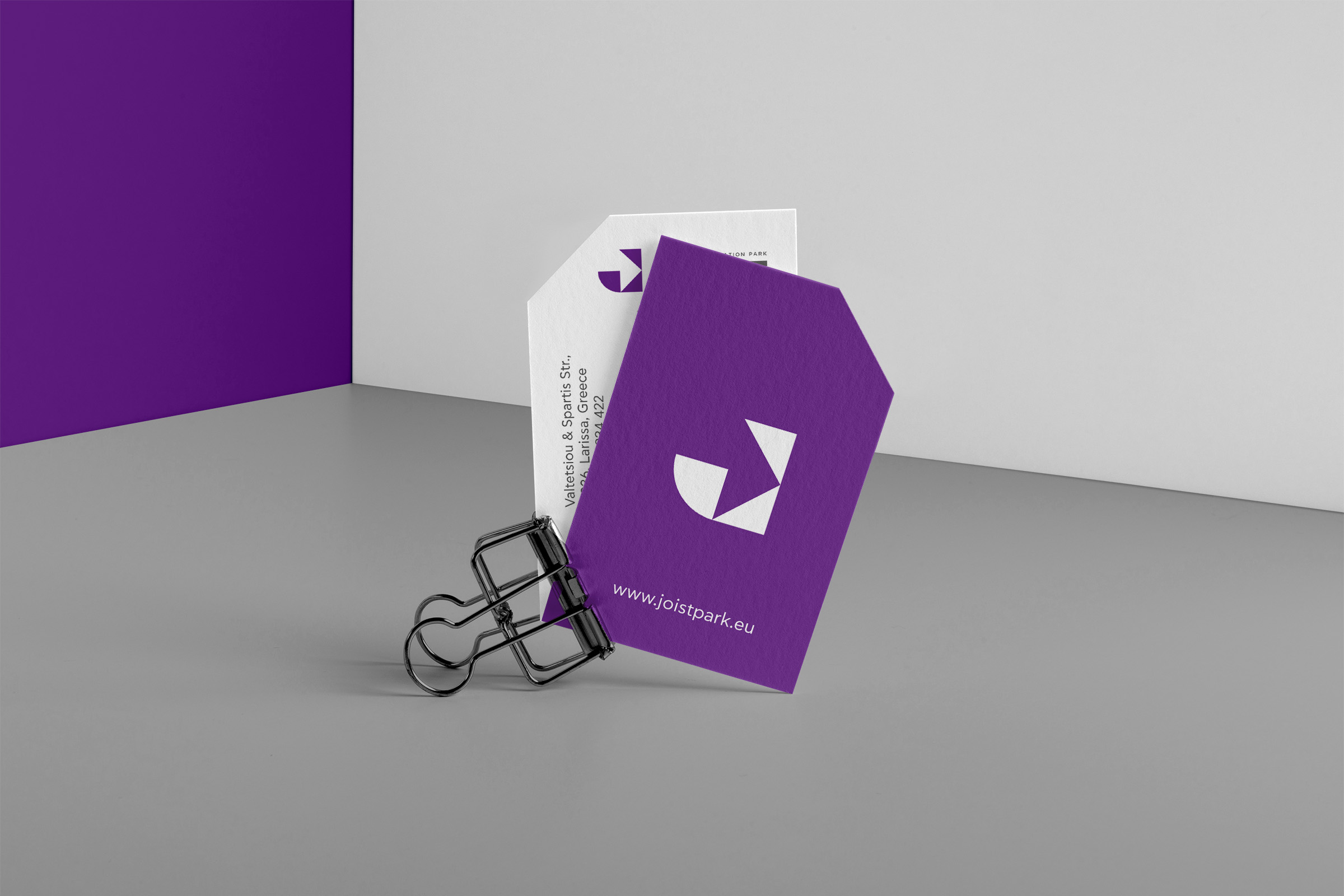
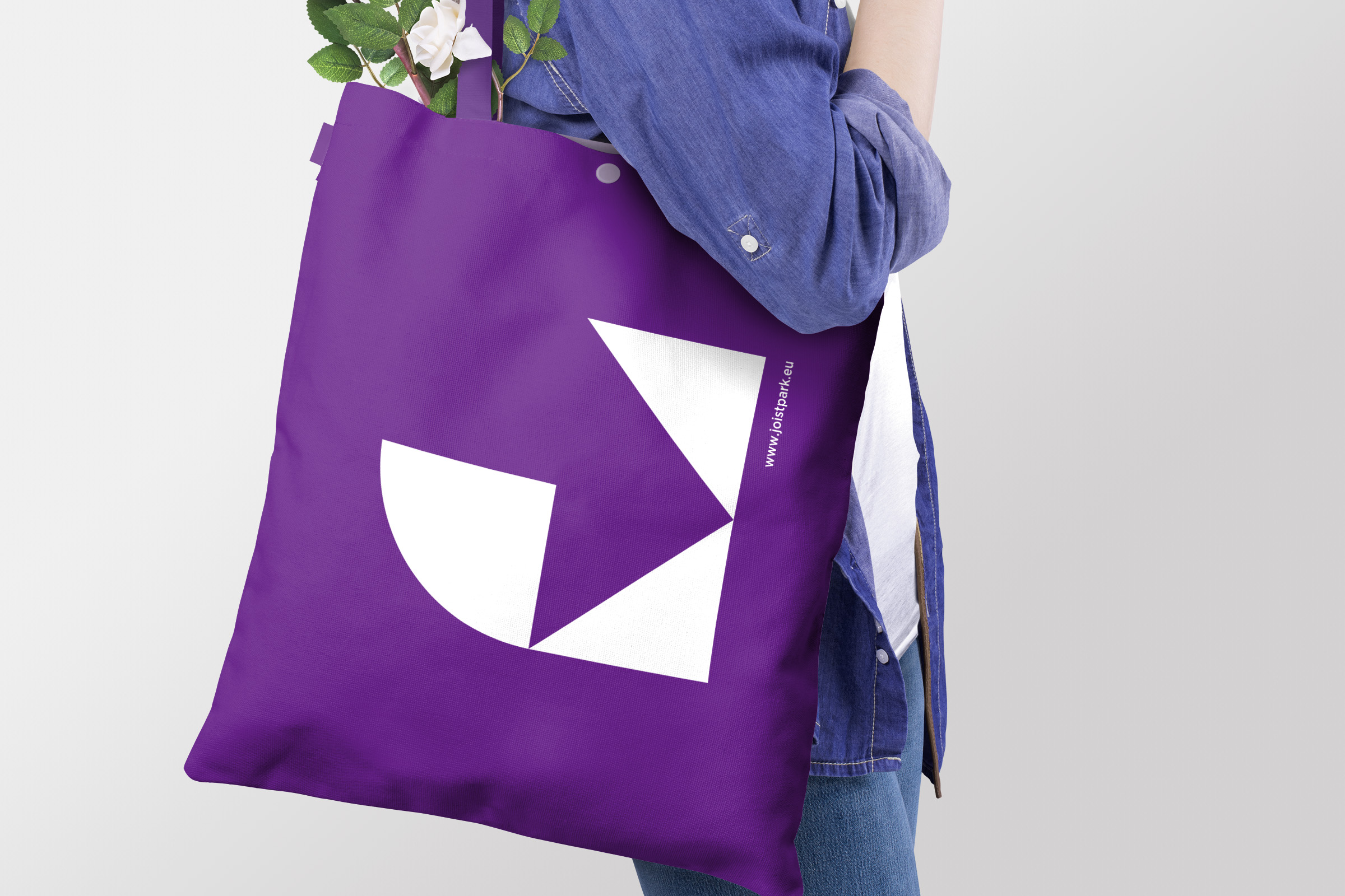
Third Step – Logotype: The previous steps visualized in a comprehensive logotype. The symbol is a monogram, based in the same ancient Chinese game mind set. Two simple geometrical forms compose the initial ‘’J’’ of the brand name. Doing so, it communicates two distinguishable meanings: the compact structure depicts a working position and the internal part of the outline shapes an arrow, prompting to an enter/entre. The brand name typography is simple and modern, while its distinctiveness empowered by cuttings, following the symbols degrees. Thus, symbol and typography are in mutual support. Tagline is taking part being a joist that traverses and houses the brand name. Synthesis gains one more discrete characteristic with its mauve color, chosen to underline the singularity and dissimilarity.
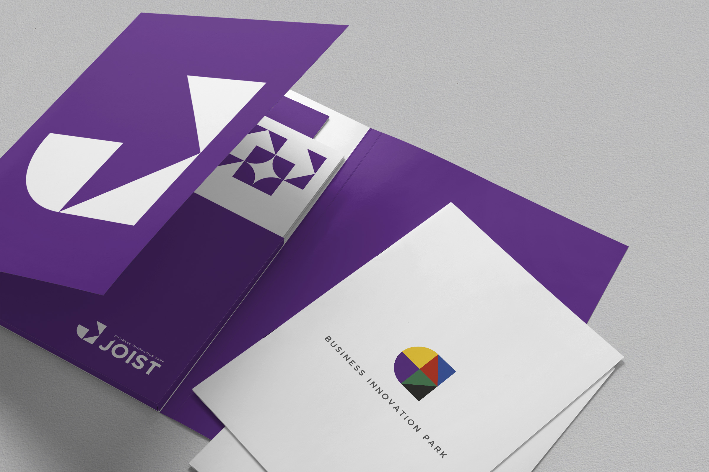
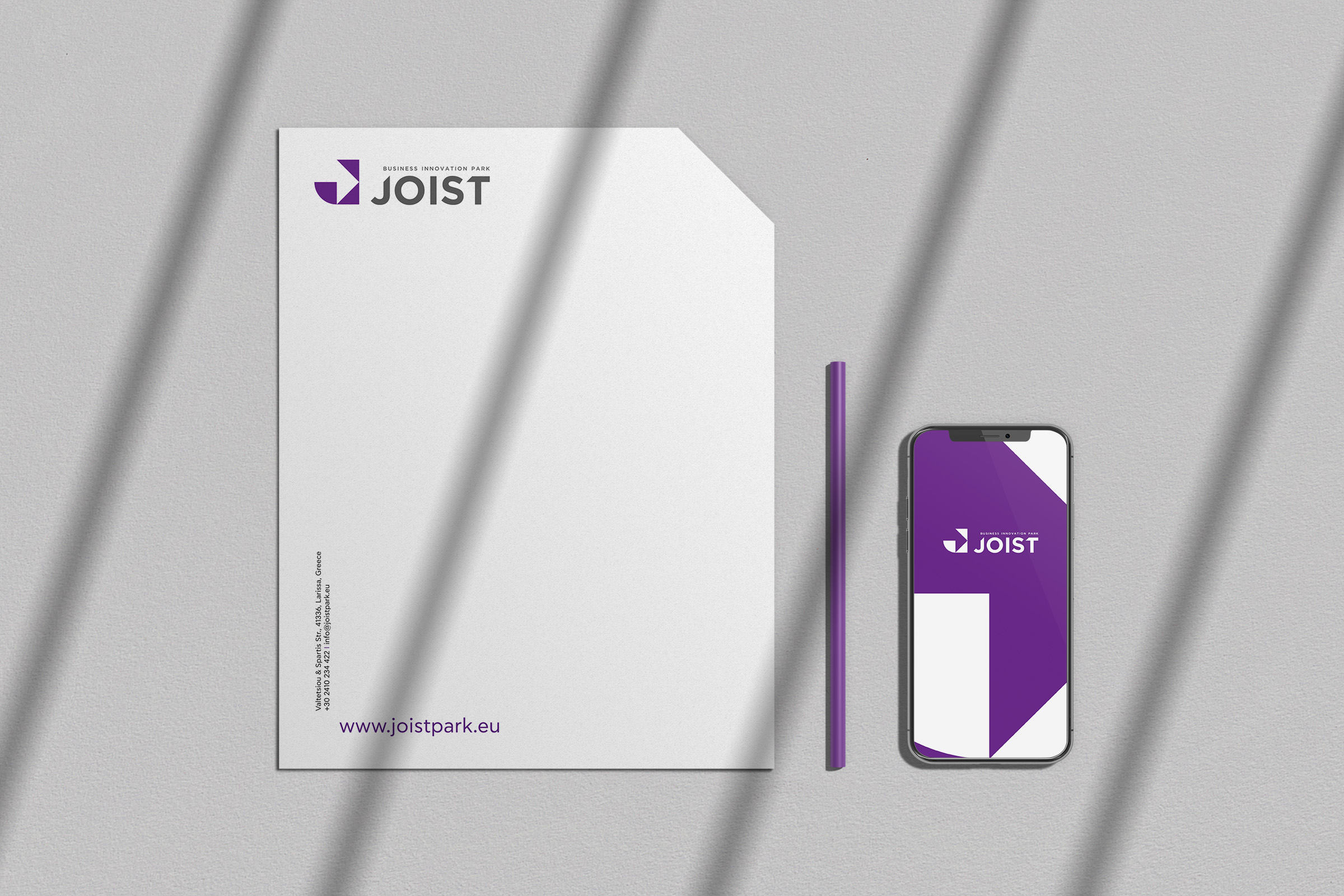
Fourth Step – Corporate Identity: A series of corporate identity applications developed to communicate, internally to the Park and externally to the market, the values and visions of innovative entrepreneurship, in a way that brings forward the Joist way of doing things.
Overall, the project broadcasts the message: do together!

CREDIT
- Agency/Creative: Cursor Design Studio
- Article Title: Joist Business Innovation Park by Cursor Design Studio
- Organisation/Entity: Agency, Published Commercial Design
- Project Type: Identity
- Agency/Creative Country: Greece
- Market Region: Europe
- Project Deliverables: Brand Identity, Brand Naming, Branding, Graphic Design, Identity System, Research
- Industry: Education
- Keywords: Business, Cursor Design Studio, CursorDesign, makes things visible, innovation, hub, park, education, branding, identity, logo, logotype, graphic design, graphic, visual, typorgaphy, icon, symbol, monogram


