


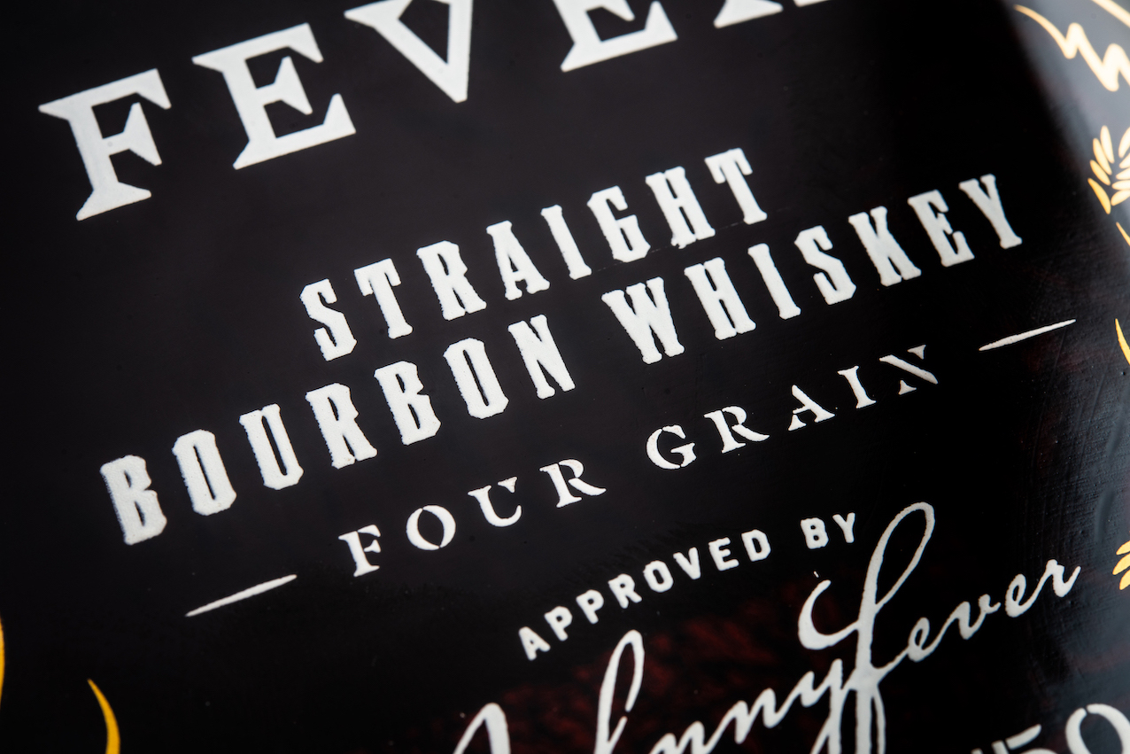
Johnny Fever is a homage to those important father figures in our lives, the ones who share their passion, their wisdom, and even their whiskey. Inspired by a special relationship with his own father-in-law, one of the distillery’s co-founders wanted Johnny Fever to embody the memories and feeling of moments savoured with those you love and respect – so we did just that.
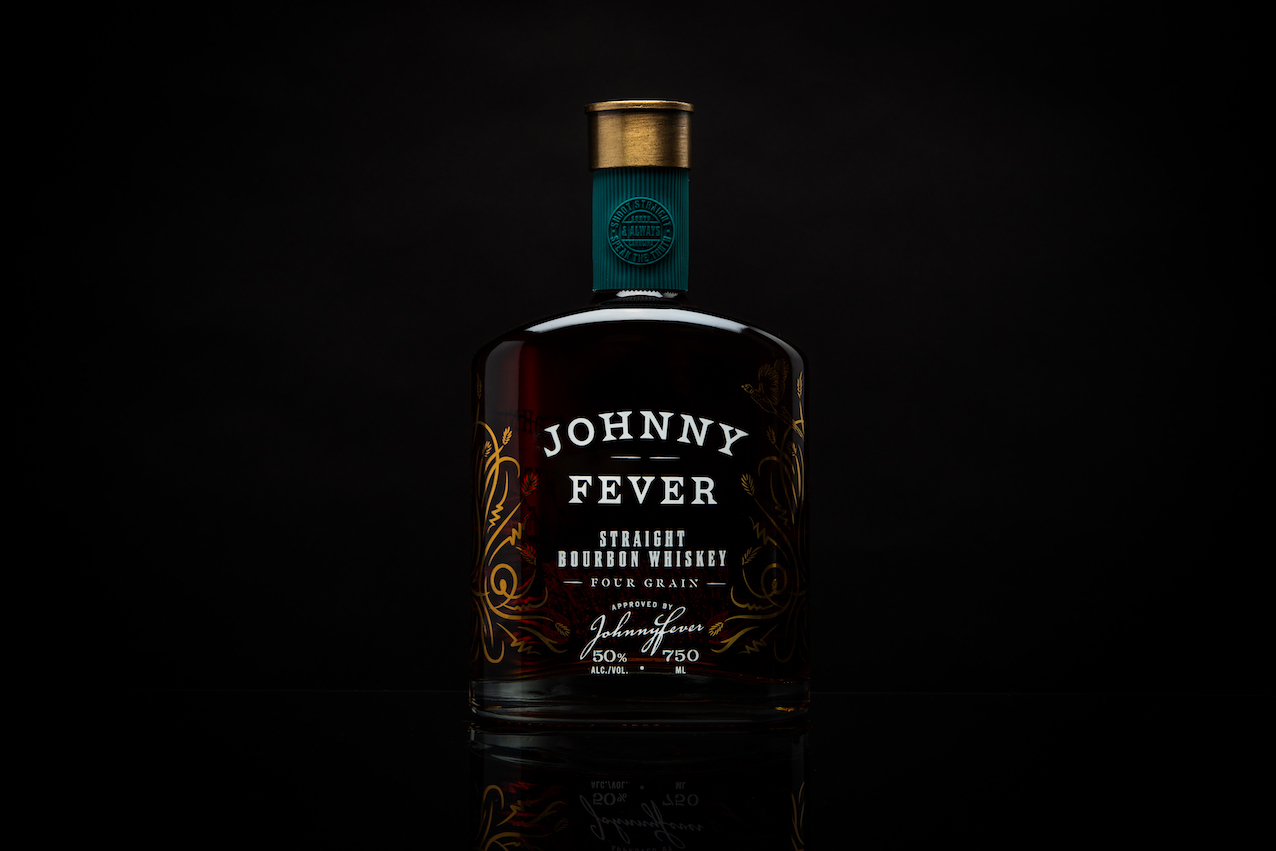
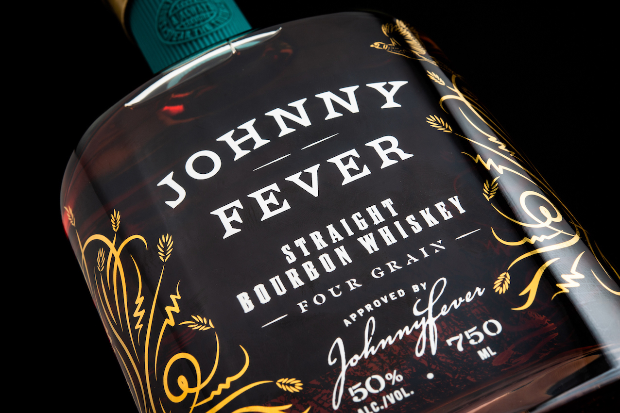
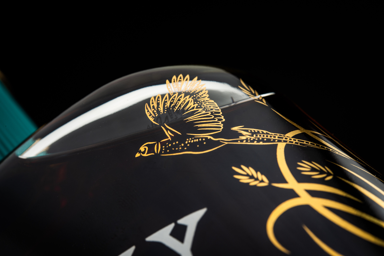
Drawing from stories of pheasant hunting and nights by the fire, we designed Johnny Fever with layers of meaningful elements to be a bottle that is both revered and familiar. While there are can’t-miss elements – such as the custom shotgun shell replica to crown the bottle – every small detail was considered, including the angle at which the bird emerges from the brush in the right position for a perfect shot.
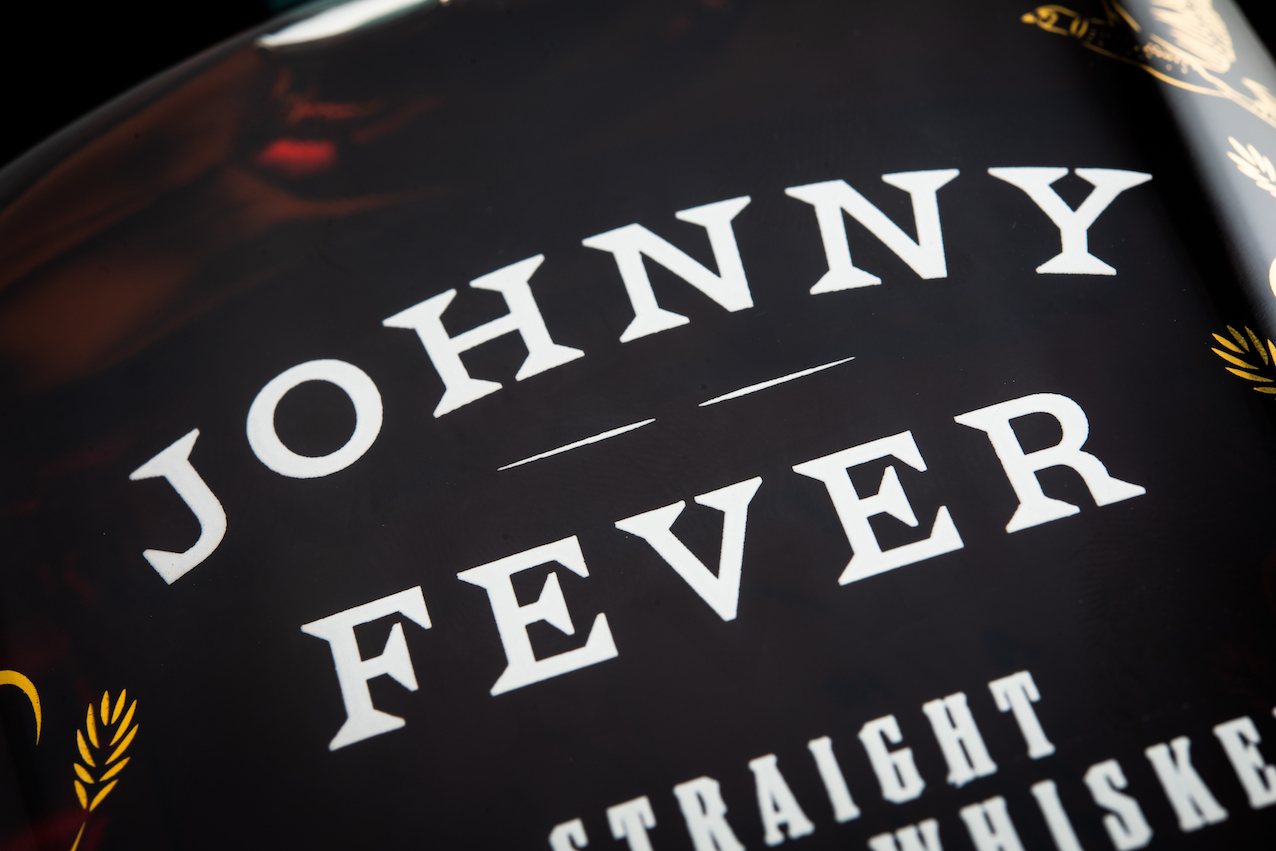
Unique to this brand: Gold foil screen printing – creates a dreamy illusion of a grassy field blowing in the breeze, as if drawn from a memory
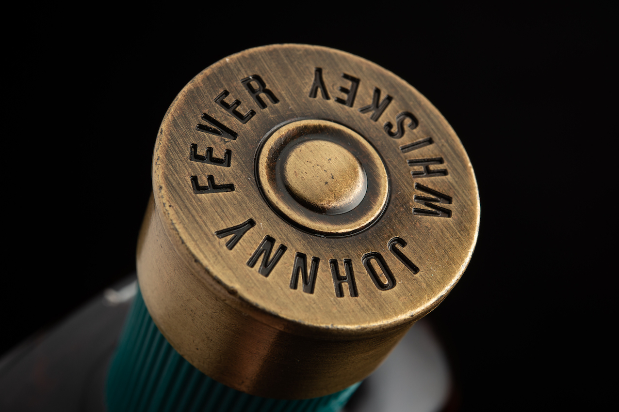
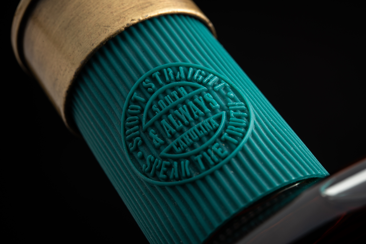
Shotgun shell bottle stopper – a bespoke brass top and shell casing neck wrap replicate a shotgun shell casing to crown the bottle
Burnt Church Distillery is a varied collection of brands developed by two brothers with a love of the Lowcountry and a knack for building successful brands across industries. Having worked with another agency at an early stage, they recognized the need for a team more familiar and experienced with the spirits industry to take their brands to the next level. The Thoroughbred Spirits Group was brought in to assist with financial modelling, liquid development, packaging design and sourcing, and general advisory services. Johnny Fever is one of nine unique offerings the Thoroughbred team re-envisioned for Burnt Church Distillery’s house of brands.
CREDIT
- Agency/Creative: Thoroughbred Spirits Design
- Article Title: Johnny Fever Whiskey Packaging Design by Thoroughbred Spirits Design
- Organisation/Entity: Agency
- Project Type: Packaging
- Project Status: Published
- Agency/Creative Country: United States
- Agency/Creative City: Chicago
- Market Region: North America
- Project Deliverables: Brand Creation, Brand Design, Brand Strategy, Packaging Design, Typography
- Format: Bottle
- Substrate: Glass Bottle
- Industry: Food/Beverage
- Keywords: whiskey, spirits, craft, duistillery
-
Credits:
Head of Creative: Benjamin Carr
Head of Client Services: Kristin Shirtz
Managing Director: Ann Moran
Executive Director: Scott Schiller


