


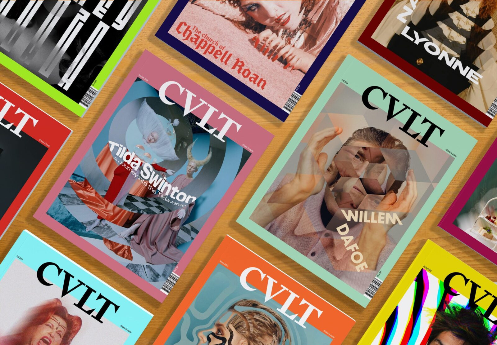
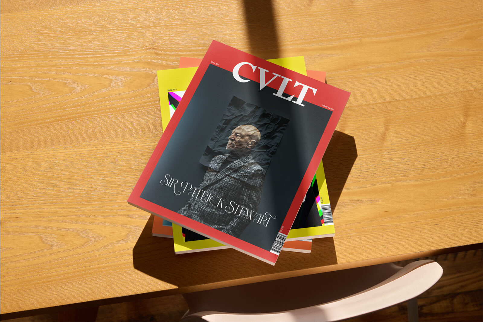
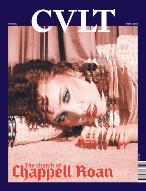
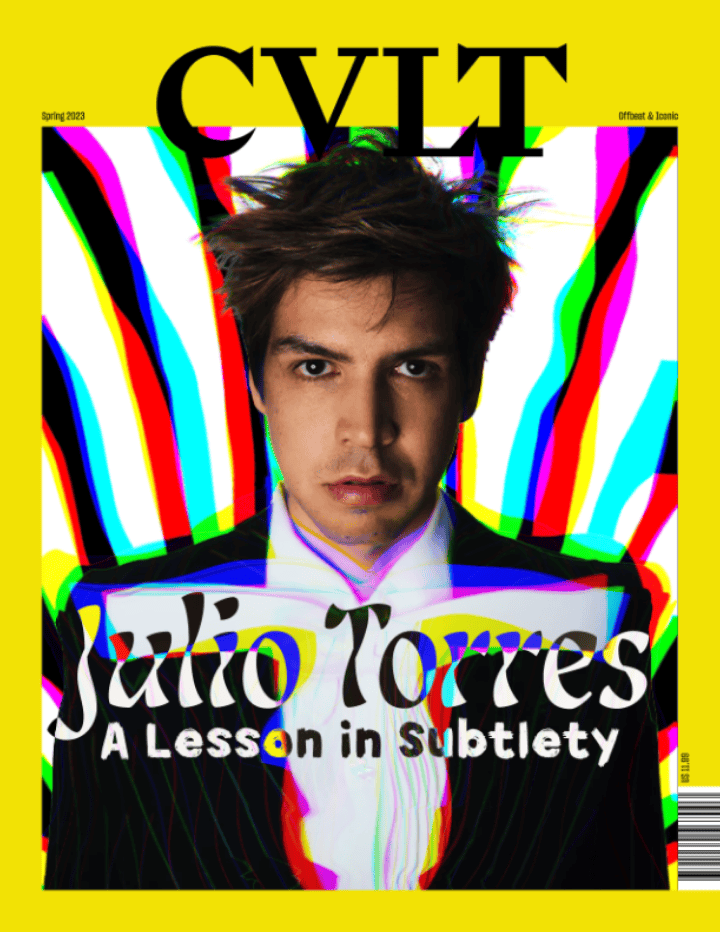
Contemporary celebrity culture is often presented through a sanitized and commercially safe lens. Mainstream entertainment journalism relies on rigid templates and PR-controlled narratives that flatten the subject matter. The objective for CVLT Magazine was to disrupt this pattern. The publication required a visual identity that treats pop culture not as disposable gossip, but as a “cult” phenomenon defined by obsession, ritual, and iconic status.
The editorial mission recognizes that “cult” followings have historically been intertwined with queer culture and the “camp” sensibility. Figures like John Waters or films like Rocky Horror exemplify this. Often dismissed by mainstream critics as “low brow” or “bad taste,” these cultural artifacts deserve to be viewed with the same reverence as fine art. The design philosophy seeks to elevate the “other.” It balances the intellectual rigor of an academic journal with the rebellious energy of a queer zine. The target audience is digitally savvy 25–40-year-olds who value subversion over perfection.
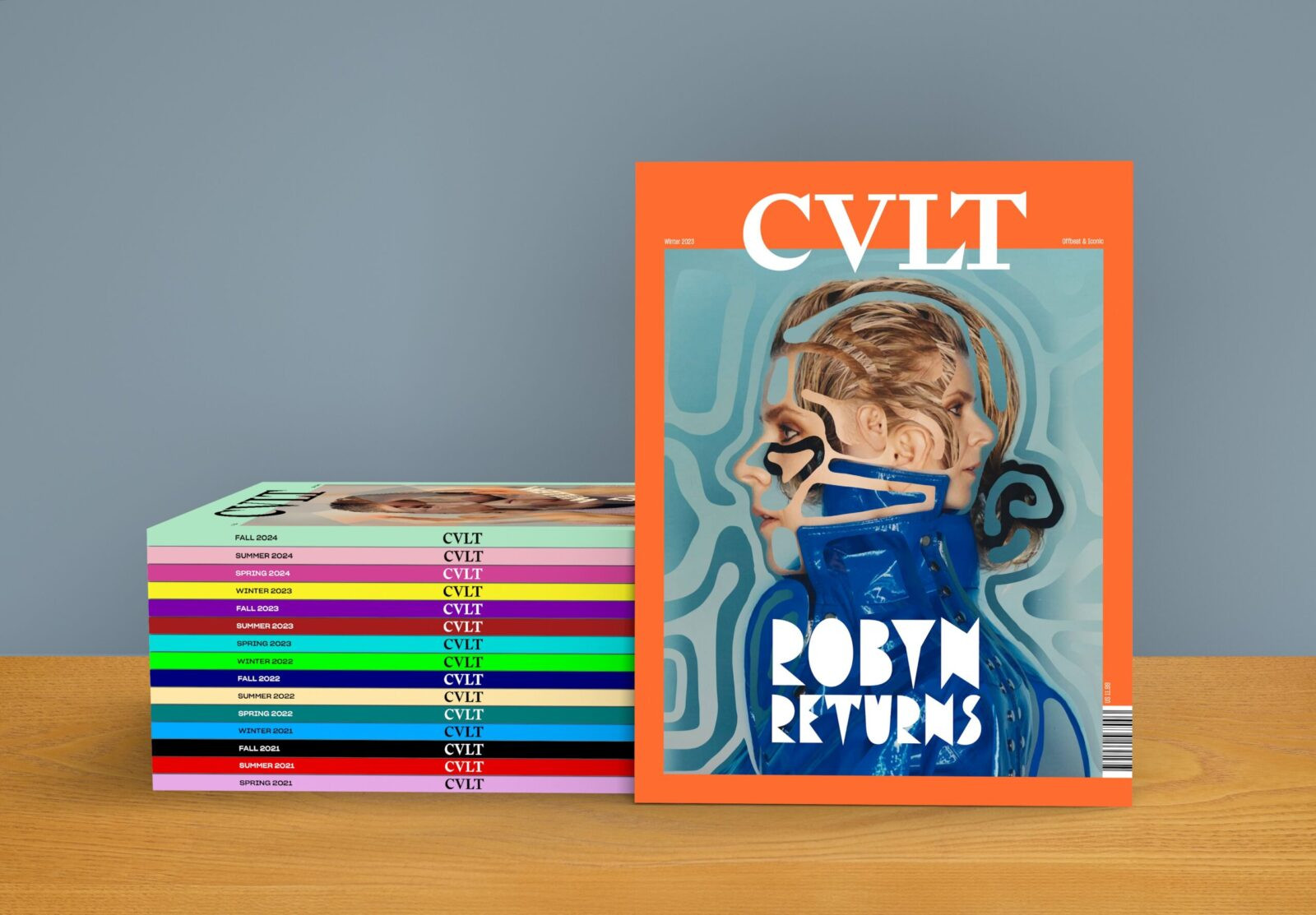
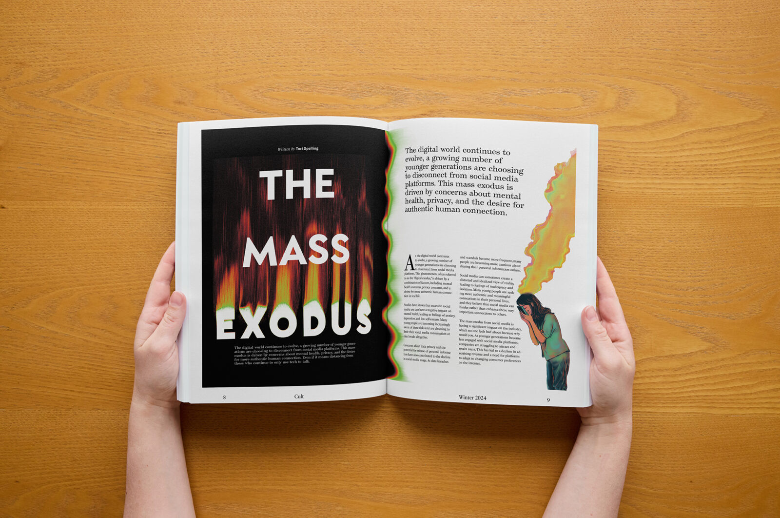
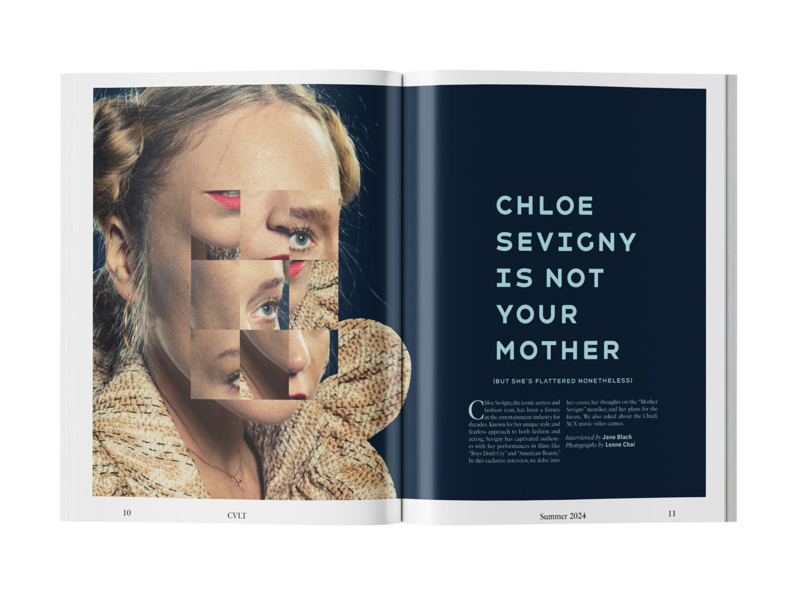
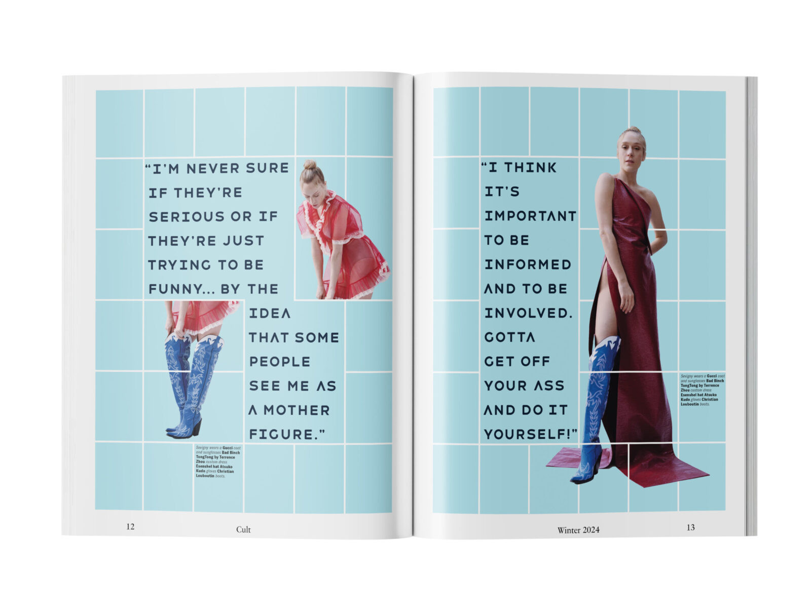
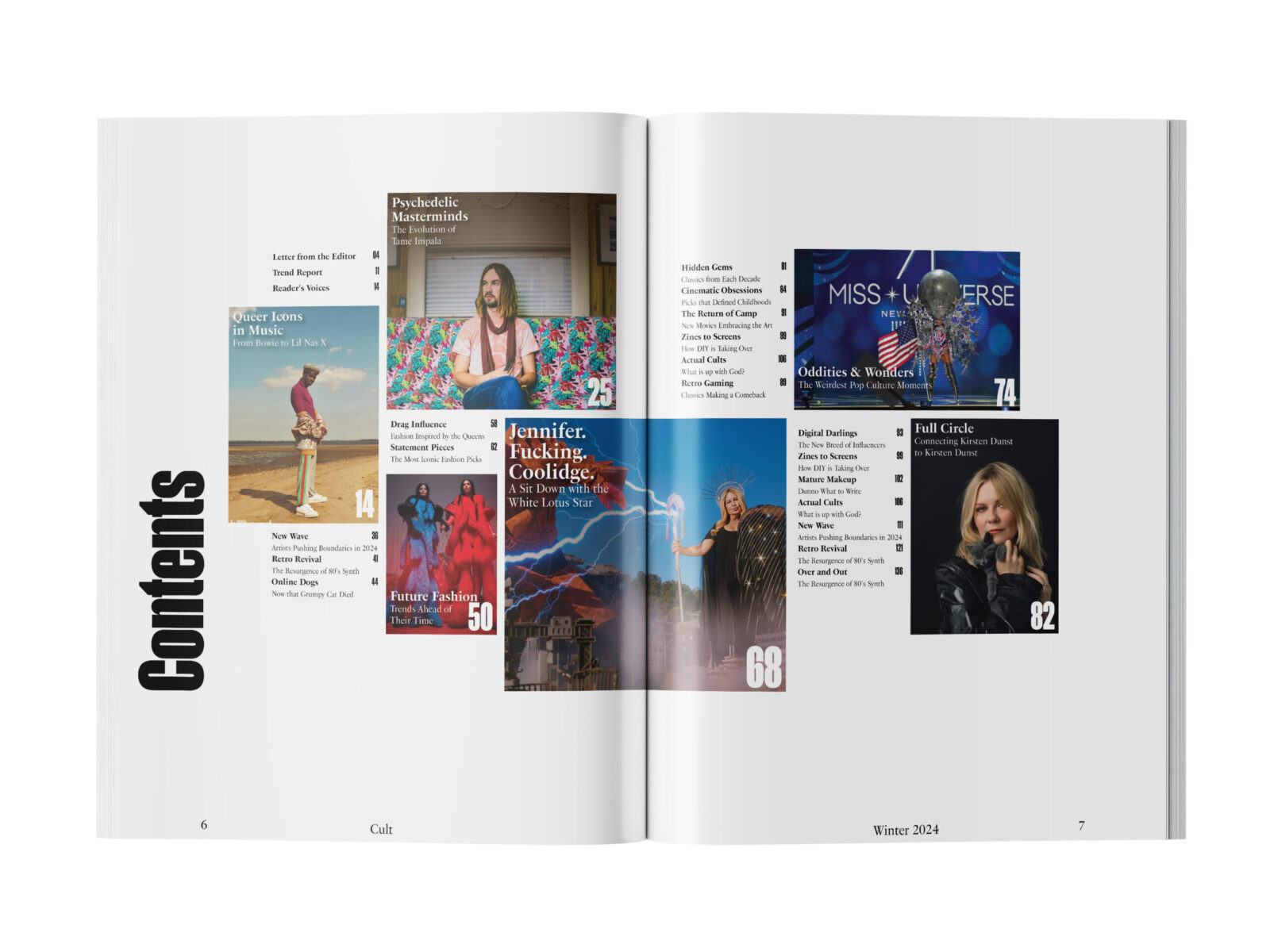
To achieve this, the design strategy relies on a high-contrast tension between order and chaos. The structural foundation is a dynamic 12-column grid system. This density provides Western editorial rigor and allows for clean, legible typography in long-form essays. Yet, this framework also supports maximalist, explosive spreads. The grid is not abandoned but is instead utilized to its limits to organize dense, chaotic layers of information. This approach reflects the volatile nature of modern internet culture.
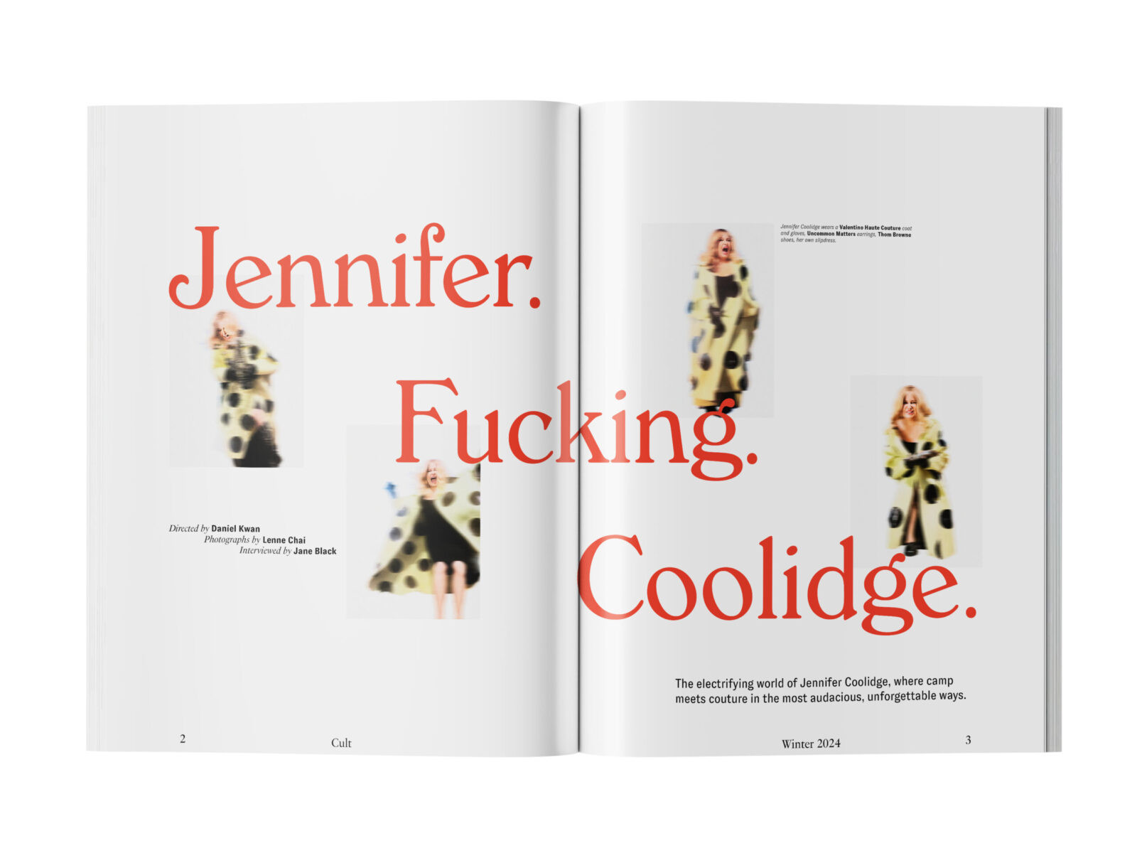
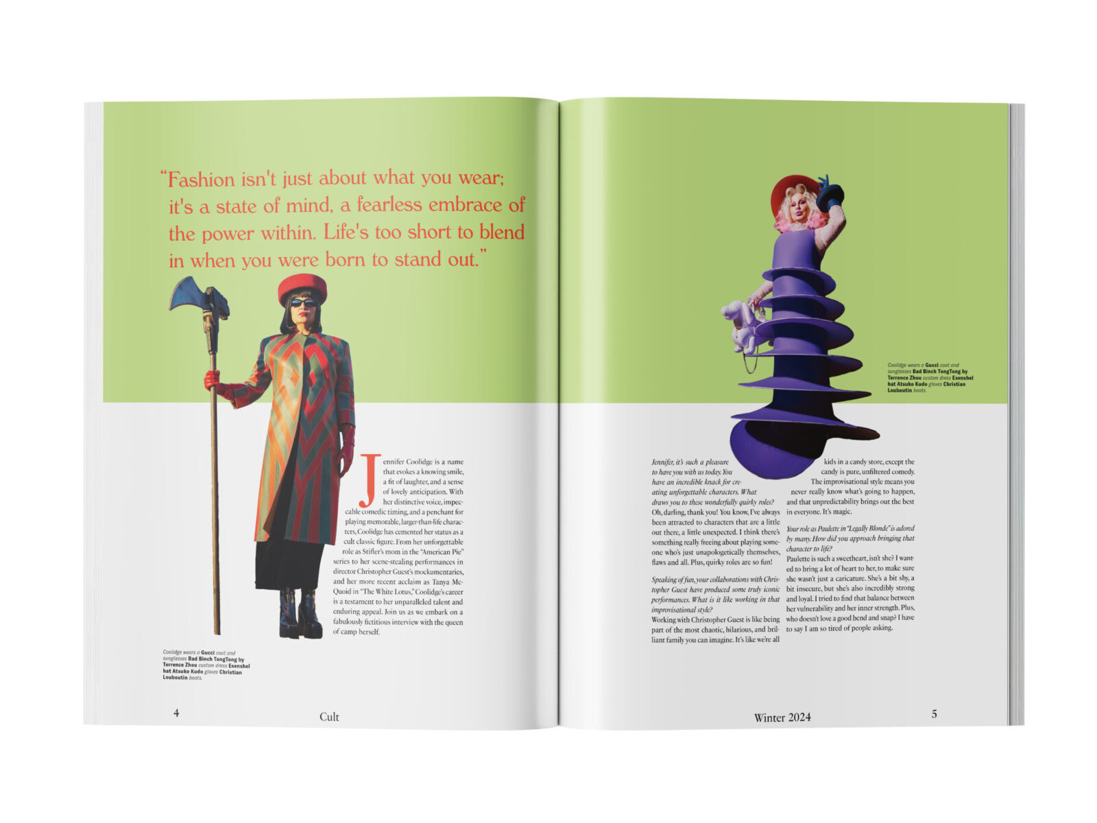
The typographic system supports this tension. The masthead uses Signifier, an angular serif chosen for its authoritative and ritualistic presence. This is paired with the elegance of Fournier for body copy. These classical elements are violently disrupted by the aggressive geometry of Sharp Grotesk and Manuka. These display typefaces add a modern edge that prevents the layout from feeling too traditional. Visually, the imagery rejects airbrushed perfection. Photographs are treated with varied and aggressive digital distortion techniques. This is a deliberate commentary on the degradation of digital images as they circulate online.
By combining these glitch aesthetics with high-end print production values, CVLT elevates the subject of pop culture into a refined design object. The result is a cohesive editorial product that challenges the conventions of the periodical format. It proves that irreverence and rigorous design systems can successfully coexist.

CREDIT
- Agency/Creative: John Wise
- Article Title: John Wise Designs CVLT Magazine as a Subversive Reframe of Celebrity Culture
- Organisation/Entity: Student
- Project Status: Non Published
- Agency/Creative Country: United States of America
- Agency/Creative City: San Diego
- Project Deliverables: Art Direction, Brand Creation, Brand Design, Brand Experience, Brand Identity, Brand Mark, Brand Naming, Brand Tone of Voice, Branding, Creative Direction, Design, Digital Art, Editorial Design, GIF Animation, Logo Design, Tone of Voice, Type Design, Typography
- Industry: Entertainment
- Keywords: WBDS Student Design Awards 2025/26 Editorial Design, Magazine, Pop Culture, Queer Culture, Camp, Typography, Maximalism, Glitch Art, Experimental Layout, Grid System, Print, Branding, Art Direction, Subculture, Visual Identity.


