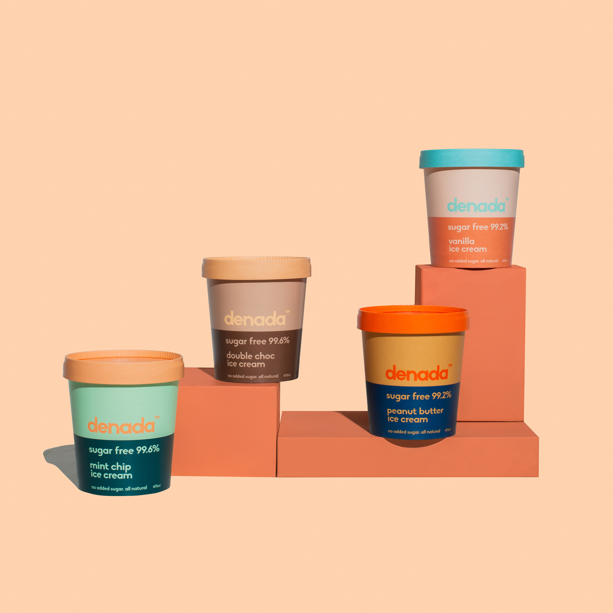
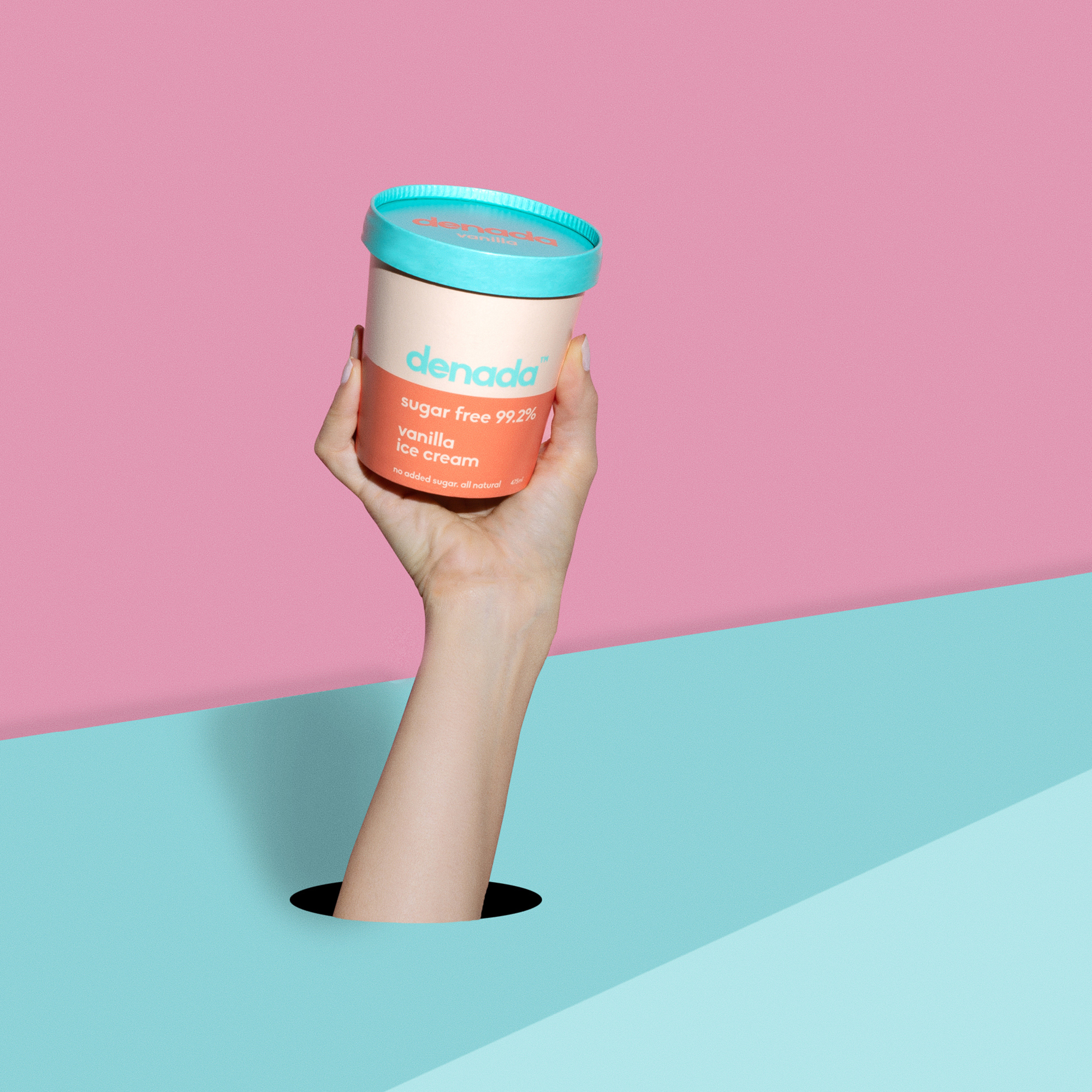
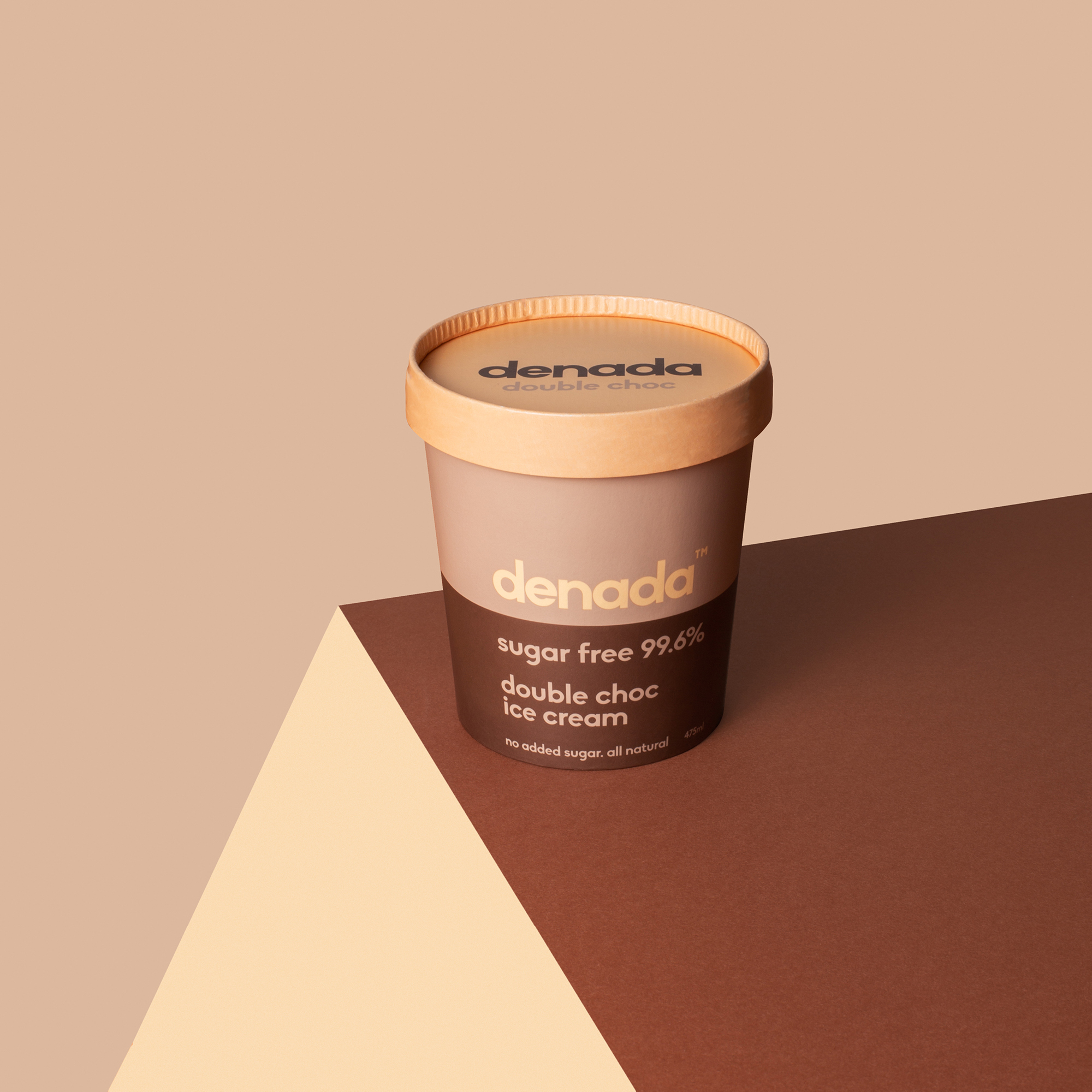
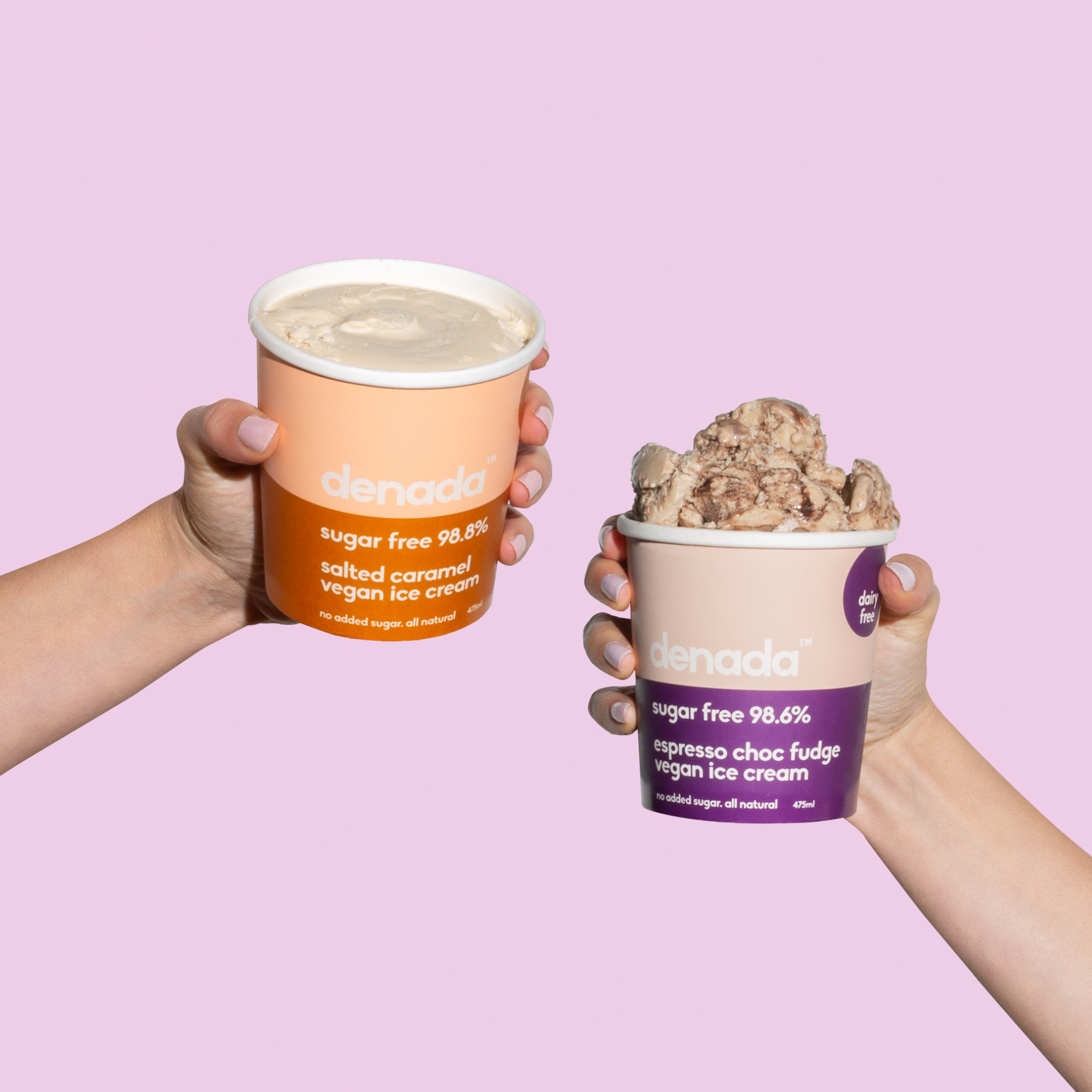
Denada Sugar Free Ice Cream was created in 2017 in Perth, Australia. Completely guilt free and everything an ice cream should be silky, creamy and downright indulgent. Denada has a uniquely smooth texture, with bright, fresh flavours and a clean finish using only the finest of natural ingredients.
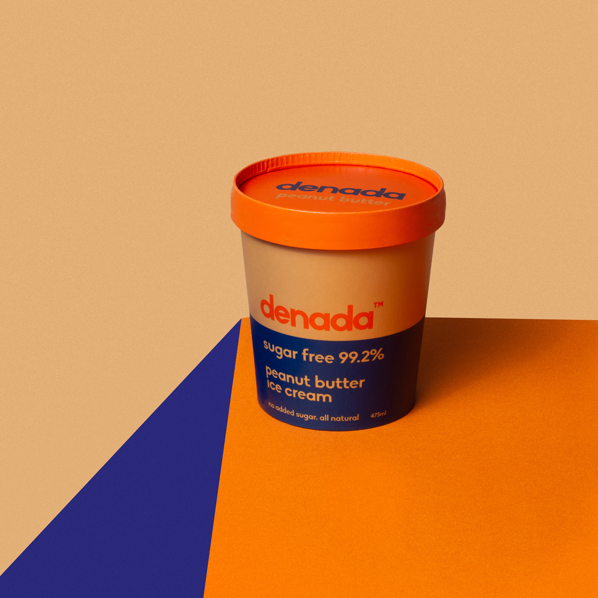
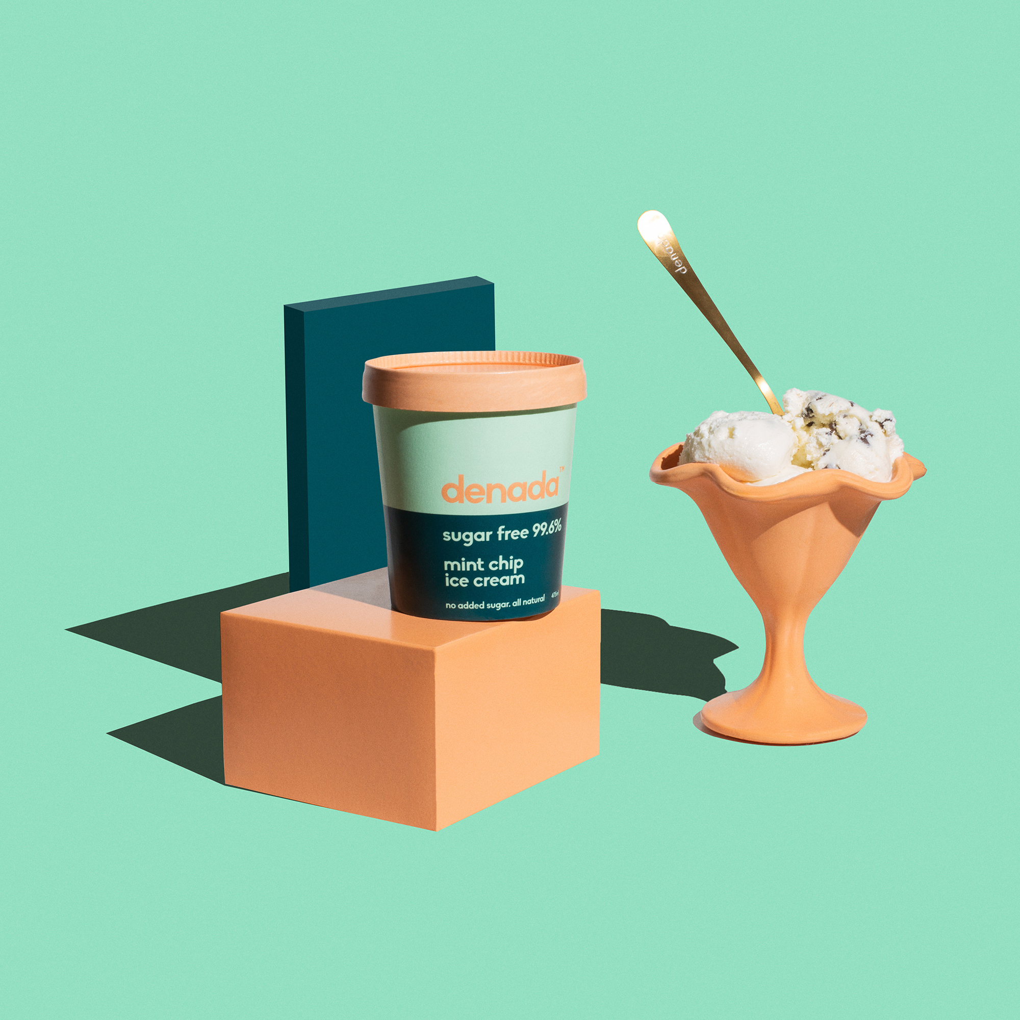
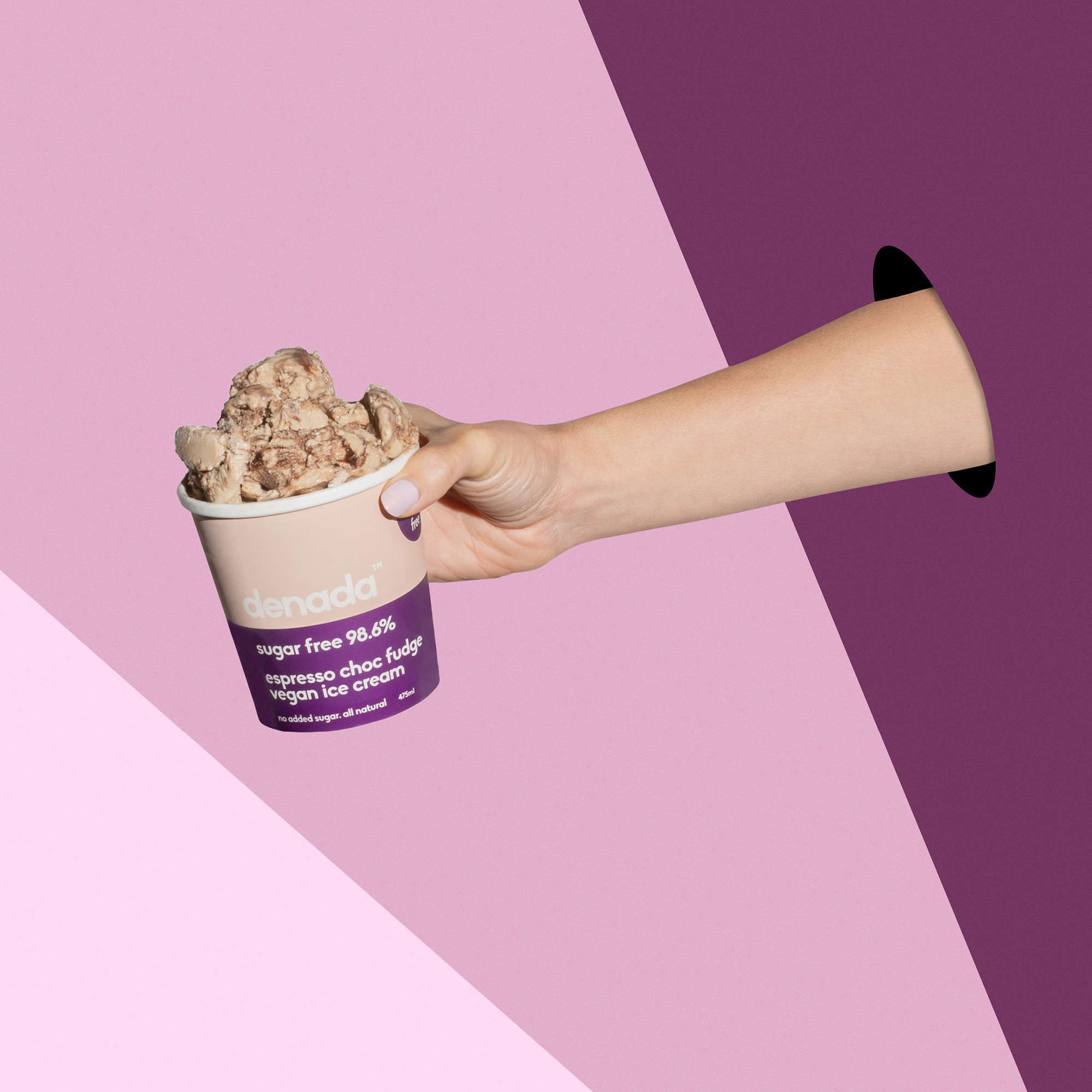
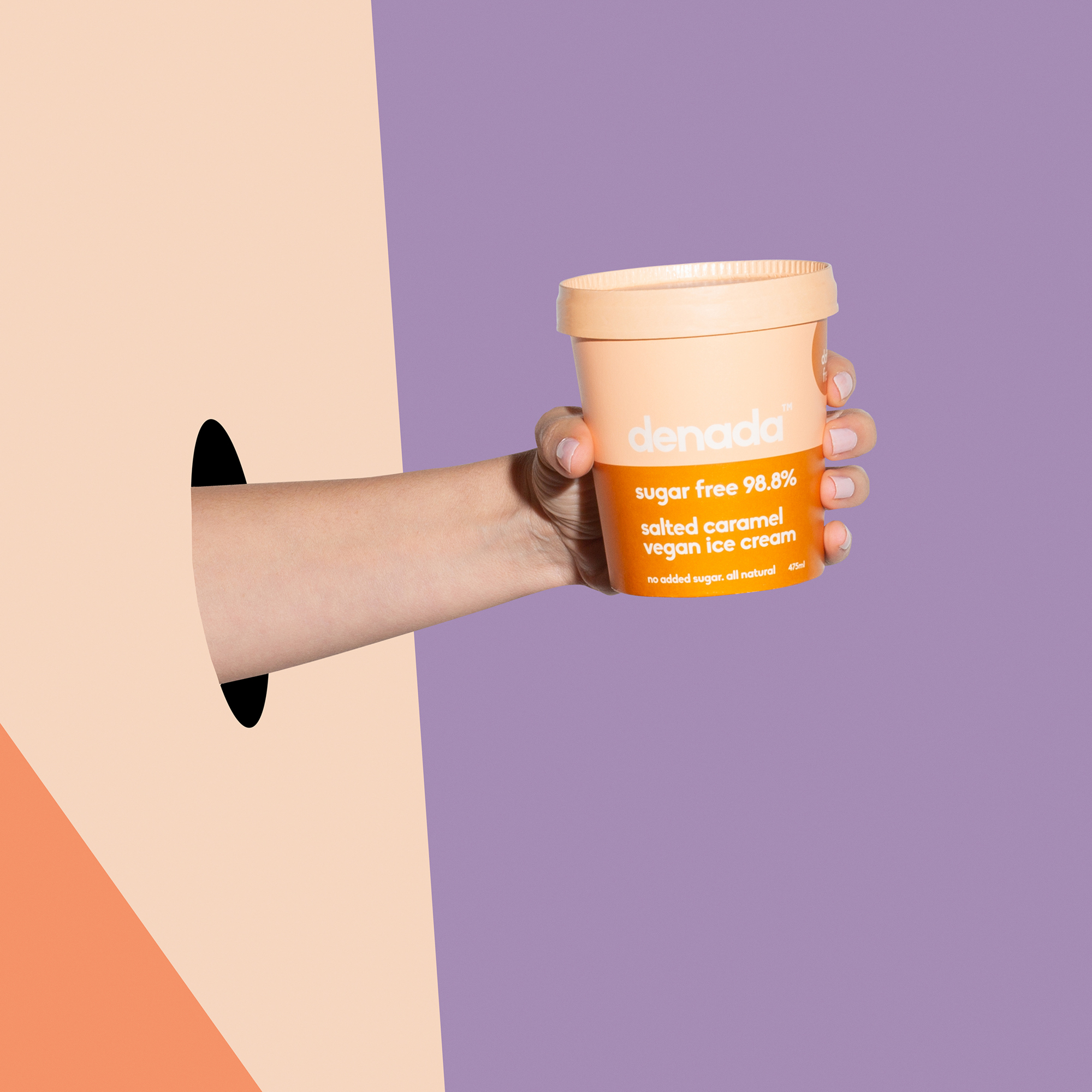
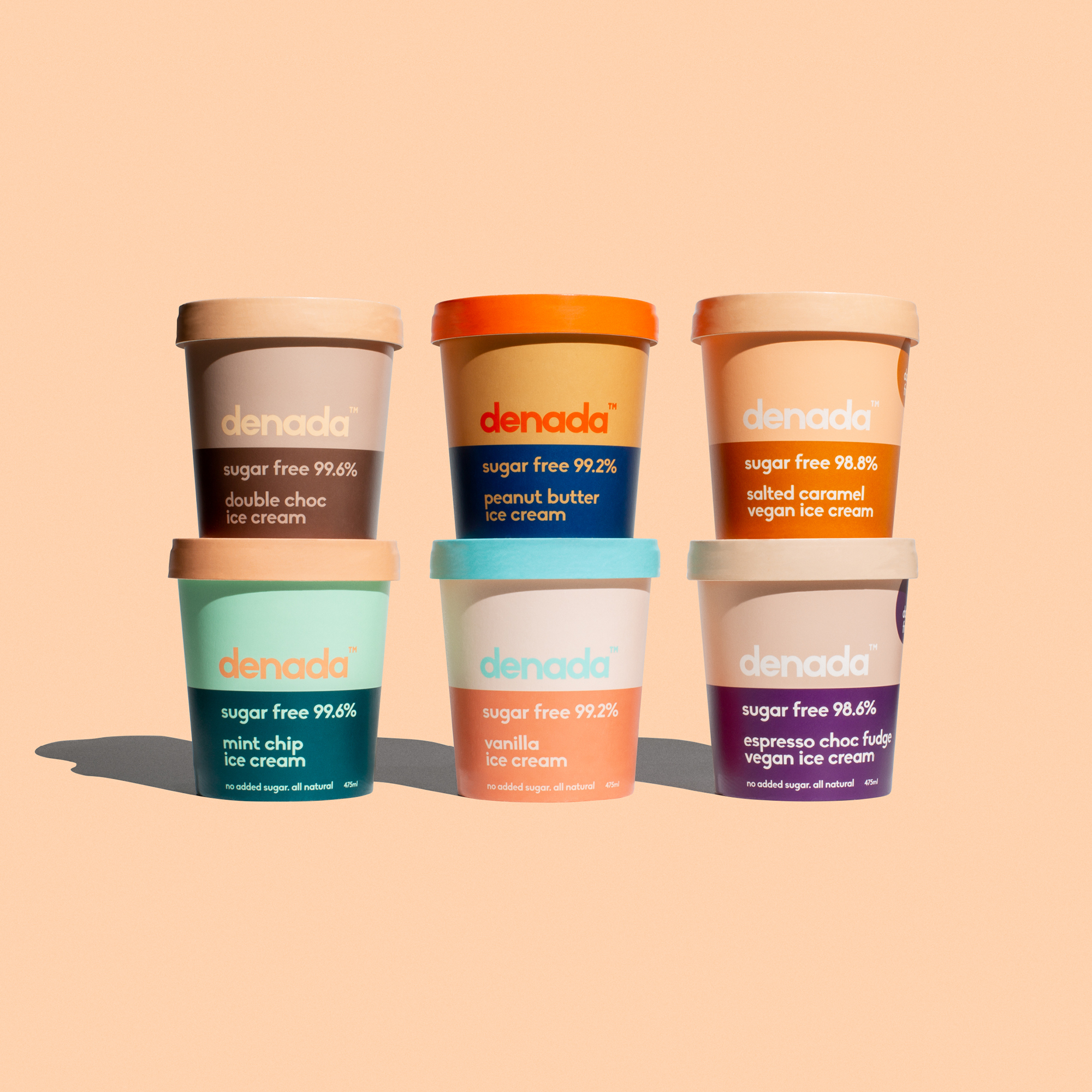
Denada translates to ‘It’s Nothing’ so like the product itself the design is stripped back of any additives. The ingredients are all natural with no surprises and the packaging reflects the same philosophy. Something minimal, yet sophisticated.
Through the design process there was always consideration to how the entire range looked on the shelf together and not just as individual tubs which stemmed from being a new product and needing a point of difference to have some impact in the marketplace. Inspiration and research covered everything from modern interior colour design trends to retro Japanese medical packaging. Once a strategy was in place, there was experimentation with dozens of colour combinations. The concept was then developed until the selected Pantone colours looked as delectable as the ice cream itself.
All Denada finished and shipping packaging is recyclable. Being a heath conscious product, there was a clear decision to extend this philosophy to the environment also.
CREDIT
- Agency/Creative: Jo Cutri Studio
- Article Title: Jo Cutri Studio Create Brand Identity and Packaging Design for Denada Sugar Free Ice Cream
- Organisation/Entity: Agency, Published Commercial Design
- Project Type: Packaging
- Agency/Creative Country: Australia
- Market Region: Oceania
- Project Deliverables: Brand Advertising, Brand Architecture, Brand Experience, Brand Identity, Brand Refinement, Brand Strategy, Brand World, Branding, Graphic Design, Identity System, Packaging Design, Photography, Product Architecture, Research
- Format: Pot
- Substrate: Pulp Paper


