


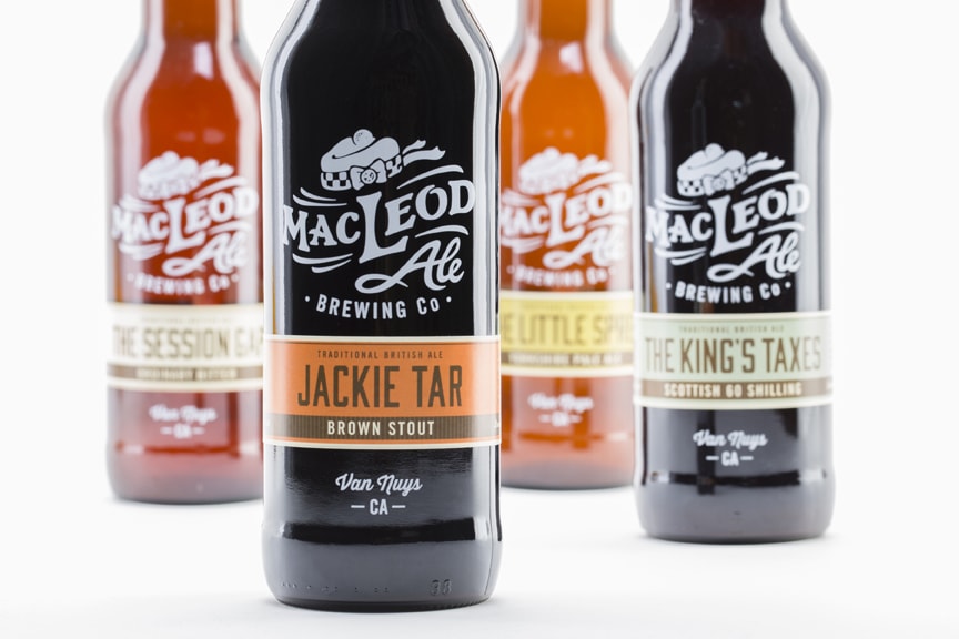
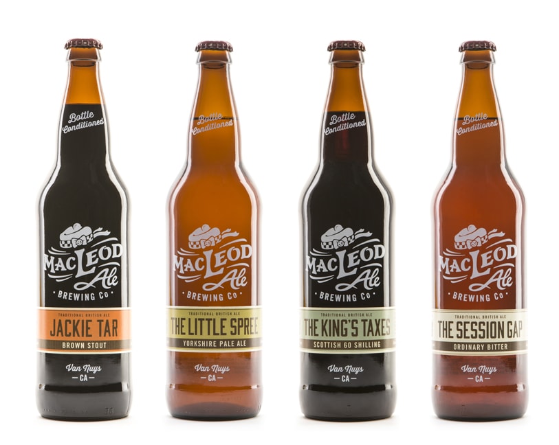
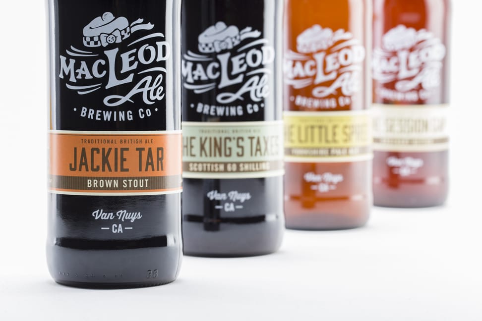
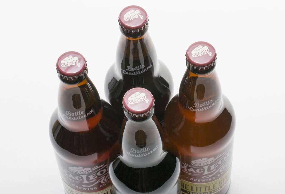
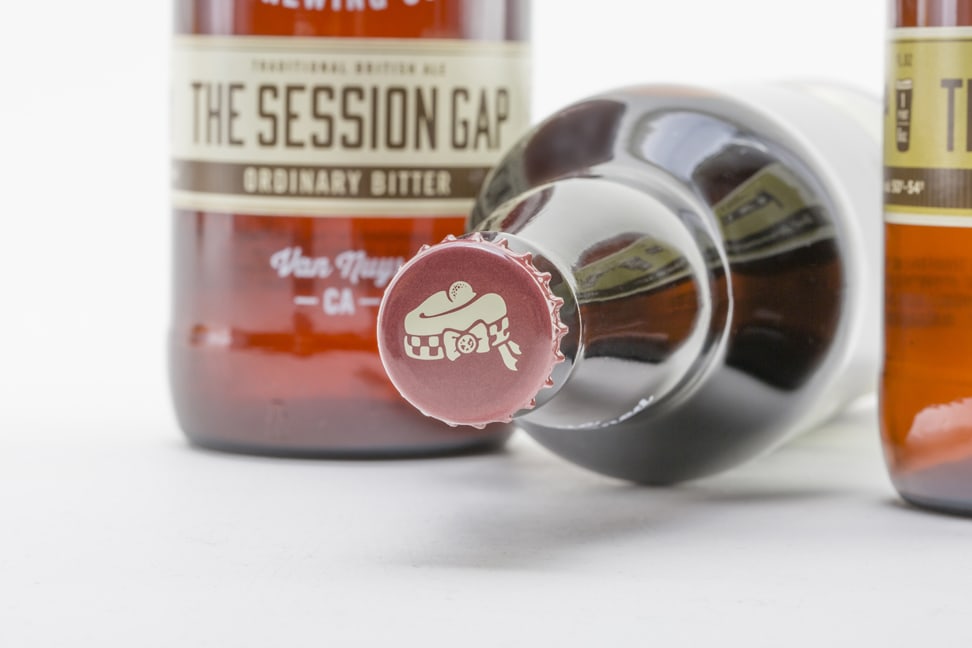
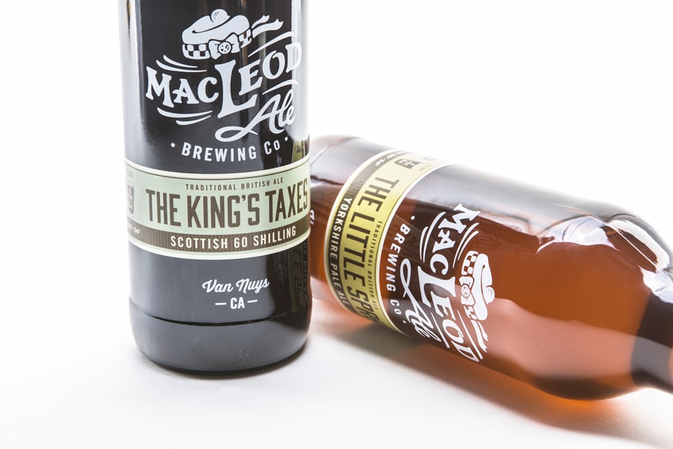
“The focus of the packaging was to boldly highlight the “MacLeod Ale” logo, so as to have a recognizable brand that would clearly stand out on the shelf from a distance. The cigar band label uses a colored graphic system that differentiates the variety of beers. To top it off, the bottle cap is a playful design of a “cap on a cap.” By taking advantage of these various printing techniques, the packaging reflects the craftsmanship of the beer itself. Beer and packaging are unmistakably MacLeod’s Cask Ale.”
https://player.vimeo.com/video/102804174?wmode=opaque&api=1
CREDIT
- Agency/Creative: Jeremiah McNulty Design
- Article Title: Jeremiah McNulty Design – MacLeod Ale Brewing Co.
- Project Type: Packaging
FEEDBACK
Relevance: Solution/idea in relation to brand, product or service
Implementation: Attention, detailing and finishing of final solution
Presentation: Text, visualisation and quality of the presentation


