


Hennig-Olsen partnered with global design agency, JDO to deliver a bold and contemporary new design for a classic ice cream, Krone-is.
Made by the oldest ice cream producer in Norway, Krone-is has been a longtime summer favourite of the Norwegian people, but with the frozen-dessert market more crowded than ever, it faced the challenge of elevating itself above the competition.
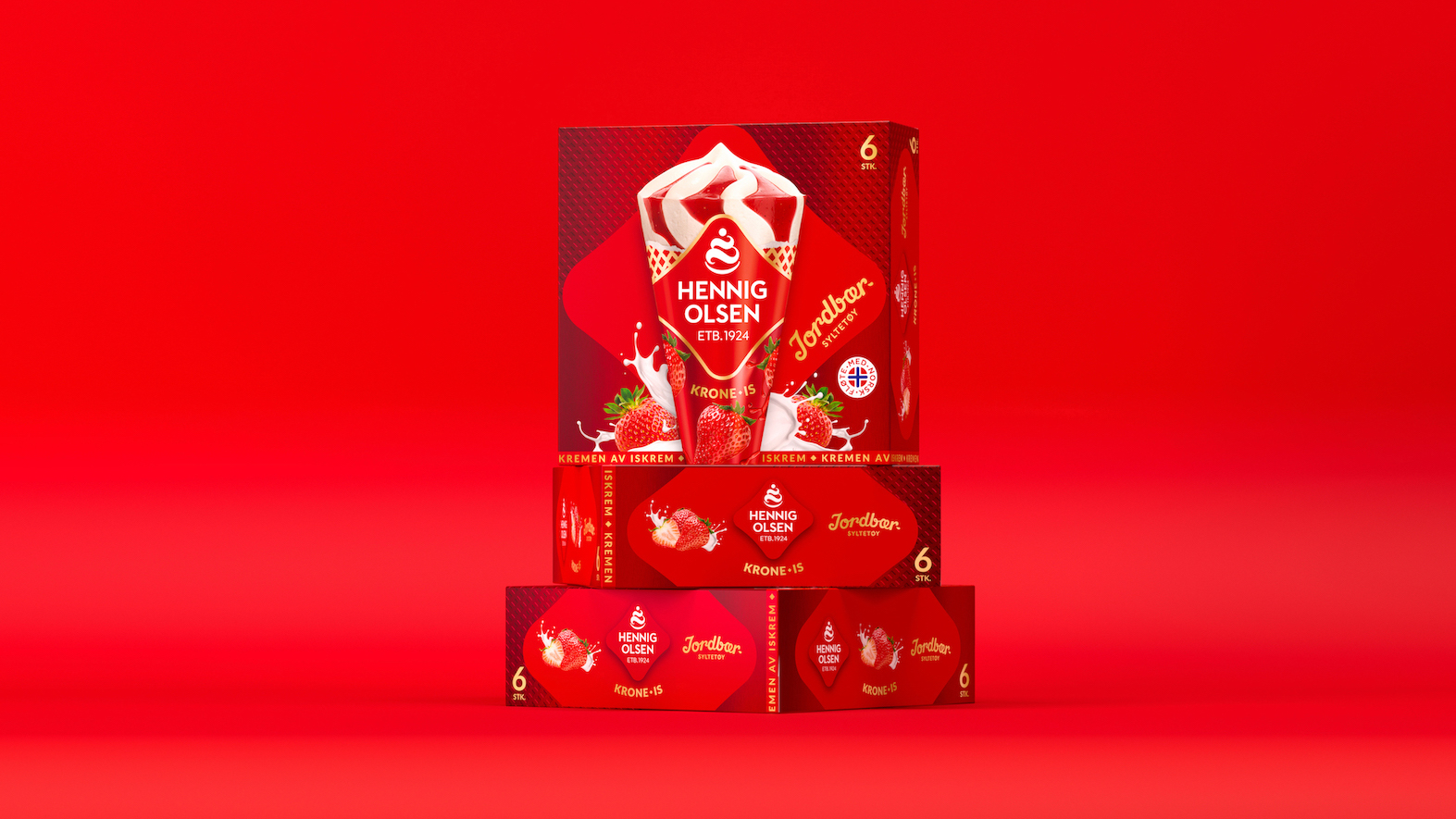
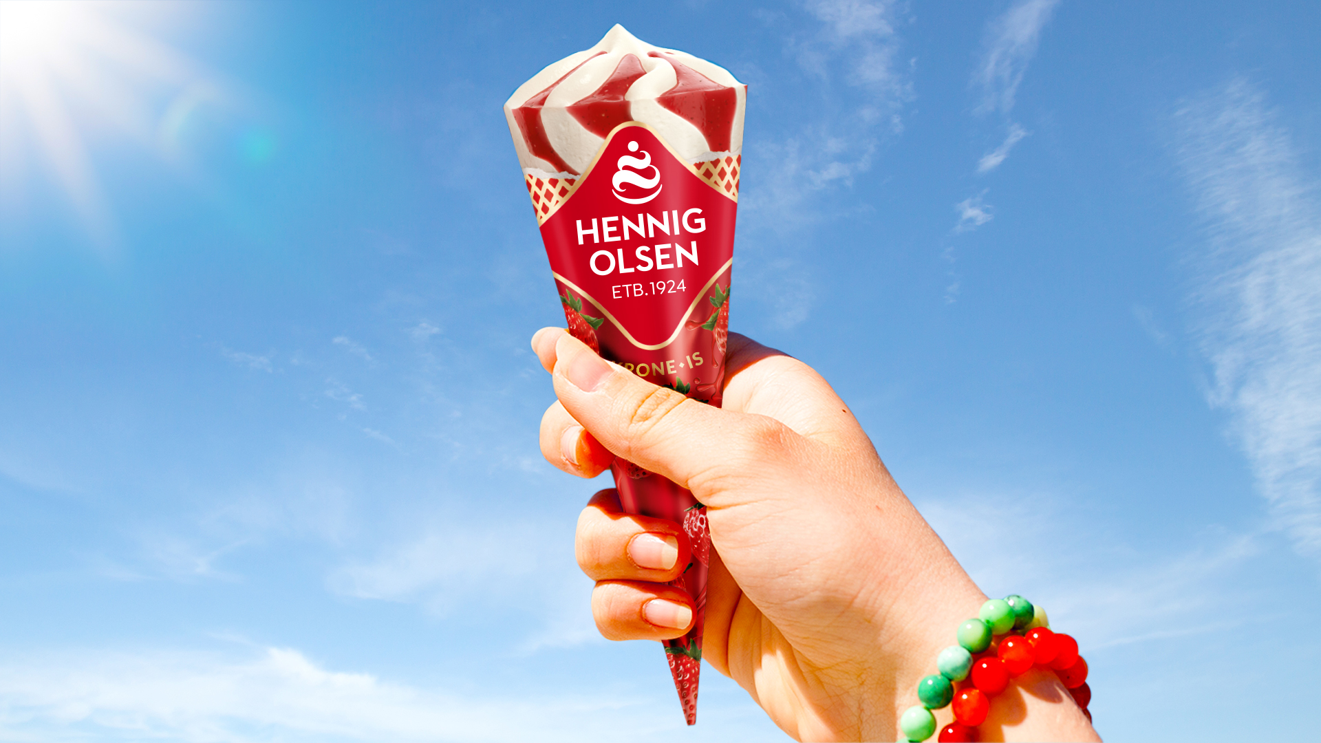
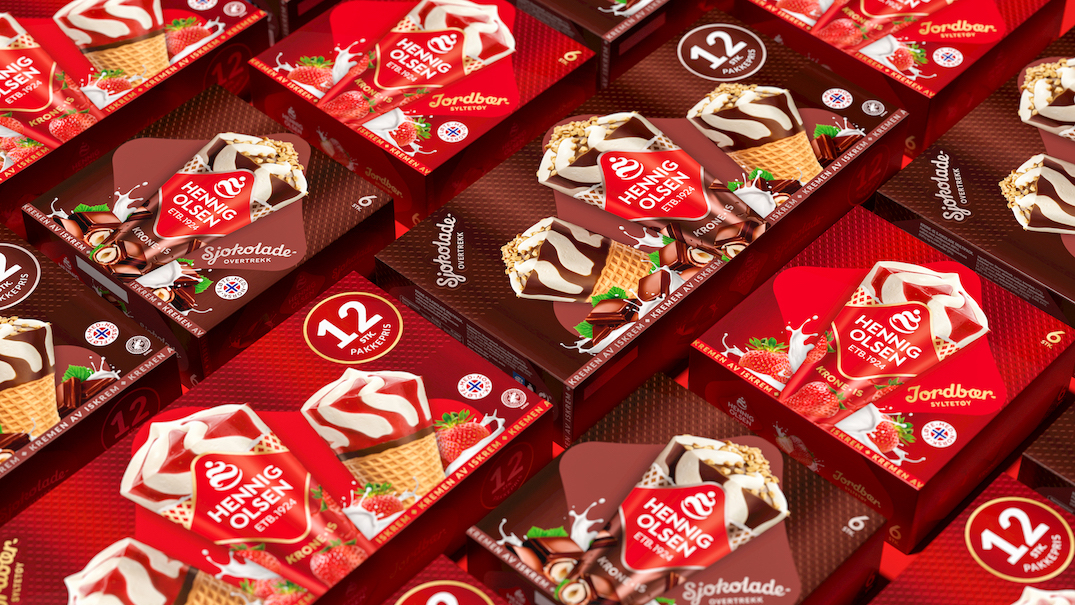
JDO was tasked to revive the brand with a visual strategy that would stand out, strengthen memorability and improve likeability. The new Hennig-Olsen wordmark is placed with pride in the centre of the pack to drive recall, whilst a ‘wafer’ pattern that uses the shape of the Hennig-Olsen logo is incorporated into the background. The design is finished with the ‘Kremen Av Iskrem’ ribbon – Hennig-Olsen’s mark of unrivalled quality. This provides texture, reinforces the product and stirs a bit of nostalgia.
“The design showcases the mother brand’s new identity creating a new brand expression with distinctive design assets to position Krone-is as the quintessential Norwegian treat,” says Ray Smith, Creative Director at JDO. “With crafted brand assets like the heart-inspired logo, the ‘wafer’ pattern, the ribbon and indulgent ingredients surrounding the hero cone, the latest design powerfully delivers standout and recognition whilst also awakening nostalgia for the treasured treat.”
“Krone-is is one of Hennig-Olsen’s classic products, and its new look by JDO celebrates our heritage, personality and heartfelt passion for quality ice cream,” comments Lillian Susanne Hall, Market Director at Hennig-Olsen. “JDO continues to be great creative partners as we reinvent the brand for the next generation of Norwegian ice cream lovers.”
CREDIT
- Agency/Creative: JDO Brand Design and Innovation
- Article Title: JDO’s Design for Hennig-Olsen’s Krone-is gets to the Heart of the Matter
- Organisation/Entity: Agency
- Project Type: Packaging
- Project Status: Published
- Agency/Creative Country: United Kingdom
- Agency/Creative City: Tunbridge Wells
- Market Region: Europe
- Project Deliverables: Brand Redesign
- Format: Box
- Substrate: Pulp Carton
- Industry: Food/Beverage
- Keywords: Ice Cream, Rebrand, Packaging Design, Brand Design
-
Credits:
Creative Director: Ray Smith


