


International strategic design agency JDO has designed Brockmans Orange Kiss, a new expression from the defiantly British gin brand known for breaking the rules with its properly improper gin.
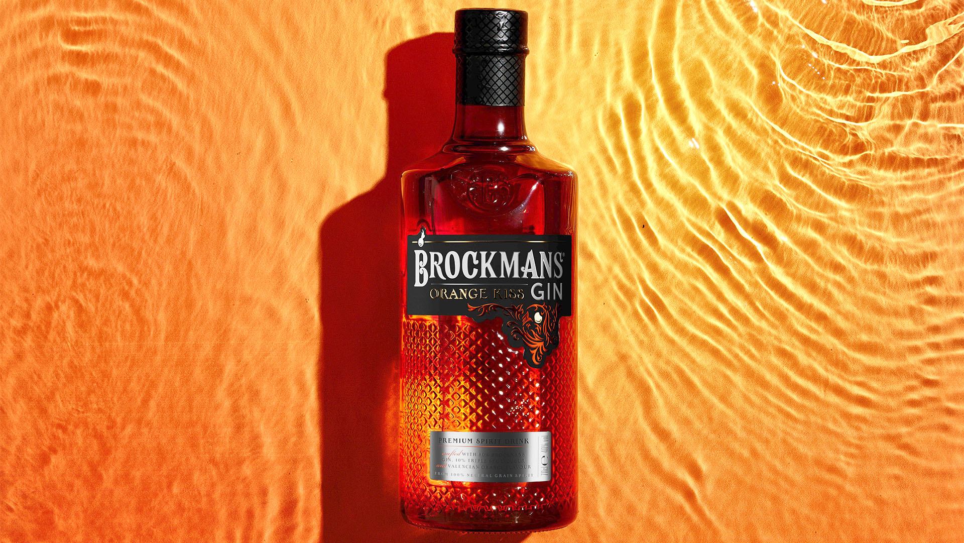
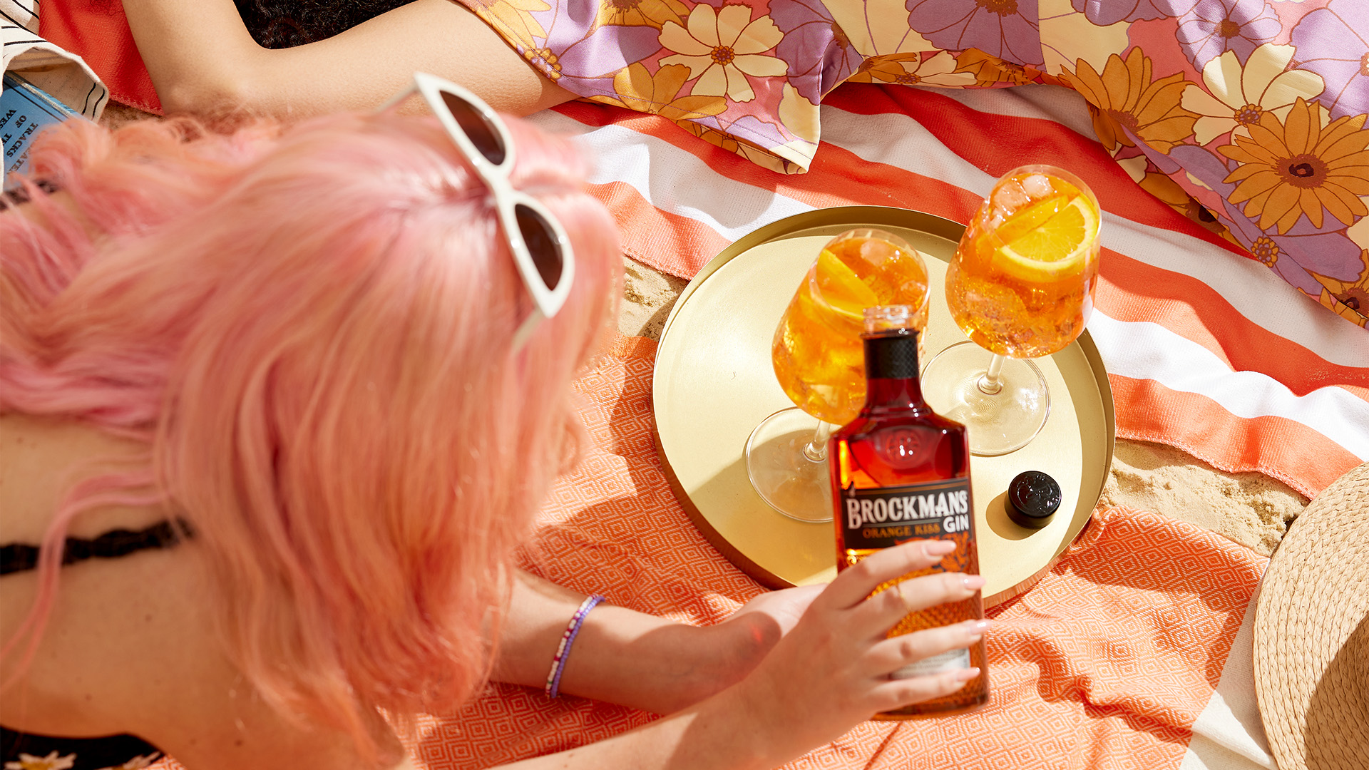
Recognising the evolving landscape of category, Brockmans aimed to captivate both their loyal audience and a new wave of drinkers by offering an experience that seamlessly transitions from sunny afternoons to extraordinary nights. This led to the creation of Brockmans Orange Kiss, a refreshing gin made with Valencia oranges for the vibrant taste of sun-kissed sweetness and tangy zest.
JDO served as strategic creative partners throughout the entire creative process, collaborating from the initial stages of innovation to the final design of the bottle. Their expertise played a crucial role in identifying growth opportunities and delivering creativity to excite and captivate both on- and off-trade.
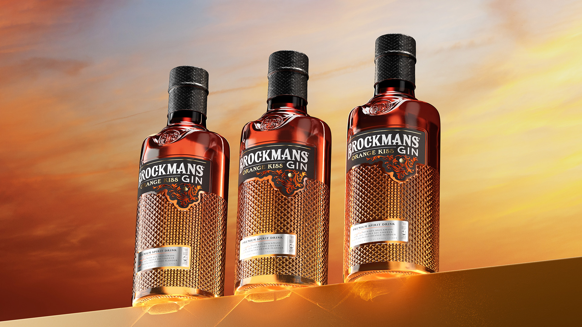
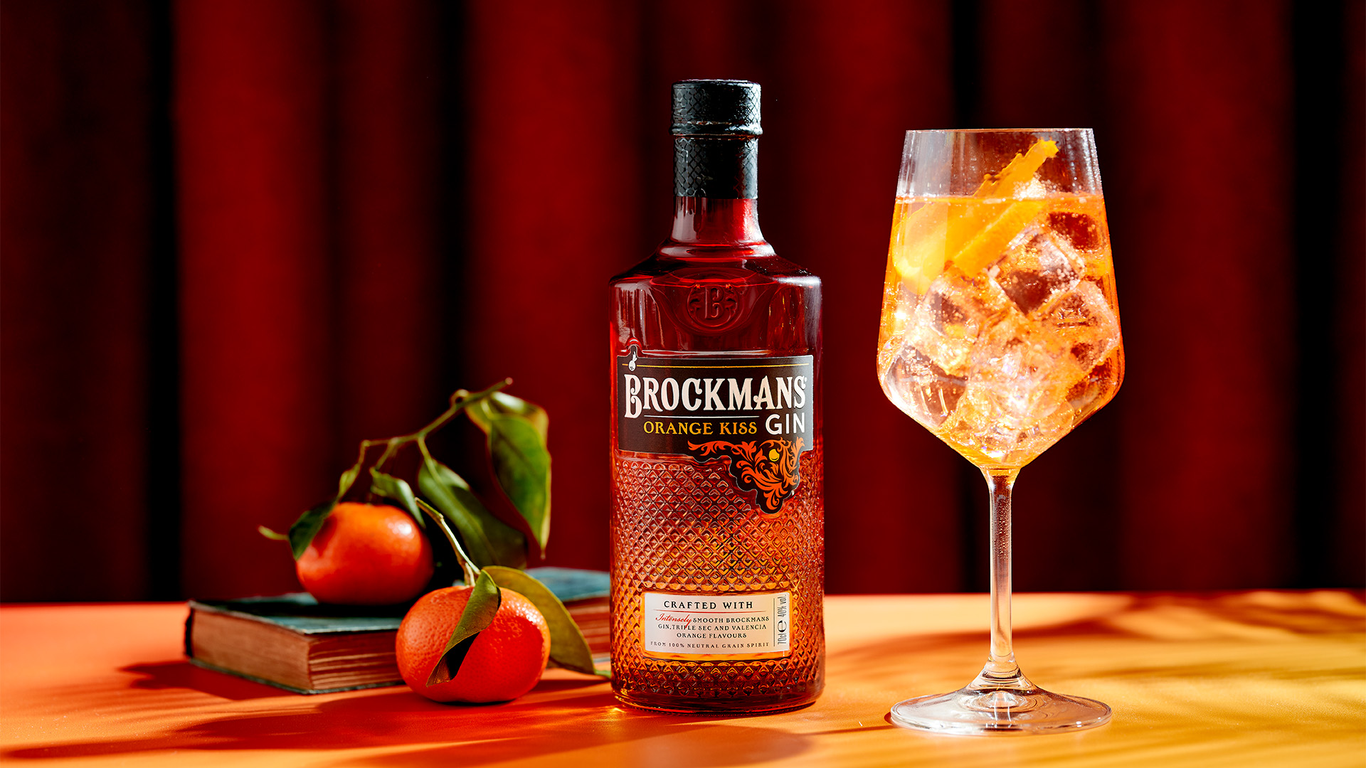
The design of Brockmans Orange Kiss reimagines the brand’s equities to communicate this new proposition with finesse and style. Building upon the architectural foundations of Brockmans’ core design, the new expression employs vivid colours to evoke the drink occasion.
The most striking feature of the design is the two-tone bottle, which seamlessly transitions from orange glow at the base to the Brockmans’ black at the top. Meticulous attention was given to achieving the perfect gradient, infusing it with the weight and depth necessary to convey the moment of when the sun is about to set.
Fiona Florence, Managing Director at JDO, says, “Our creative team paid close attention to the colours and details in the design of Brockman’s Orange Kiss to create a story of a refreshing and vibrant gin that you can enjoy from sunset into the evening. In designing for a different occasion, they made sure to keep the mysterious and alluring essence that Brockmans is known for as a gin of the night.”
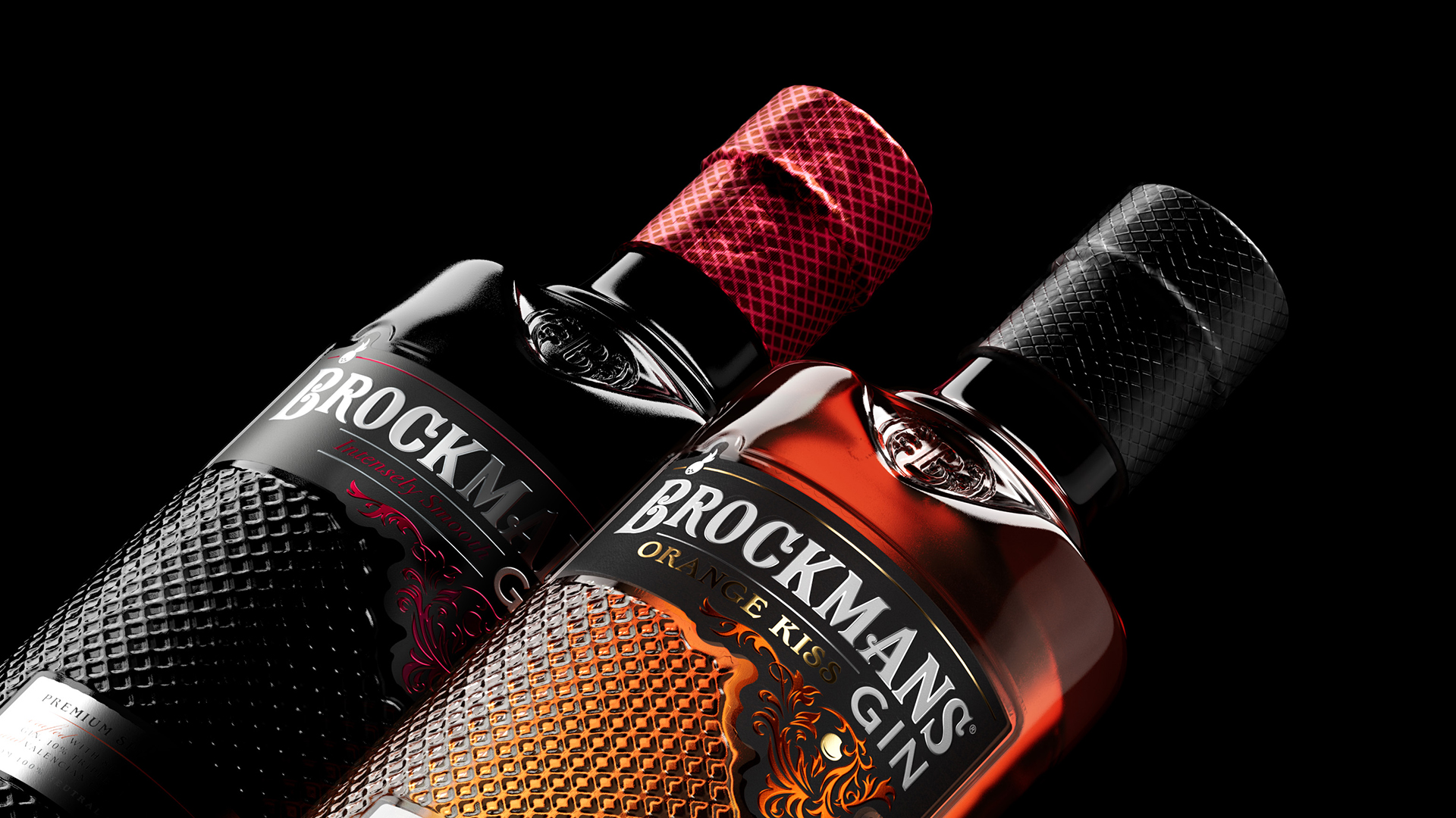
JDO’s design of Brockmans Orange Kiss builds upon their previous successful rebranding of Brockmans, which elevated the brand into a modern space with a more refined and premium aesthetic that beautifully showcases its distinct berry-flavoured profile.
“Brockman’s Orange Kiss is our exciting first step into flavoured gin and a departure from our traditionally opaque bottles. It was a bold move that was supported by the expertise of JDO, who ensured that our evolution and expansion remained true to our brand,” says Eric Sampers, Global Marketing Director at Brockmans. “We are absolutely thrilled with how the design captures the transition from day to night, promising a mesmerising experience for our consumers.”

CREDIT
- Agency/Creative: JDO
- Article Title: JDO Unveils Captivating Design for Brockmans Orange Kiss
- Organisation/Entity: Agency
- Project Type: Packaging
- Project Status: Published
- Agency/Creative Country: United Kingdom
- Agency/Creative City: Tunbridge Wells
- Market Region: Europe
- Project Deliverables: 2D Design, 3D Design, 3D Modelling, Brand Identity
- Format: Bottle
- Industry: Food/Beverage
- Keywords: Alcohol Packaging Identity
-
Credits:
Designer: Jay Dorward


