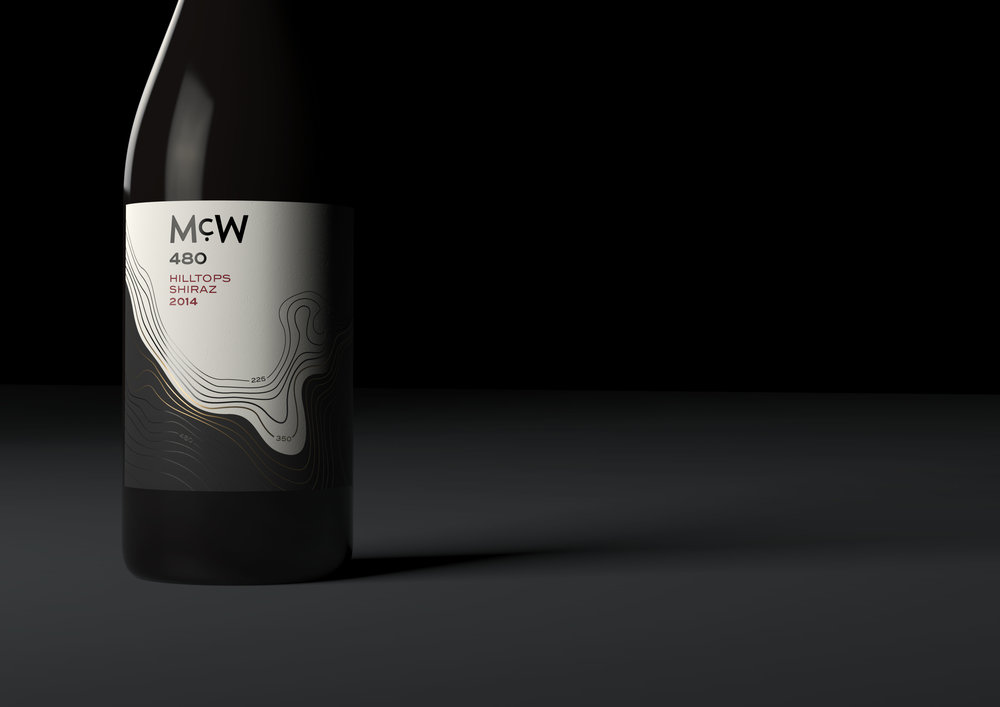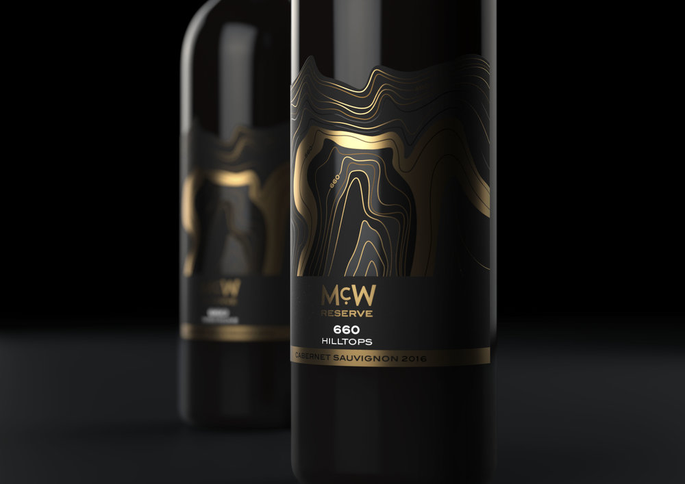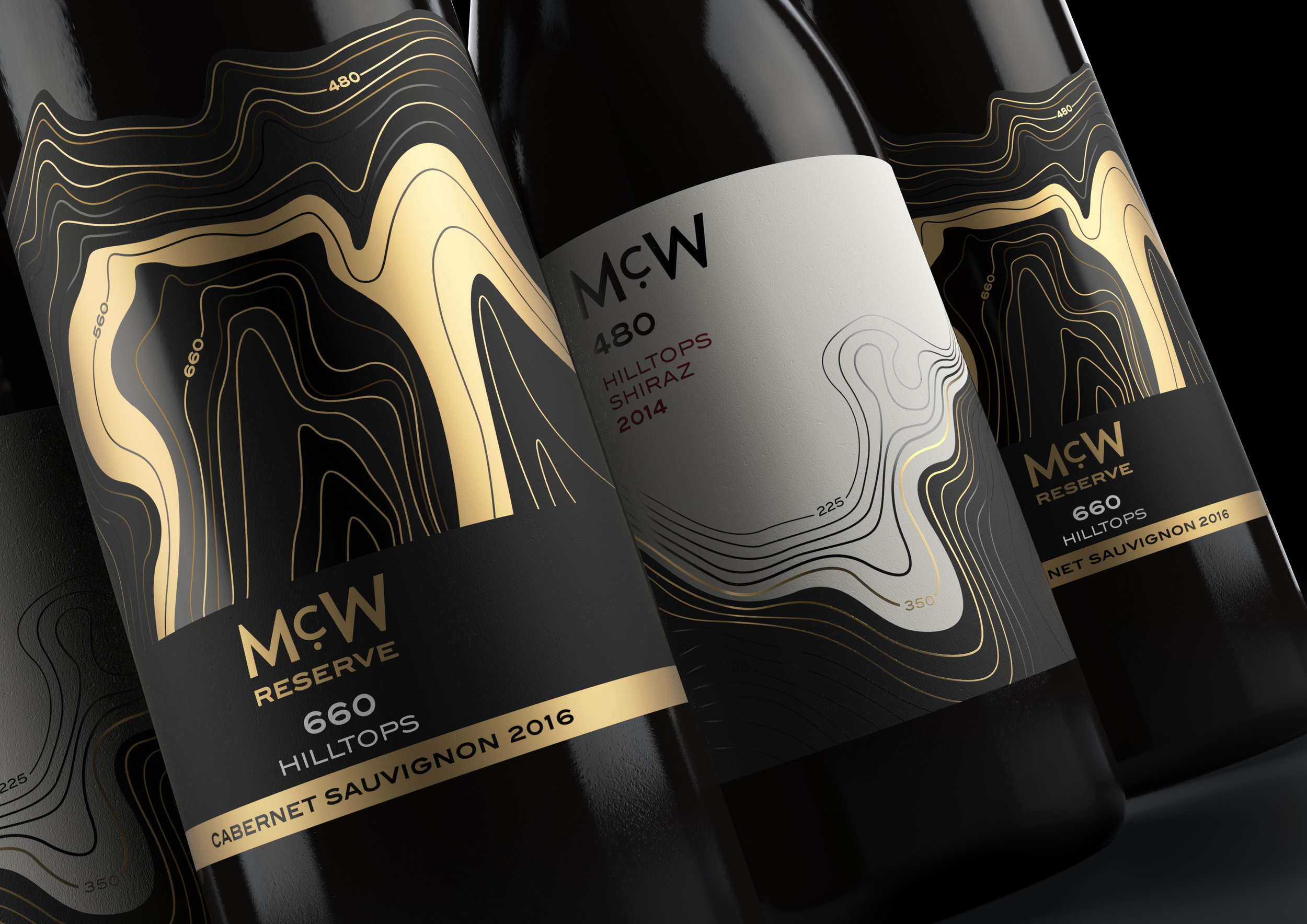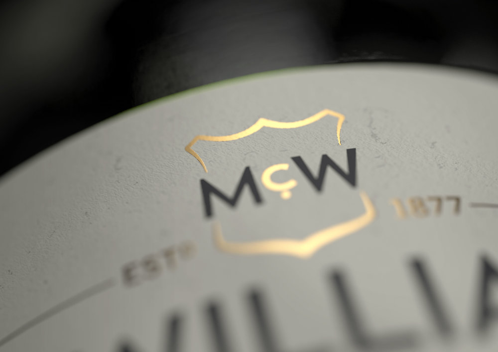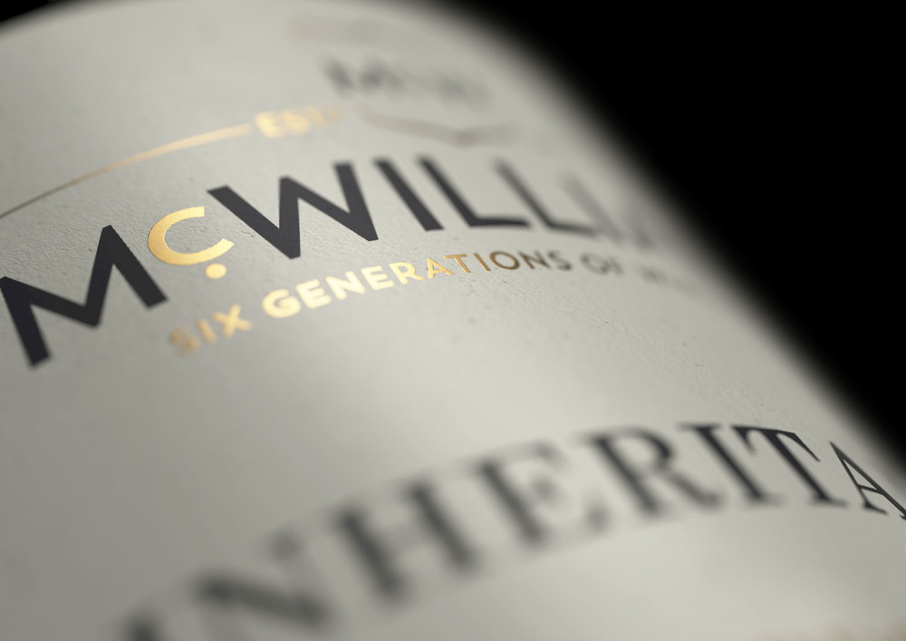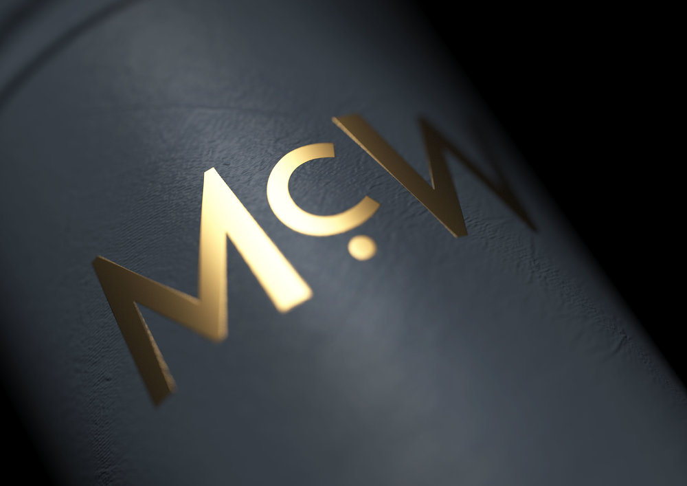
” McWilliam’s are true veterans of the vine. Building on six generations of Australian experience to craft quality wine for the world to enjoy, the brand has been adding new ranges and collections to their growing portfolio for 140 years.JDO, an award-winning UK based design studio, won a 3-way pitch to create the new brand identity and pack designs for McWilliam’s Wines, building on the essence of the brand with a fresh and ownable look.The true passion behind the McWilliam’s brand is celebrated with a characterful crest, locked up with bold typography to showcase the family name. The challenge was to communicate the depth and gravitas of the brand’s expertise, without losing its down-to-earth family roots.JDO created a look and feel that was proud but not pretentious, and developed a cohesive and clear core portfolio strategy for McWilliam’s which brought structure and clarity to the various ranges, allowing simple tier and individual wine navigation.For the next step, and to satisfy the ever-evolving consumer palette, McWilliam’s raised the bar of the modern wine market with a contemporary collection under the ‘McW’ sub-brand. JDO named and created McW, with its portfolio of eight remarkable bottles, designed to win over the Millennial generation of wine lovers.Each label design showcases the relationship between the land, the climate and the winemaker. The charcoal grey colour palette of the range is a contemporary, yet versatile backdrop to the striking design elements, and the natural contour patterns of Australian landscapes symbolise the diversity of each bottle. The final designs elegantly communicate McWilliam’s philosophy of distinction in every part of the winemaking process.Sara Faulkner, JDO Design Director, said: “We found inspiration in the concept of altitude and terroir influencing the wine’s flavour profile, so differentiated every bottle with its own topographical map in a metallic finish. We’ve struck a perfect balance between preserving the brand’s craft whilst pushing the creative boundaries of contemporary design.”Sarah Nichols, Head of Marketing at McWilliam’s, is delighted with JDO’s restage, commenting: “A range that once looked disparate is now unified. Bottles sit shoulder to shoulder on shelf, closely intertwined to tell the authentic story of the many generations of family winemakers who continue to craft a wine of true excellence. Our bottle designs as well as our wines are now inspirational!””
