“JDO continues Ringnes partnership to launch Imsdal Iste
JDO Brand Design & Innovation has continued its partnership with Carlsberg owned Ringnes, this time to create an identity and packaging design for a new iced tea drink, Imsdal Iste for the Norwegian market. The agency has worked with Ringnes on several recent projects including the Imsdal Aktiv and Farris water re-designs and an update for Solo soft drink.
Imsdal is Norway’s leading bottled still water brand. Launched in 1994, it extended its water portfolio in 2007 to include Imsdal Aktiv, a sports water, which has the same active ingredients as the market leading sports drinks but is a healthy alternative that has no artificial additives.
With the rise in popularity of iced tea in Norway, Ringnes saw an opportunity to extend the Imsdal range further and to bring the Imsdal brand to a new, younger audience. Imsdal is synonymous with naturalness and purity and has a strong Norwegian identity. A growing health trend in Norway has prompted consumers to look for iced tea products that are more natural and don’t use as much sugar or artificial sweeteners as most popular brands. Building on this trend, Ringnes identified Imsdal as the perfect brand to bring a healthy iced tea drink to market in Norway without any compromise on taste.”
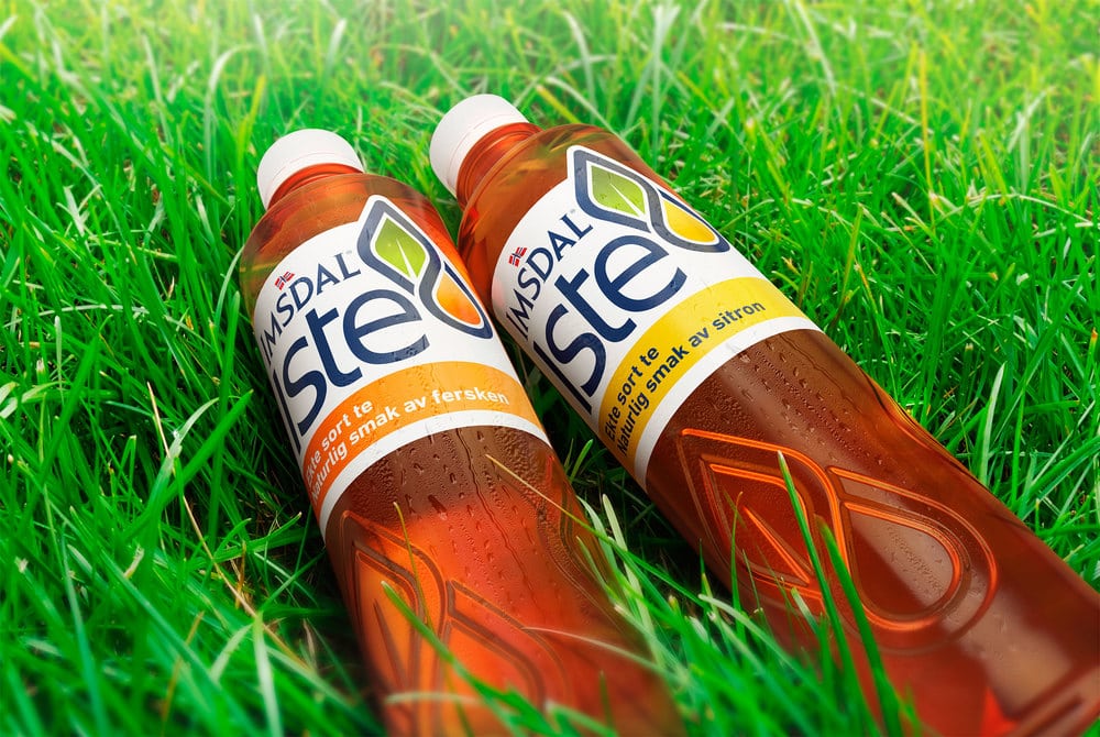
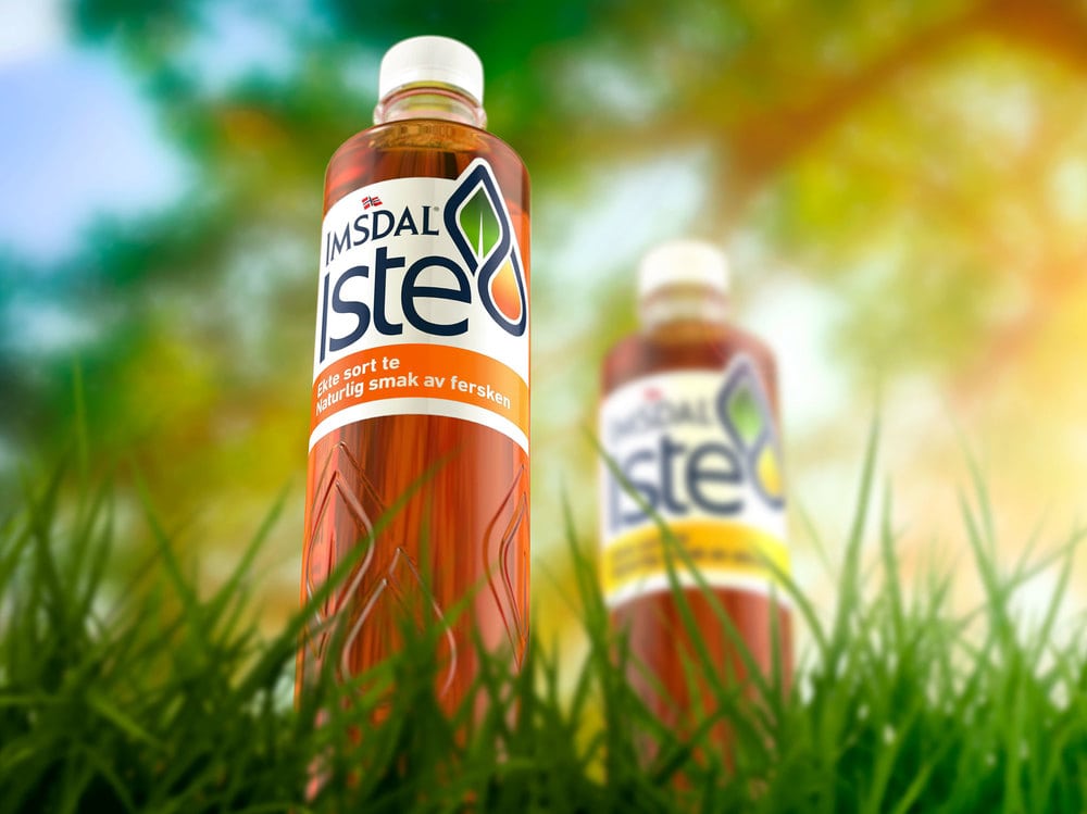
“JDO’s new Imsdal Iste brand identity retains the strong characteristics of simplicity, purity and honesty that have become the guiding principles of the core Imsdal brand. An Iste graphic icon illustrates the fusion of two droplets representing the authentic black tea and natural fruit flavours that combine to deliver a refreshing, thirst quenching taste. The icon itself is both memorable and contemporary and has great stand out on shelf and adaptability off pack. As well as the development of the pack graphics, JDO has also supported the new launch with the creation of a brand guidelines document to help ensure consistency across all communication and marketing materials.
Paul Drake, JDO creative director said, “The new logotype has been designed to appear bold, clean and pure and to sit seamlessly with the existing Imsdal identity, helping to build a relationship with the established core brand. We updated the current Imsdal bottle using a crisp embossing detail from the new Iste icon, driving recognition and improving tactility.”
Peder Onsøyen, brand manager at Ringnes, added “JDO has created a design with a perfect combination of existing core Imsdal brand equities and new and unique Imsdal Iste brand elements. This new design communicates the brand proposition clearly, an iced tea that provides pure enjoyment and a healthier option for consumers.”
The initial launch comprises two flavour variants; peach and lemon with further flavours planned for the future. Packs are now being rolled out across Norway.”