


“JDO Brand Design & Innovation has continued its partnership with the global Dove hair team, this time to relaunch the brand in new packaging for the Japanese market.
First launched in Japan as a ‘moisture expert’ in 2011, the Dove brand was in need of a refresh to reconnect with consumers in what is a very dynamic and competitive, yet fragmented market. Japan is the number three hair care market in the world. Although the brand was relatively well known and had a high repeat purchase rate, the packs needed to communicate on a more premium level with a warmer and more feminine aesthetic.
JDO was briefed to design new packaging communicating a step change for Dove. This was achieved by developing a design that communicated Dove as an expert in superior moisture solutions.”
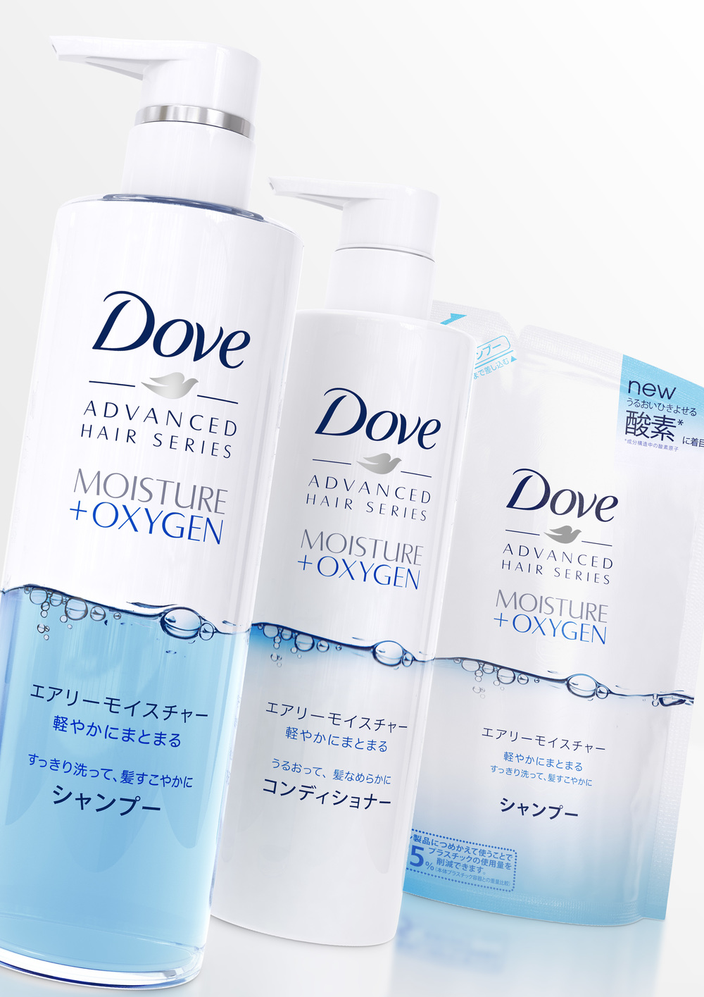
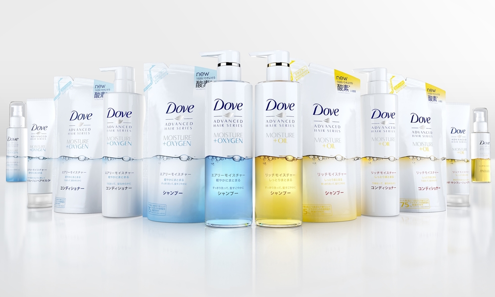
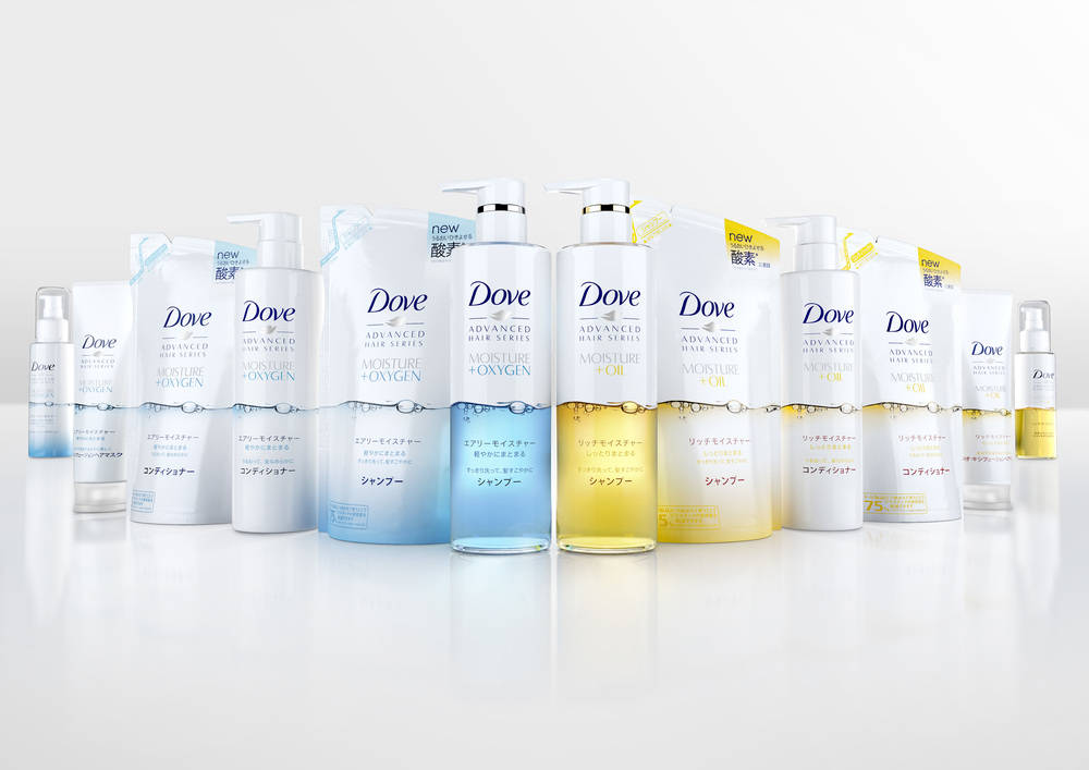
“The Japanese market is completely distinct from the rest of the world and JDO needed to ‘get under the skin’ of local nuances and cultural differences. Femininity in Japan is key to beauty and is expressed by the term ‘Kawaii’ which is a girlish and sweet type of femininity. It has become a prominent aspect of Japanese popular culture influencing entertainment, clothing food, behavior and mannerisms. JDO embraced this element by imbuing the new design with a complementary feminine look and feel, incorporating delicate touches and superior moisture and nourishment cues, creating a sense of genuine personal care. The new range comprises two variants: moisture plus oxygen in a pale blue colourway and moisture plus oil represented in yellow.
Ray Smith, creative director at JDO said, “The colour palette is in tune with the feminine nature of ‘Kawaii,’ while the strong graphic device of the oxygen rich bubbles signals a new proposition for the market to better differentiate and elevate the Dove offer.”
Leandro Barreto, Dove global brand director added, “JDO’s new design is consistent with Dove hair’s look and feel globally but addresses the specific needs of the Japanese market with a more premium and feminine representation. The packs are still recognizable as being Dove with its ‘white plus’ approach, but the new designs achieve both stand out on shelf in this very competitive market as well as intuitive variant navigation for consumers.”
CREDIT
- Agency/Creative: JDO Brand Design
- Article Title: JDO Brand Design – DOVE JAPAN
- Project Type: Packaging


