


Auréla is a modern skincare concept that embraces calm, clarity, and visual purity. The brand was created around a simple idea: that softness can be powerful, and stillness can speak louder than decoration. Every detail in this project was designed to feel intentional, from the materials and color palette to the spacing, typography, and overall visual rhythm.
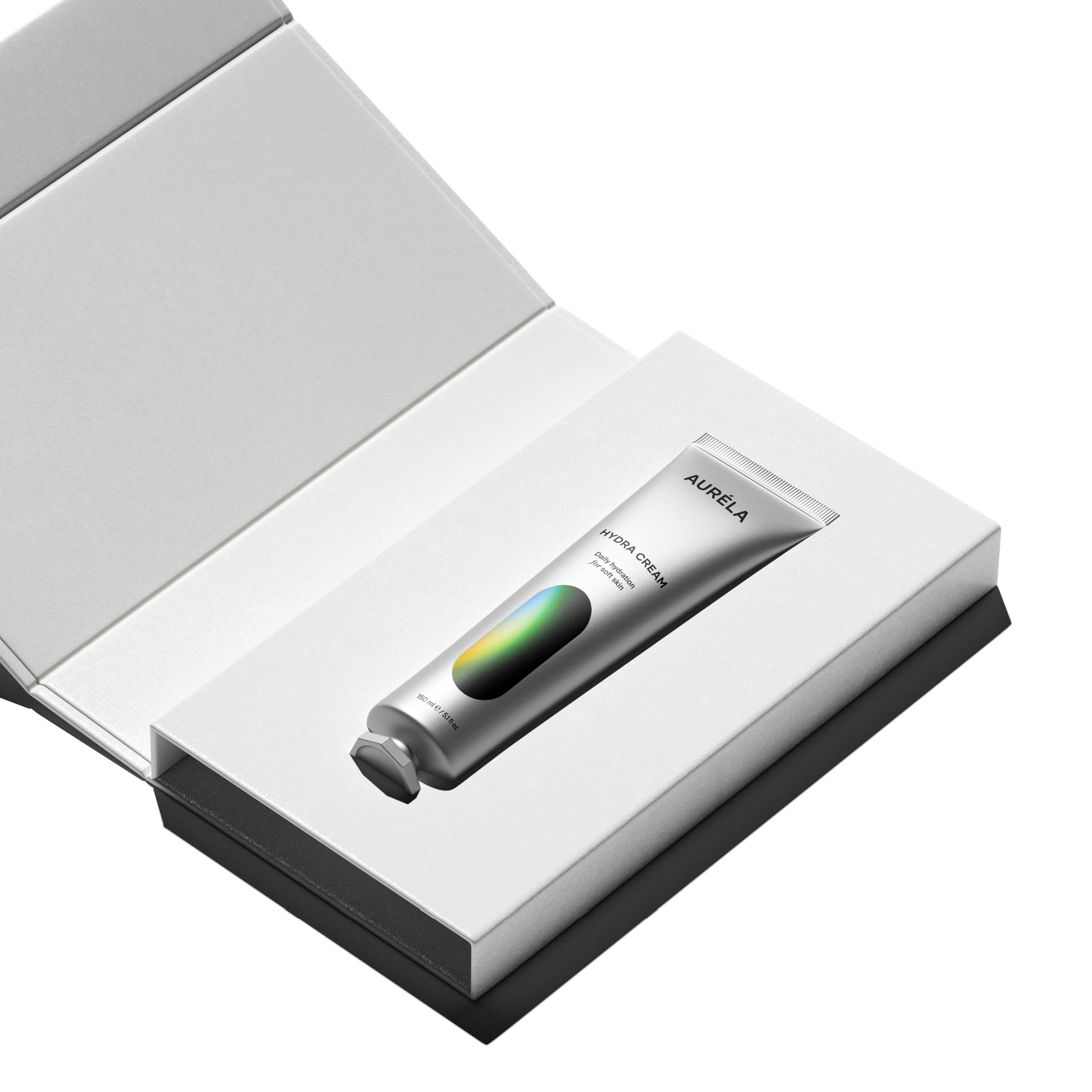
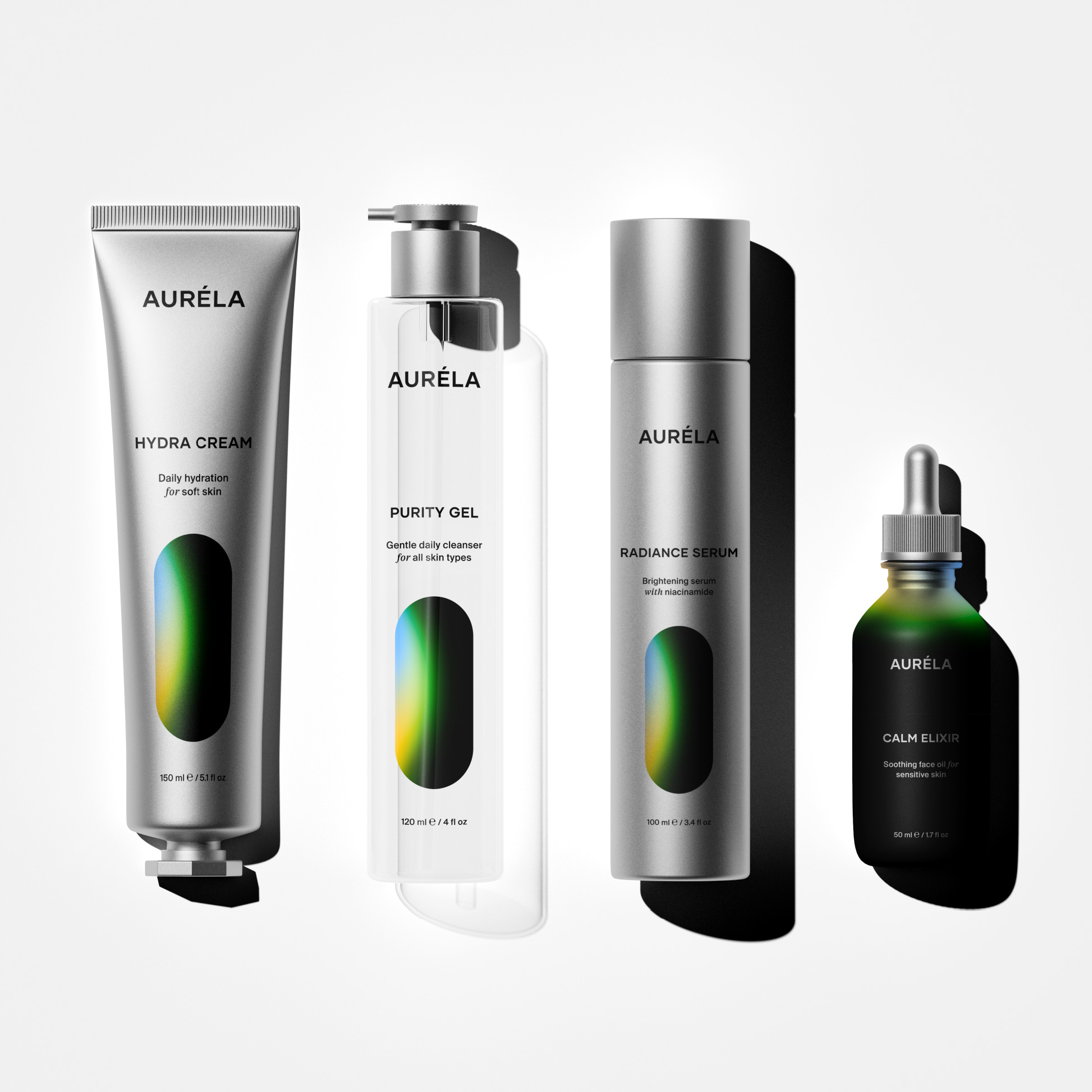
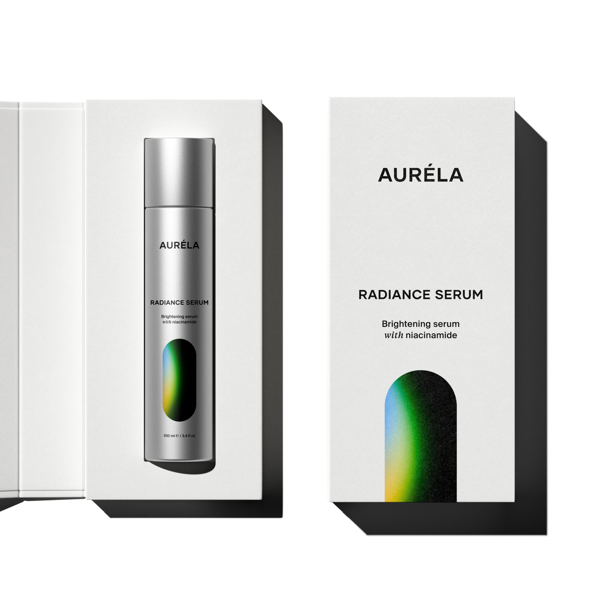
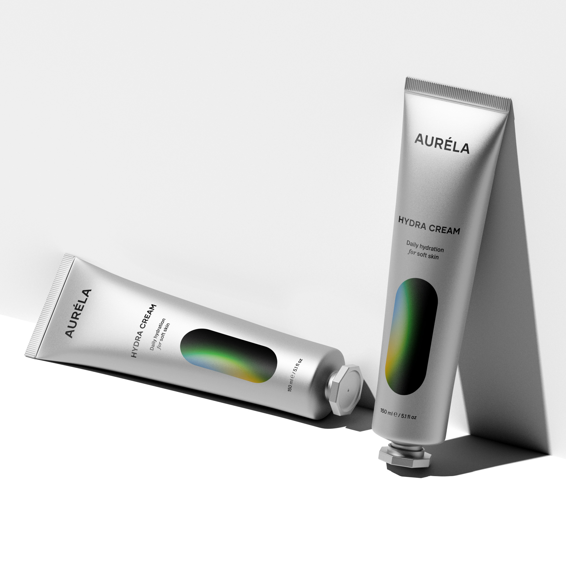
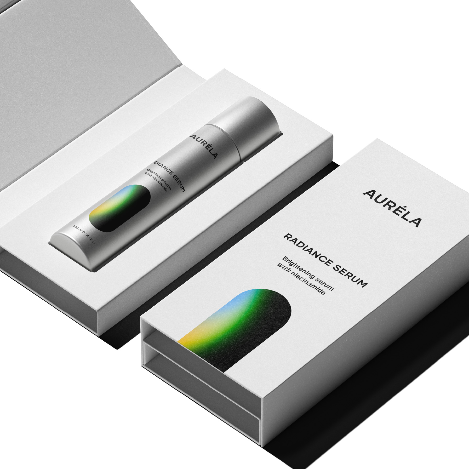
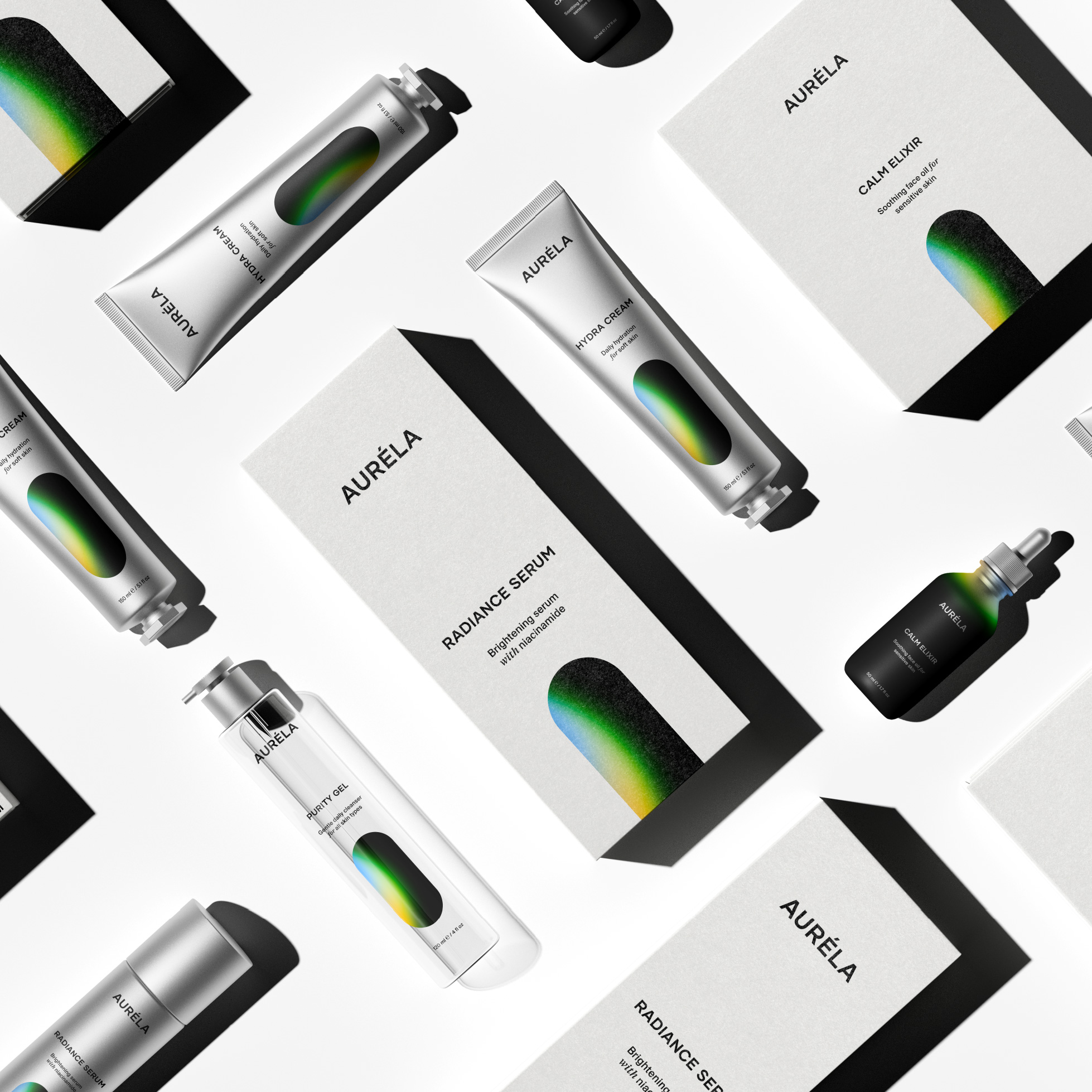
The central visual element is a two-dimensional capsule shape, glowing softly against a black background. This shape features a gradient of green, yellow, and blue. The subtle shift in color symbolizes energy, balance, and the quiet glow of something living. The capsule does not represent a literal object. It is a symbolic form, something abstract yet familiar, that holds the feeling of care, light, and protection. It brings emotion into a system that is otherwise stripped down to its core.
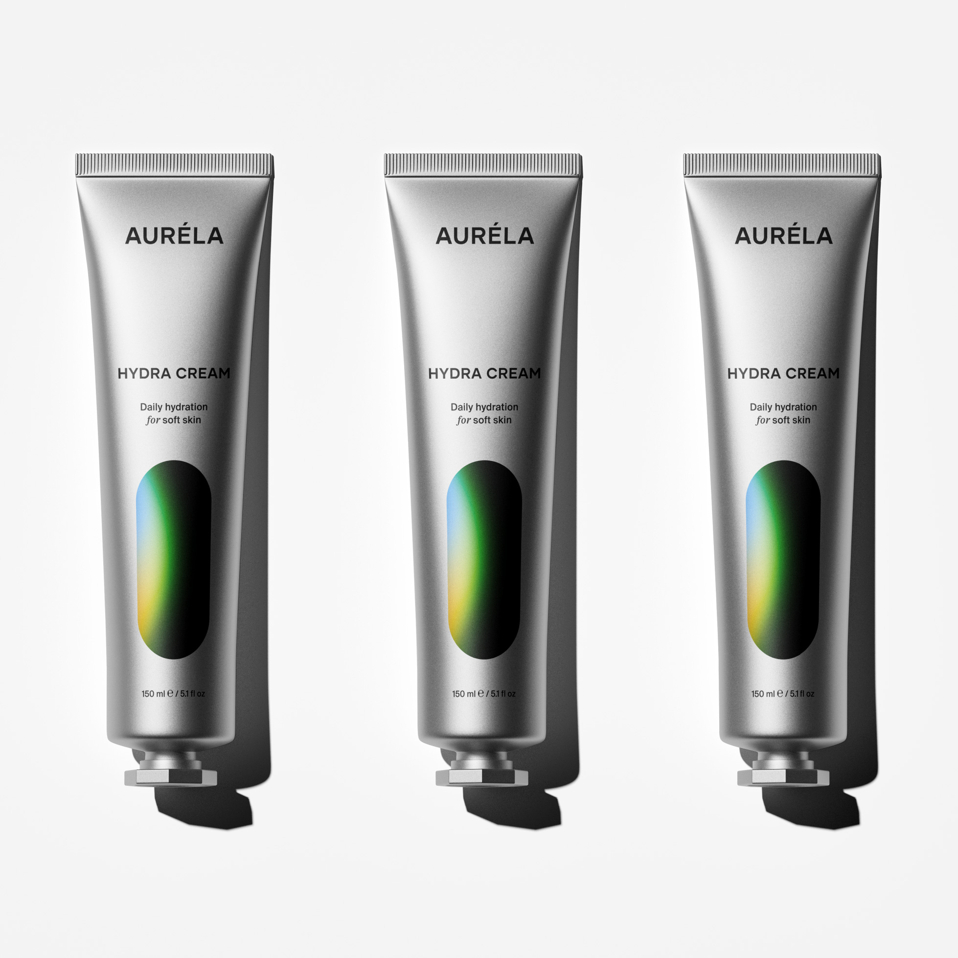
The packaging is where this contrast becomes most clear. Each product is housed in a clean, all-white container. Typography is black. Layouts are structured but soft. The front of each package includes only what matters. The Auréla wordmark. The product name. A short description in sentence case. The volume. Nothing else. The silence around these elements becomes part of the design. It creates a sense of luxury not through excess but through restraint.
Small details become emotional choices. The space between the logo and product name is wide and deliberate. The font weight is carefully chosen to avoid heaviness while remaining confident. Words like with and for are set in a separate serif italic, not to draw attention but to add softness. A quiet, feminine rhythm lives within the sentence. These choices are invisible at first, but they shape the feeling of the object in the hand and in the mind.
This project is not about decoration. It is about presence. Auréla does not sell itself through noise. It offers space. It allows each element to breathe and invites the viewer to slow down. In a world where everything demands attention, Auréla asks for stillness. And in that stillness, it becomes something more.
Auréla is skincare in its most honest form. Thoughtfully minimal. Emotionally precise. Designed to feel like care, not just look like it.

CREDIT
- Agency/Creative: Jawad Zelmadi
- Article Title: Jawad Zelmadi Reimagines Luxury Skincare with the Quiet Presence of Auréla
- Organisation/Entity: Agency
- Project Type: Packaging
- Project Status: Non Published
- Agency/Creative Country: Morocco
- Agency/Creative City: marrakech
- Market Region: Europe, Global
- Project Deliverables: Brand Identity, Identity System, Logo Design, Packaging Design
- Format: Bottle, Box, Tube
- Industry: Beauty/Cosmetics
- Keywords: packaging design, cosmetics, branding, packaging, cosmetic packaging, skincare
-
Credits:
Designer: Jawad Zelmadi


