


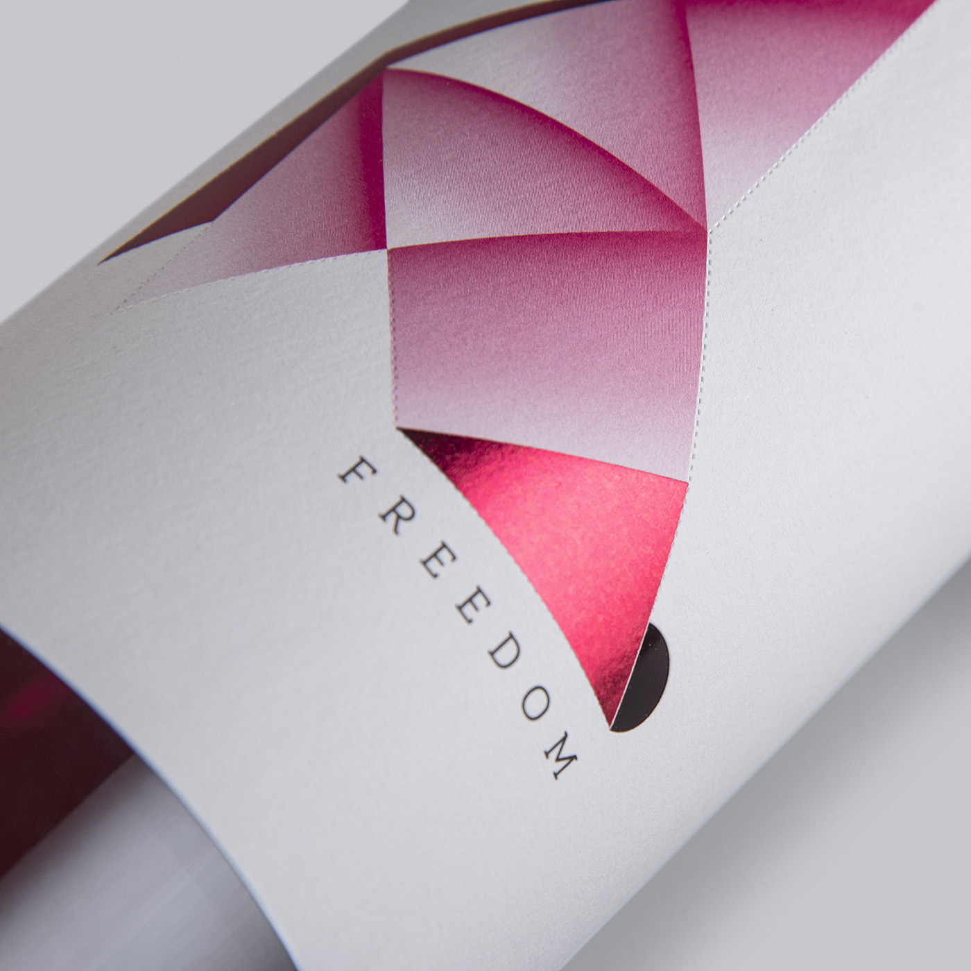
The bow tie freed from a label
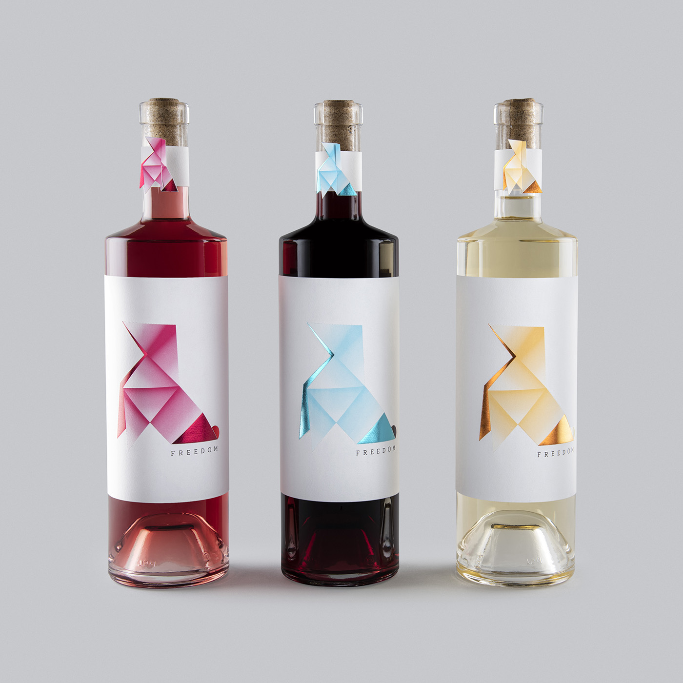
The client commissioned us to design the packaging for their range of red, white, and rosé wines, which they named Freedom. They wanted distinctive packaging that would captivate consumers and spark conversation at the table.
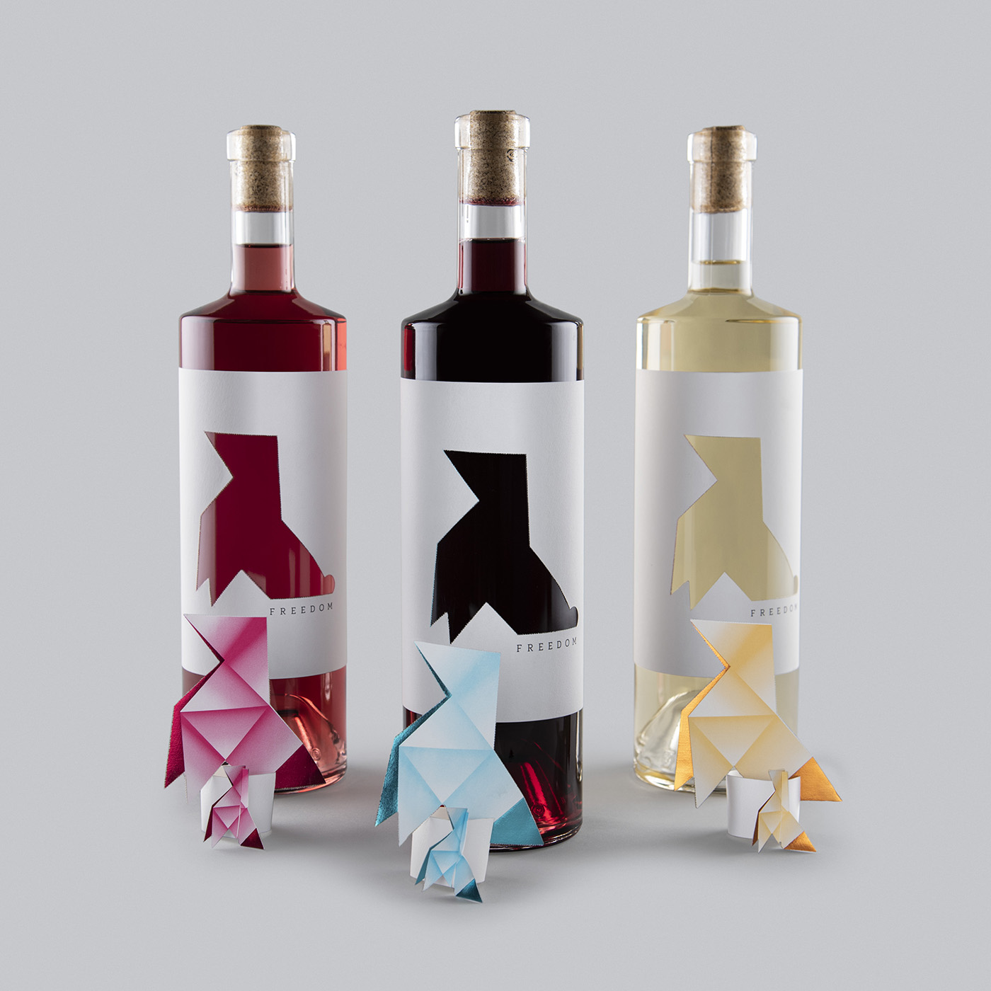
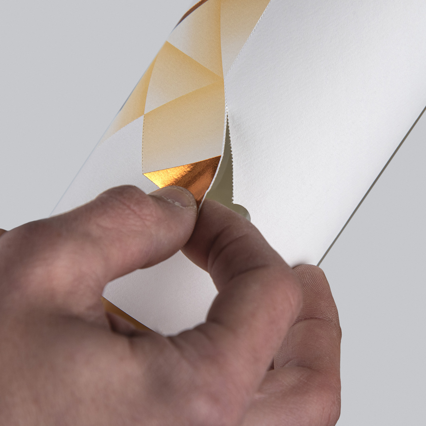
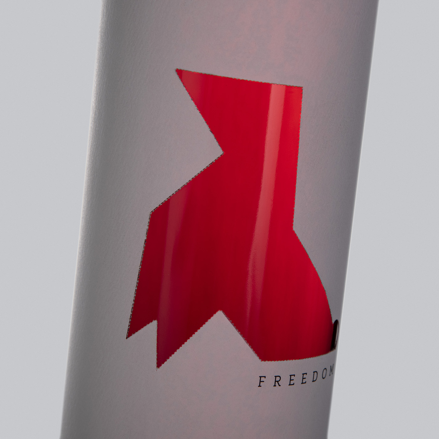
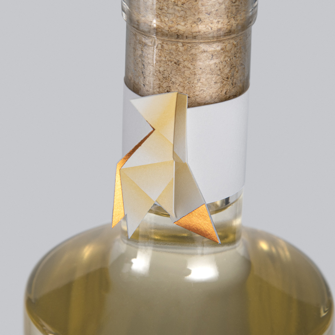
We were looking for a unique concept for the word “Freedom,” and as a result, we came up with the idea of creating a metaphor using a significant element of origami: the paper bow tie. This bow tie would represent a bird, a symbol of freedom, and through a micro-perforated and die-cut system, the bow tie could be removed from the label, thus freeing it. Removing the bow tie transforms the label’s design in a unique way, revealing the wine’s color. In this way, the label tells a story that consumers will enjoy sharing with their friends and family, making the packaging memorable. Each bow tie features a different color combined with foil stamping to make the design unique, distinctive, and elegant all at once.
The element on the neck of the bottle is not only decorative but also allows the bow tie to stand upright, creating an interactive experience for the consumer.
The labels and neckbands are printed by Mida Lemogroup using an exquisite technique. They are die-cut on both sides so that the transfer paper remains within the bow tie shape, while the rest of the label adheres to the bottle. We arrived at this solution after numerous tests and processes to find the best way to achieve this eye-catching effect, making them also collectible.
CREDIT
- Agency/Creative: Javier Garduño Estudio de Diseño
- Article Title: Javier Garduño Estudio de Diseño Gives Freedom Wine a Removable Label Design Inspired by Origami
- Organisation/Entity: Agency
- Project Type: Packaging
- Project Status: Published
- Agency/Creative Country: Spain
- Agency/Creative City: La Hiniesta. Zamora
- Market Region: Europe
- Project Deliverables: Packaging Design
- Format: Bottle
- Industry: Food/Beverage
- Keywords: wine, tie bow, label
-
Credits:
Creative Directios: Javier Garduño Estudio de Diseño


