


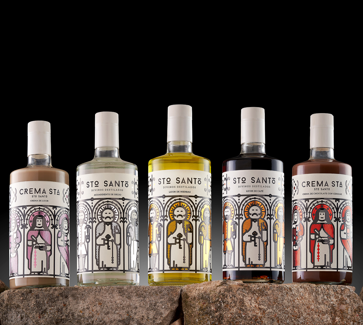
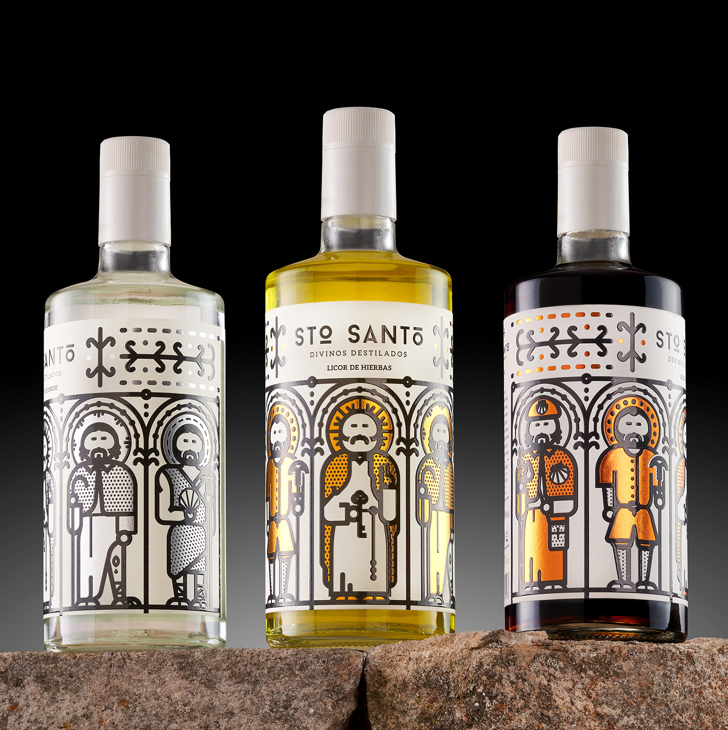
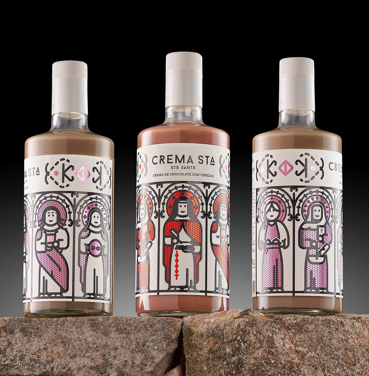
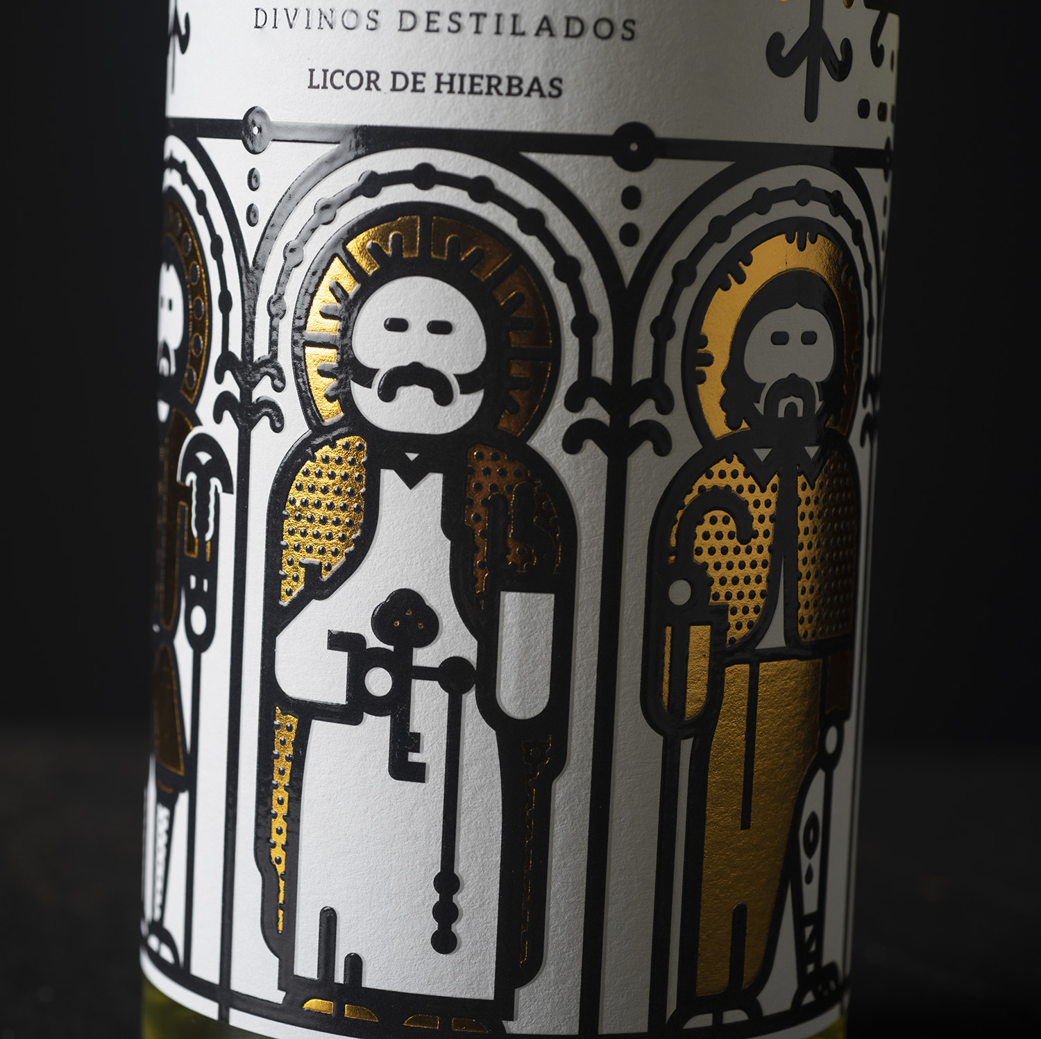
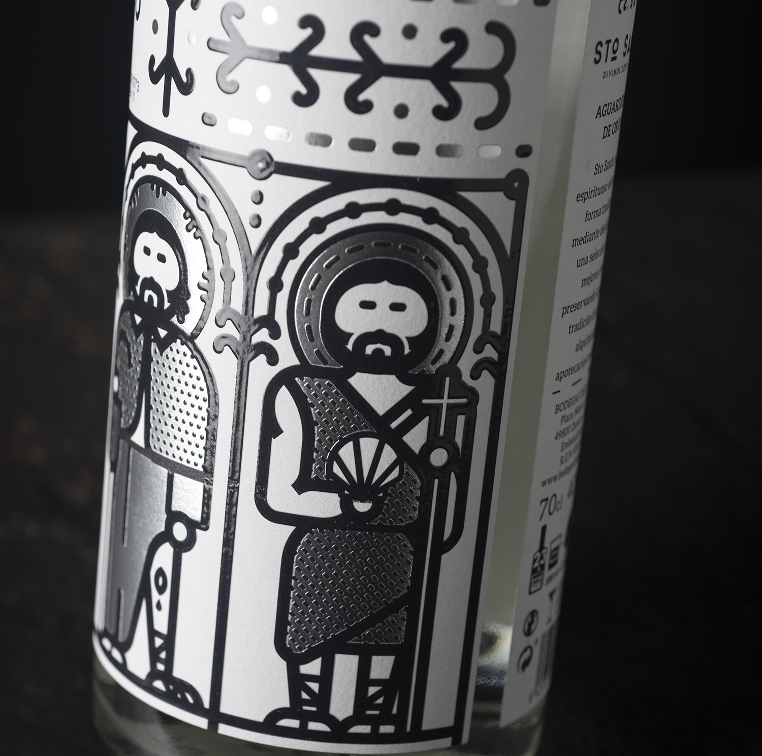
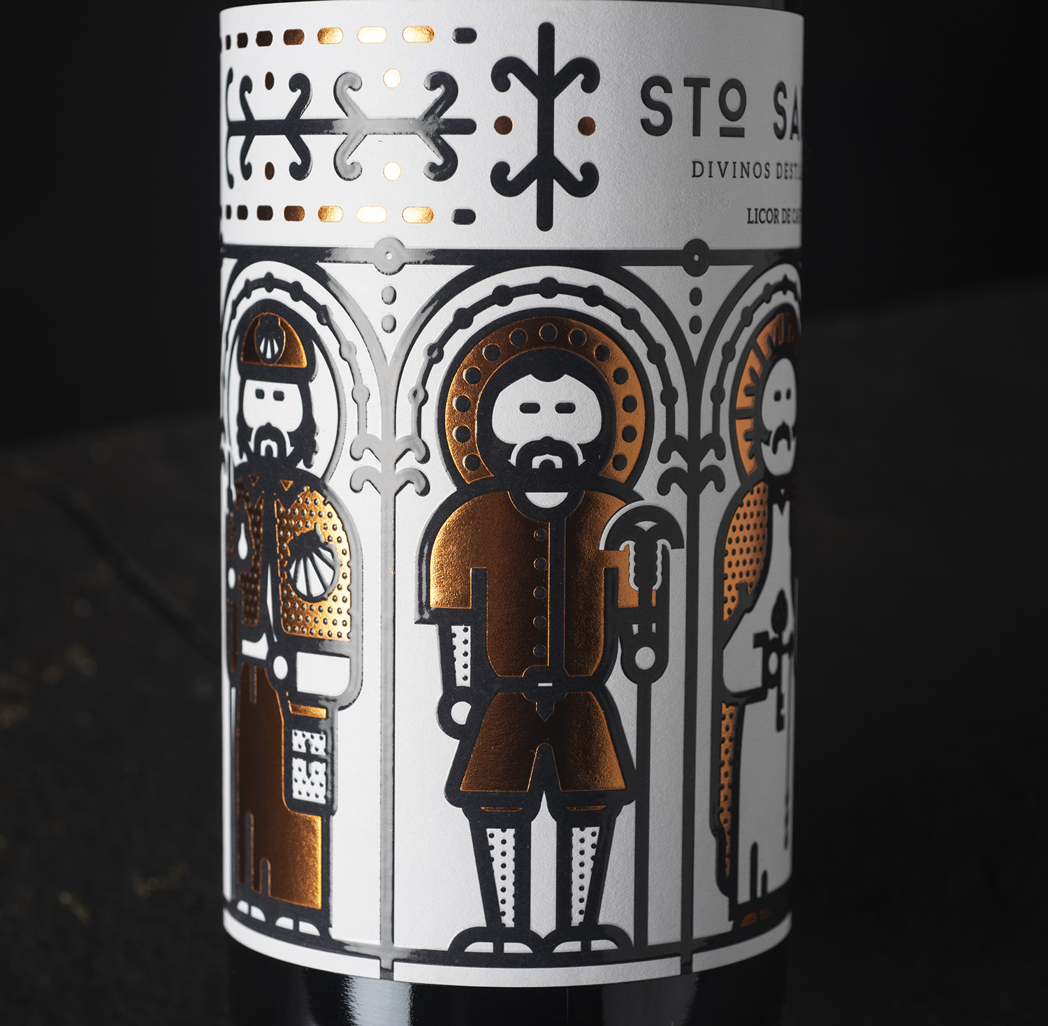
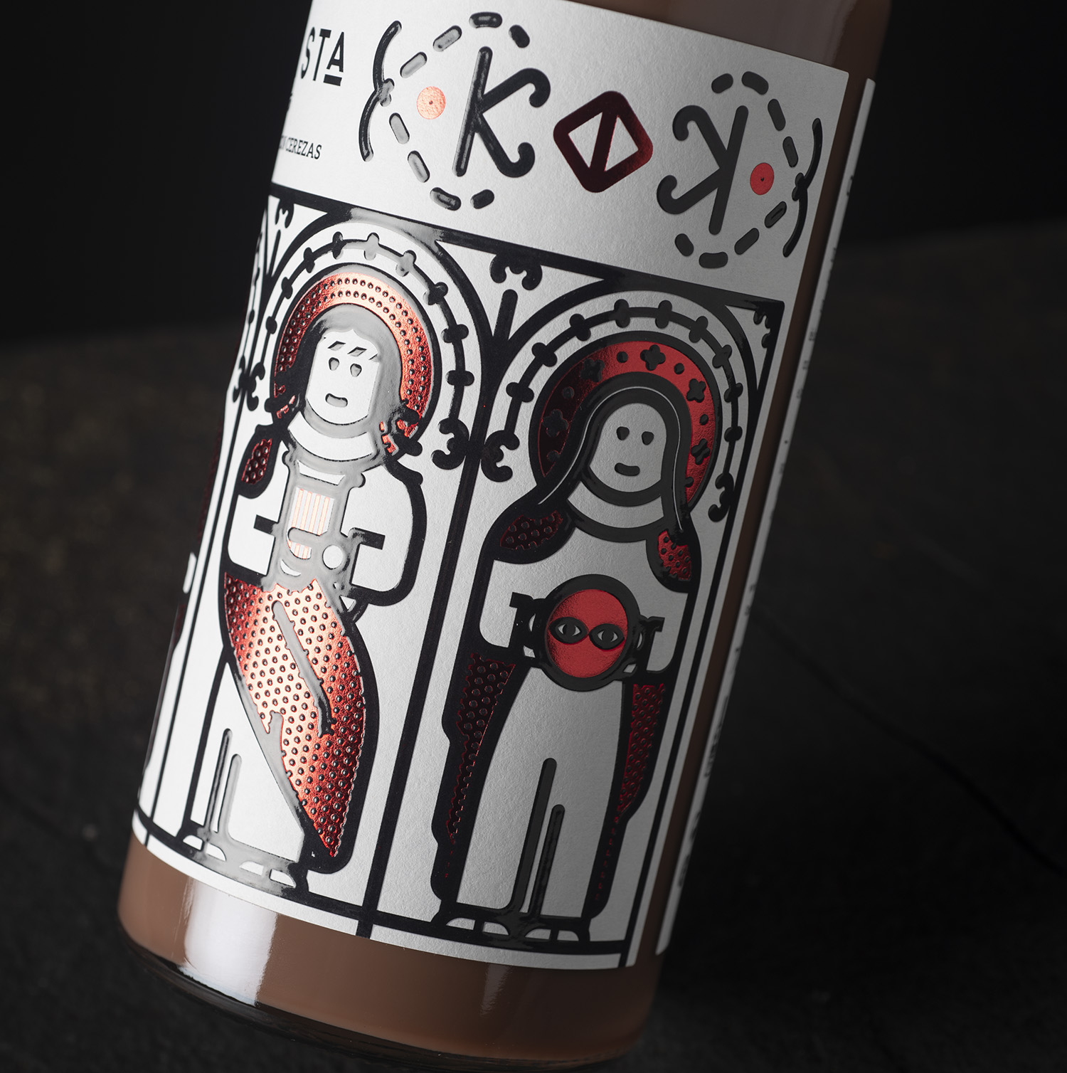
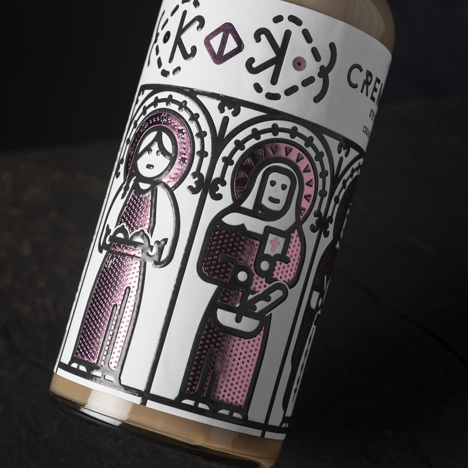
Sto Santo and Cream Sta. Bodegas Diez Gómez. In the first briefing it was explained to us that these liqueurs and creams are a tribute to the monks of the monasteries where these drinks began to be made. From the first moment we were clear that the general concept for the label would be related to the Romanesque monasteries that were the first places where these liqueurs were made. In Spain all the monasteries are dedicated to some saint, there are many and with different names depending on the area of the Spanish geography. That is why we decided that the saints for liqueurs and the saints for creams should be the protagonists of the labels. We made some very nice illustrations with 5 saints and 5 saints so the label would fill the entire bottle and make it more attractive. Then we would assign a stamping color to each flavor to differentiate them chromatically and with the stamping they would have the call for attention that we wanted. The stamping plates are the same in all the labels of each range, thus lowering production costs. In the graphic on the label, all the characters are placed in a Romanesque cloister simulating a monastery with each space for each illustration.
The variable data of each label is in black to be able to update each batch and year. For the stopper we had few options since it had to be a generic stopper and we decided on the white one as it combined much better with all the liquor labels and made the bottle much more stylish, even though it is very pretty due to its shape and its shoulders, perhaps in the linear it can give the feeling of low, we solve this with the blank cap. The result is an eye-catching design with a very strong concept.
CREDIT
- Agency/Creative: Javier Garduño Estudio de Diseño
- Article Title: Javier Garduño Estudio de Diseño Create New Design for Artisan Liqueurs
- Organisation/Entity: Agency
- Project Type: Packaging
- Project Status: Published
- Agency/Creative Country: Spain
- Agency/Creative City: La Hiniesta. Zamora
- Market Region: Global
- Project Deliverables: Packaging Design
- Format: Bottle
- Substrate: Glass Bottle
- Industry: Food/Beverage
- Keywords: liqueurs, spain, romanic
-
Credits:
Javier Garduño Estudio de Diseño: Javier Garduño


