


Krkr, the ultimate chocolate experience crafted for the vibrant, modern Saudi Arabia youth. With its sleek design and rich, irresistible flavor, Krkr Chocolate Fingers are more than just a treat—they’re a vibe!
Whether you’re catching up with friends, fueling your creativity, or simply taking a break, Krkr brings the perfect balance of indulgence and energy. It’s not just chocolate; it’s a lifestyle statement for the bold, the fun, and the trendsetters of today.
Introducing Krkr Saudi Chocolate Finger, where indulgence meets sophistication. Crafted with the finest ingredients and inspired by rich Saudi Arabian heritage, each bite delivers a decadent experience like no other.
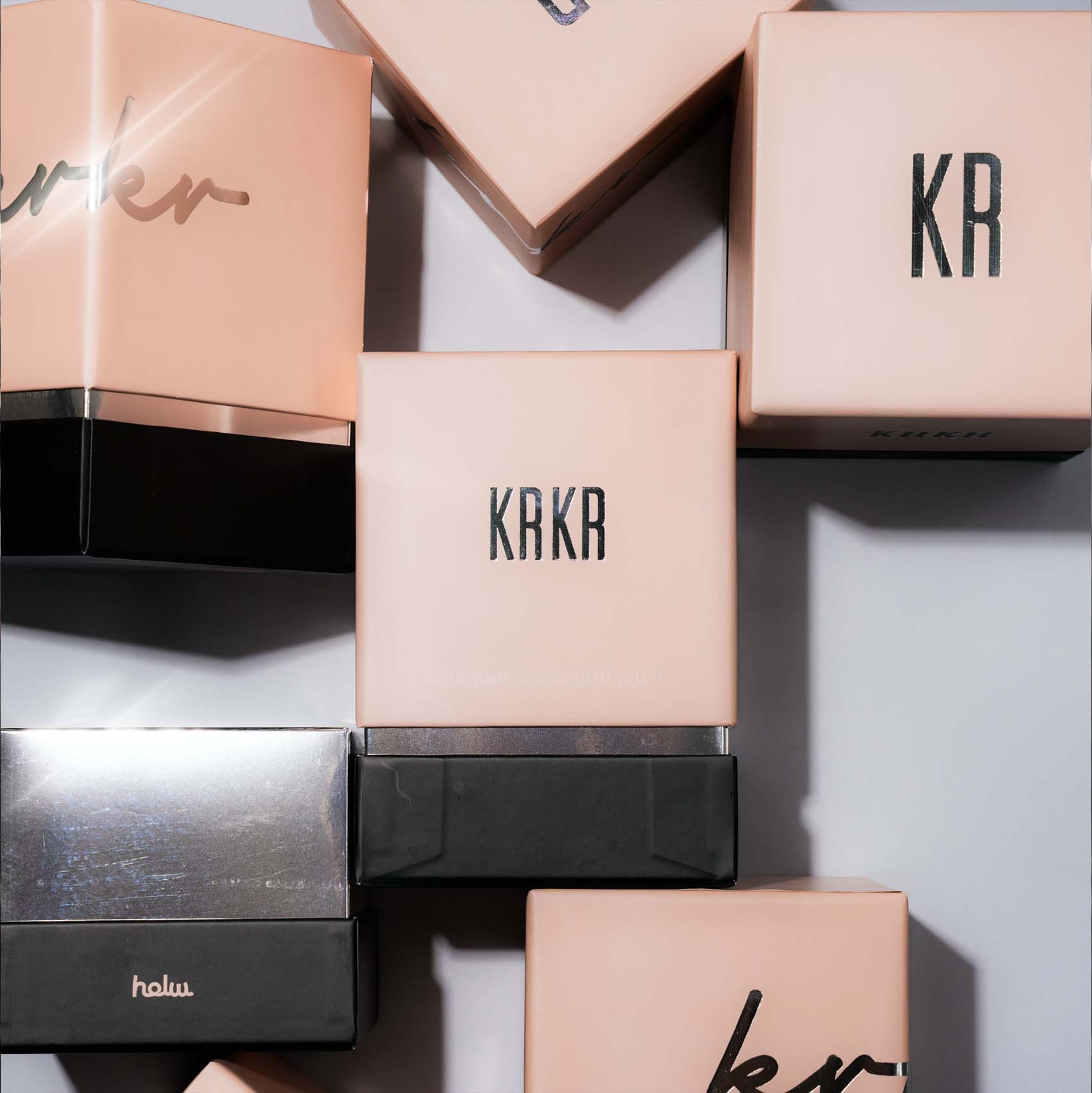
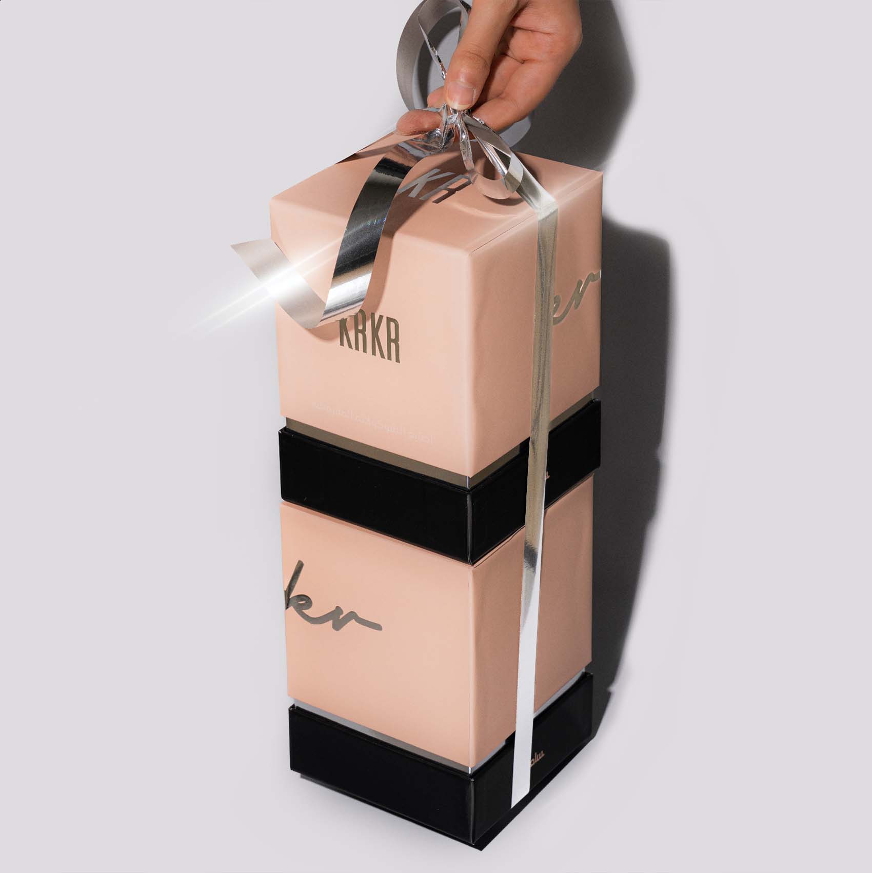
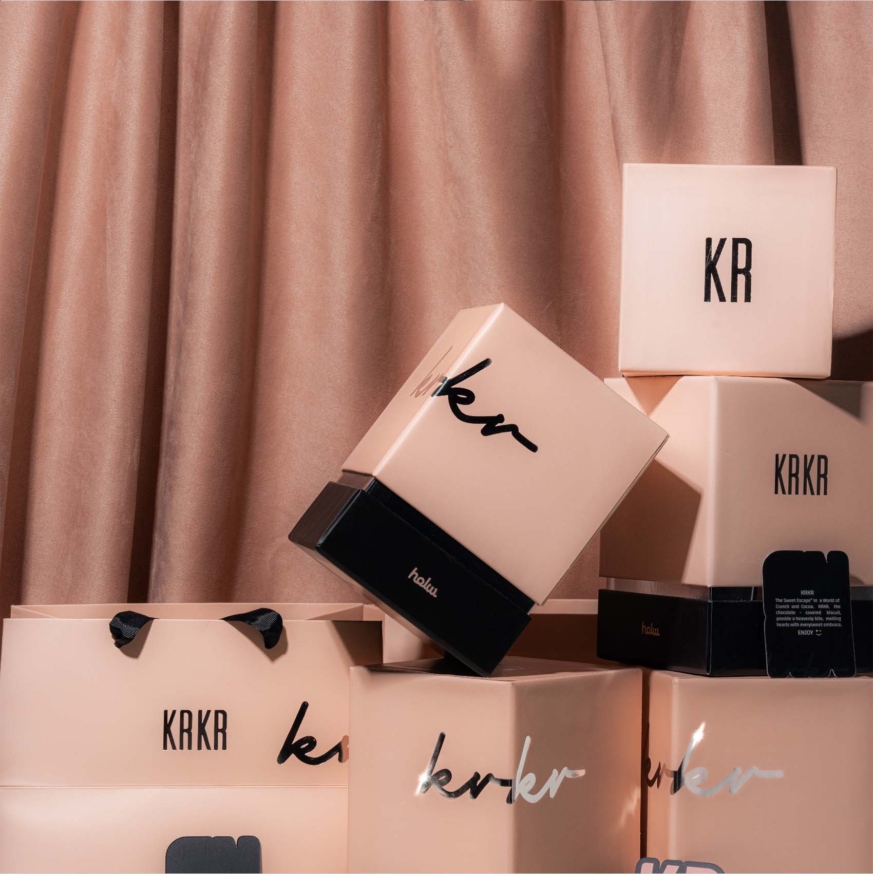
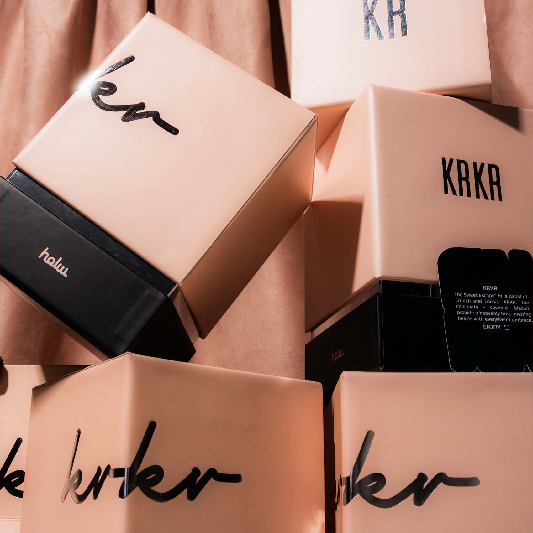
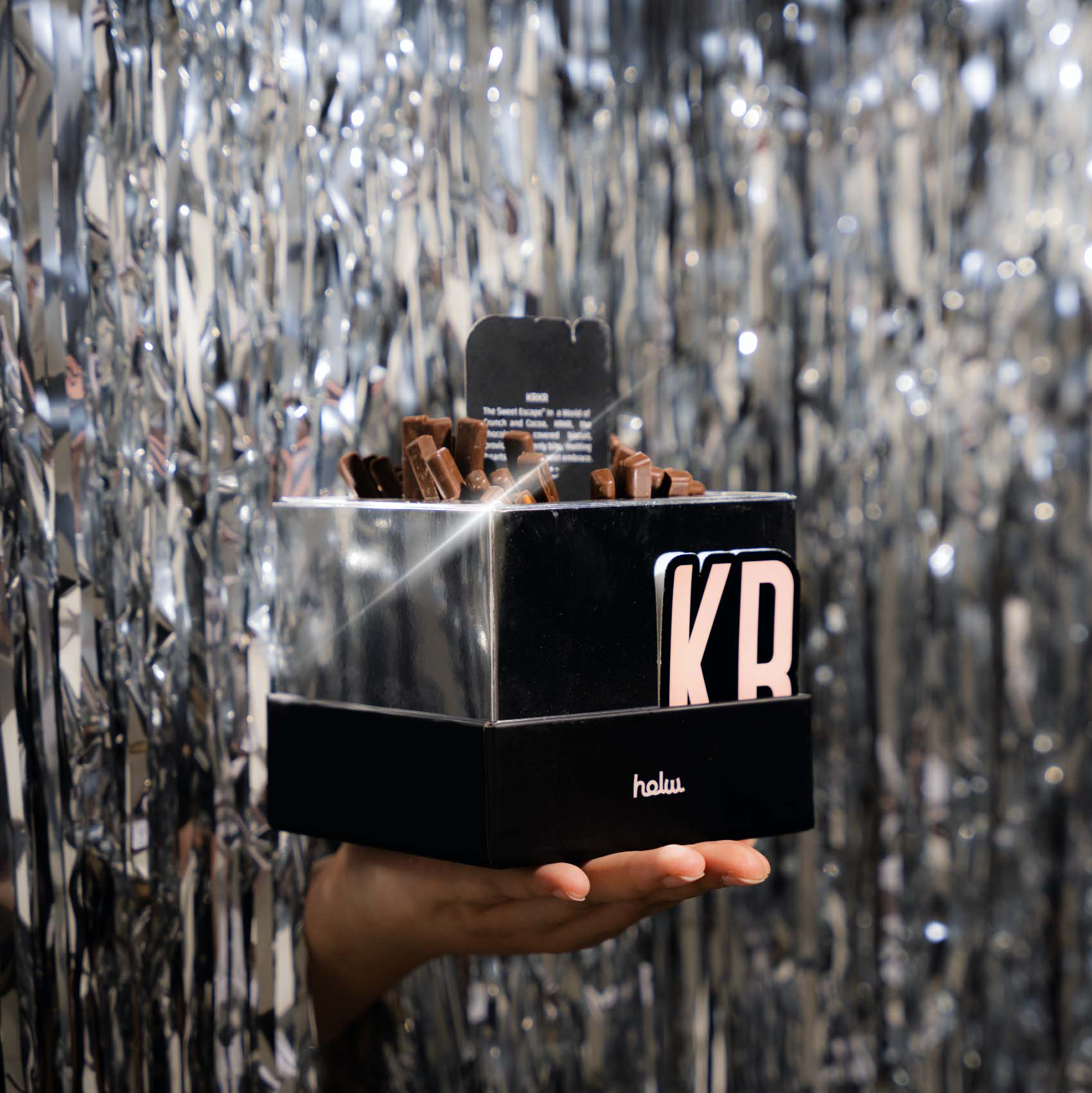
When designing packaging for chocolate Krkr, color choices play a crucial role in evoking emotions and drawing attention to the product. Using a combination of black and pink colors with a shiny luminous effect creates a striking visual appeal that conveys both sophistication and playfulness, making the chocolate box stand out on the shelves.
By blending the deep, commanding presence of black with the soft, vibrant energy of pink, and accentuating the design with shiny luminous finishes, this packaging concept balances elegance and excitement. It ensures the product not only stands out in a crowded marketplace but also communicates a sense of quality and indulgence, inviting customers to experience something special.
Black, often associated with elegance, luxury, and mystery, sets the stage for a premium and refined look. It serves as a perfect backdrop that allows other colors and design elements to pop, making it an ideal choice for high-end chocolate packaging. The dark hue also conveys strength and quality, which are essential attributes for indulgent products like fine chocolates.
On the other hand, pink introduces a sense of warmth, sweetness, and modern femininity. It adds a soft, inviting touch that contrasts beautifully with the boldness of black. Whether used as a soft pastel or a rich, vibrant hue, pink evokes feelings of joy, tenderness, and playfulness, making it an appealing choice for products aimed at those who seek both luxury and a sense of fun.
The addition of a shiny luminous effect—through techniques such as metallic foiling, holographic finishes, or gloss accents—brings an added layer of sophistication and intrigue. The reflective quality of the luminous elements catches the light, creating a dynamic and eye-catching design that draws the consumer in. This shimmering effect not only enhances the visual appeal but also elevates the overall tactile experience, signaling that the product inside is a premium treat.
CREDIT
- Agency/Creative: jasmine mohamed
- Article Title: Jasmine Mohamed Fuses Sophistication and Playfulness in Krkr Chocolate Identity
- Organisation/Entity: Freelance
- Project Type: Packaging
- Project Status: Published
- Agency/Creative Country: Saudi Arabia
- Agency/Creative City: Hh
- Market Region: Asia
- Project Deliverables: 2D Design, Art Direction, Industrial Design, Packaging Design
- Format: Blister-Pack, Box
- Industry: Food/Beverage
- Keywords: Package, chocolate, product, box
-
Credits:
Art director: jasmine mohamed


