


The client is a brewery that makes Japanese sake for over 200 years.
Since the population in Japan is severely declining, it is necessary to expand the sales channel to foreign countries. For this, it was thought to be best to incorporate the unique Japanese culture in the design.
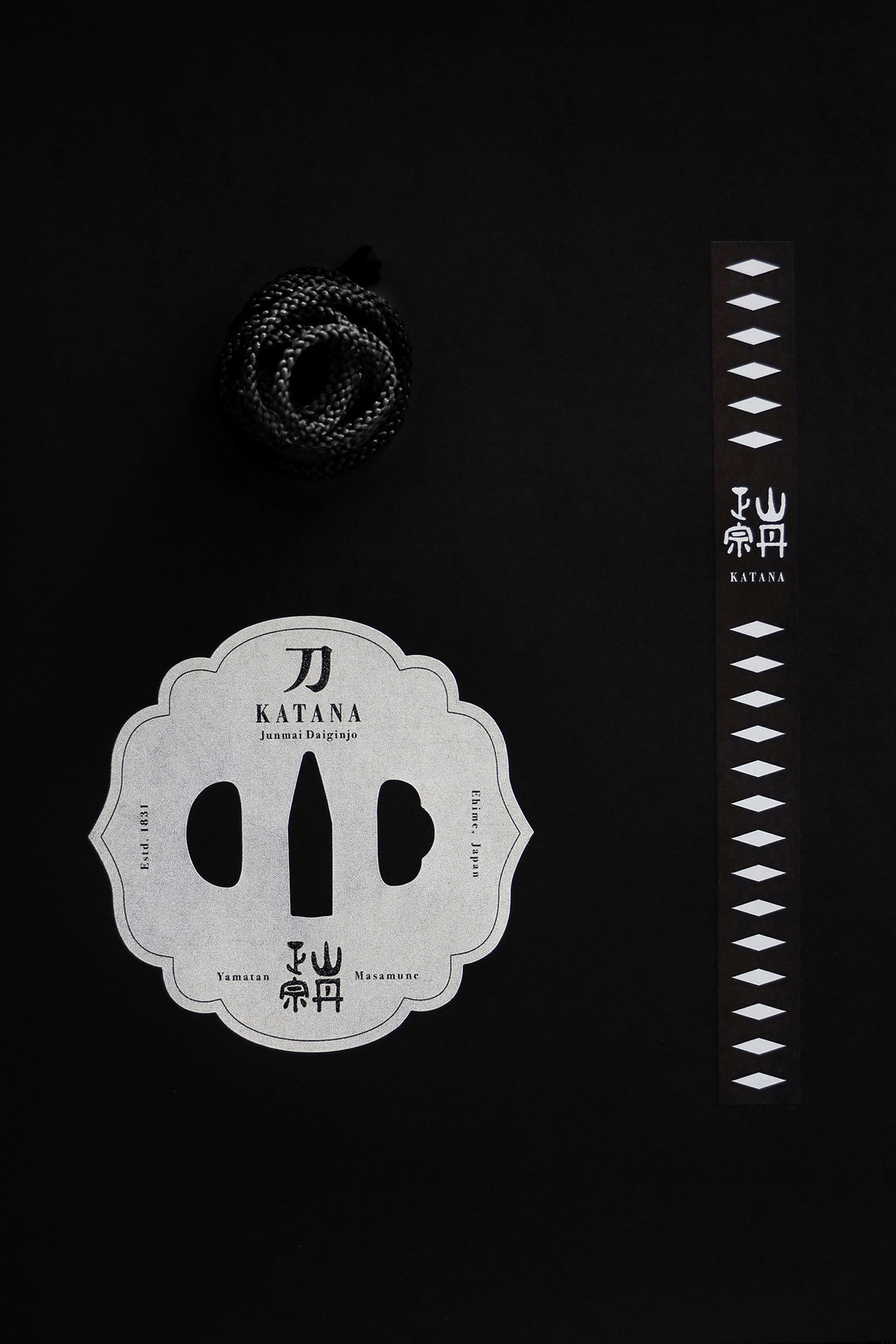
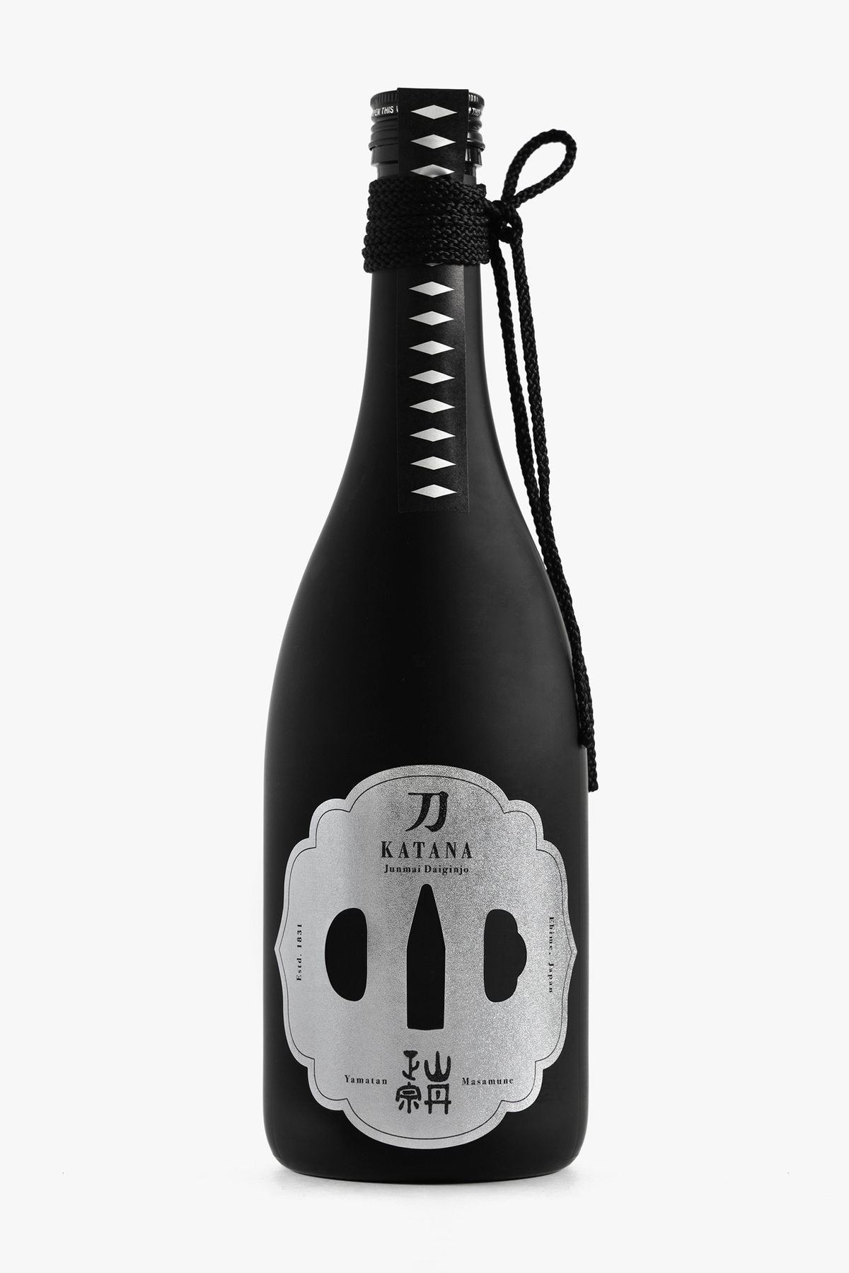
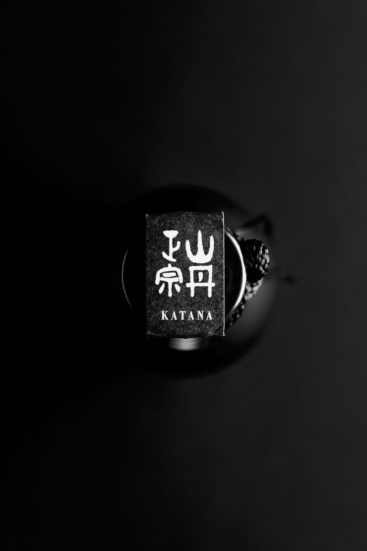
Being inspired by the client’s history and the delicious sharpness of the product, the concept of the “Japanese sword” possessed by Japanese samurais and ninjas was adopted, with a design of unique decorations and patterns of the Japanese sword.
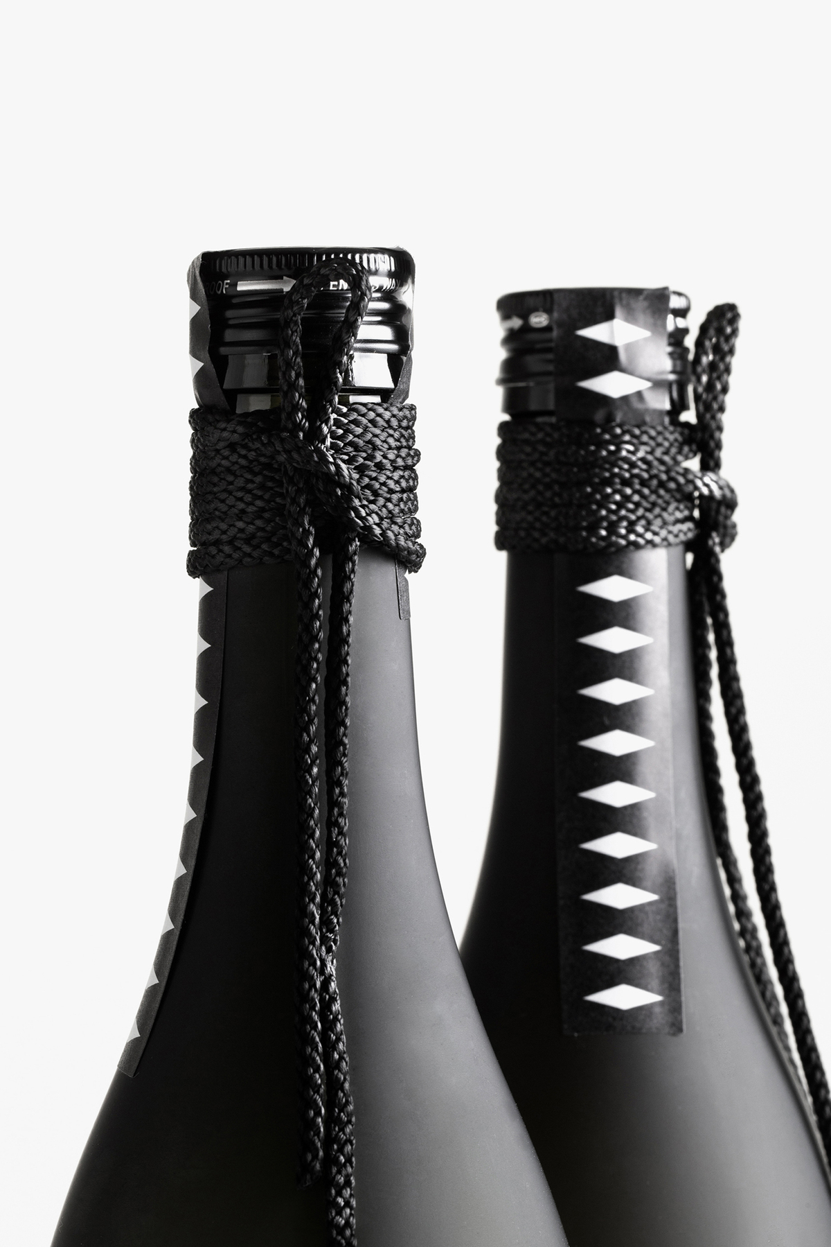
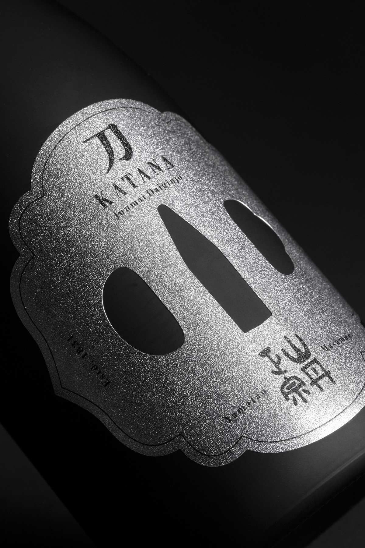
The color scheme was minimized to silver and black, with the upper part of the bottle adopting the design of the “grip of the sword”, and the silver label adopting the “handguard of the sword.”
When it is wrapped in the pitch-black paper, it looks like a hiding ninja, and when it is unwrapped, an illustration of a Japanese sword appears.
CREDIT
- Agency/Creative: Grand Deluxe
- Article Title: Japanese Sword KATANA
- Organisation/Entity: Agency, Published Commercial Design
- Project Type: Packaging
- Agency/Creative Country: Japan
- Market Region: Europe
- Project Deliverables: Brand Naming, Graphic Design, Packaging Design
- Format: Bottle
- Substrate: Glass Bottle, Pulp Paper


