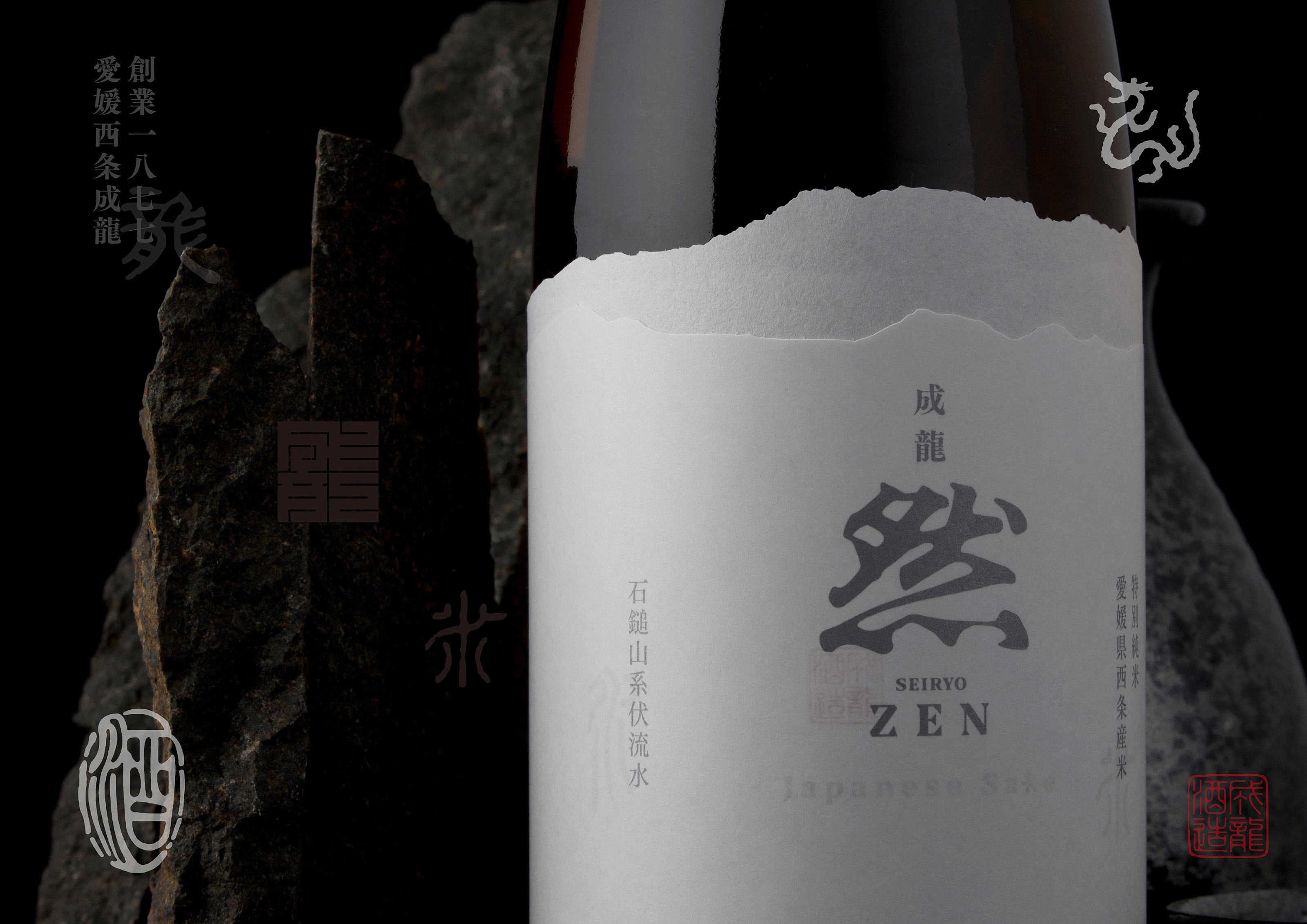
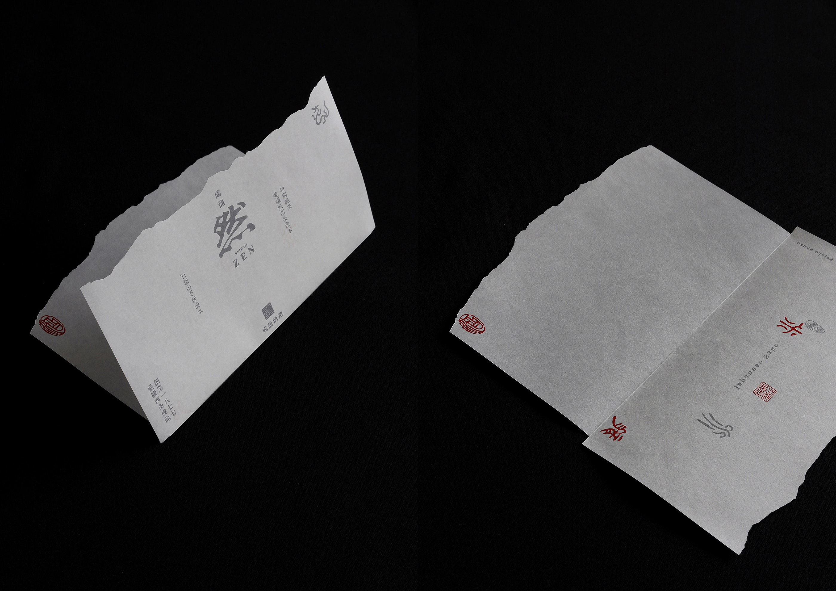
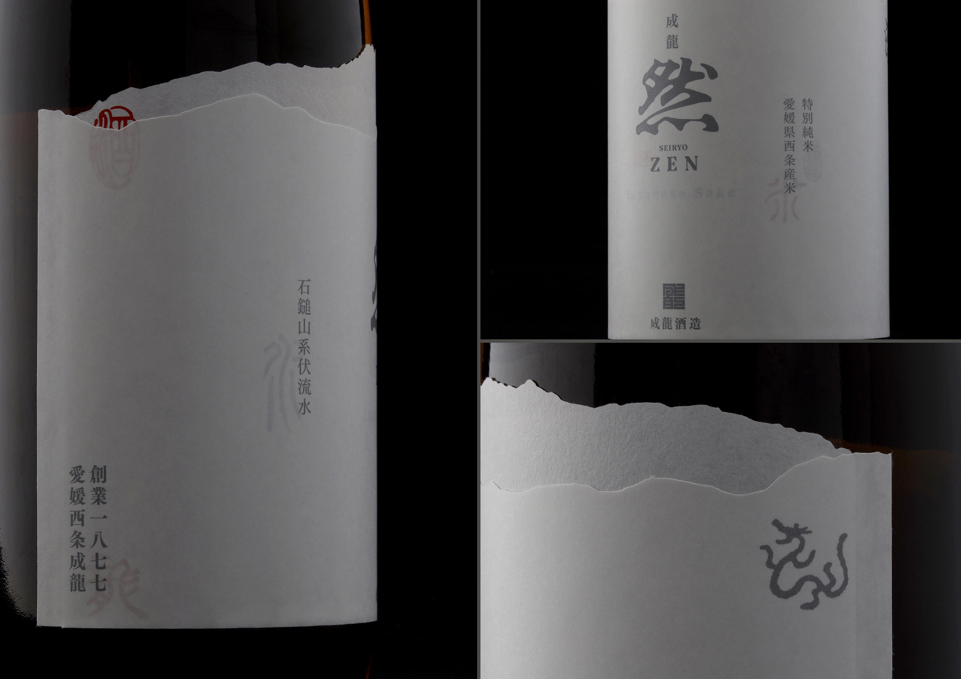
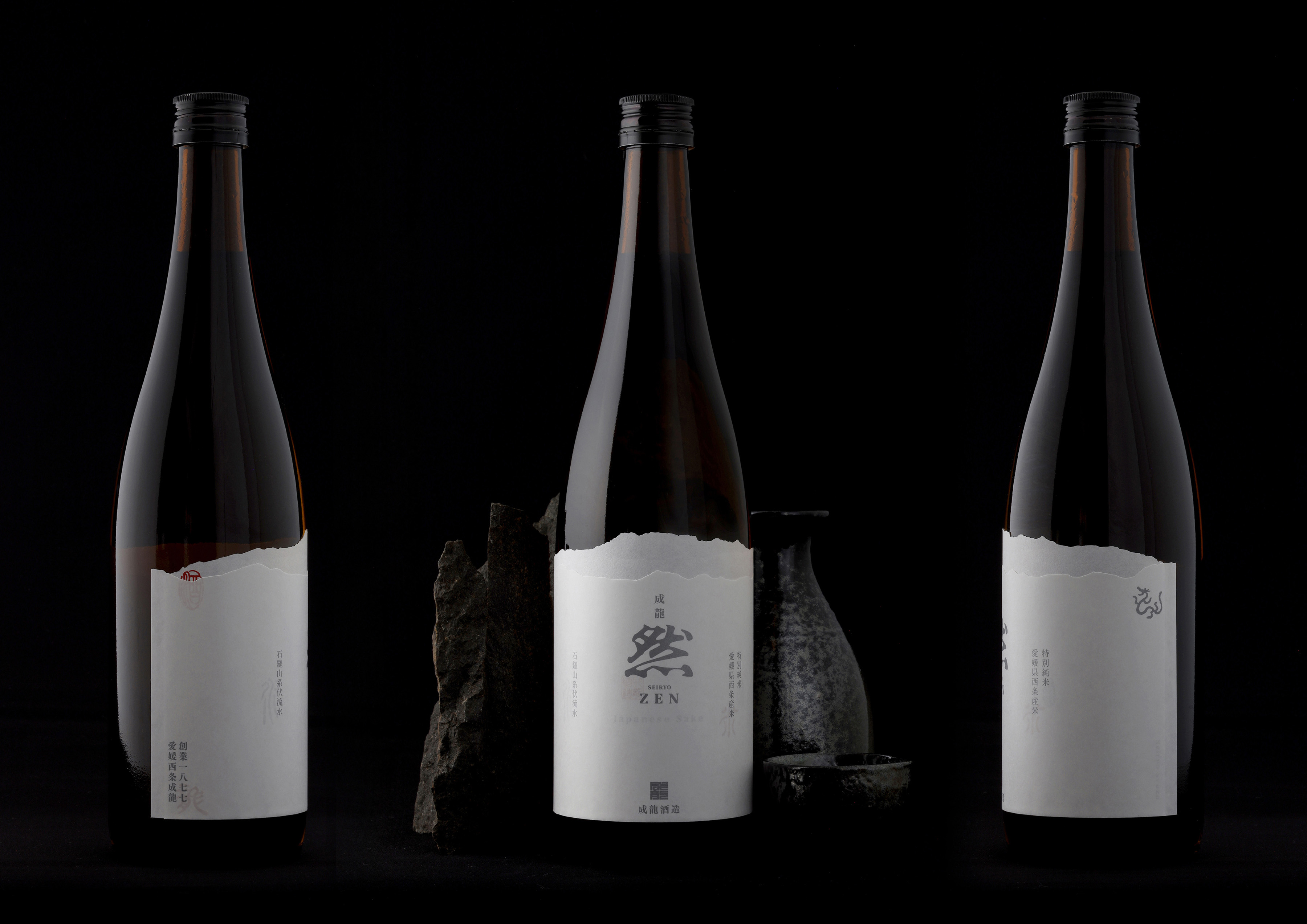
The design uses the motif of Mt. Ishizuchi, which can be viewed from the sake brewery and is the highest peak in western Japan, since the sake flavor is largely affected by the local climate. Sake is said to have been first made in the Yayoi period, about 2,000 years ago, to dedicate to the deities, and Mt. Ishizuchi is enshrined as a sacred mountain. A folded sheet of paper imitates a three-dimensional scene of overlapping mountain ranges. Since the paper is thin and printed on both sides, the printing on the back side is visible through the folded paper. The design uses characters such as rice and water—the essentials of sake brewing—and integrates pictographs from the Yayoi period. White and silver are used as the main colors, representing the color of white rice that determines the sake taste and the snowy season when sake brewing begins. With this packaging design displaying the history and background unique to the sake brewery, the sake quickly sold out at an exceptional speed.


CREDIT
- Agency/Creative: Grand Deluxe
- Article Title: Japanese Sake Mt. Ishizuchi Motif and Label Design by Grand Deluxe
- Organisation/Entity: Agency
- Project Type: Packaging
- Project Status: Published
- Agency/Creative Country: Japan
- Agency/Creative City: Matsuyama
- Market Region: Asia
- Project Deliverables: Brand Design, Design, Graphic Design, Packaging Design
- Format: Bottle
- Substrate: Glass Bottle
- Industry: Food/Beverage
- Keywords: #branding #logo #logodesign #logotype #symbol #symbolmark #package #packaging #packagedesign #typo #typography
-
Credits:
Creative Director: Koji Matsumoto
Art Director: Koji Matsumoto
Graphic Designer: Koji Matsumoto
Design Studio: Grand Deluxe


