


Otrekk: Walking Together, Safer and Better
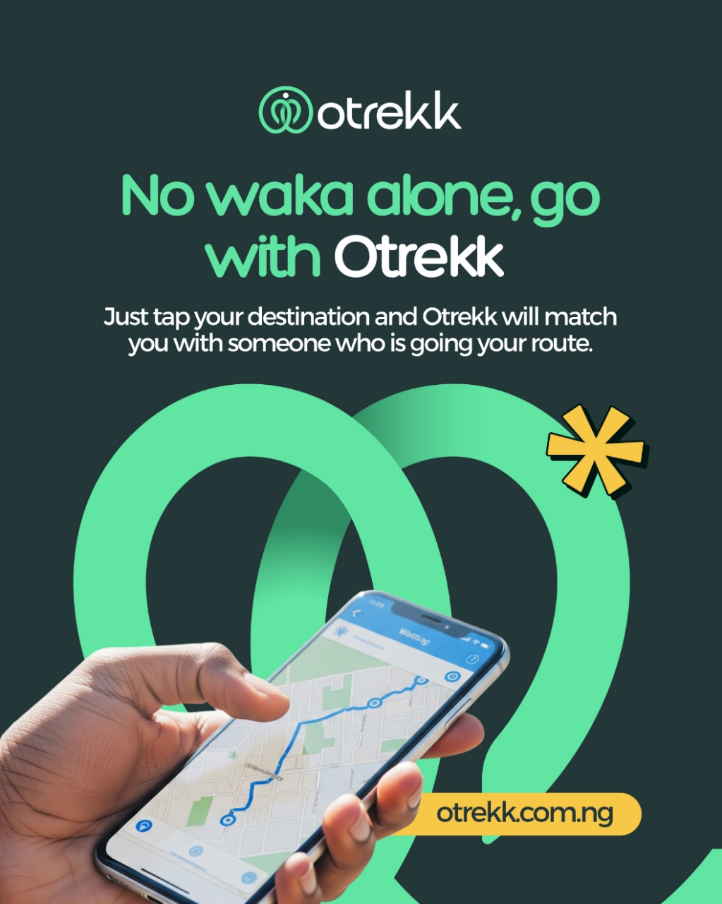
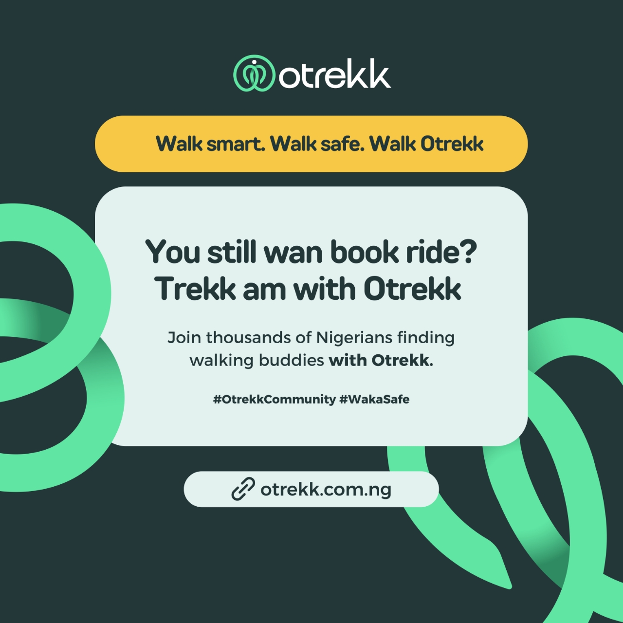
Otrekk is a community-driven mobility concept designed to make walking feel safer, more social, and more purposeful. In many bustling cities like Lagos, everyday movement is more than just transportation, it’s about navigating shared experiences, finding safety in numbers, and building connections along the way. Otrekk taps into this insight by offering a platform where people going in the same direction can walk together.
The brand identity was crafted to capture this essence of connection, movement, and humanity.
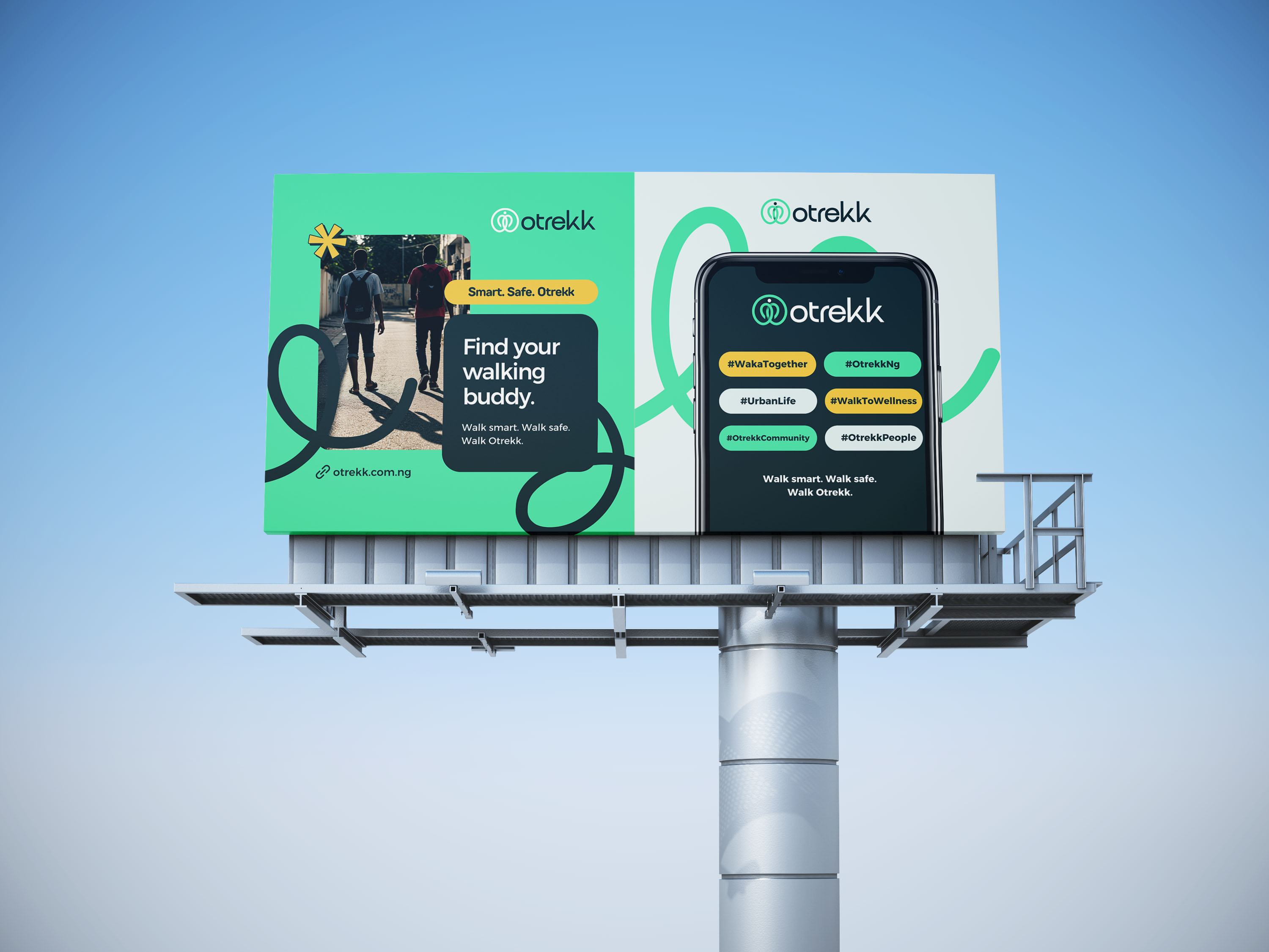
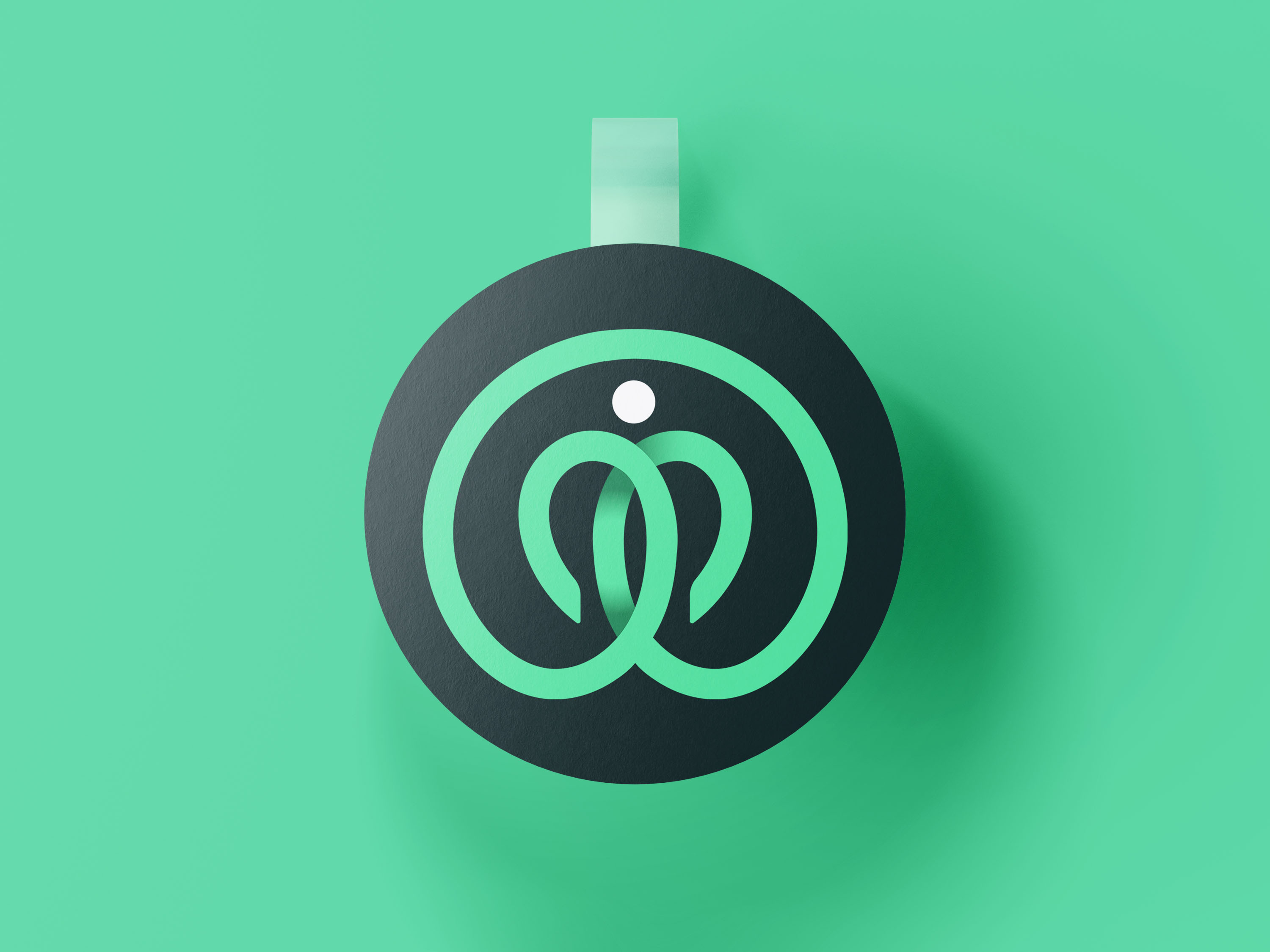
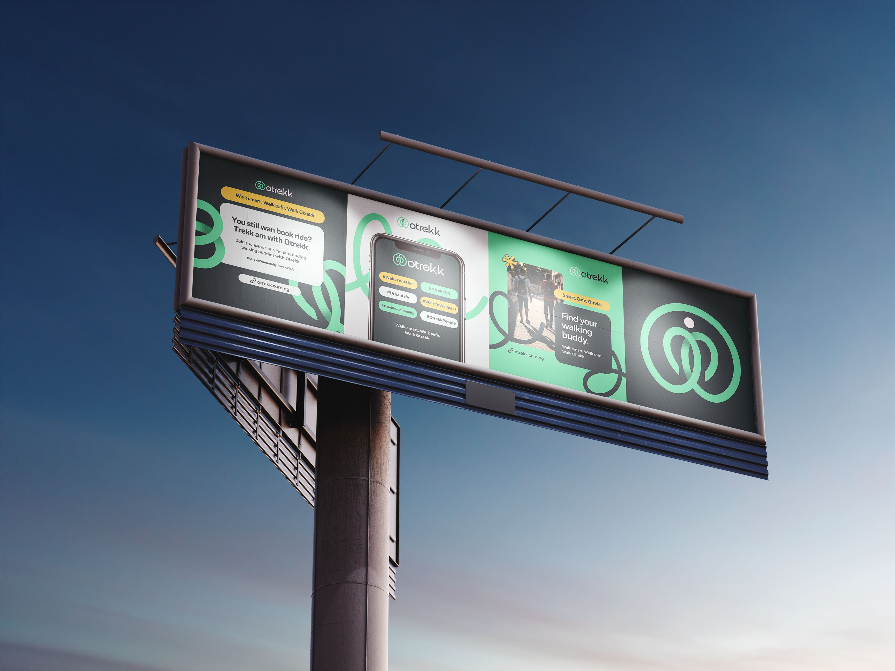
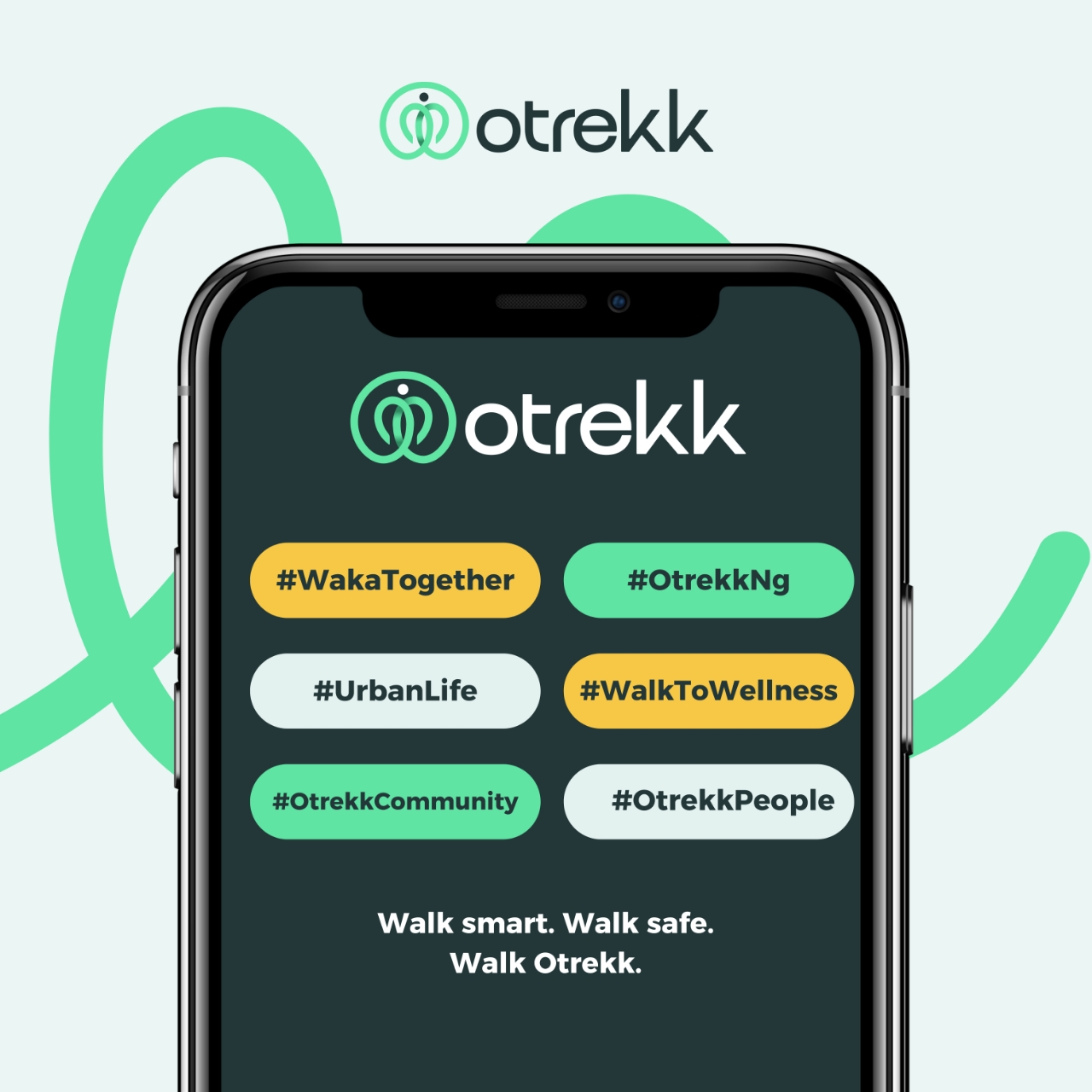
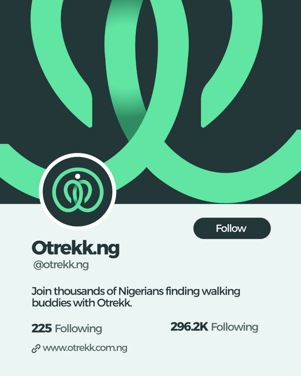
The logo mark is a blend of overlapping elements: a location pin, a heart, a human form, and a circle of unity. These shapes merge seamlessly to symbolize togetherness, care, and shared journeys. The design emphasizes that Otrekk is not just about reaching a destination, it’s about the comfort and security found in walking with others.
The chosen color palette reflects this balance of trust and energy. A deep, grounded teal, provides stability, while a refreshing mint and a warm urban yellow bring vibrancy and optimism. A soft misty white ties the palette together, giving the brand a modern, airy feel.
These colors were intentionally selected to resonate with everyday users while ensuring clarity and contrast across digital and print applications.
Typography plays a key role in reinforcing Otrekk’s approachable yet professional personality. TT Rounds Neue was chosen for its friendly rounded edges, evoking warmth and human connection, while Montserrat brings in a clean, digital structure that ensures readability across user interfaces and marketing materials. The pairing strikes a balance between friendliness and modern efficiency.
For visual storytelling, the brand leans into relatable photography and imagery human-centered moments without always showing faces. Cropped perspectives of people walking, shoes on pavements, shadows on sunny Lagos streets, and motion-focused compositions highlight the human element without losing universality. This direction ensures that Otrekk feels relatable to the everyday Nigerian while remaining adaptable to global audiences.
Beyond the visuals, Otrekk represents a shift in how we think about movement. It is about community over isolation, connection over anxiety, and presence over speed. In cities where trust and safety are ongoing concerns, Otrekk offers a simple but powerful idea: walking together is better.
This project reflects not just a branding exercise but an exploration of how design can amplify human experiences. Through thoughtful symbolism, color, typography, and relatable storytelling, the Otrekk identity communicates warmth, trust, and modernity, laying the foundation for a brand that inspires people to move together.
CREDIT
- Agency/Creative: Jameelah Jibril
- Article Title: Jameelah Jibril Shapes Otrekk Into a Modern Mobility Identity Built on Connection
- Organisation/Entity: Freelance
- Project Type: Identity
- Project Status: Published
- Agency/Creative Country: Nigeria
- Agency/Creative City: Federal Capital Territory, Abuja
- Market Region: Africa
- Project Deliverables: Advertising Photography, App Design, Brand Design, Brand Guidelines, Brand Identity, Brand Mark
- Industry: Public Utility
- Keywords: Movement, Connection, Urban Life, Community, Simplicity
-
Credits:
Creative Designer: Jameelah Jibril


