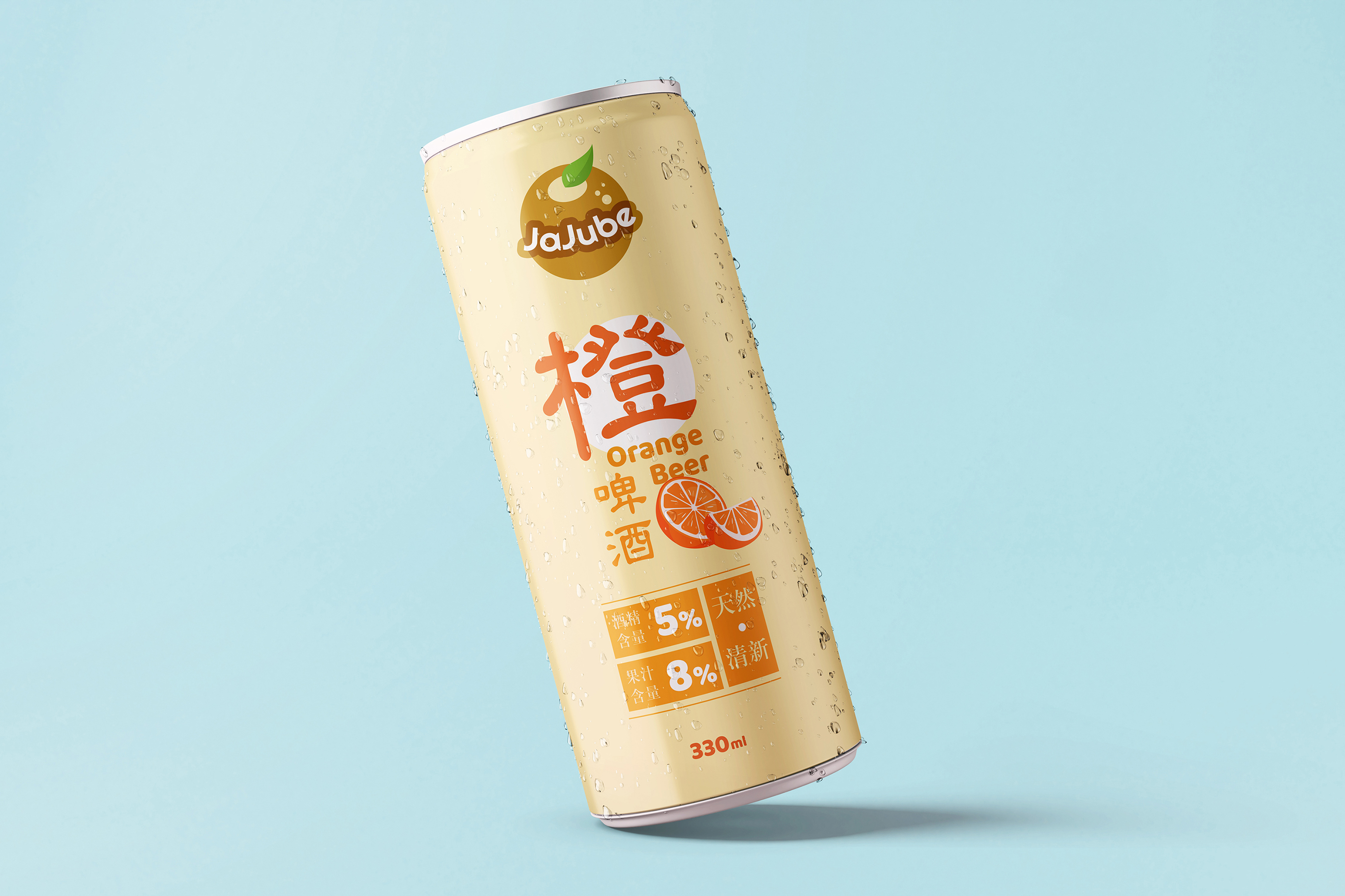
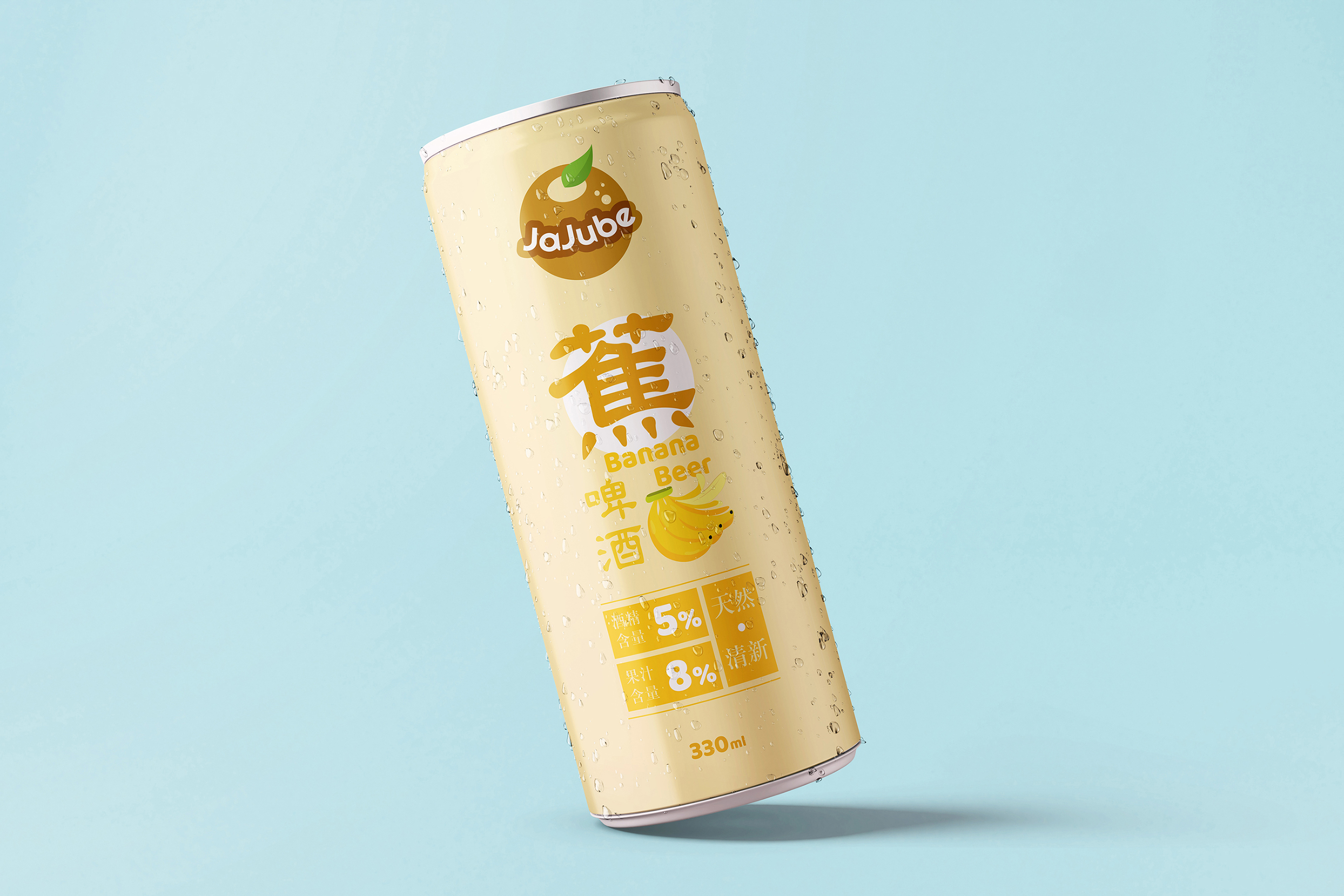
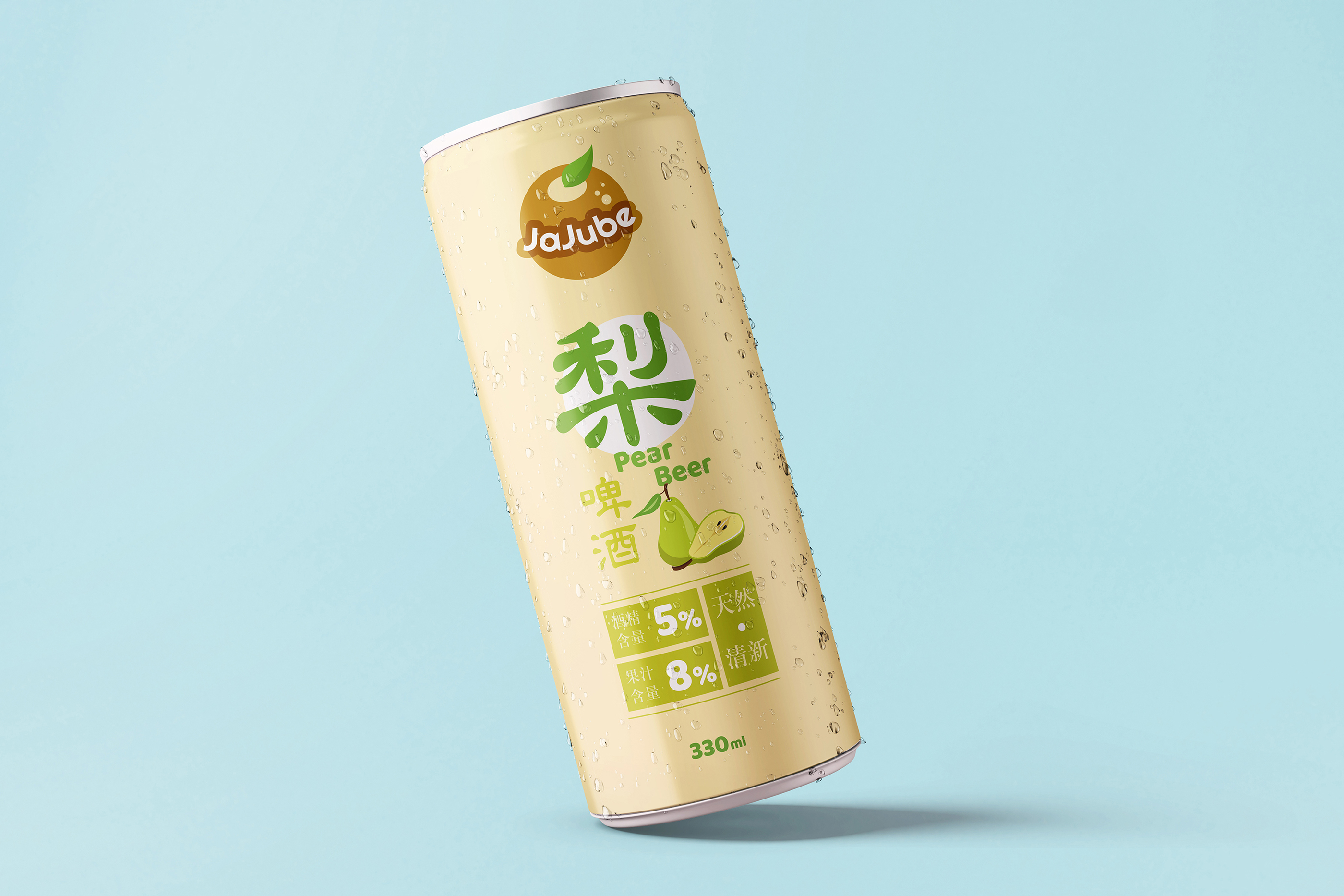
JaJube is a conceptual Taiwan brand which produces different kinds of fruit beer. Ja stands for Jar, Ju stands for Juice and be stands for beer. The bubbles inside the fruit-shape logo, presented the perfect combinations of fresh fruits and alcohol. With only 5% of alcohol, we believe these drinks are going to be popular among the girls who want some refreshing and natural beer.
After the observation in the supermarket in Taiwan, we found most of the beer cans design are over complicated. Either the patterns or the colors they chose are too distracting. Therefore, we deeply believe that if there is a light and clean can design is placed in the same region, it might be quite sharp to catch the customers’s eyes, especially, teenage girls. So, this time we designed for 3 flavors: Banana, Orange and Pear Flavors. Let us know which one do you want to try?


CREDIT
- Agency/Creative: Pivotal Design
- Article Title: JaJube Fruit Beer
- Organisation/Entity: Agency, Non Published Concept Design
- Project Type: Packaging
- Agency/Creative Country: Taiwan
- Market Region: Asia
- Project Deliverables: Brand Advertising, Brand Design, Brand Naming, Brand Strategy, Brand World, Branding, Graphic Design, Illustration, Packaging Design, Product Naming
- Format: Can
- Substrate: Metal


