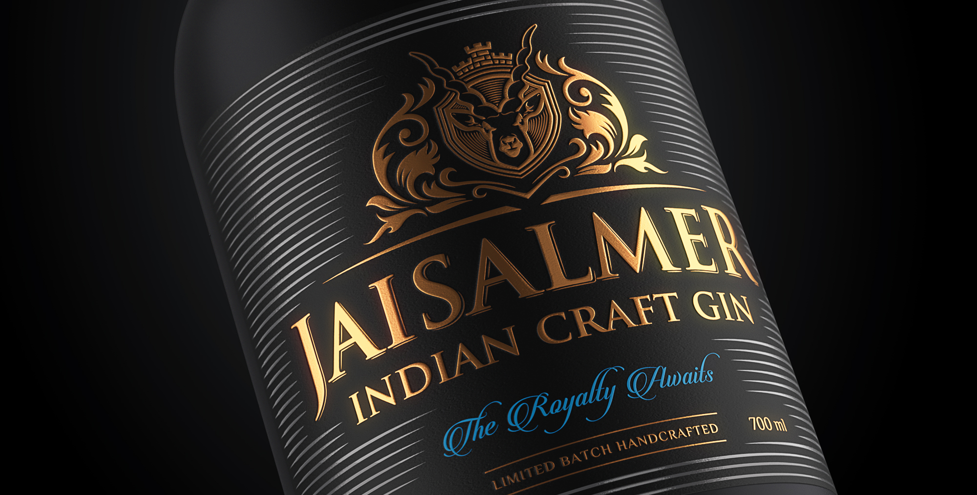
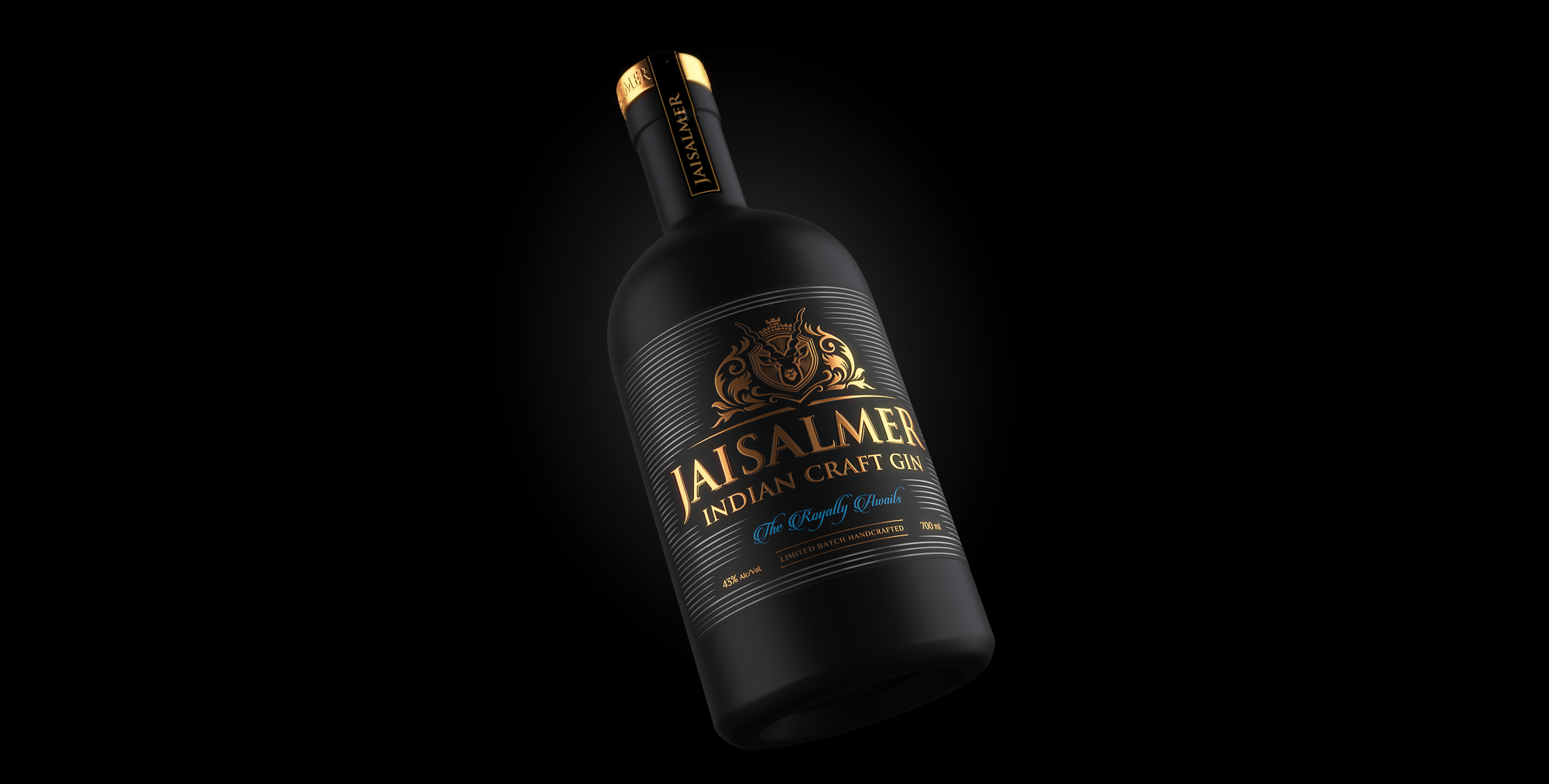
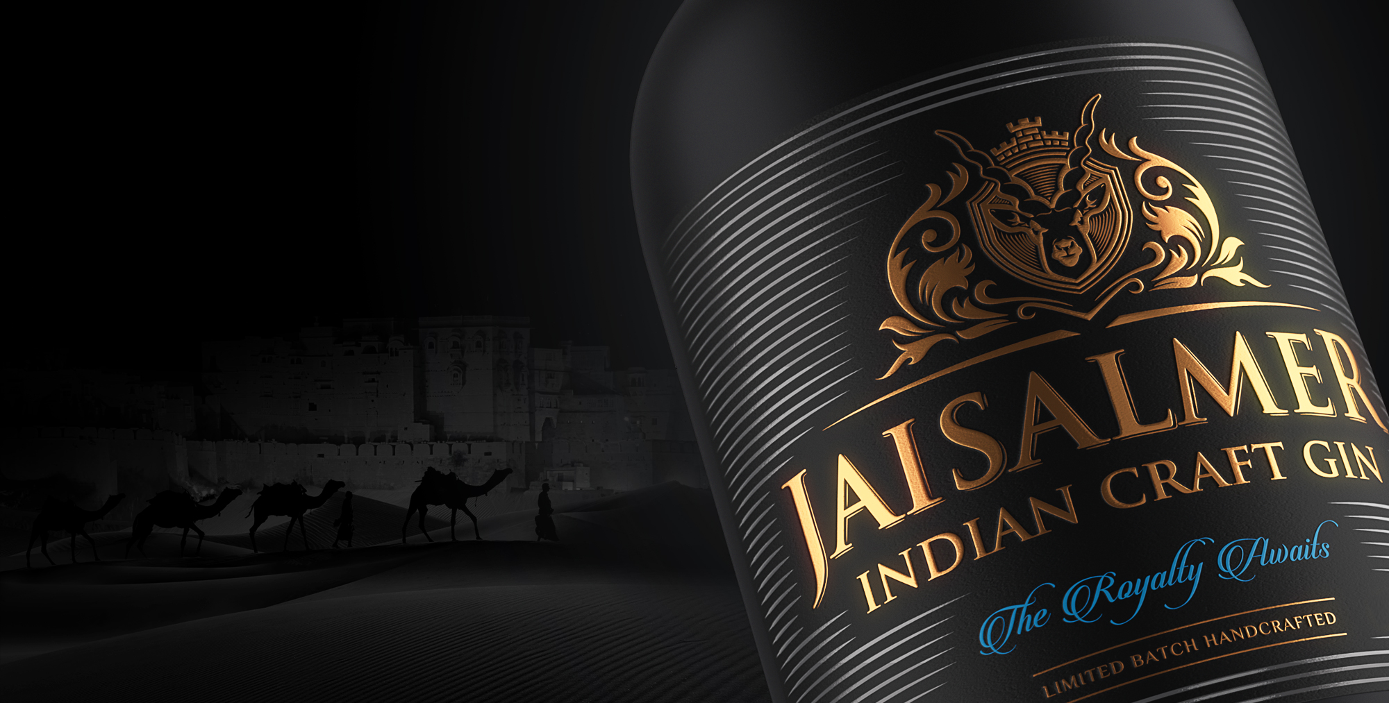
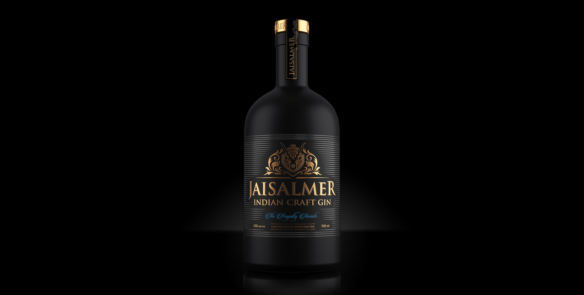
The chic dark black packaging of Jaisalmer Indian Craft Gin is complemented with touches of muted gold. Perhaps, it is an allusion to the golden sand that shines in all its glory, against the pitch-black night. The black buck in the logo is royally reminiscent of the highly prized Jaisalmer Royal Flag.
Set between the horns of the Black Buck is the Jaisalmer Fort, a glistening symbol of royalty, quite like no other. It silently proclaims the valour, honour and royal pride of the imperial clan. Finally, the traditional Rajasthani motifs add the impeccable detailing and thoughtfulness that only royalty can bring.

CREDIT
- Agency/Creative: Firstbase
- Article Title: Jaisalmer Craft Gin Designed by Firstbase
- Organisation/Entity: Agency, Published Commercial Design
- Project Type: Packaging
- Agency/Creative Country: India
- Market Region: Global
- Project Deliverables: Brand Architecture, Brand Creation, Brand Experience, Brand Guidelines, Brand Identity, Brand Naming, Brand Strategy, Branding, Graphic Design, Illustration, Packaging Design, Product Naming, Research, Tone of Voice
- Format: Bottle
- Substrate: Glass Bottle, Metal
FEEDBACK
Relevance: Solution/idea in relation to brand, product or service
Implementation: Attention, detailing and finishing of final solution
Presentation: Text, visualisation and quality of the presentation


