Introducing Jacob’s Cut Straight Bourbon Whiskey, Legacy Batch — a homage to a family’s cherished heritage, tradition, and legacy, and the culmination of generations of passion and expertise. Crafted by a current family member, whose love for whiskey led to the creation of a treasured recipe, Jacob’s Cut is a celebration of tradition, innovation, and the passing of the torch to the next generation.
Named in honor of Jacob, the beloved grandson and heir to the family legacy, Jacob’s Cut symbolizes the continuation of a rich tradition and the handing down of the family recipe to a new era.
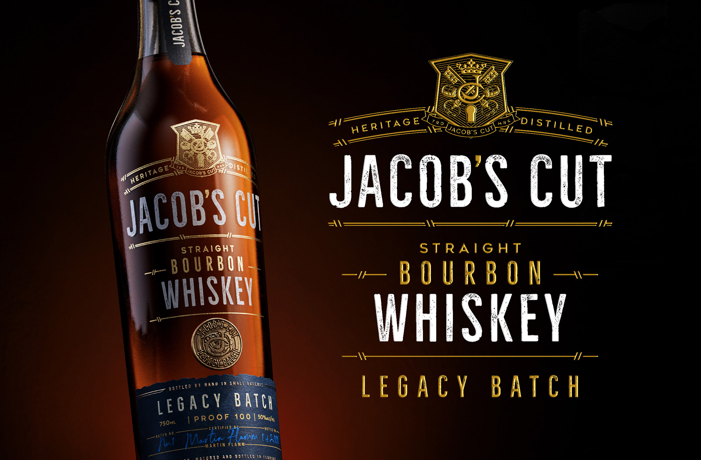
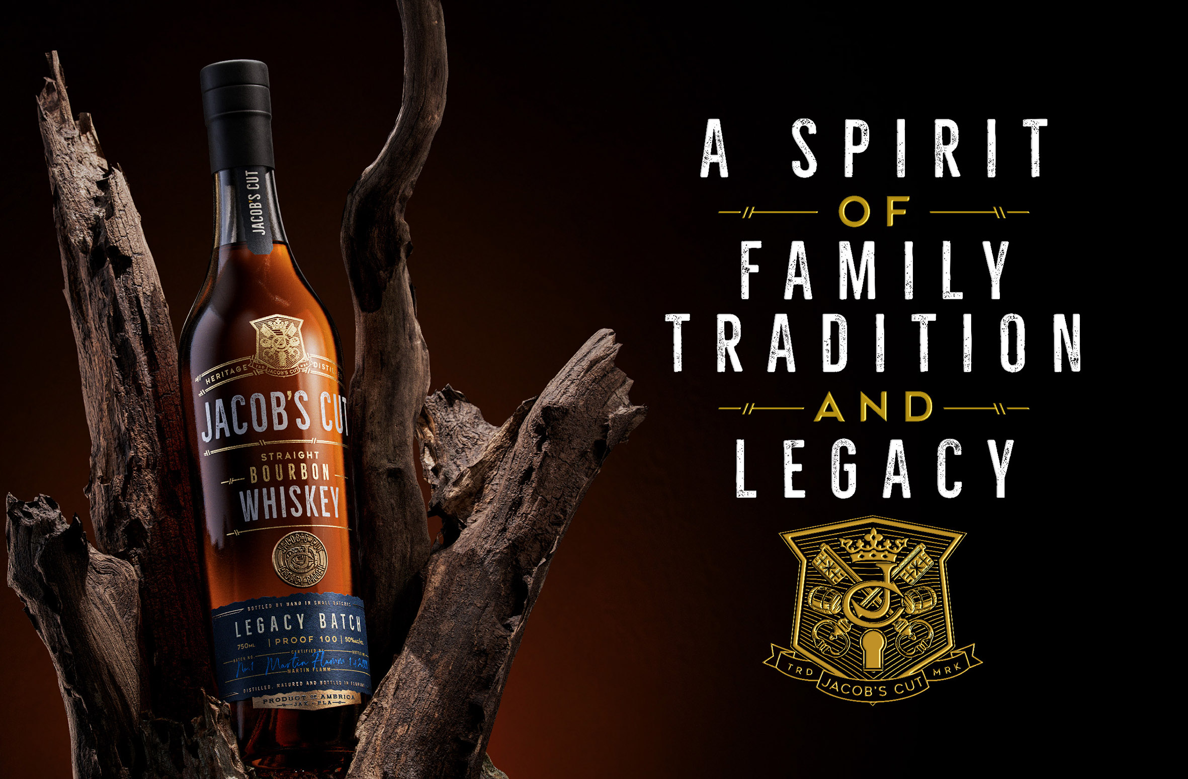
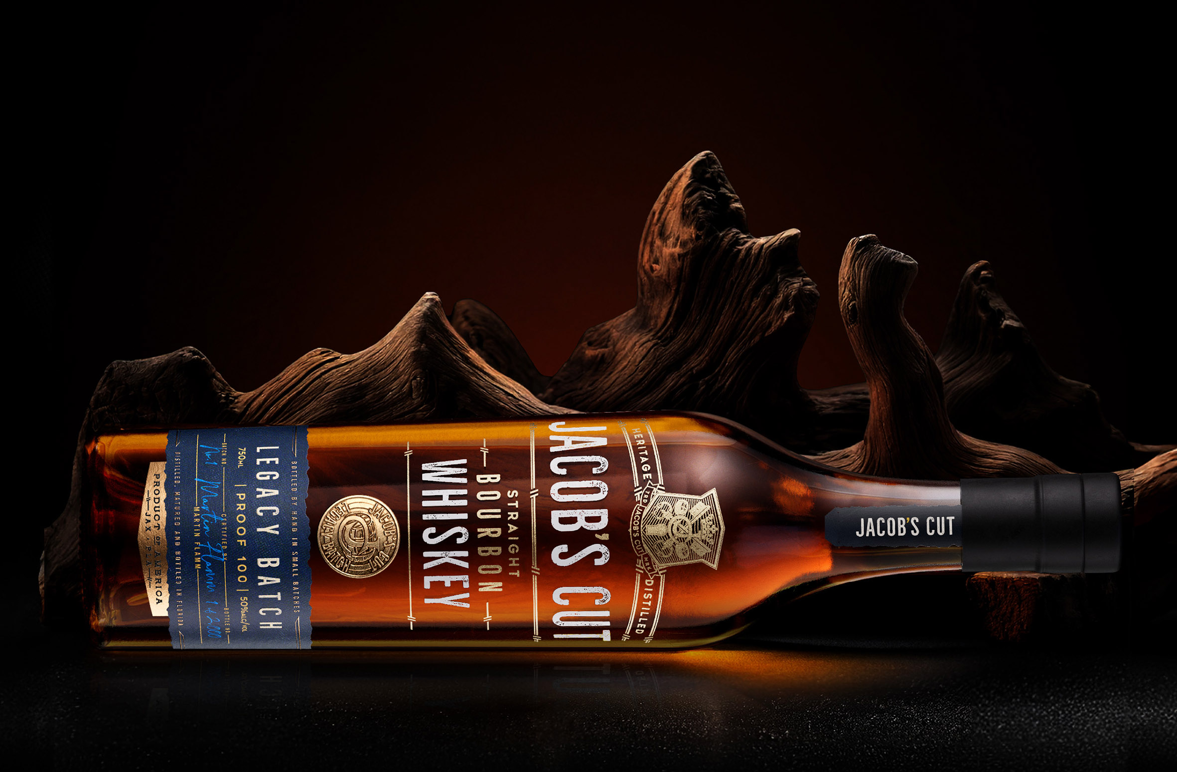
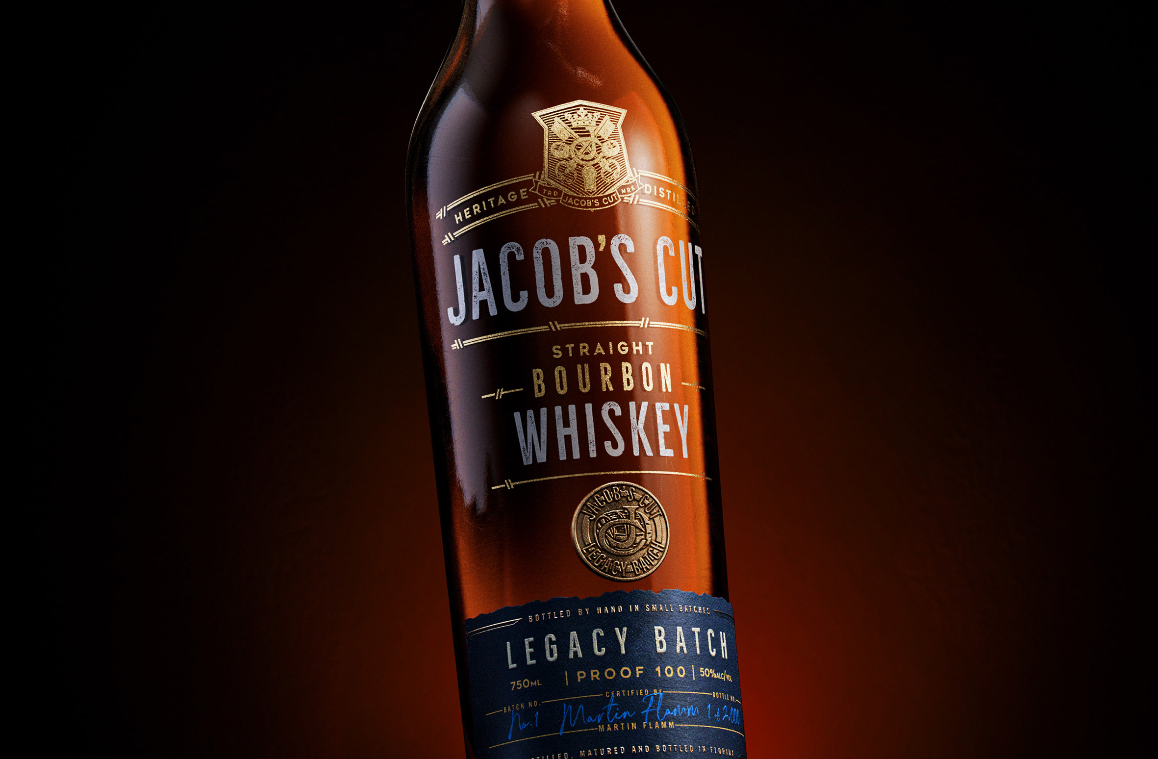
Our creative process extended beyond the name to reflect the depth of the whiskey’s story through every aspect of the packaging. The bottle features a screen-printed design, exuding a modern elegance, and is adorned with a symbolic coin charm—a nod to the family’s deep-rooted history. The uncoated label stock, with its custom die-cut, evokes the wear of time and embodies the spirit of legacy, creating a tactile connection to the past. A black shrink wrap caps the neck label strap, adding a refined touch to the overall aesthetic.
The brand mark, a custom-designed crest, represents both the family and the brand, framing the top of the Jacob’s Cut logo. At its heart are two crossing keys, symbolizing the convergence of family generations; a central “JC” honors Jacob’s Cut itself. Whiskey casks on the outer represent both product and legacy batch, while a crown at the top signifies the passing of the crown, and a keyhole at the base symbolizes new beginnings and opportunities ahead. Framed by “Heritage Distilled,” this mark is a tribute to the family’s whiskey distilling heritage.
In addition to the packaging, we took great care in shaping the brand’s story and identity—crafting the name “Legacy Batch,” writing the brand narrative and tagline, and designing and copywriting the website to ensure every detail resonates with the family’s rich history.
A Spirit of Family Tradition and Legacy – Heritage Distilled


CREDIT
- Agency/Creative: Brand Hatch Creative
- Article Title: Jacob’s Cut Straight Bourbon Whiskey Legacy Batch Packaging Design Honoring Whiskey Heritage by Brand Hatch Creative
- Organisation/Entity: Agency
- Project Type: Packaging
- Project Status: Published
- Agency/Creative Country: United States
- Agency/Creative City: Miami
- Market Region: North America
- Project Deliverables: Brand Creation, Brand Design, Brand Guidelines, CGI, Packaging Design
- Format: Bottle
- Industry: Food/Beverage
- Keywords: Whiskey, Bourbon, American Whiskey, Creative Design
-
Credits:
CGI Renders: Tricycle Studio


