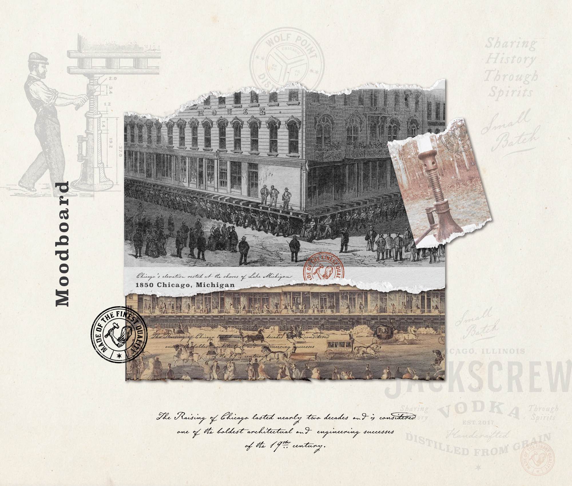
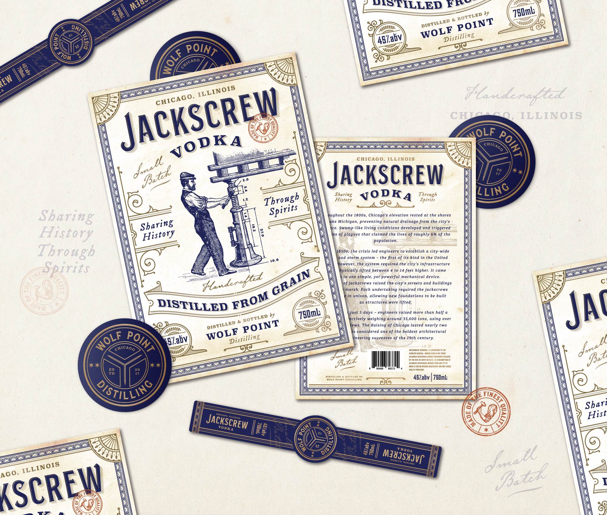
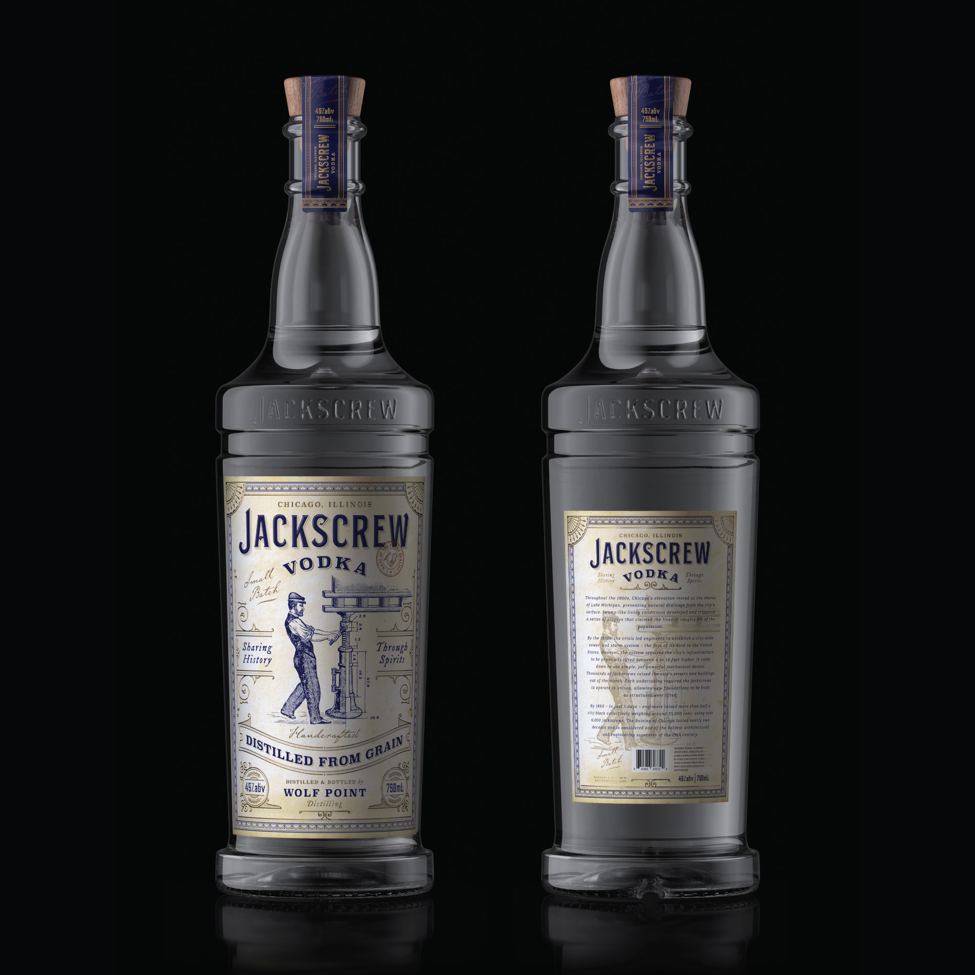
Throughout the 1800s, Chicago’s elevation rested at the shores of Lake Michigan, preventing natural drainage from the city’s surface. Swamp-like living conditions developed and triggered a series of plagues that claimed the lives of roughly 6% of the population. By the 1850s, the crisis led engineers to establish a city-wide sewer and storm system – the first of its kind in the United States. However, the system required the city’s infrastructure to be physically lifted between 4 to 14 feet higher.
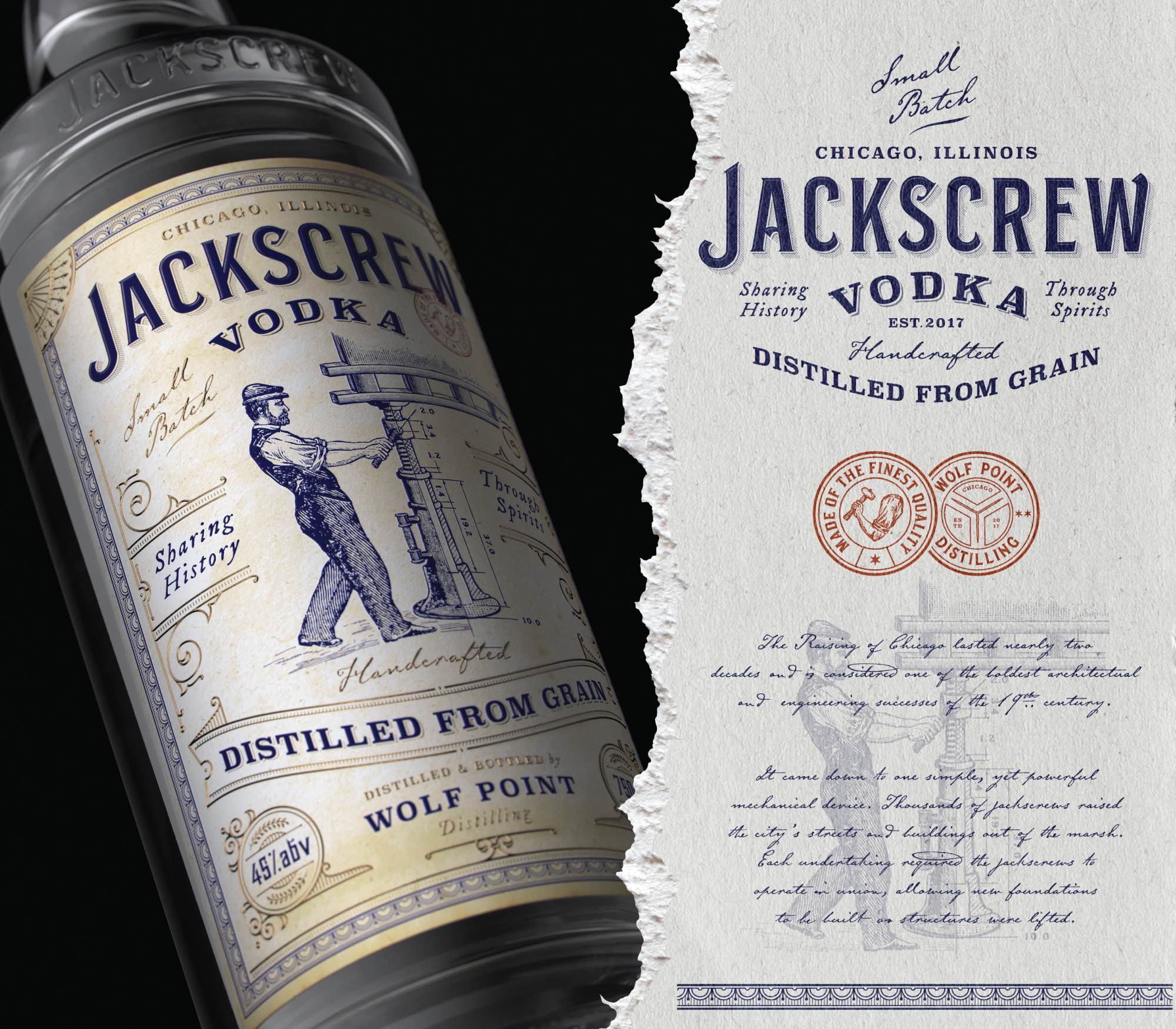
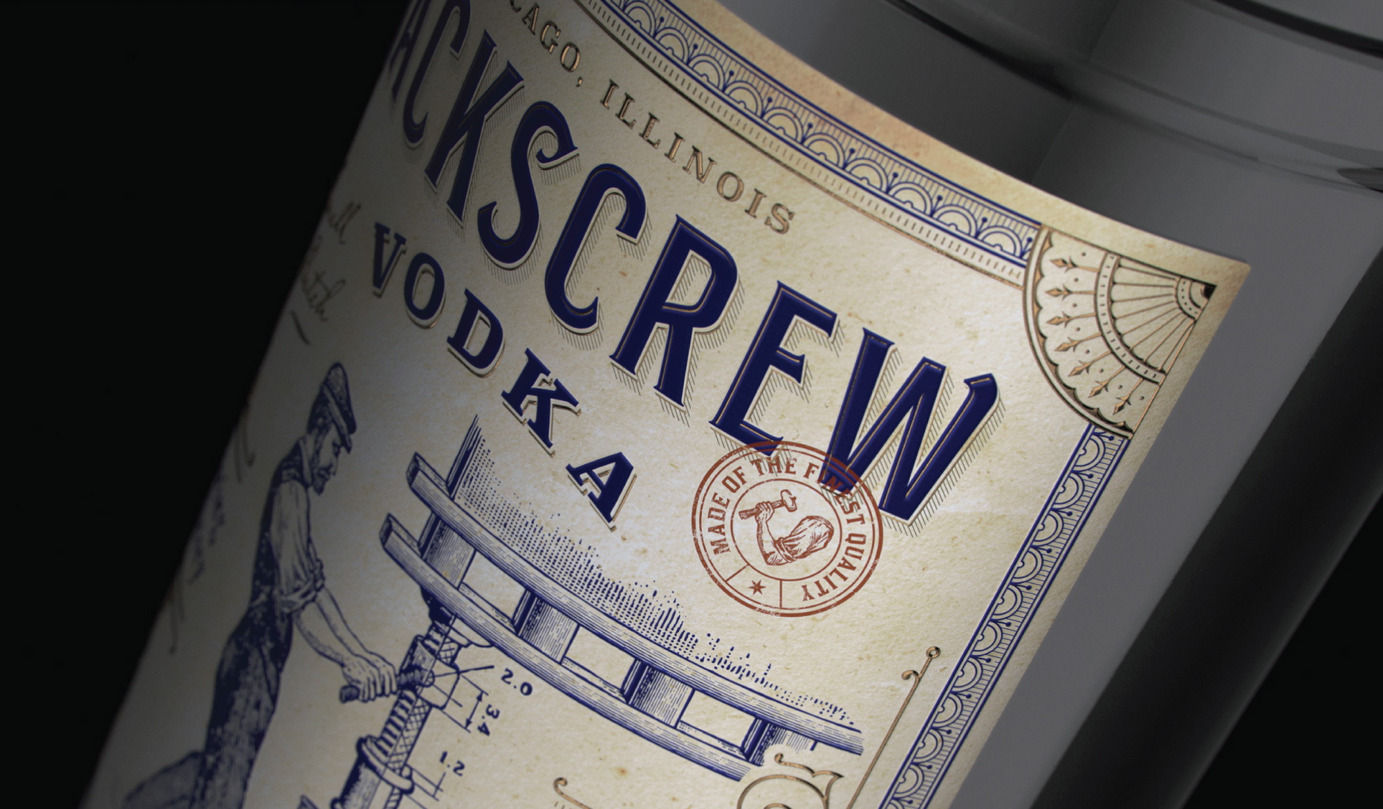
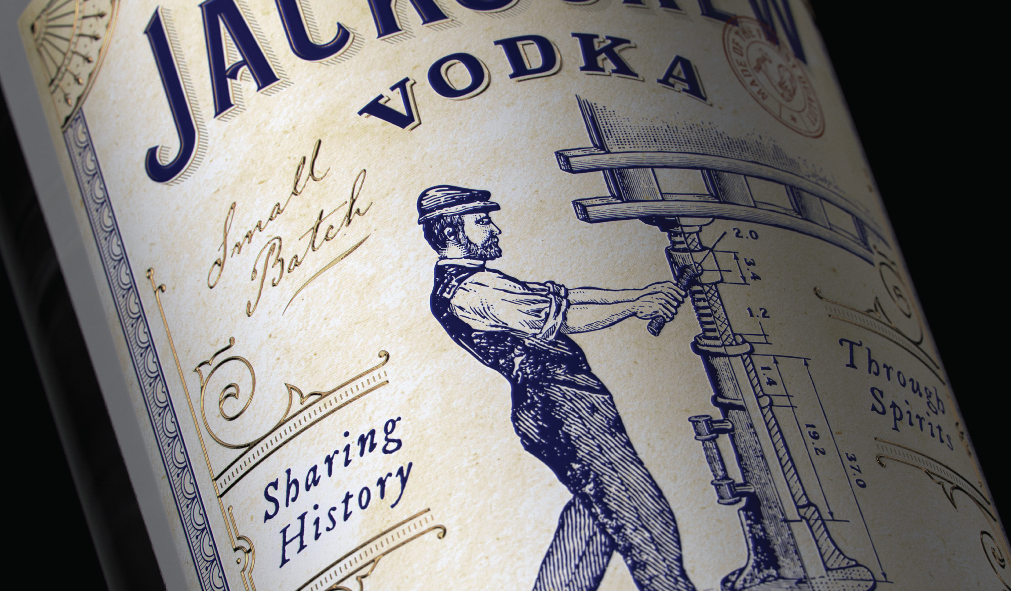
It came down to one simple, yet powerful mechanical device. Thousands of jackscrews raised the city’s streets and buildings out of the marsh. Each undertaking required the jackscrews to operate in union, allowing new foundations to be built as structures were lifted. By 1860 – in just 5 days – engineers raised more than half a city block collectively weighing around 35,000 tons, using over 6,000 jackscrews.
The Raising of Chicago lasted nearly two decades and is considered one of the boldest architectural and engineering successes of the 19th century.
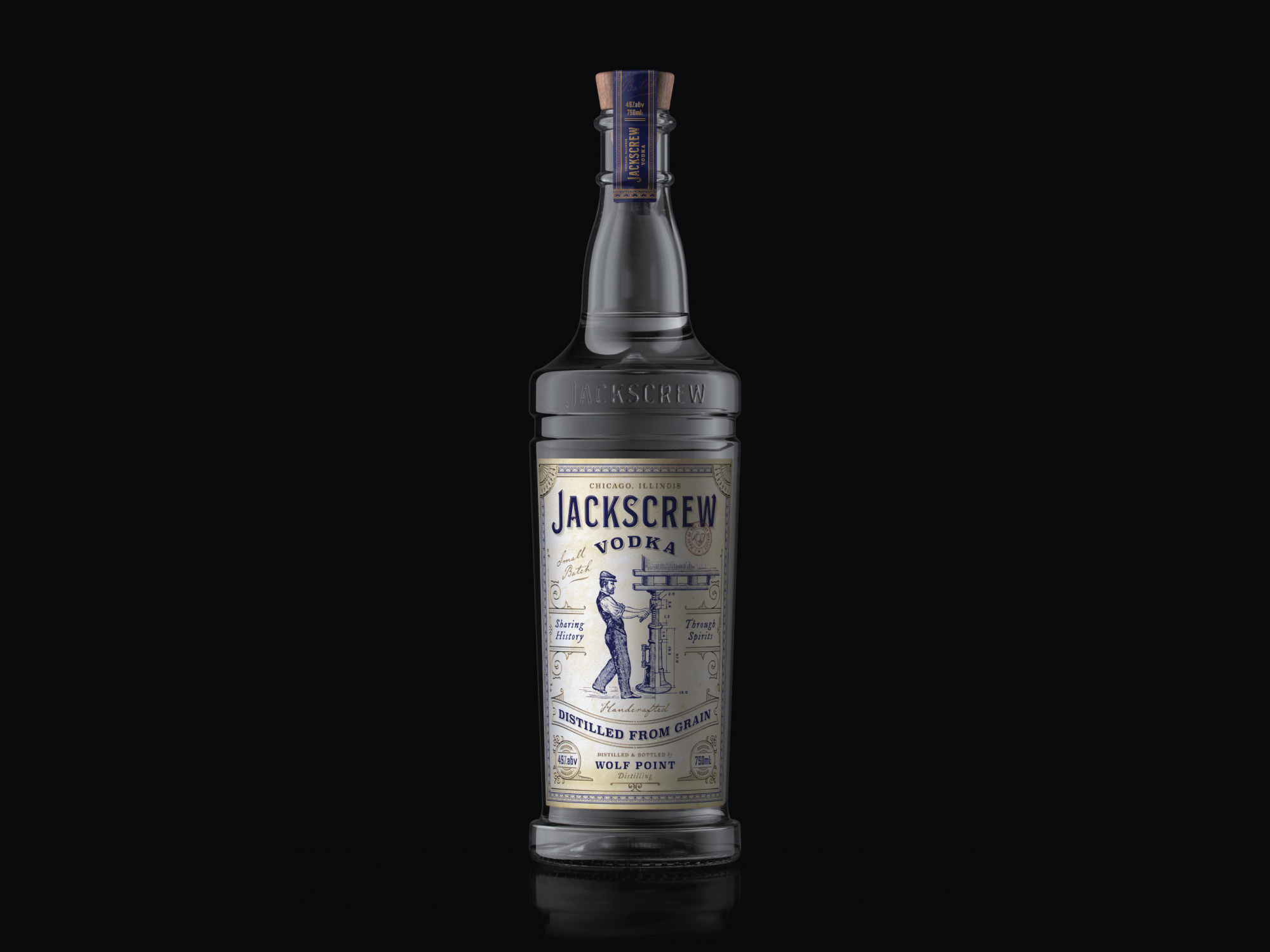
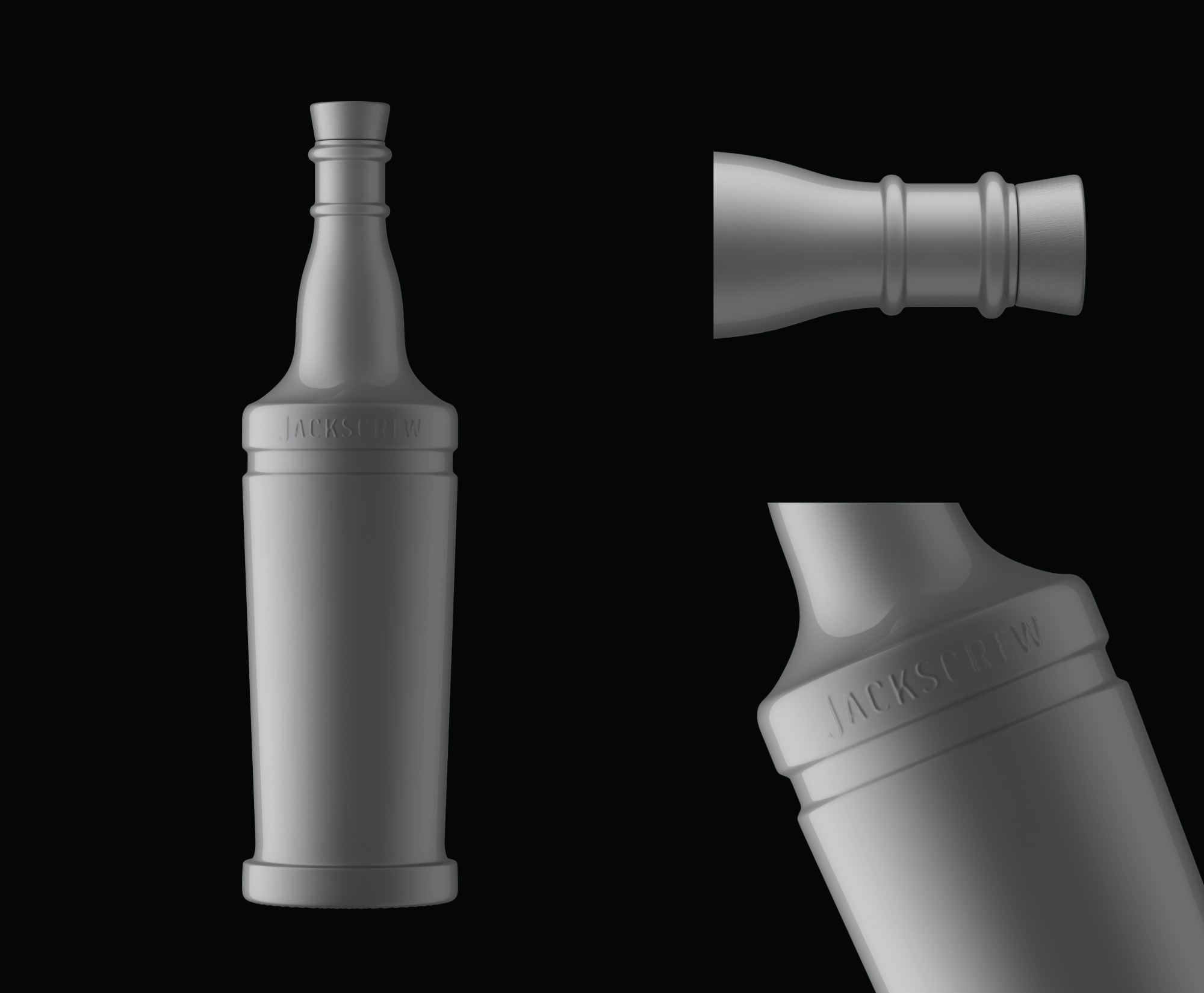
Custom bottle design & concept
Most bottles are designed keeping drinkers in mind and not the pourers. This led us to the idea of a bottle design which ultimately is meant for pourers but still keeps the interest of drinkers.
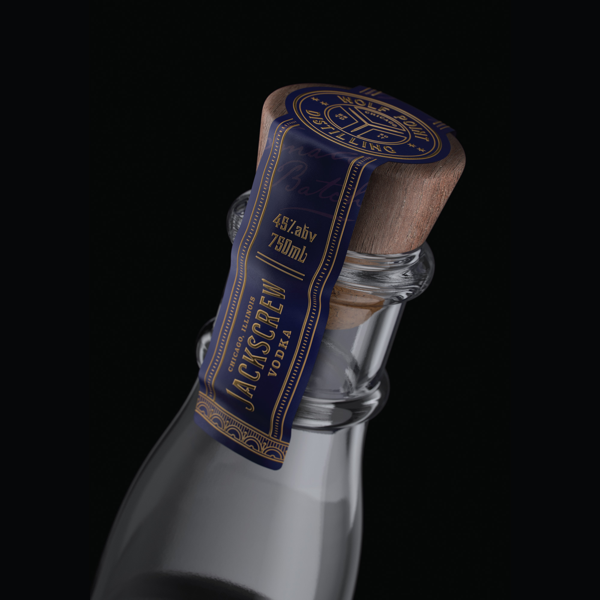
Based on the research we have done, an ideal bottle for pourers should have – a neck to grab onto, a shoulder rest for the wrist and a thick flat base as a counterweight. These features make it easier for bartenders to grip the bottle, flip it over with ease to pour a drink and necessary for the bottle to stand securely on the shelf.
Coincidentally, these criteria describe a Jackscrew. Who knew? We took inspiration from the jackscrew to design these elements. Not only are they technically well-rounded but also visually appealing. Look closely…the top half of the bottle looks pretty similar to a jackscrew. The tapered glass body merging into a thick base is the foundation the jackscrew is screwed into.
CREDIT
- Agency/Creative: Dusan Sol
- Article Title: Jackscrew Vodka Branding and Packaging Design Concept and Story
- Organisation/Entity: In-House
- Project Type: Packaging
- Project Status: Published
- Agency/Creative Country: Serbia
- Agency/Creative City: Cacak
- Market Region: North America
- Project Deliverables: 3D Art, 3D Design, 3D Modelling, Brand Creation, Brand Design, Brand Identity, Brand Refinement, Branding, Illustration, Logo Design, Packaging Design, Product Design, Typography, Visualisation
- Format: Bottle, Wrap
- Substrate: Glass, Glass Bottle, Pulp Paper
- Industry: Food/Beverage
- Keywords: Packaging design, Product design, label design, 3d model, bottle design, branding, brand identity, illustration, typography, vintage design
-
Credits:
3d Designer: Amit Chippa
Client: Wolfpoint Distillery, Chicago
Label Design and Illustrations: Dusan Sol
Graphic Design : Dusan Sol
Bottle Concept and Design: Amit Chippa
CGI Visuals: Amit Chippa


