Located at the most western edge of the Barossa Valley, Lienert Vineyards is a partnership between brothers John and James Lienert. Established in 1998, the vineyards are planted in distinctive rich red loam over limestone soils, and enjoy uninterrupted exposure to the warm Barossa sun. Each year, John and James reserve parcels of fruit from select vineyard blocks to be sold under the Jack West label.
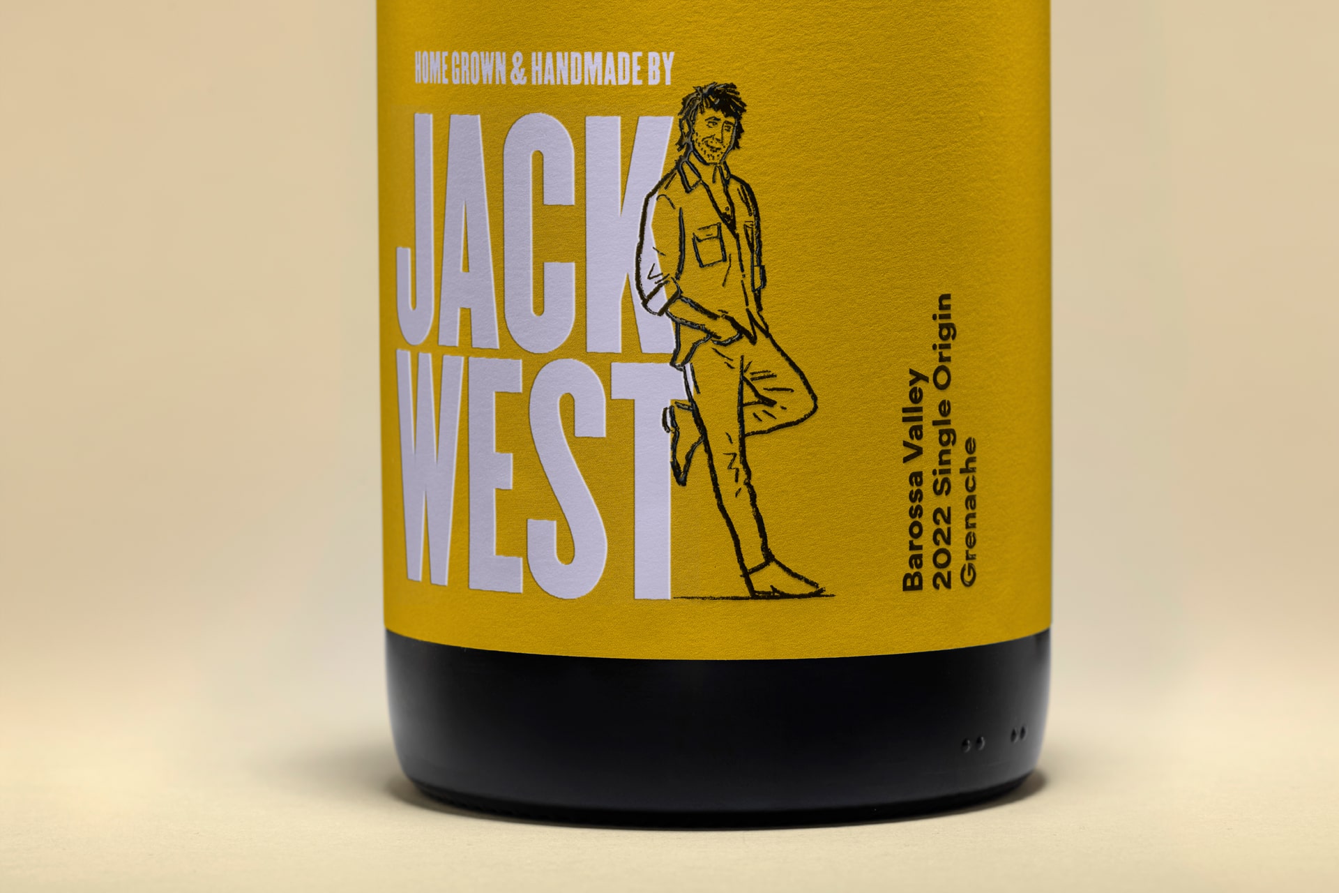
Jack West is a brand named after John; a grapegrower who consciously cultivates his vines on the family estate. He believes that healthy soils become the foundation of a healthy vineyard, and the healthier the vine the better result in the glass. It was important to highlight this philosophy on the packaging, so consumers understand that the wines are grown and made by Jack West himself.
Whilst enigmatic, Jack is a genuine bloke; a likeable character, well respected by his mates and peers. Once seen as bold, Jack West’s original packaging was looking dated and lacking in personality. Cornershop’s objective was to refresh the brand identity and packaging to engage the target consumer and express Jack’s unique personality to distinguish him from the crowd.
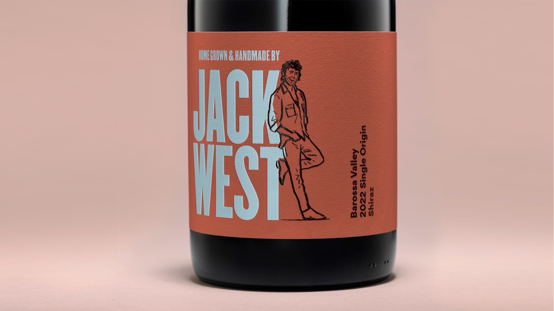
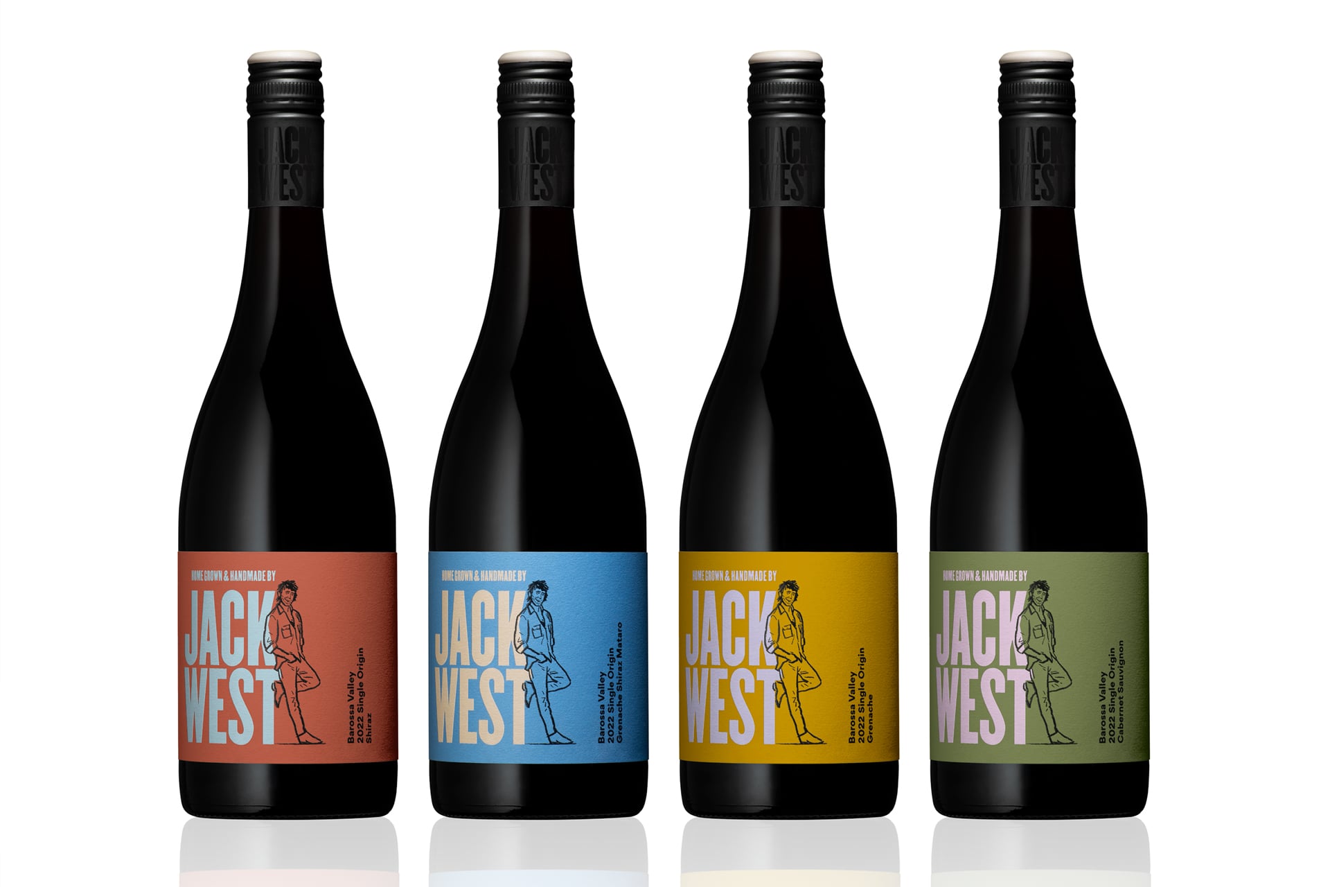
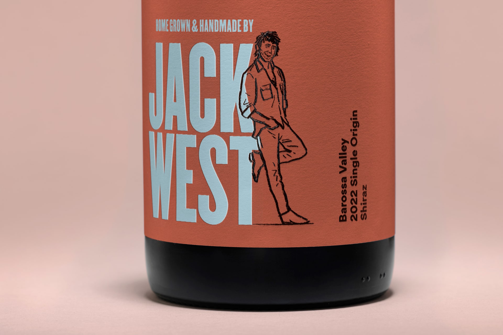
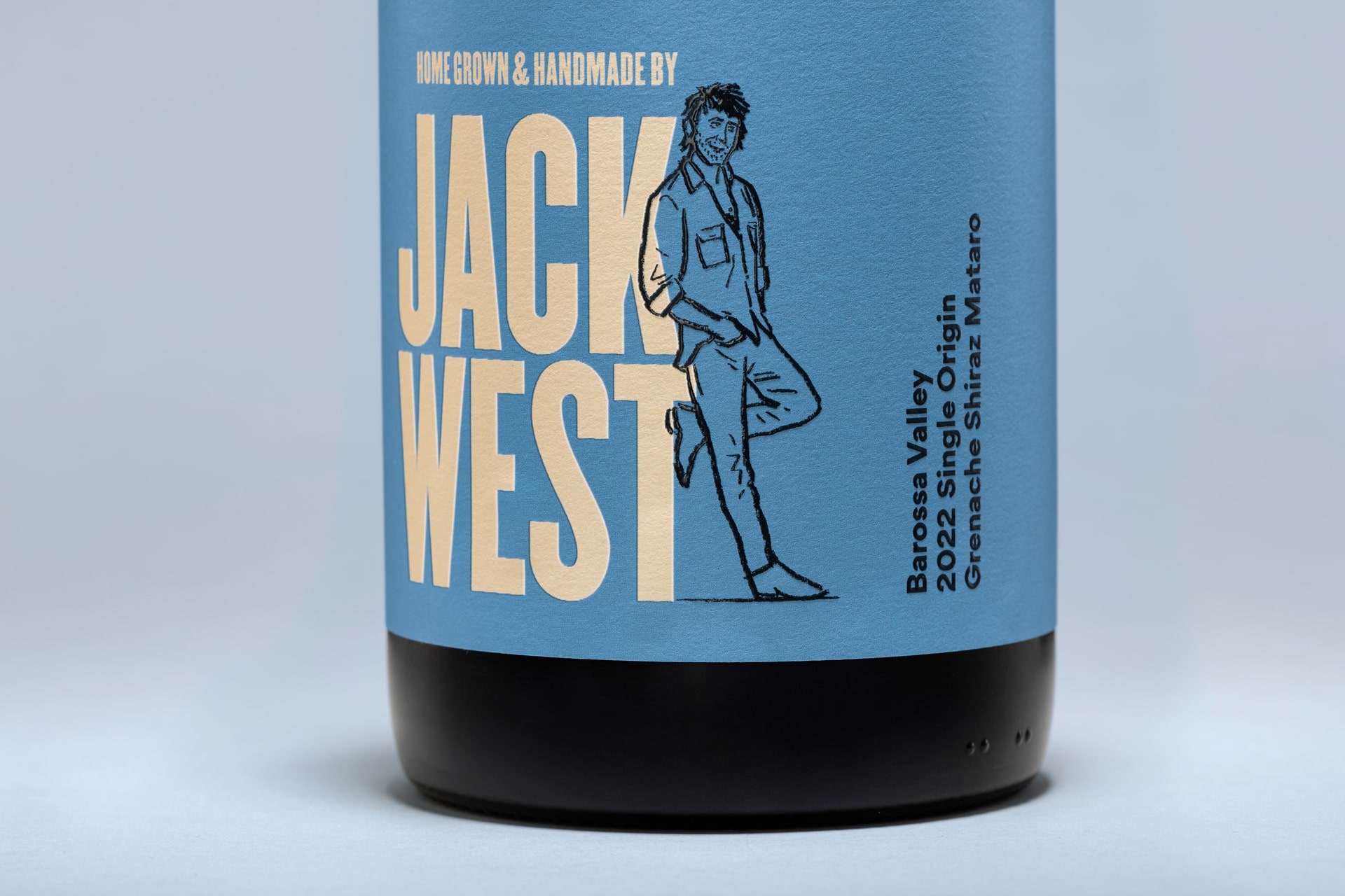
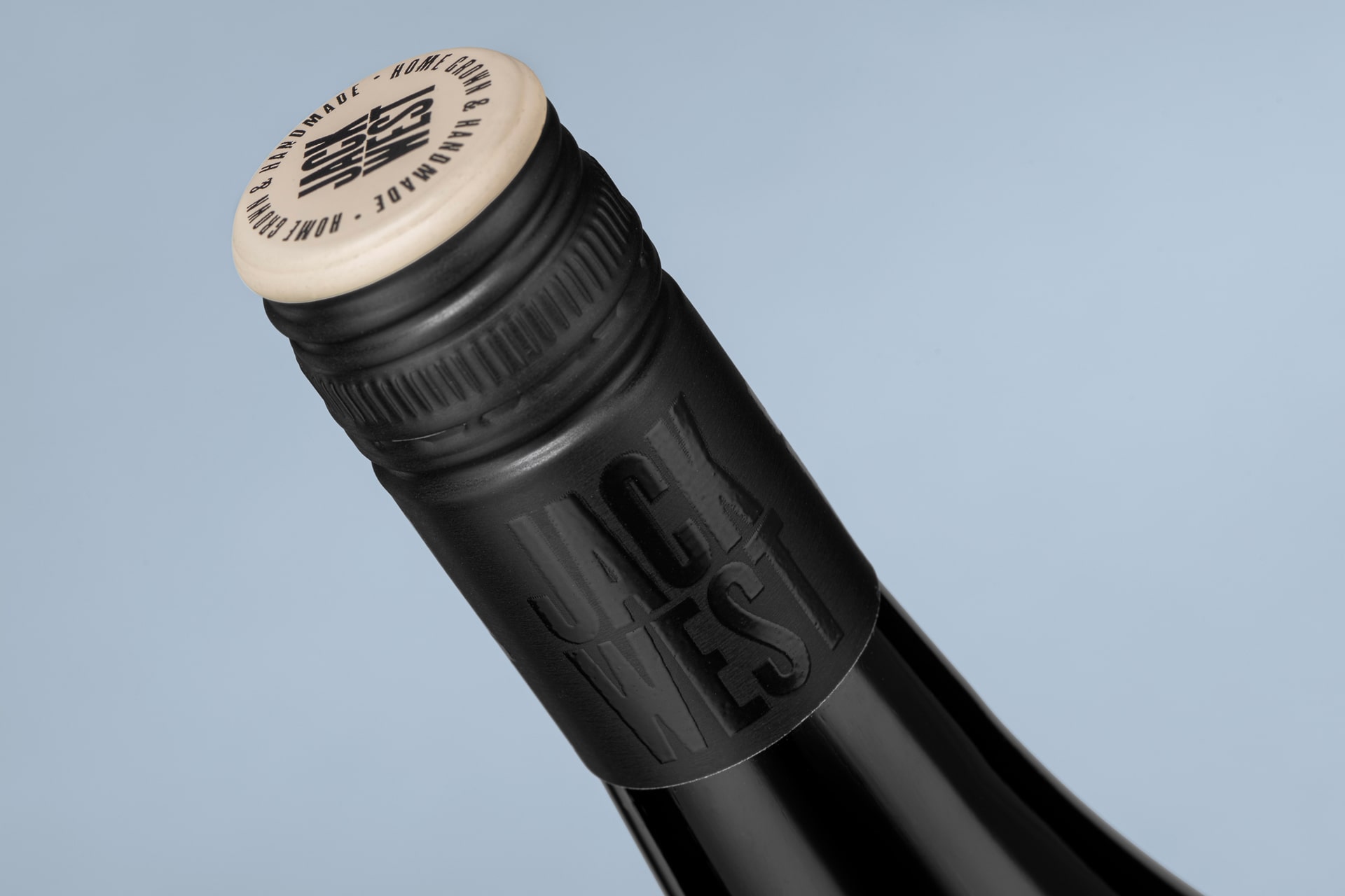
Cornershop collaborated with illustrator Dan Tomkins to create an engaging character that epitomises the personality of Jack West; approachable, authentic and Australian. To complement the illustrated character, they established a visual system for the packaging design; with bold typography and colours to identify varietals and a solution that supports range extension. ‘Home grown and handmade by Jack West’ clearly communicates craft and provenance to the consumer. To add value and maximise shelf appeal, the illustration, plus logo on the capsule, are finished in a glossy high build varnish. The overall package effectively positions Jack West at A$25 rrp per bottle.

CREDIT
- Agency/Creative: Cornershop Design
- Article Title: Jack West Wines’ Modern Packaging Redesign by Cornershop Design
- Organisation/Entity: Agency
- Project Type: Packaging
- Project Status: Published
- Agency/Creative Country: Australia
- Agency/Creative City: Adelaide
- Market Region: Oceania
- Project Deliverables: Illustration, Packaging Design
- Format: Bottle
- Industry: Food/Beverage
- Keywords: Wine packaging, Illustration
-
Credits:
Brand Keeper & Designer: Damian Hamilton


