


Depot WPF – ITM
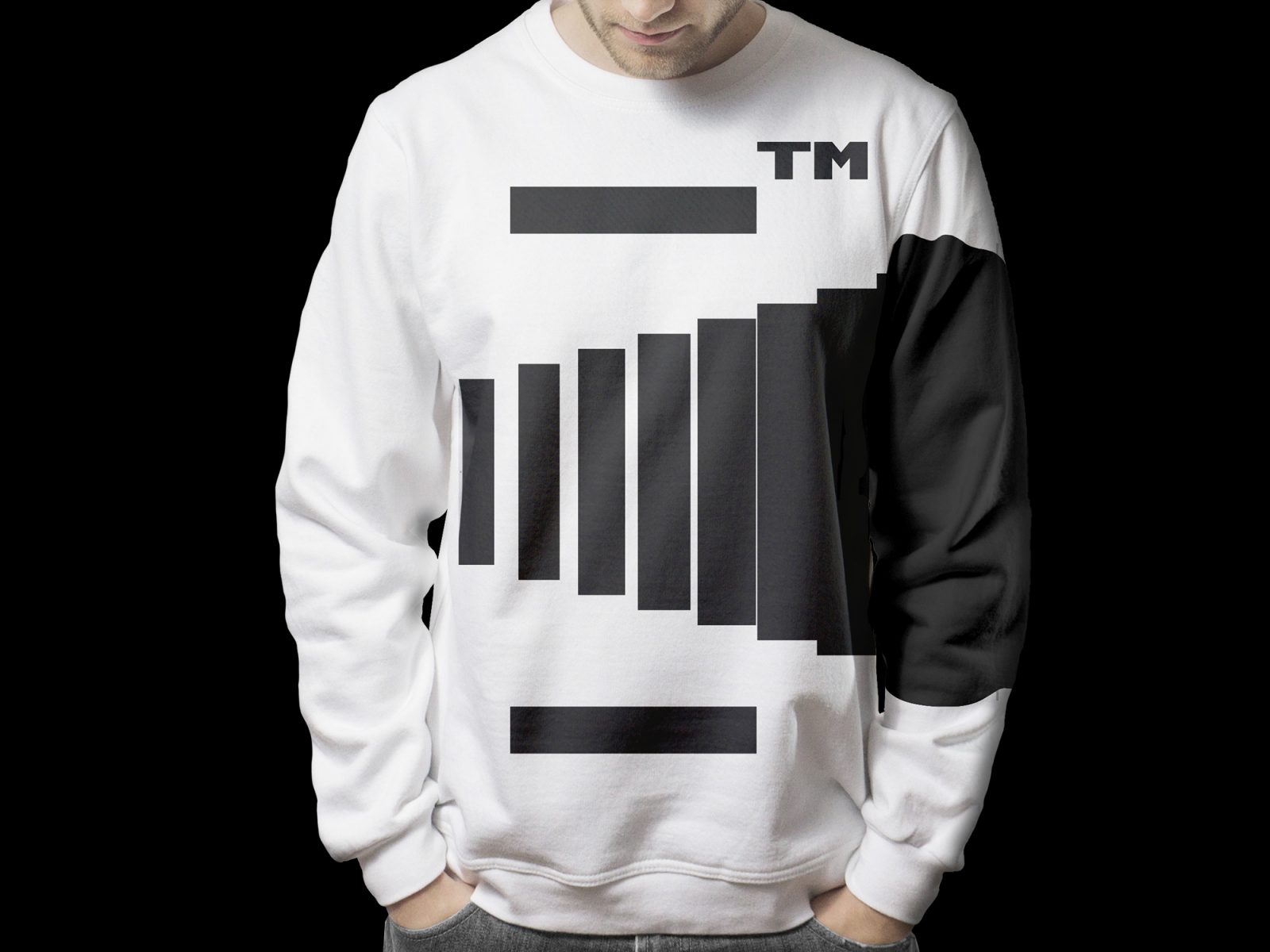
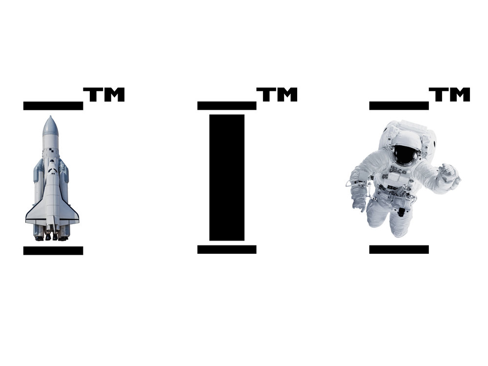
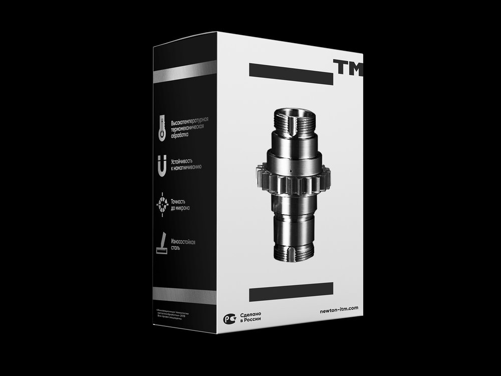
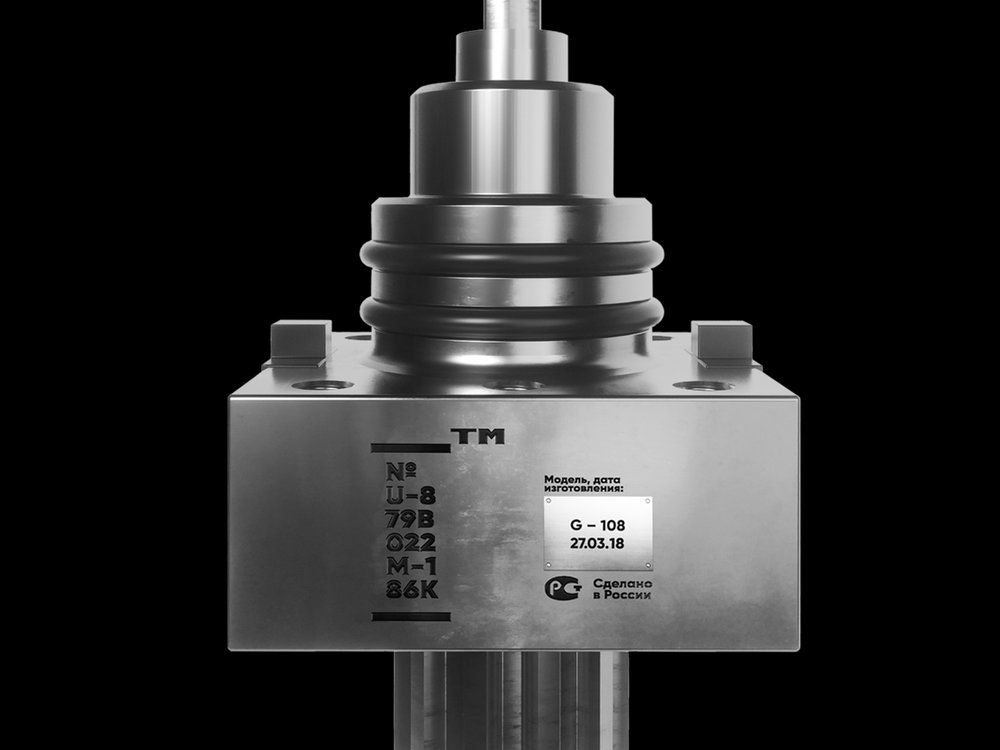
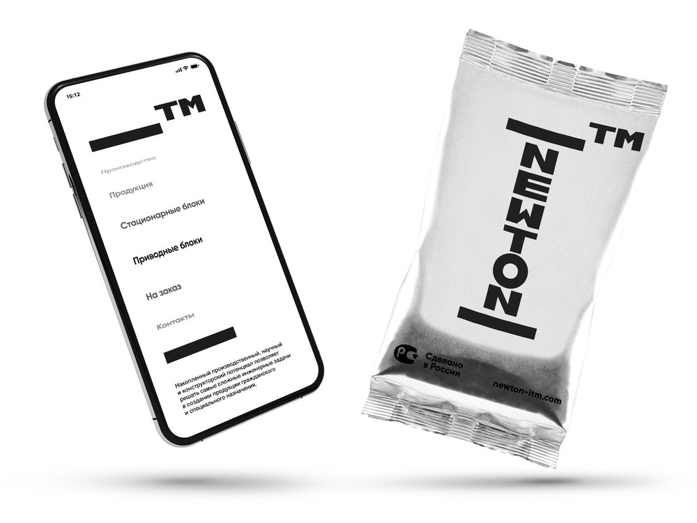
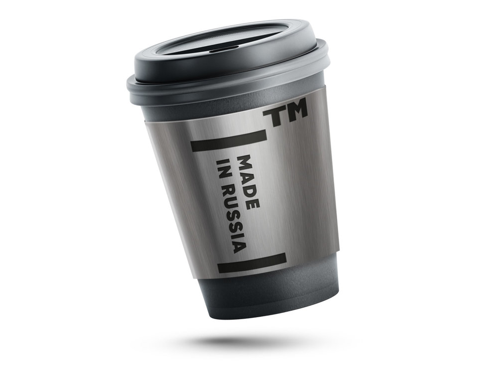
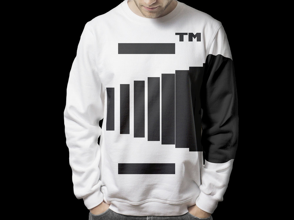
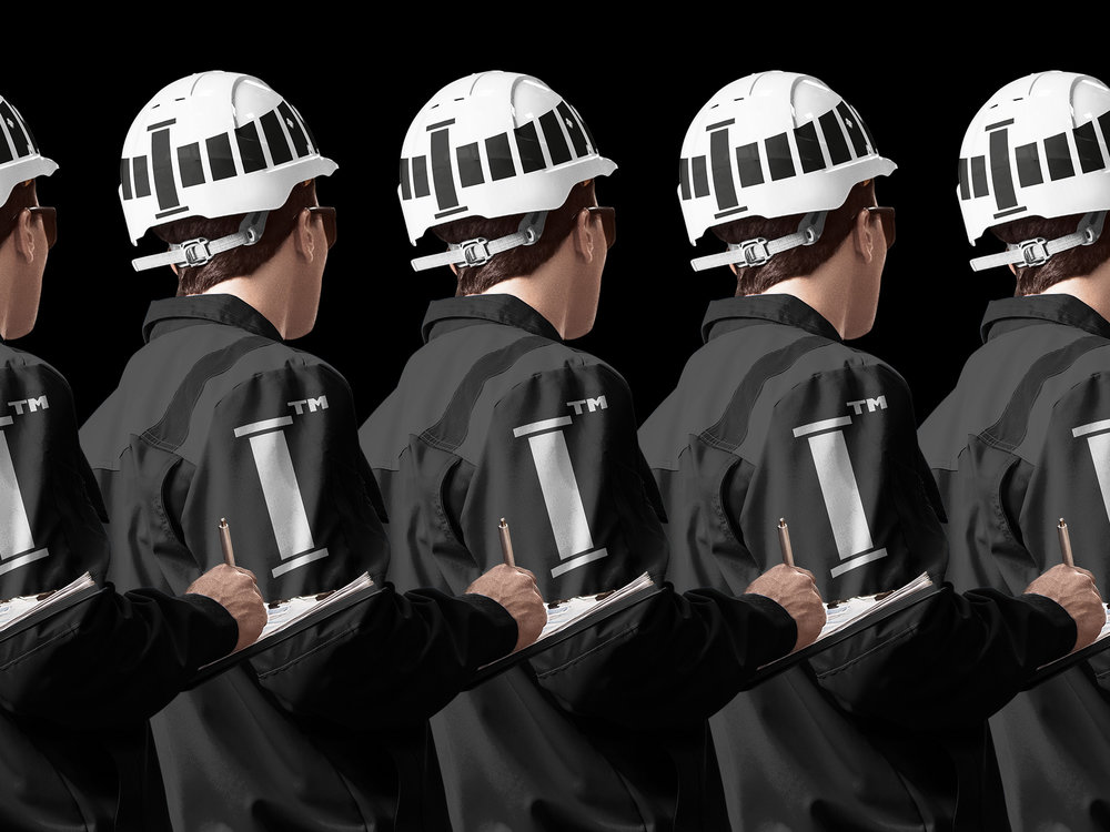
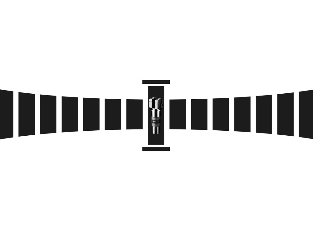
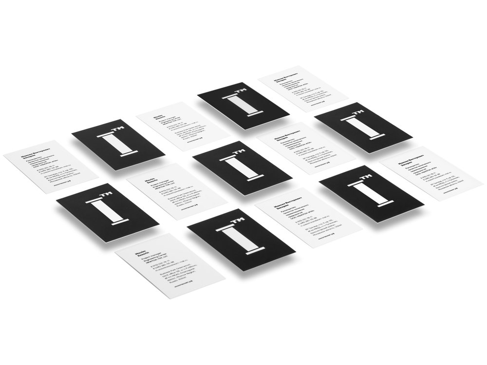
ITM is a leading supplier of innovative high-tech metalworking equipment for the needs of industrial enterprises in Russian Federation and CIS. Our task was the unification of several activities of the company under a common brand, the development of a single brand platform and sub-brands, as well as the creation of a visual system of the company. The target audience of the project are large metalworking enterprises of Russia and the world.We decided to pay more attention to staff but not to equipment, resources or power. ITM employs over 100 people and everyone is aware of personal responsibility. While developing the identity we focused on the first letter of the abbreviation – “I”. It helped us to emphasize that reliability and reputation are made up of each person’s responsibility in the area entrusted to him. The Latin letter “I” is visually similar to the Roman “one”. The mark corresponds to the real place of ITM among those who ensure the growth of the country’s production potential.We also decided to add opportunities for the dynamic development of communication to the identity structure. A trademark can be situationally used to inscribe the subbrand name or be replaced with a symbol of the company’s production direction, a visual display of a specific product on the package, slogan or elements of a mobile application.Following the results of the strategic session, we developed common corporate style standards: kept two separate names for various activities and created a visual umbrella for them. The name of the company engaged in the sale of equipment was Newton. It can be equally understandable to both Russian customers and foreign partners. For the production part, it was decided to keep the abbreviation ITM (full name – Innovative Technologies of Metalworking) for the production part. It gives fresh graphic “sound”.The main element in the ITM logo is the first letter. “I” is personal responsibility for the proposed solutions and the position of the leader. The TM letters located at the top of the logo can be read as a peculiar quality mark accompanying all the company’s offers. The design turned out to be convenient. And design made it possible to inscribe various signs, images and inscriptions into brand communication.The developed identity is currently being implemented by the company. The internal communications are already revised and dynamically used by employees. The company also uses elements of the new identity in external communications. The new version of Newtone’s website was prepared and is in the launching process. The version of the site and the used identity are still intermediate. The full update is planned to be finished till the end of the year. The rebranding of the production itself (plant, production lines, branded clothing etc) and translation under the “banners” of the developed style of all subsidiaries are also among the plans of ITM company.The main value of the brand is convenience and flexibility. Basic forms of our identity reflect the reliability, solidity and stability of the organization, with no inappropriate importunity. We managed to organize communication well both with young specialists and with people who organize state tenders.
CREDIT
- Agency/Creative: Depot WPF
- Article Title: ITM: Innovative Technologies of Metalwork
- Project Type: Packaging
- Agency/Creative Country: Russia
- Market Region: Middle East
- Industry: Manufacturing


